Built with Framer
Saatvy - Designed & Built an Ayurvedic Wellness Site
Jithin Kumar
Saatvy
An Ayurvedic wellness brand that needed to feel like medicine and meditation at the same time.
The wellness space online has a look. You've seen it. Soft gradients, floating leaves, a woman mid-yoga-pose on a cliff at sunrise. It's calming in the way elevator music is calming: technically pleasant, completely forgettable. Saatvy came to me with a product that was the opposite of forgettable, real Ayurvedic treatment programs for chronic conditions like thyroid disorders, IBS, and gut health issues, but a digital presence that didn't exist yet.
They needed a website. Not a template. Not a "wellness landing page." A complete digital experience, designed and built from zero, that could do two things at once: feel deeply natural and holistic, while also converting visitors into consultation bookings. That tension, between calm and conversion, shaped every decision I made.
I handled the entire project end to end. Design system in Figma. Development and interactions in Framer. Every section, every animation, every hover state.
The design had to earn trust before the copy did.
Wellness brands ask people to believe in something they can't see yet. The design needed to do that heavy lifting instantly. I built the visual system around warm, earthy tones, deep greens, soft ambers, and natural textures that reference Ayurvedic ingredients without being literal about it. No stock photos of turmeric roots on marble countertops.
The typography is clean and spacious. Generous line heights, deliberate padding between sections, and a reading rhythm that slows you down on purpose. The layout breathes. When someone lands on this page after scrolling through the chaos of social media, the contrast is immediate. That's the point.
White space isn't decoration here. It's part of the treatment.
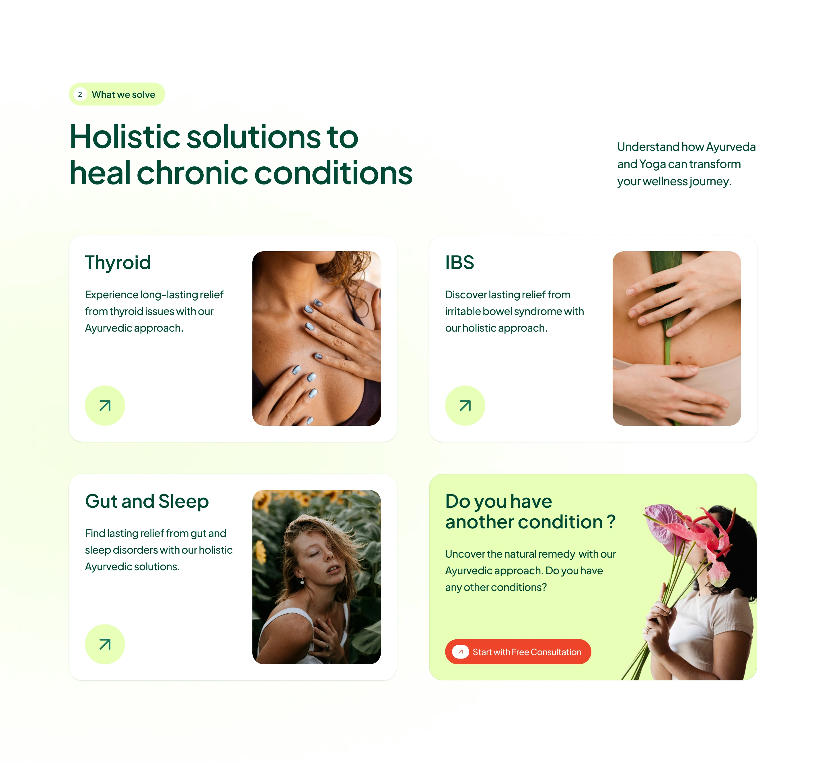
Every section solves a specific problem in the user's journey.
The homepage isn't a brochure. It's a funnel disguised as a story. Each section exists because it answers a question the visitor is already asking:
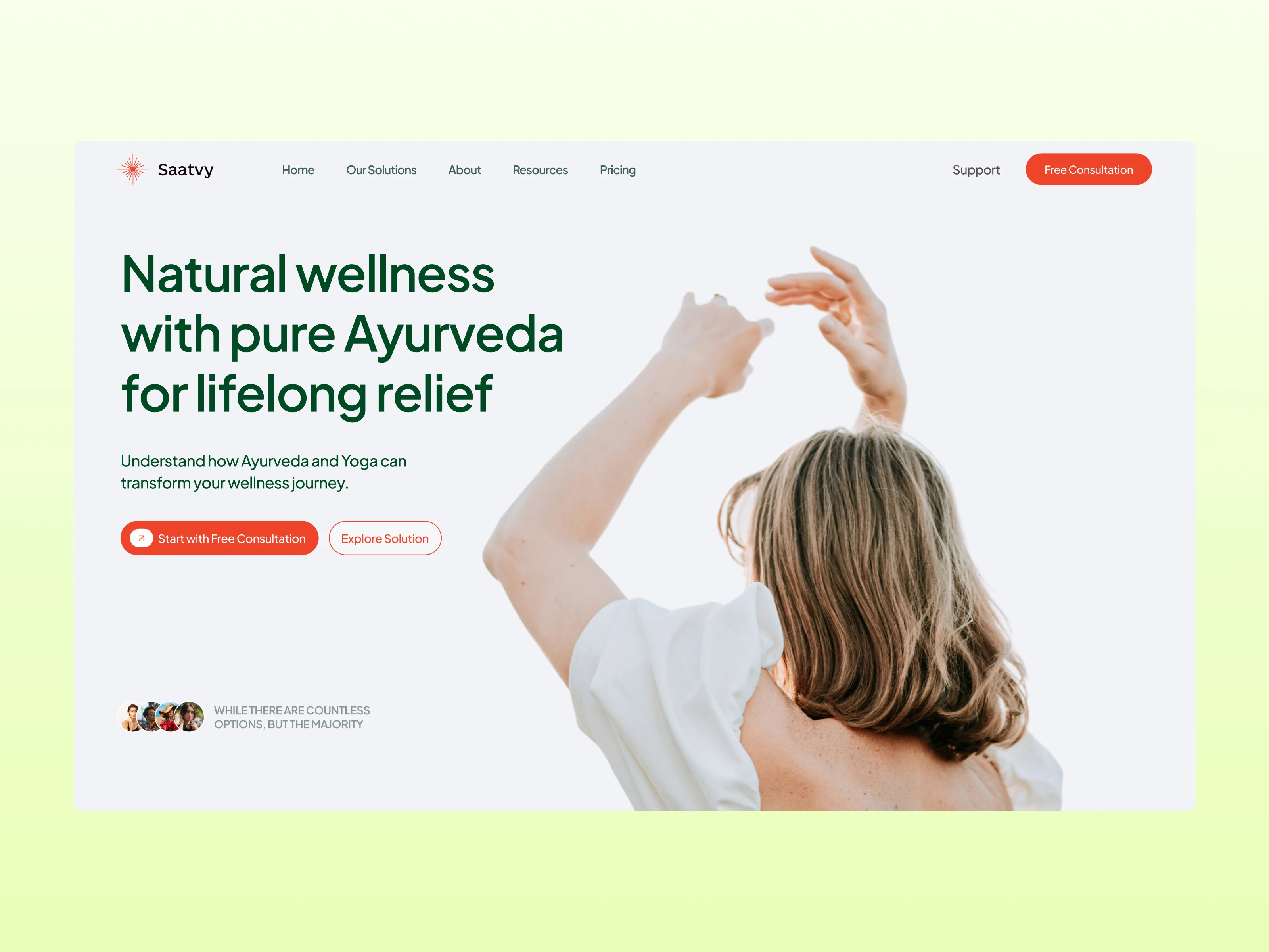
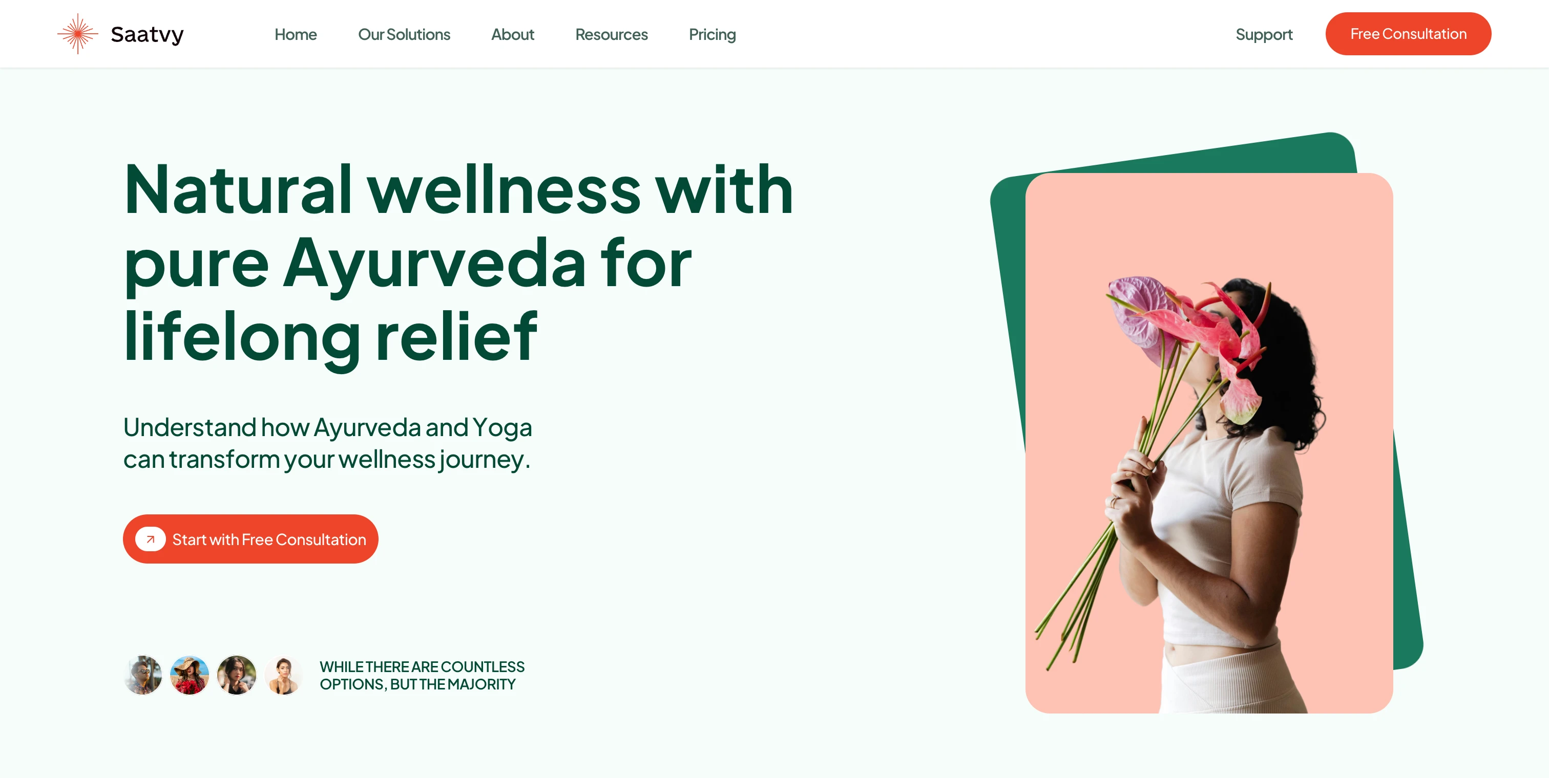
"What is this?" The hero answers with a continuous image marquee of natural ingredients and treatments, paired with a single clear headline. No jargon. No "synergistic wellness solutions." Just: natural wellness with pure Ayurveda for lifelong relief.
"Does this actually work?" The insights carousel follows immediately, with animated stat counters showing real improvement numbers. 60% improved condition by month three. The numbers do the talking.
"Do they understand what I'm going through?" The pain-point grid names the frustrations directly: longer appointment times, lack of personalized care, no improvement after medications, opaque billing. This section exists to make the visitor feel seen before Saatvy offers a single solution.
"What can they help with?" The solutions showcase breaks conditions into clear cards (Thyroid, IBS, Gut & Sleep), each with its own visual and description. Hover states invite deeper exploration without forcing a click.
"How does it work?" A numbered process flow walks through four steps, from getting started to enjoying life again. Sequential scroll-triggered animations reinforce the step-by-step nature of the approach.
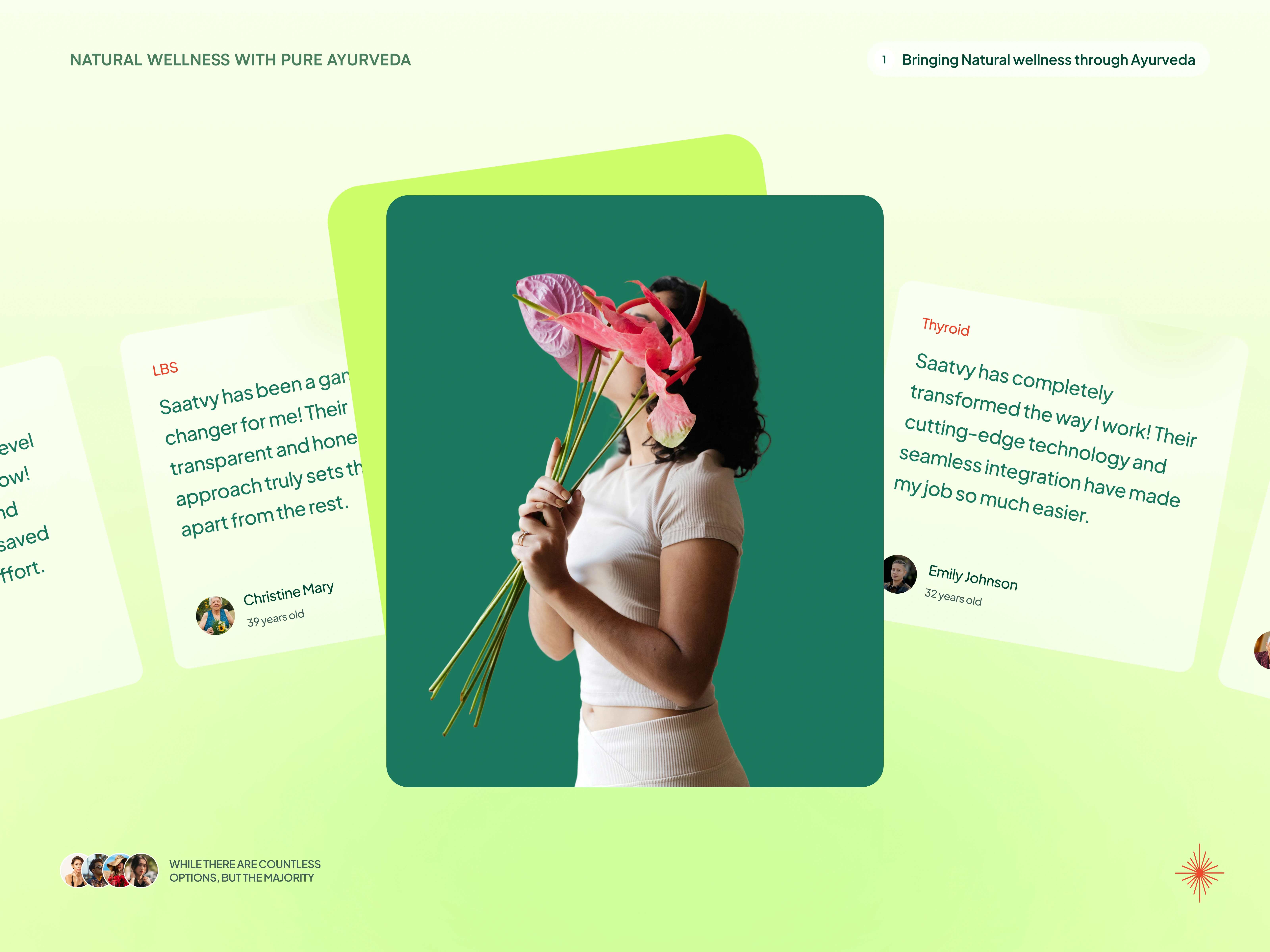
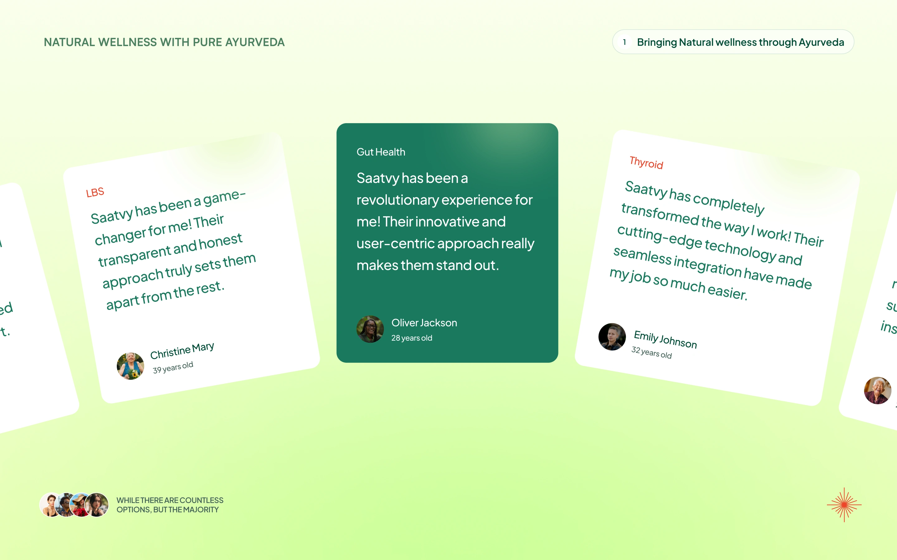
"Can I trust these people?" Testimonials close the loop. A full carousel with real reviews, names, ages, and conditions treated.
The interactions are where the site stops being a page and starts being an experience.
Static wellness sites feel like pamphlets. I wanted Saatvy to feel like a place you walk into. Every interaction was designed with one rule: motion should guide, not distract.
The hero marquee runs on a continuous loop, smooth and unhurried, like ingredients passing on a conveyor in an apothecary. It sets the pace for the entire site.
Scroll-triggered reveals bring sections into view with subtle fade and slide-in effects. Headings, cards, stat blocks, and testimonials all animate on entry, but staggered, so the eye moves through the content in the order it was meant to be read.
The stats carousel uses animated counters that tick up as you scroll into view. It's a small detail, but it turns passive numbers into something you watch happen.
Solution cards respond to hover with elevation shifts and subtle color transitions, signaling interactivity without shouting.
The process flow animates sequentially: step one appears, then two, then three, then four. The timing mirrors the patience of the Ayurvedic approach itself.
The testimonial carousel supports swipe and click navigation, with fluid card transitions that feel tactile.
None of these interactions are complex for the sake of complexity. Each one exists to keep the visitor moving forward, toward that consultation CTA.
The values section isn't filler. It's the brand's backbone.
Three principles anchor Saatvy's approach: Transparent and Honest, Holistic and Natural, and Personalised Guidance. I gave each one its own card with enough visual weight to feel like a promise, not a bullet point. These sit right before the process flow, so by the time you see how Saatvy works, you already know what they stand for.
The CTA strategy is quiet but persistent.
There are multiple "Start with Free Consultation" buttons throughout the page, but they never feel aggressive. The design earns the right to ask by providing value in every section first. By the time you reach the final CTA, with its own hero-style section, animated marquee, and 4.9-star review badge, the ask feels like a natural next step, not a sales push.

What this project taught me.
Wellness is one of the hardest verticals to design for because the line between "trustworthy" and "generic" is razor thin. The difference comes down to specificity. Specific color choices, not "earthy tones" from a mood board. Specific interaction timing, not "add some animations." Specific content hierarchy that mirrors the actual questions a person with a chronic condition is asking at 11pm on their phone.
Saatvy's site works because every pixel has a reason to be there. Nothing decorative. Nothing default. Just a clear path from "I'm exhausted from years of effort" to "let me try this."
Like this project
Posted May 18, 2026
Designed and built Saatvy's Ayurvedic wellness site end to end in Figma and Framer, with scroll-driven animations and conversion-focused UX.
Likes
0
Views
9