The Email Marketers | Landing Page Design
Overview
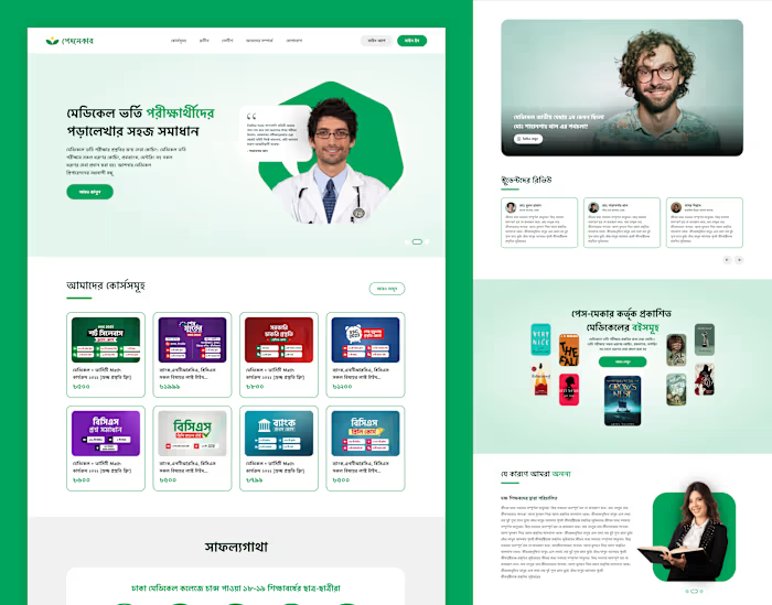
The redesigned landing page for The Email Marketers (TEM) reflects a modern, clean, and visually engaging aesthetic tailored to retention marketing in the e-commerce space. Its goal is to captivate potential clients, communicate TEM’s unique value proposition, and encourage action.
Key Design Elements
Streamlined Visual Hierarchy
The layout prioritizes clarity, guiding users from a compelling hero section to clear calls-to-action.
Subtle animations and transitions enhance interactivity without overwhelming the user.
Fresh, Modern Aesthetic
A new color palette that avoids the previous black, green, yellow, turquoise, and white tones.
The use of clean typography, ample white space, and high-quality visuals ensures a professional look.
Engaging Content Structure
The page features a well-organized flow, starting with a value-driven headline in the hero section.
It highlights TEM’s key services—email, SMS, direct mail, referrals, and subscriptions—using concise copy and engaging icons or illustrations.
Inspirations Translated
Elements from inspirational websites like Underground Ecom and Obviously are adapted to create a visually unique, branded experience.
Action-Oriented Design
Prominent and strategically placed CTAs encourage potential clients to learn more or contact the team.
This landing page design combines style, function, and branding to effectively communicate The Email Marketers' expertise and drive conversions.

Like this project
Posted Dec 16, 2024
The Email Marketers, a retention marketing agency, now has a redesigned UI—clean, intuitive, and focused on results.
Likes
0
Views
15


