TixHut UX/UI Design for Event Ticketing Platform
Approve request to show earnings
View
Ramsha Q
Verified
TixHut – UX/UI Design Case Study for a Modern Event Ticketing Platform
When I first joined the TixHut project, the challenge wasn’t just about designing another ticketing app. It was about reimagining the entire event journey — from the moment someone discovers an event, to the second they walk through the gates with a ticket that feels secure and trustworthy. TixHut was about solving a bigger challenge: how do you create one platform that serves attendees, organizers, staff, and admins all without losing simplicity?
Most platforms I researched felt… transactional. You buy a ticket, and that’s it. But events aren’t transactions they’re experiences. TixHut needed to capture that sense of excitement while also serving four very different audiences: attendees, organizers, staff, and admins.
The Turning Point
Early in the process, I remember mapping out the flows and realizing: this isn’t just one product, it’s four products living inside one platform. Each role came with its own needs, frustrations, and goals — yet all had to feel connected through a unified design language.
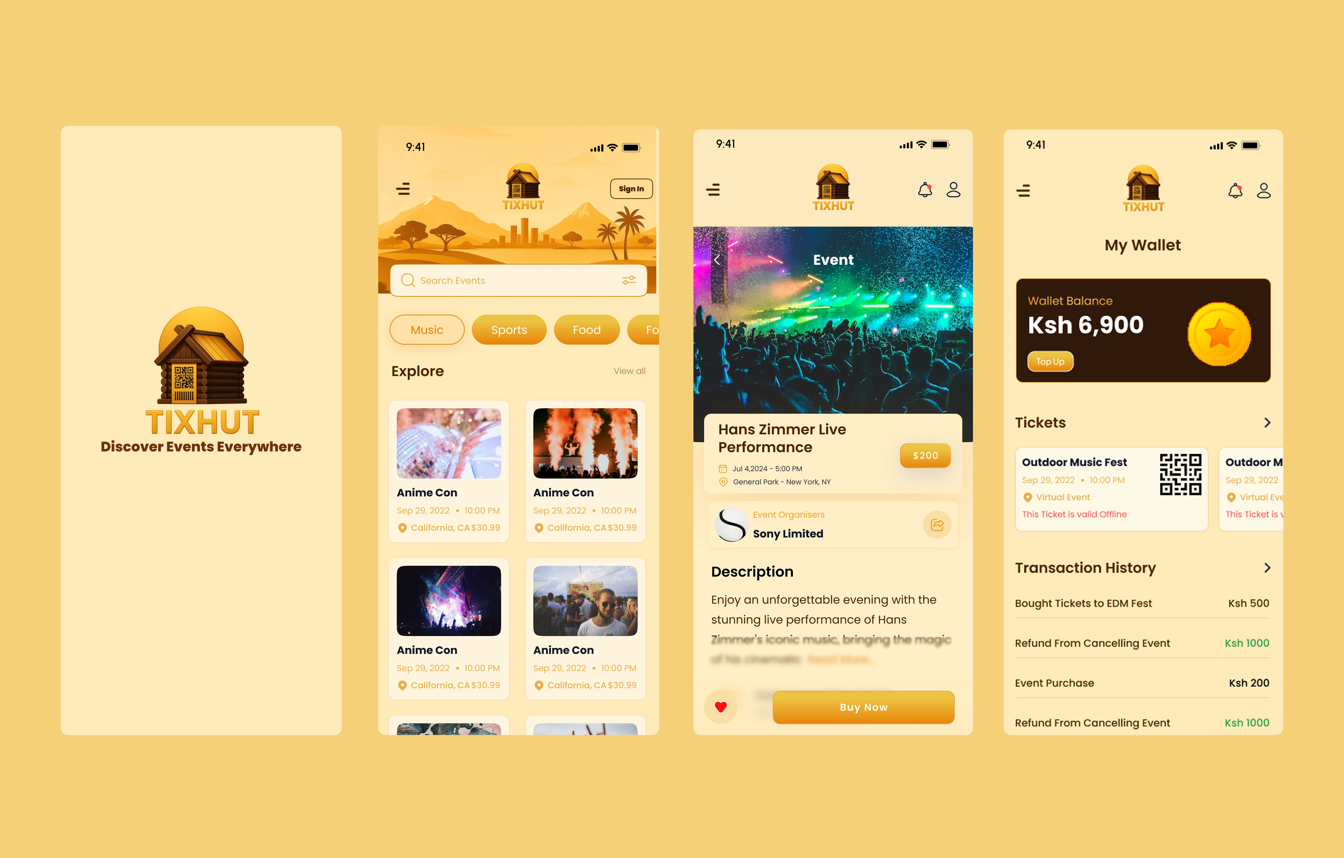
Attendees wanted browsing to feel effortless, like scrolling Netflix on a Friday night.
Organizers needed tools that didn’t feel like a maze of spreadsheets.
Staff needed scanning systems that worked at the speed of a crowd.
Admins needed oversight, control, and trust.
Balancing all of these became the heart of the design journey.
Building Trust Through QR Logic
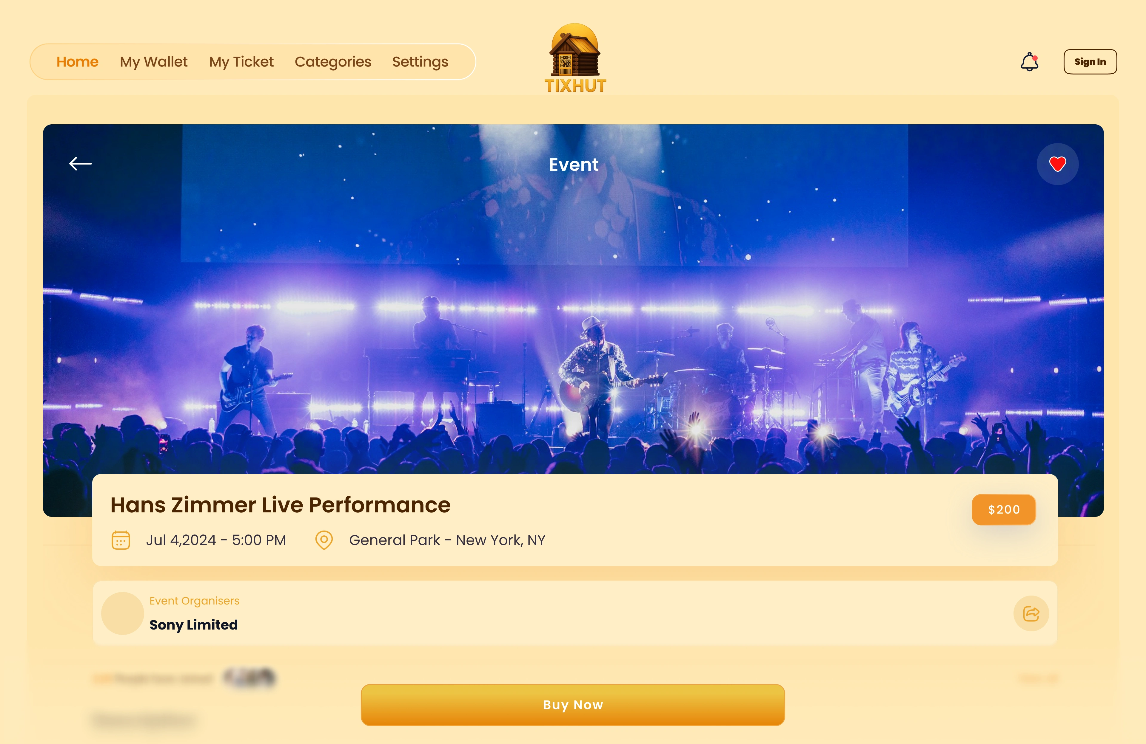
One of the first problems to solve was ticket authenticity. Event-goers hate the feeling of “Will this QR code even work at the gate?” To fix this, I designed a dynamic QR code system — each ticket carried a unique, secure link that could be validated in real time. This wasn’t just a technical fix, it was a trust-building moment in the user journey.
Reimagining Event Discovery
The next piece was the Explore Events page. Instead of overwhelming users with endless lists, I designed it like an interactive gallery — strong visuals, intuitive filters, and accessibility-first layouts. The goal was simple: make discovering events feel exciting, not exhausting.
I introduced clean event cards, hover interactions, and smart categories so users could explore with curiosity instead of friction.
Designing for Everyone
What I loved most about TixHut was designing with empathy for multiple roles.
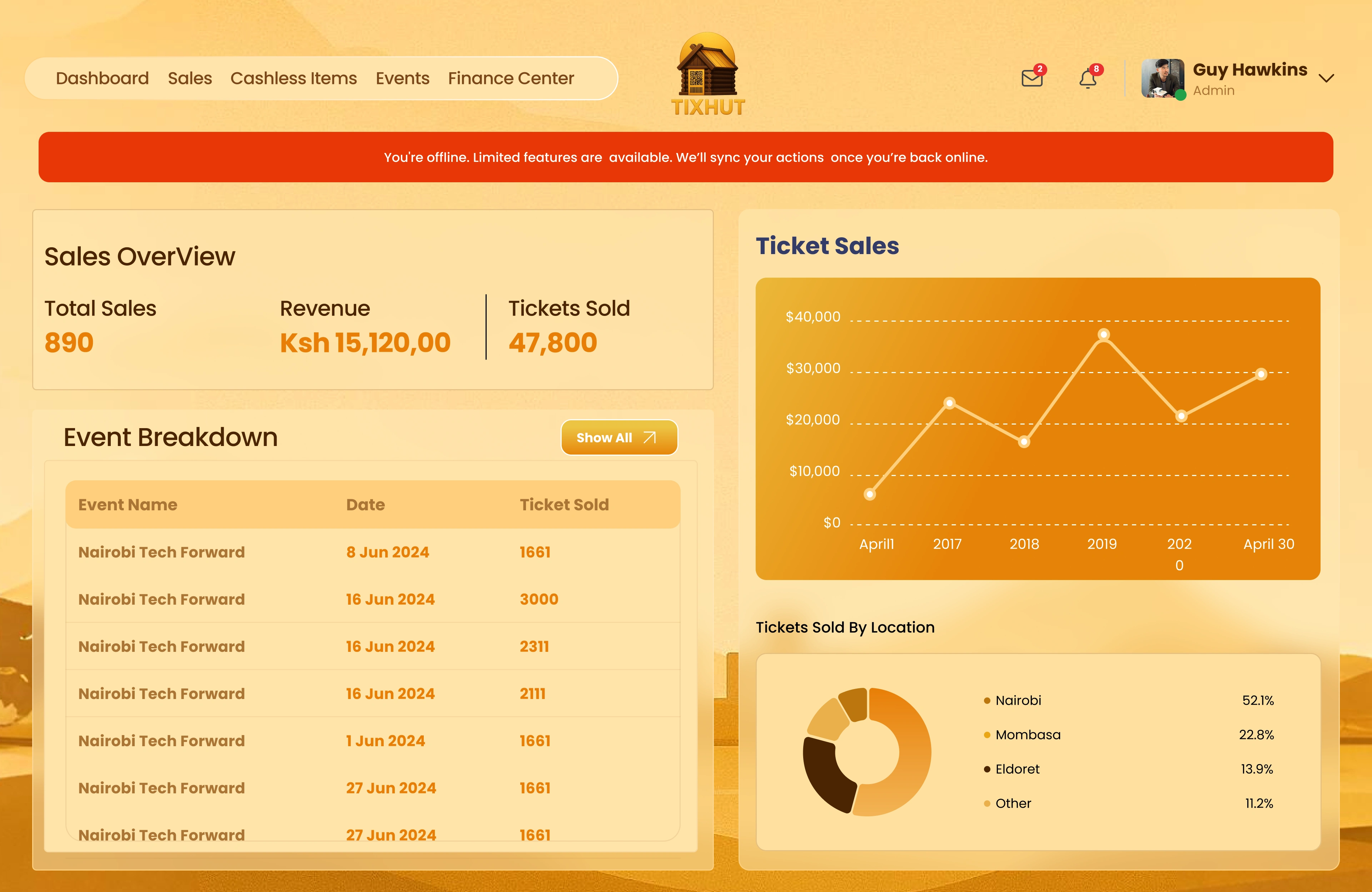
For organizers, I created a dashboard that didn’t just display numbers, but told a story: quick stats, drag-and-drop uploads, and guided steps for creating events.
For staff, the scanning tool was stripped down to the essentials — bold, readable, and fast.
For admins, I built flows that gave them confidence: approval queues, fraud detection, and reporting.
It was about meeting each user where they are while still weaving everything into the same brand identity.
The Outcome
In the end, TixHut wasn’t just a ticketing system — it became a seamless ecosystem:
Attendees discover and purchase tickets without hesitation.
Organizers feel empowered instead of overwhelmed.
Staff run events smoothly.
Admins stay in control.
Reflection
This project taught me that designing for multiple roles requires balance and empathy. Every decision had to serve a different type of user while maintaining a consistent, trustworthy brand experience.
In the end, TixHut was a story of turning complexity into clarity and building an event platform where everyone, from attendees to admins, feels at home.
Like this project
Posted Sep 15, 2025
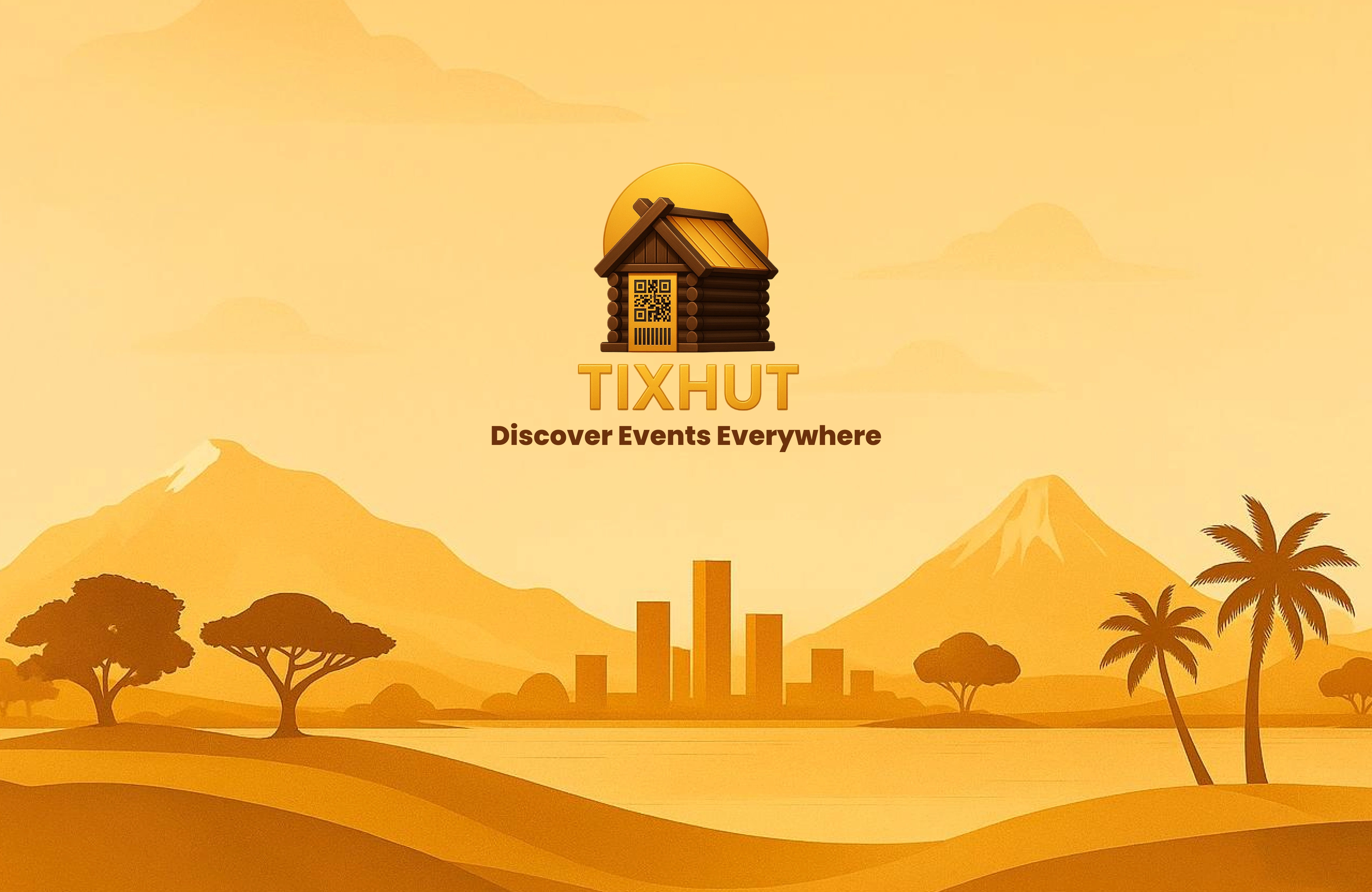
TixHut is a modern event ticketing and management platform designed to transform the way people discover, buy, and manage event tickets.
Likes
2
Views
41
Timeline
Apr 11, 2025 - Sep 17, 2025
Clients
TixHut