Visual identity for the Elizabeth Heyrick Society
The Elizabeth Heyrick Society, established to recognise and celebrate the influential abolitionist Elizabeth Heyrick, sought a comprehensive visual identity and logo to honour her legacy. The Society's mission includes raising funds for a public memorial and fostering awareness about the fight against slavery, promoting values of freedom and equality.
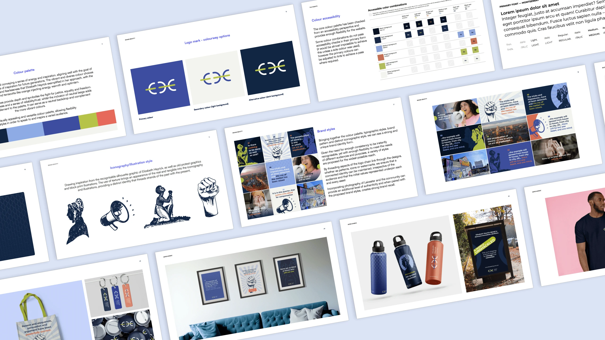
Extract of early brand guidelines for EHS
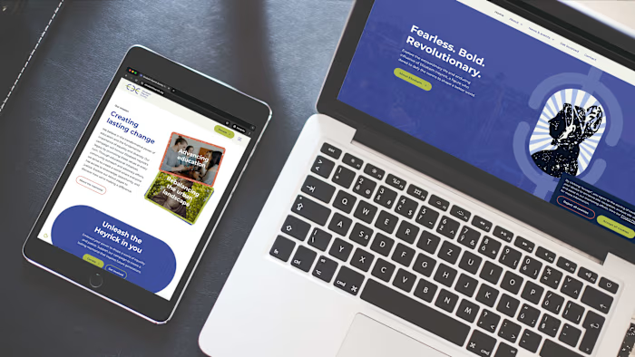
They required a visual identity that would effectively balance the historical significance of Elizabeth Heyrick with a modern appeal, making her story relatable and inspiring for future generations. They required a flexible and recognisable identity that resonates with a broad audience, from grassroots donors to corporate decision-makers, and evokes energy and excitement, while maintaining an informative and accessible approach. Capturing Heyrick's spirit of immediate abolition and societal disruption through design was also crucial. Deliverables included a logo, illustration library, branded presentation and social media templates, with ongoing work on website design and development.
The design process began with in-depth research into Elizabeth Heyrick's life, values and impact on the abolitionist movement. This was complemented by extensive user research and journey mapping to understand the potential supporters and how they would interact with the Society. Subsequent design work involved careful selection of the colour palette and font to ensure the visual identity would be accessible to a wide audience.
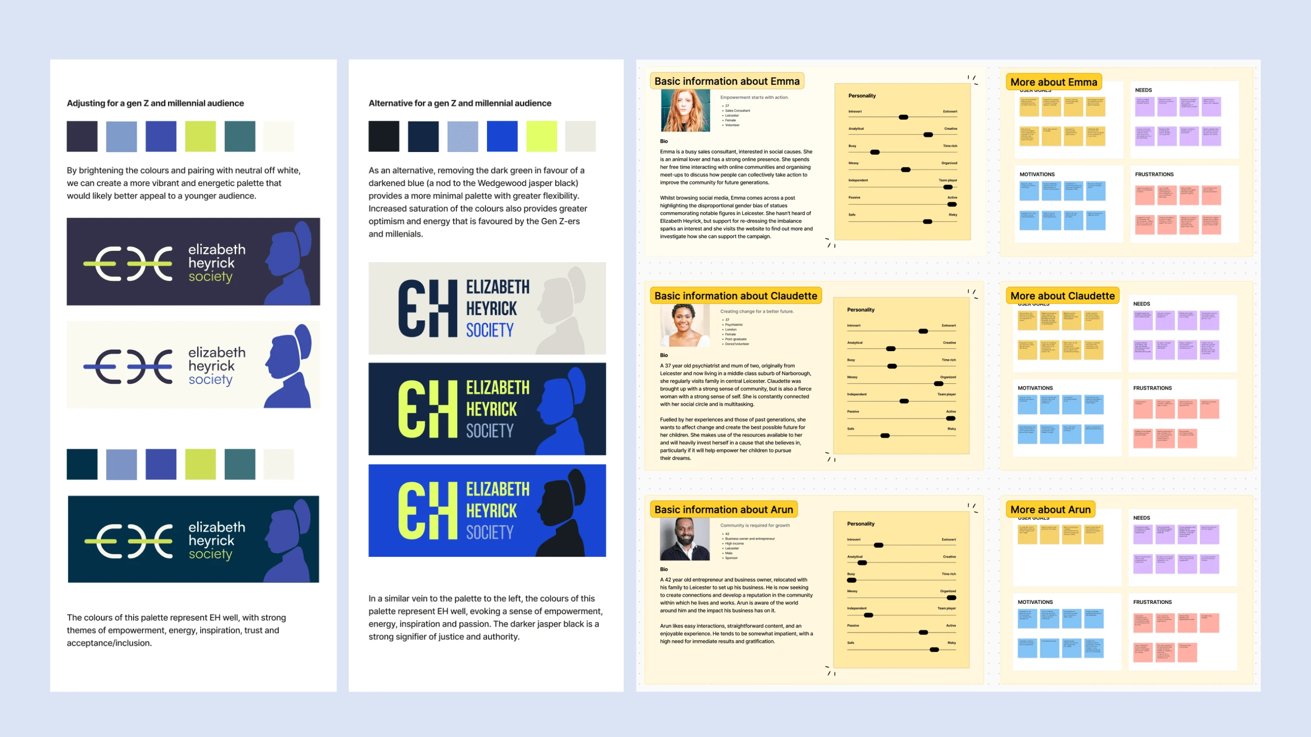
Initial logo concepts and extract of user research
Starting with the logo, an abstract approach evolved, representative of the values that Elizabeth Heyrick stood for and the contributions she made to society. The broken chain link, emphasised with a touch of animation, symbolises Heyrick’s challenge to the status quo and advocacy for immediate abolition - a portrayal of disruption and a break from what was considered the norm. It is also an illustration of Elizabeth Heyrick’s initials, E and H.
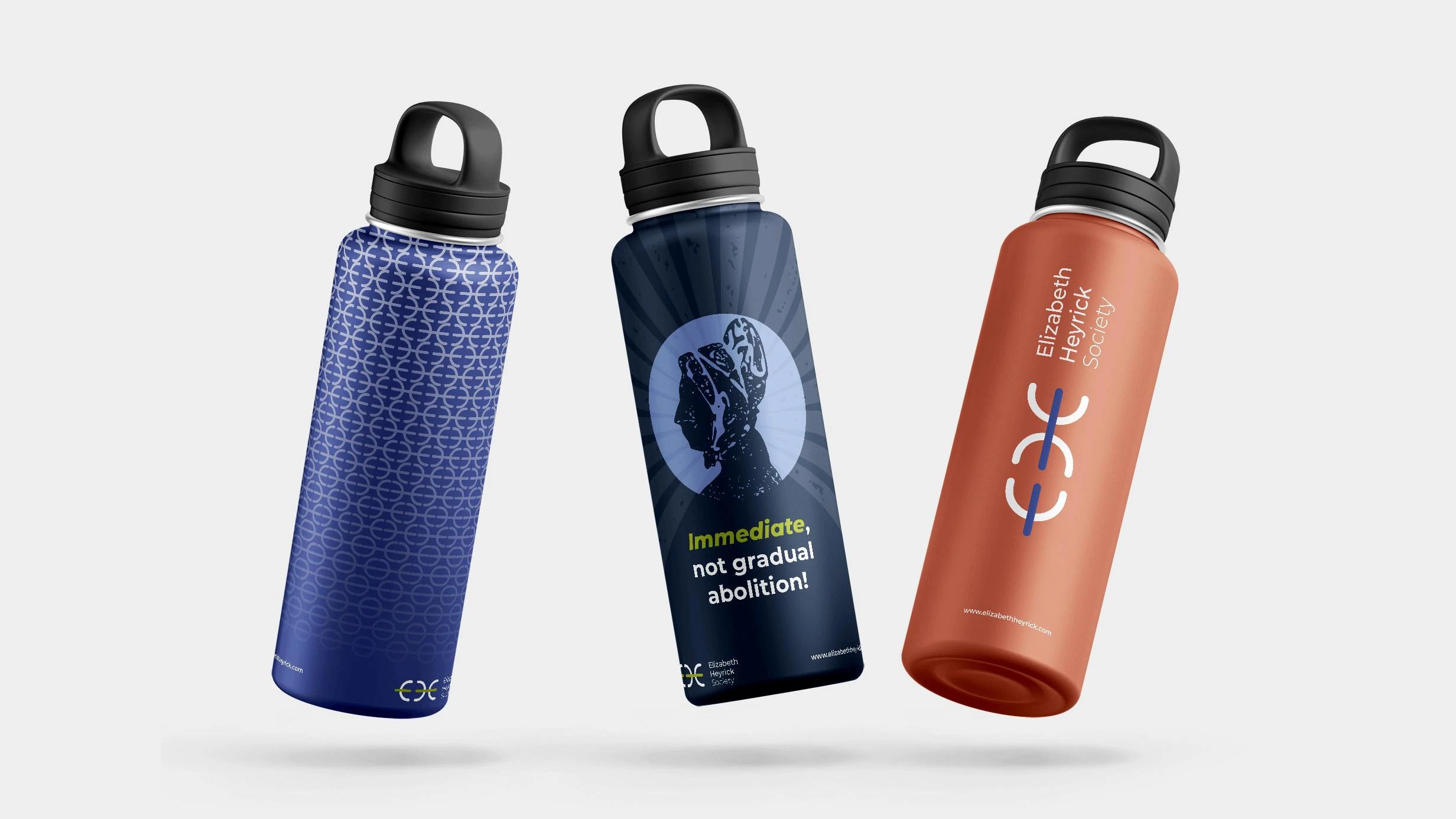
Branded merchandise
The wider visual identity features a central theme of interplay between the past and present, reimagining stories from the past for audiences of the future. Vibrant tones and dynamic imagery are used to contrast with traditional historical content, bringing fresh energy to the historic narrative. Drawing inspiration from historical protest graphics, block print illustrations, and Heyrick’s recognisable silhouette, textured graphics provide a tangible, real-world feel, threading elements of the past into the present, and a modern colour palette provides immediate contrast to visually echo Elizabeth Heyrick’s words - immediate, not gradual abolition.
The flexible identity maintains consistency through various styles, ensuring it meets different audience needs while embedding the core values in every asset. The client expressed delight with the resulting identity, noting its invaluable role in conveying Heyrick’s achievements and the Society's mission.
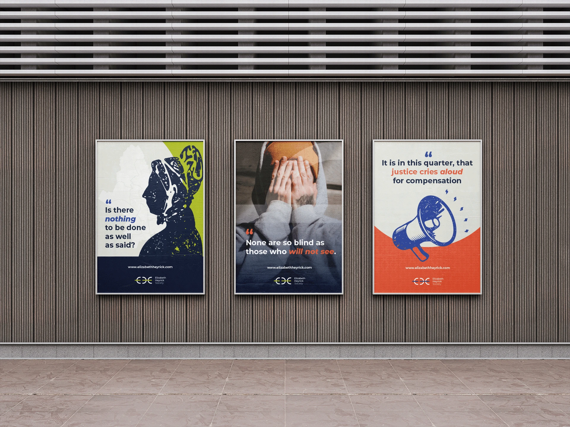
Promotional poster designs
If you'd like to chat about how I can support you and your business, please get in touch.
hi@designbyrw.com | www.designbyrw.com
Like this project
Posted Aug 20, 2024
Development of a logo and dynamic visual identity for the Elizabeth Heyrick Society, celebrating an influential abolitionist and promoting her legacy.


