Report design - Budget Submission
Pre-budget Submission Report 2023
WA Social Enterprise Council
About the Project
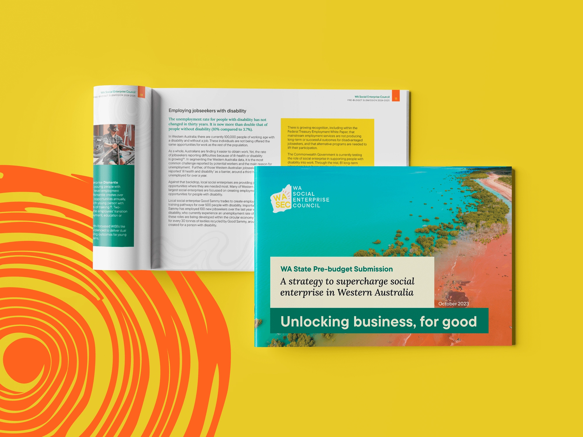
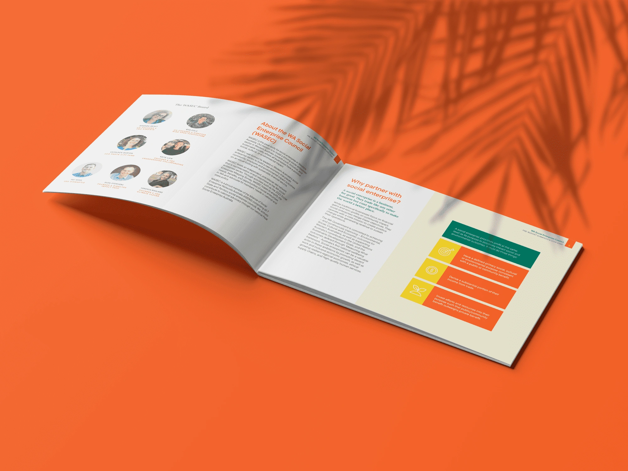
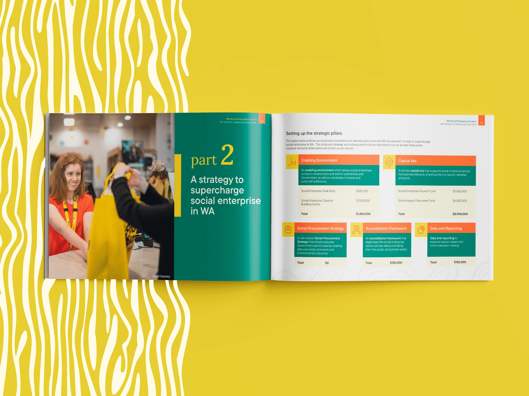
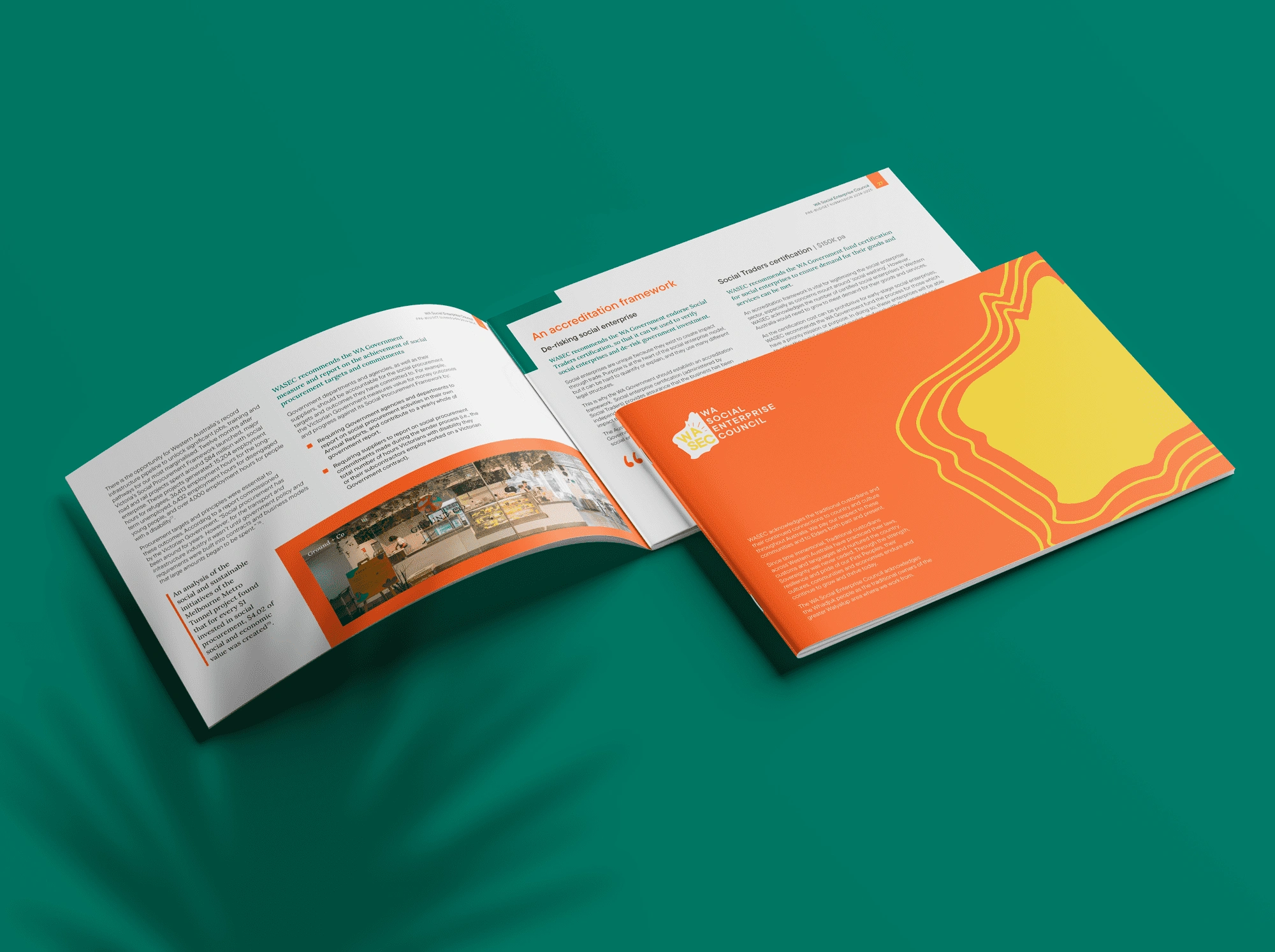
I was tasked with designing the 2023 Pre-budget Submission Report for the WA Social Enterprise Council. The fonts and colors were pulled from the organization's website to keep things consistent with their simple and clean existing style, even though their brand guide was fairly basic. Since it was their first year, the goal was to give the report an authoritative look, balancing simplicity with professionalism.
My Role
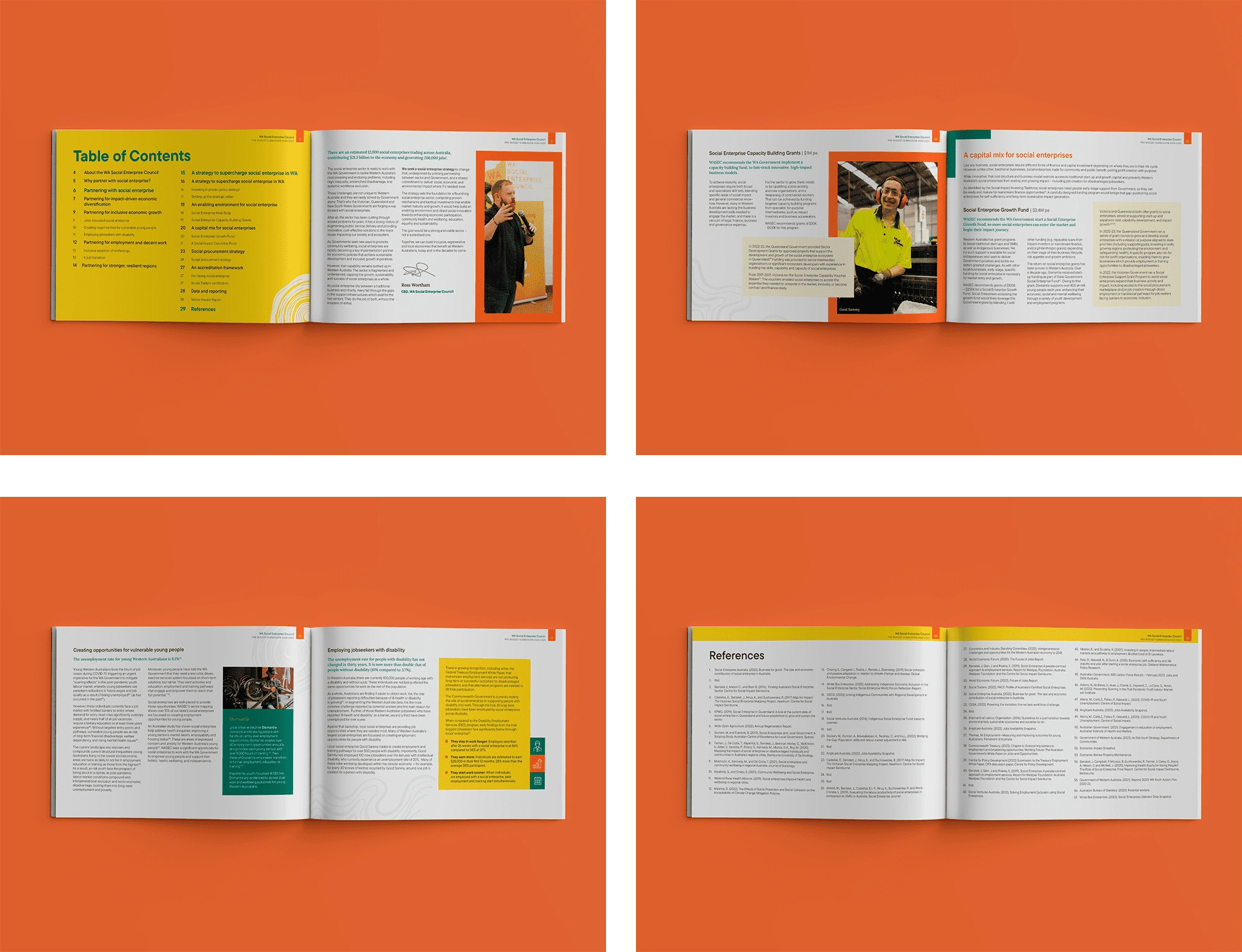
As part of the DropIN team, my role involved designing a clean and accessible layout that adhered to best practices for readability. I used dark colors for text against a white background to enhance accessibility. The report was laid out in landscape format, chosen to emphasize the high-quality images the client provided, enhancing the overall aesthetic and engagement. This landscape format was also ideal for digital viewing on desktops, as the same file was intended to be displayed on their website.
The Result
The client was very satisfied with the final result, noting that the design successfully conveyed the intended professionalism. Only minor revisions were requested to adjust the tone in a few sections, where the client wanted a slightly more sober presentation. The project was completed smoothly, with minimal changes needed.
Like this project
Posted Aug 27, 2024
Designed the 2023 Pre-budget Submission for WASEC, following a minimalist design that had strong accent colours along the layout.
Likes
0
Views
11

