LUNOR — A Night-Inspired Premium Lifestyle Brand
Ojo Oyewole
LUNOR — A Night-Inspired Premium Lifestyle Brand
Client: LUNOR
Scope: The project scope covered the development of a complete brand identity system for Lunor.
Services: Lunor operates as a premium restaurant and lounge brand.
LUNOR is a conceptual premium lifestyle brand inspired by night-time relaxation and refined social experiences. The identity is built around the calm ritual of unwinding in the evening — a moment of ease, ambience, and quiet luxury.
The main challenge was to create a brand identity that feels modern, minimal, and premium without appearing overly formal or rigid.
The visual system needed to communicate a night-time mood, lifestyle elegance, and emotional warmth through simple and meaningful design elements.
This was addressed by developing a symbolic logo, a carefully curated color palette, and a refined typographic direction that collectively express relaxation, sophistication, and ambience. Every element of the identity was intentionally crafted to reflect the essence of chilling at night while maintaining clarity, versatility, and a strong premium presence.
Brand Concept
The name “Lunor” is derived from “lunar,” referencing the moon as a symbol of calm, rhythm, and night.
The core idea behind the identity is the feeling of chilling at night — relaxed, refined, and effortless.
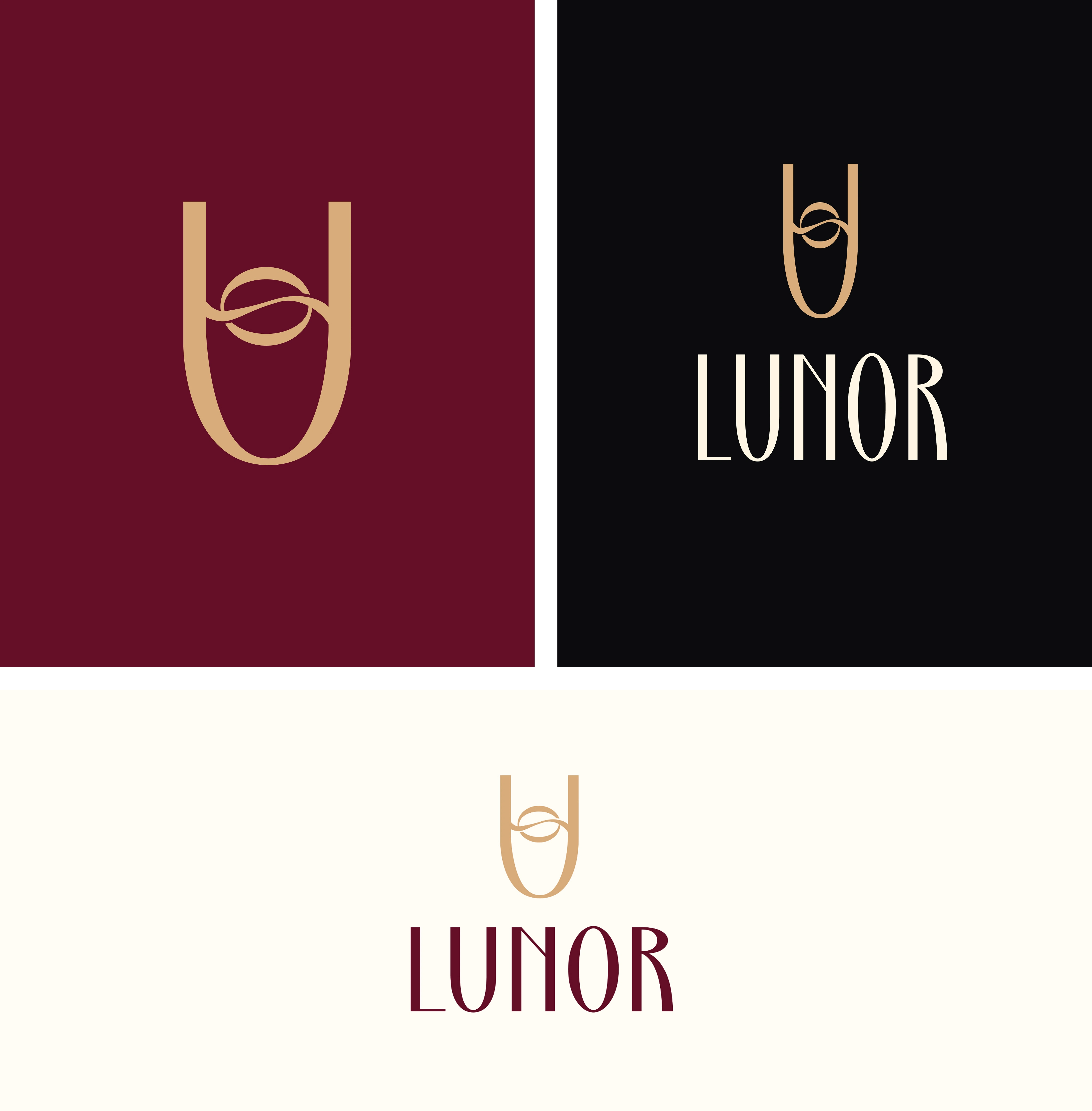
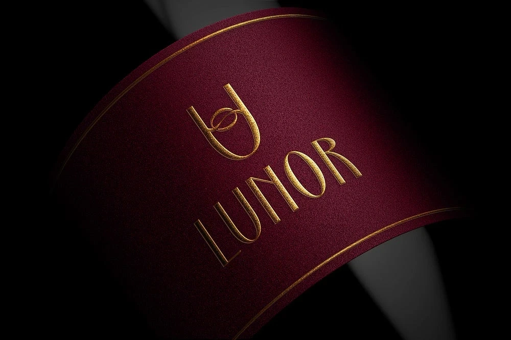
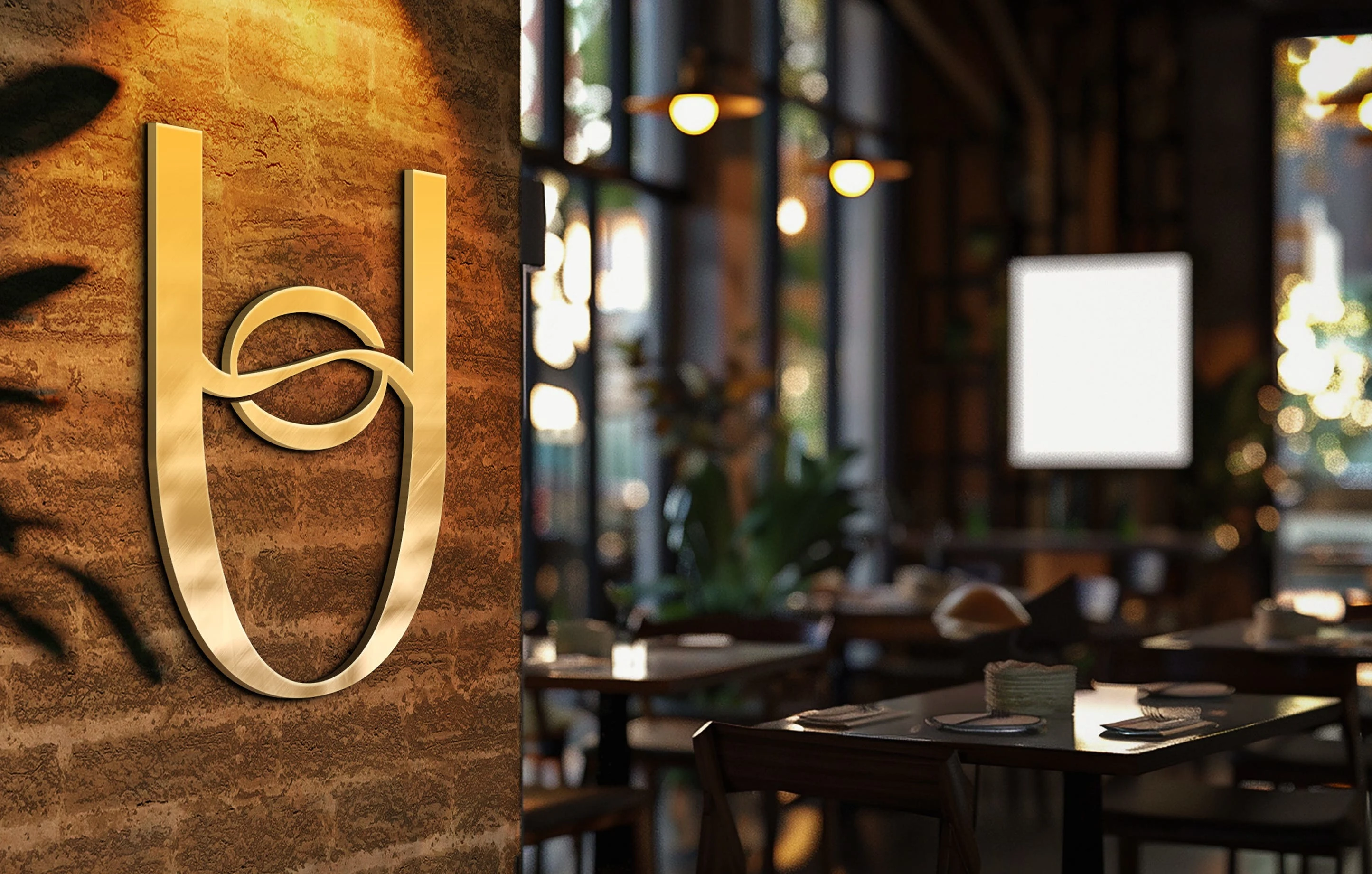
Logo & icon
Logo Design Concept
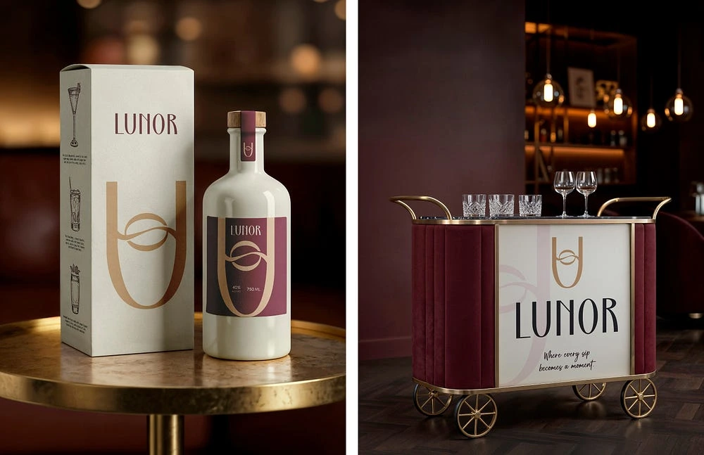
The Lunor logo is constructed from the abstraction of the letters U and O, merged into a single symbolic form.
The U represents a wine glass, symbolizing drinks, relaxation, and social moments. A flowing wave moves across the glass, representing the smooth pour of a drink. The O, connected within the wave, represents the moon resting inside the glass.
The connection of the wave and the O creates a visual story of motion and stillness — a drink being poured under the moon.
The result is a simple yet meaningful mark that embodies night-time calm and lifestyle luxury.
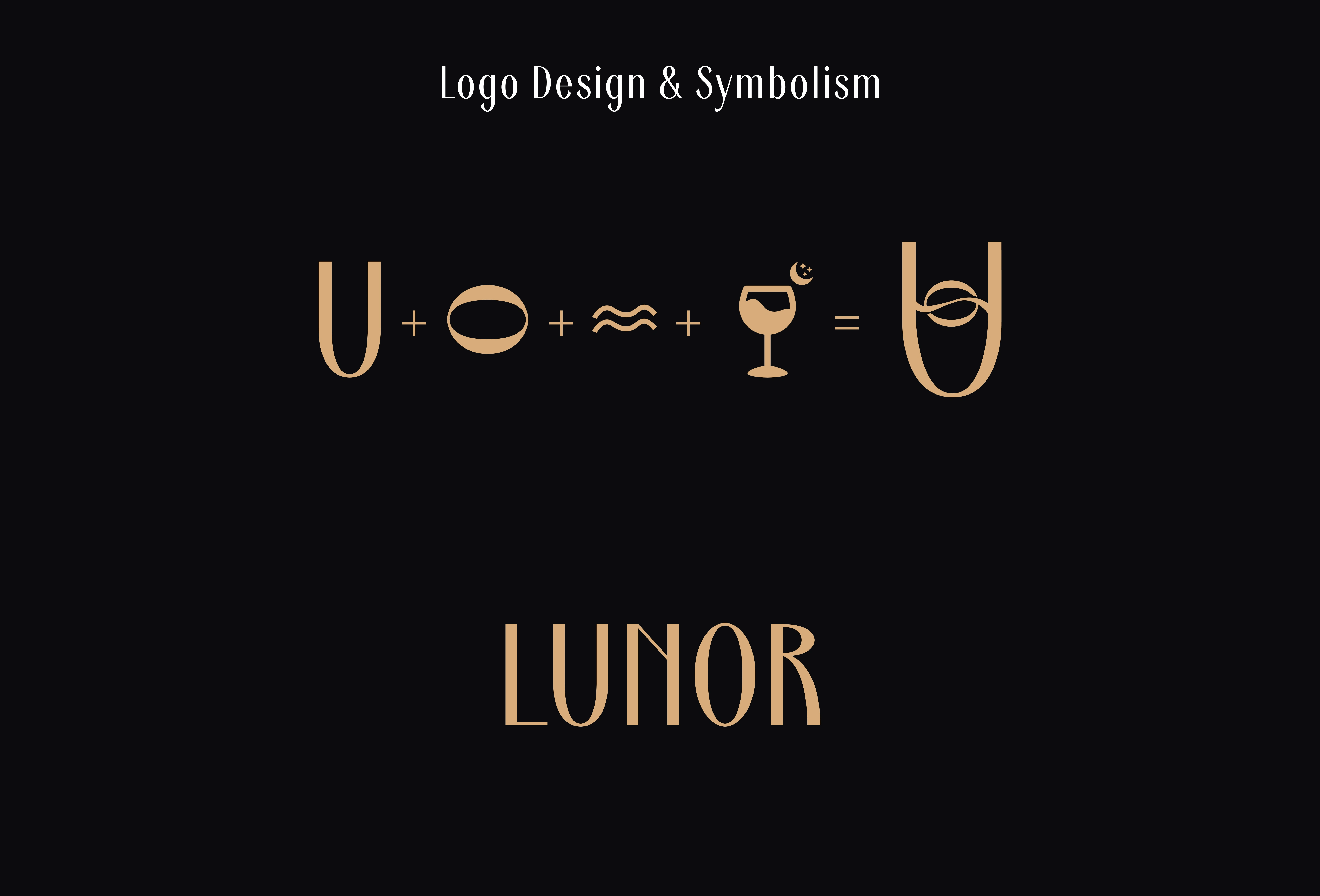
Logo concept
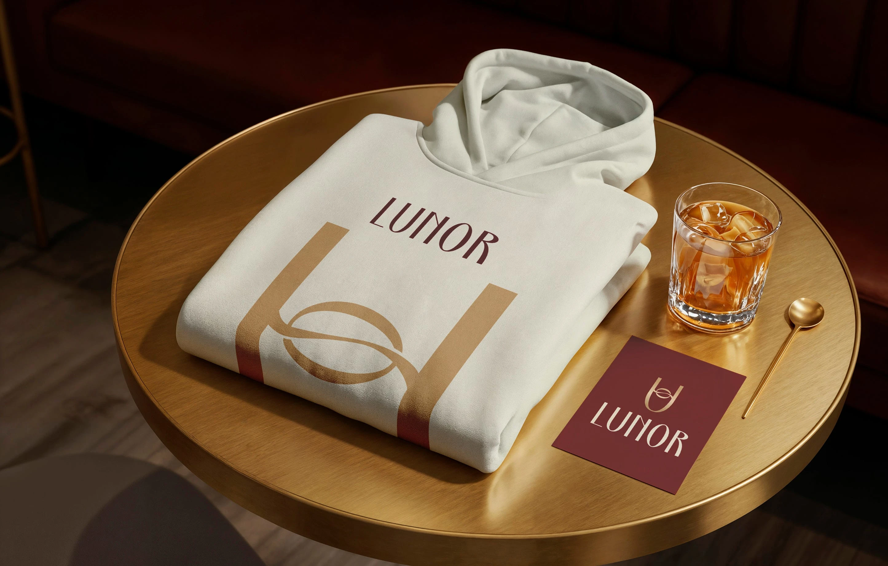
Typography & Color Direction
The wordmark “LUNOR” is set in an Art Deco–inspired typeface.
This choice communicates elegance, structure, and timeless sophistication. The typeface balances classic refinement with modern minimalism.
The color palette was developed to reflect the mood of night. Deep wine and maroon tones express warmth, depth, and intimacy. Soft gold accents represent moonlight, refinement, and subtle luxury. Together, the colors create a visual identity that feels rich, calm, and premium.
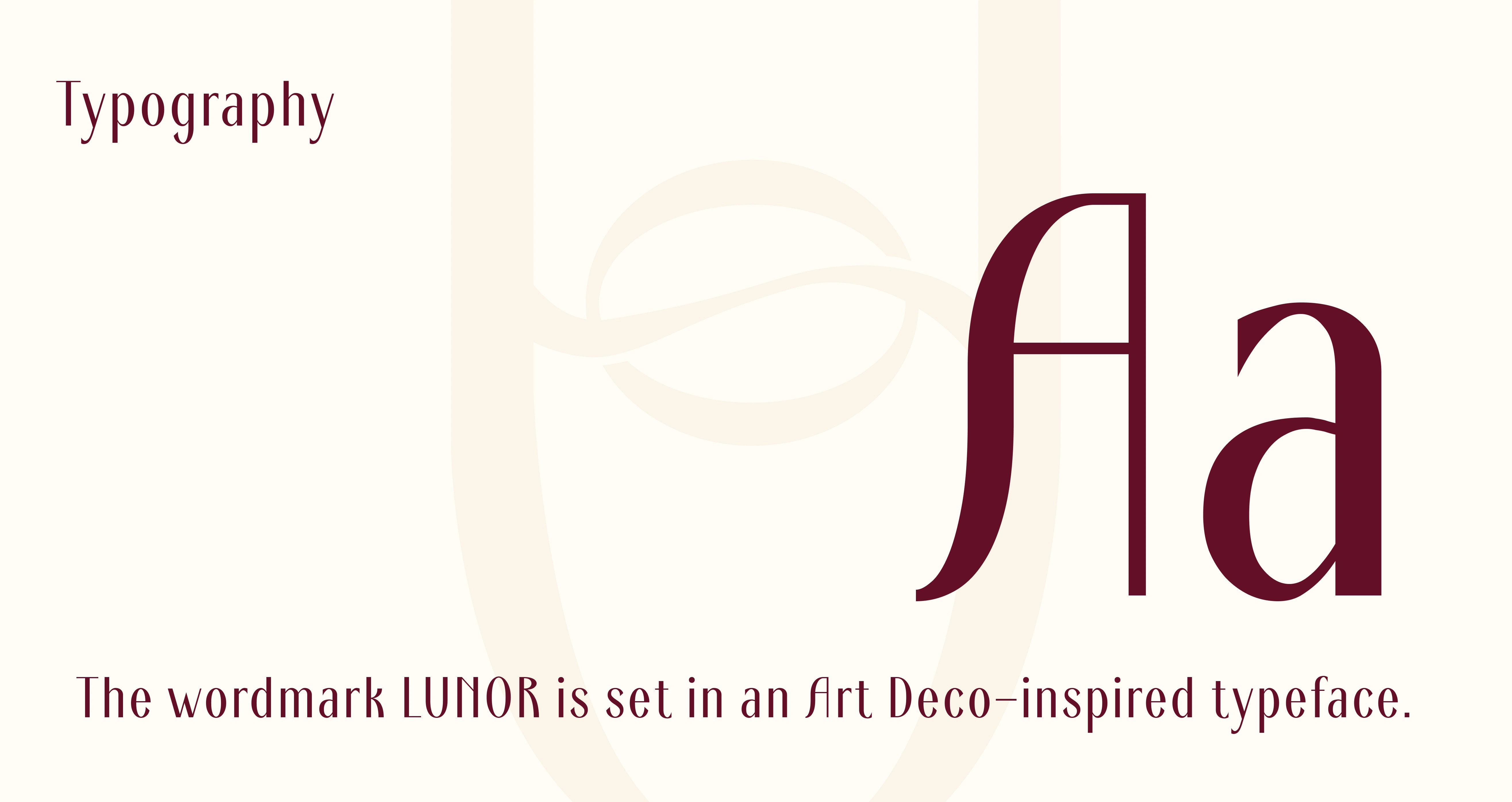
Typography
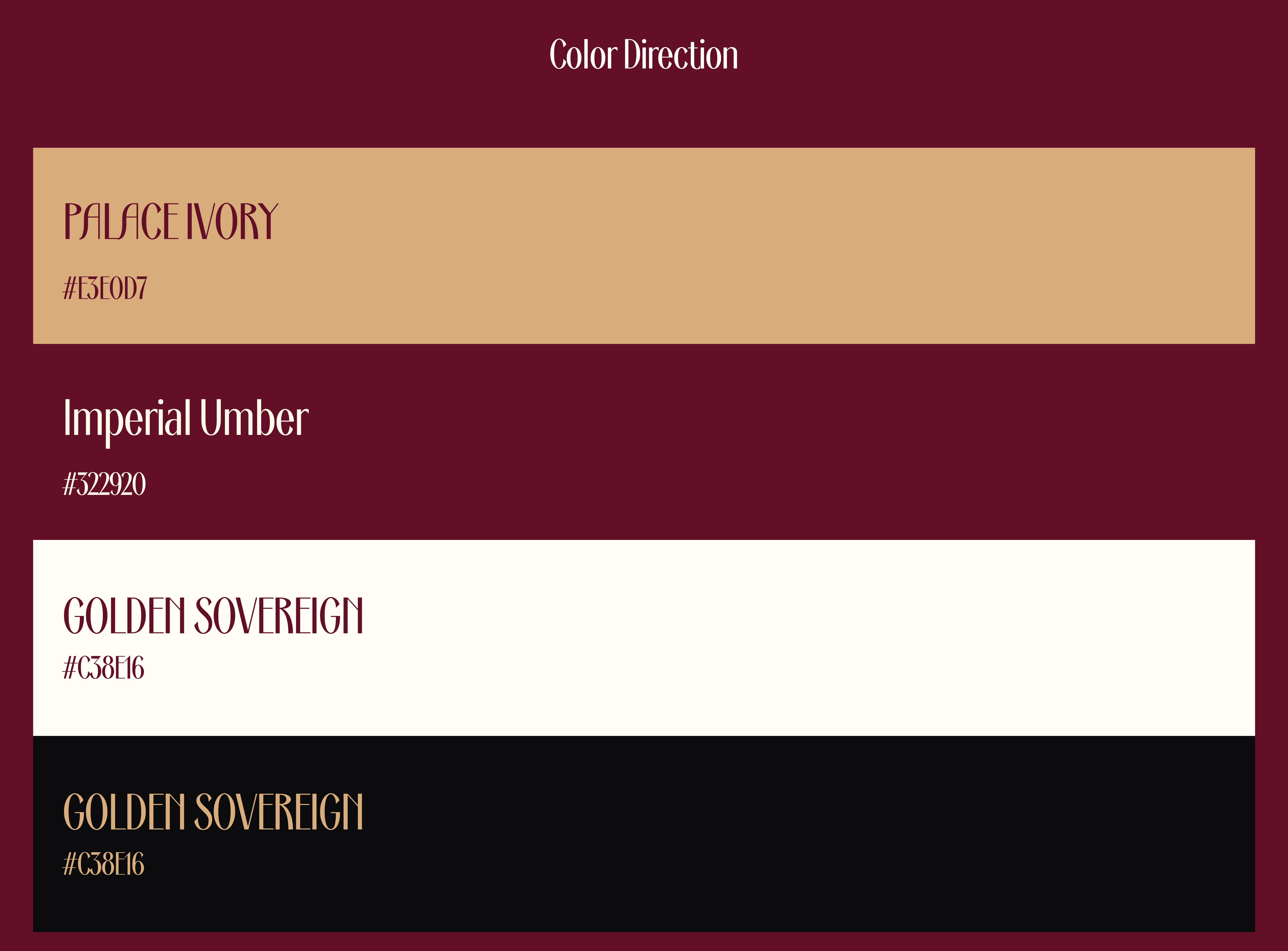
Brand colors
Brand Personality
Lunor embodies a calm, elegant, and minimal character with a premium, modern feel inspired by the night. It speaks to individuals who appreciate ambience, detail, and refined experiences.
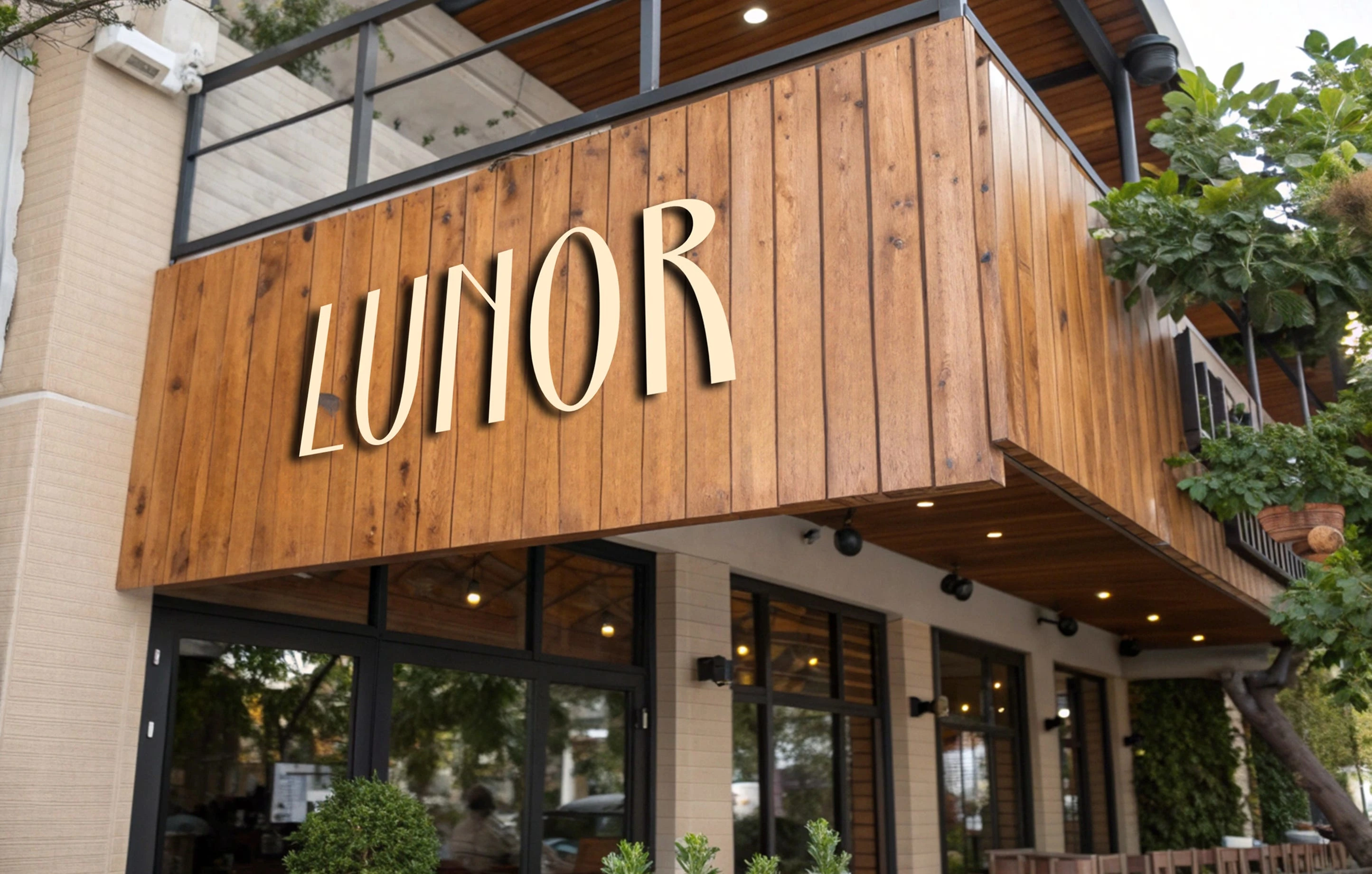
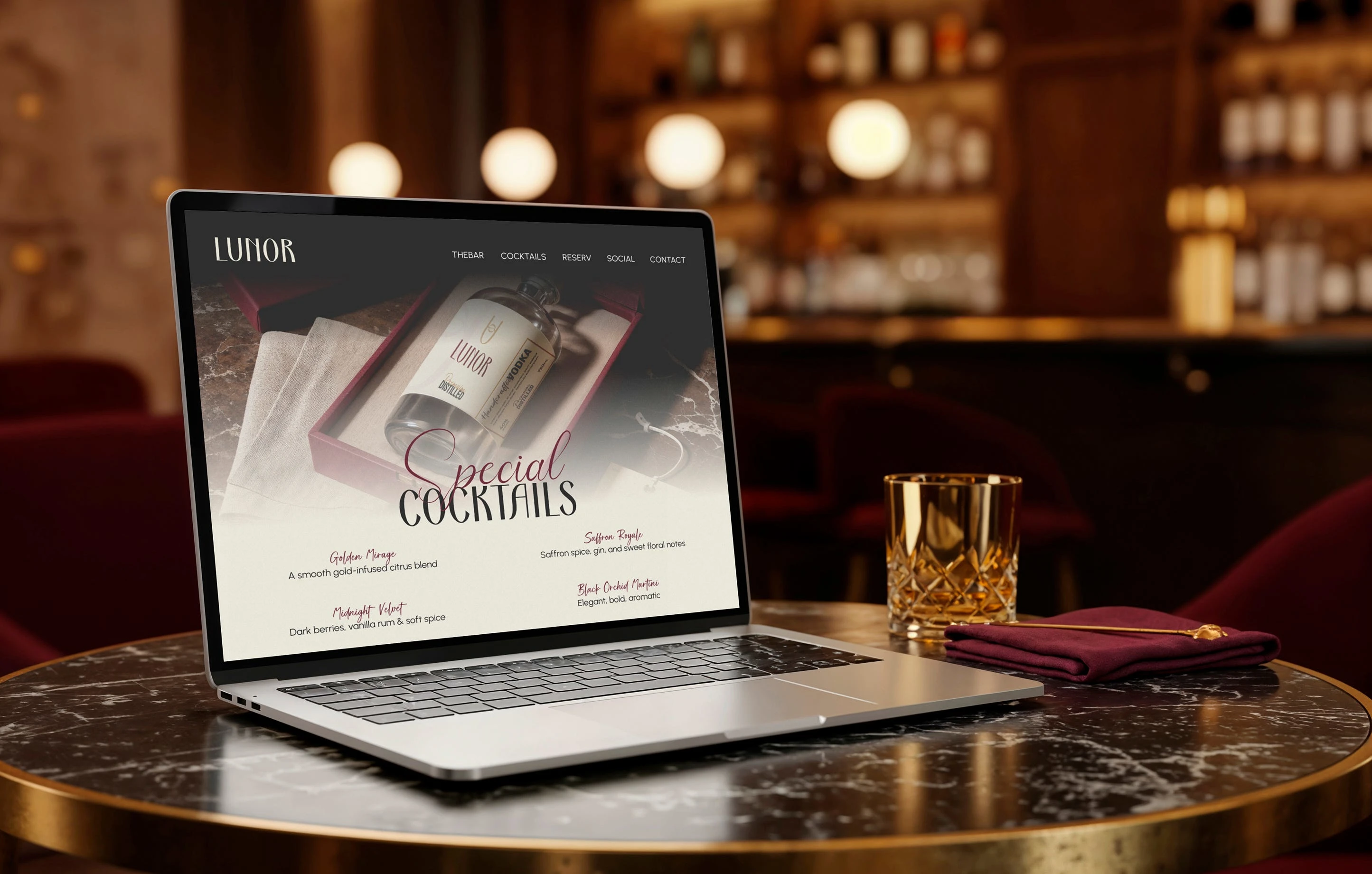
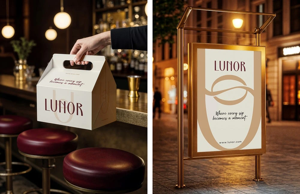
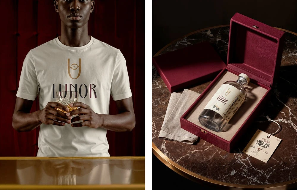
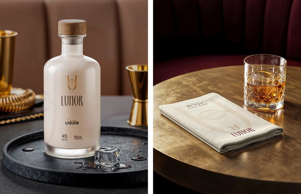
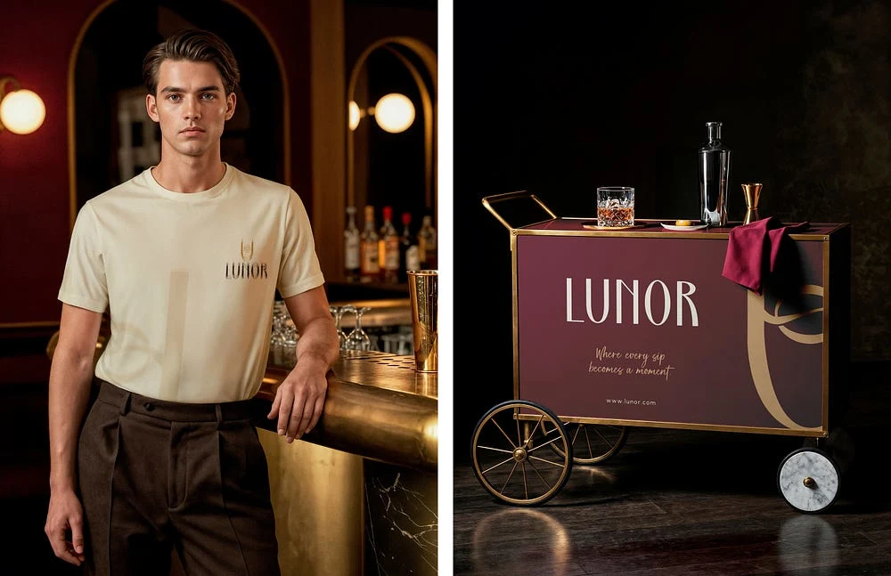
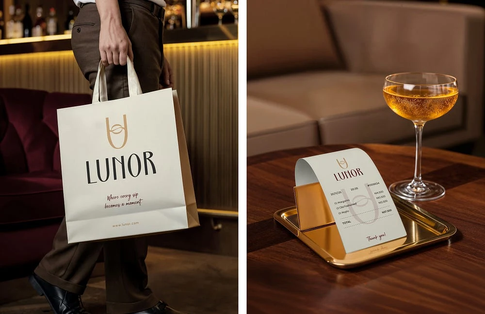
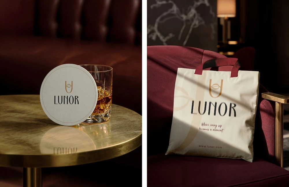
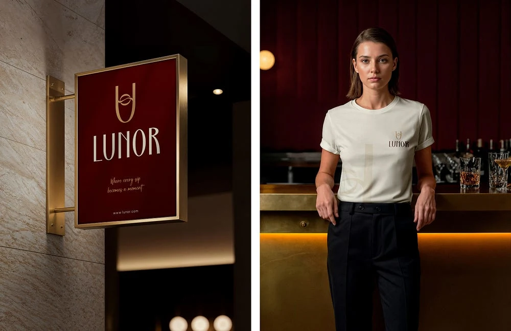
Brand Applications
The identity is designed to translate seamlessly across packaging, menus, signage, social media, and lifestyle assets.
Its minimal approach ensures clarity, versatility, and long-term relevance.
Final Outcome
The Lunor brand identity successfully transforms a simple night-time ritual into a refined visual story.
By merging a wine glass, a flowing pour, and the moon into one cohesive mark, Lunor captures the essence of relaxation, ambience, and modern luxury in a timeless and understated way.
Like this project
Posted Jan 23, 2026
A premium lifestyle identity built around the feeling of unwinding at night, expressed through symbolic design and refined minimalism.