Just wrapped up this branding
Nesar U. Rahid
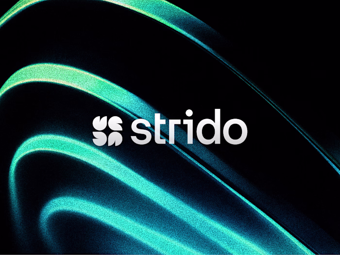
Just wrapped up this branding exploration for Strido a collaboration software brand built around sync, flow, and connection.
The core idea combines Letterform S + flames + sparkles + connection to create a mark that feels energetic, modern, and digital first.
Color direction: Teal, light blue, light green, with black & white accents.
Wanted the identity to feel like:
when teams sync, work flows.
Would love to hear your feedback from fellow designers especially on the logo concept, color system, and overall brand vibe.
Like this project
Posted Mar 9, 2026
Just wrapped up this branding exploration for Strido a collaboration software brand built around sync, flow, and connection. The core idea combines Letterfor...