Website service design that increased bookings by 50%
Olga De Luna Demenev
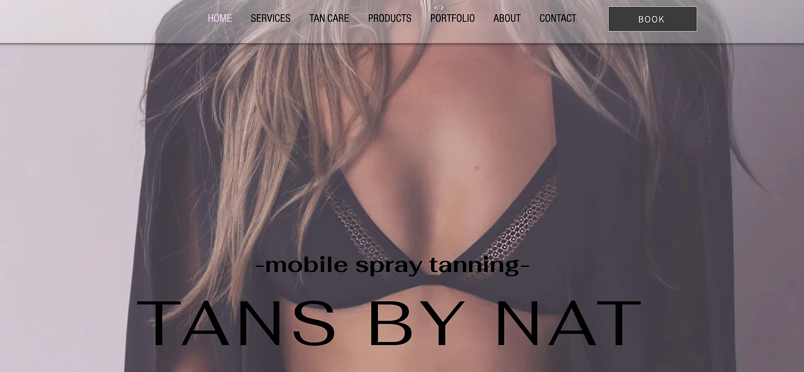
Tans by Nat is a mobile spray tanning business that wants to increase monthly bookings by 50%. They have an Instagram page but no website or booking link. The owner wants to have a website that will contain all important information for clients while at the same time providing a quick, easy and intuitive booking process. She believes that having a website will help establish a higher level of professionalism thereby increasing client trust.
ROLE & IMPACT
As the main UX designer I was involved in all phases of the project, from research, to discovering design solutions, conducting usability studies and delivering final designs. My primary focus was to keep the user front and center to design a seamless and exceptional experience while also bringing value to the business and help it increase bookings.
HOW WAS THIS ACCOMPLISHED?
The business owner wants to increase monthly bookings by 50%. Currently clients can only book by sending a direct message through Instagram or through text message.
With 4 weeks to complete the project we outlined a plan of action:
Determine user needs and pain points
Ideate and identify a possible solutions
Test efficacy of the website booking process
Not doing this could be detrimental to business growth.
Understanding user pain points was imperative in navigating the most strategical approach. I started by conducting user surveys and both owner and user interviews.
RESEARCH
Qualitative Research
User Interview
We interviewed 5 users ( previous clients ot the business) over a phone call to understand the challenges they encountered when booking. We recruited existing clients because we wanted to shed light on the current booking process while also uncovering:
Behaviors
Points of views
Emotions
Attitudes
Frustrations
Processing of information
A few of the interview questions:
1. How did you go about booking your last spray tan appointment ? Tell me about the experience.
2. Do you remember how long it took to get a response and approximate time frame before appointment was finalized?
3. What were your biggest frustrations when booking an appointment for this spray tanning service?
4. What do you think could be improved about the booking process?
5. Are there any particular features or tools that you think would be particularly helpful when booking your next spray tanning service?
All users expressed desire to be able to book online and see date/time availability because they want quick process.
Two users expressed it took a few hours to get first response and few more hours to finalize booking
All users would like to see before/after photos on website.
Most users expressed that it is important website is modern, professional and easy to navigate.
Most users would like to see tanning product information, pricing, customer reviews and information about the spray tanning artist and what kind of training she has.
Insights
Stakeholder Interview
The business owner was interviewed to get an understanding of the current business landscape and assess the following:
Business goals and obstacles
Vision for the website features and visual aesthetics
Thoughts on current booking process
Target audience
Existing branding elements
Customer Service Goals
To gain deeper understanding of current booking process and communication between potential clients and business owner we asked for screen shots of previous inquiry message conversations. This was helpful to track response time and what other questions clients were needing answered.
Potential Client #1
Potential Client #2
Potential Client #3
Current response time business owner to client:
Average 1-3 days
Of the 3 potential clients, one did not convert.
Despite tanning care instructions and product info on IG story highlights, customers still asking for:
Pre/Post Tan Care Instructions via DM
Information of tan solutions to choose for their service
General information
Currently people DM or text to book. Sometimes owner can’t respond immediately.
Currently tanning info is sent through DM despite it being on IG stories. This is time consuming for owner to send.
Goal is to have an easy, quick way to schedule appointments and booking feature that can send reminder text to clients.
Goal to increase monthly bookings by 50%.
Would like certain features on the website such as: Before/after photos, pre/post tan instructions, product description, online booking, product info, customer testimonials, about me & FAQ section.
Wants a modern and minimal look to the website that matches her existing branding.
Target audience: Young professional women between ages of 20-40’s who have active an social life.
Wants to build website using Wix
Insights
Owner wants to use Wix to build website which can have limitations. Despite having this discussion that I’m not deeply familiar with Wix and that likely there will be limitations regarding specific customization, she wants to move forward with this approach.
Quantitative Research
We did an online survey using Survey Monkey which consisted of 10 questions. 9 individuals responded. We wanted to uncover any patterns or similarities in what users may want to make booking process seamless, easy and quick.
In the past how have you typically researched and found spray tanning services?
What do you think is important information to have/see on a website to persuade you to get a spray tan? (Check all that apply)
If you have booked a spray tan with Tans by Nat how easy was the booking process?
Most users find spray tanning through online search or word of mouth which tells us having a website is important.
Website features users want to see that helps persuade them to book are: Pictures of tans, product info and customer testimonials.
Most users found it easy to book with current process but some would like booking through a website.
Insights
Conducting user interviews and surveys allowed us to understand not only user needs but also define their goals, frustrations and attitudes. We performed a competitive analysis to supplement the data gathered up to now and identify areas of opportunity.
Competitive Analysis
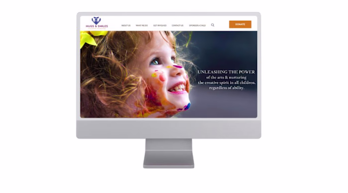
A Competitive Analysis on four other spray tanning business websites allowed us to compare user experience by carefully examining elements such as user navigation, features, value proposition, accessibility, visual design, and content. This data helped us identify competitor strengths, weaknesses and areas of opportunity.

had impactful visual elements such as imagery, logo and placement of elements.
had had multiple CTA or Donate buttons
had a clear value proposition and excellent user flow
great content impact and descriptiveness
overall great website experience
The competitive analysis helped us understand current shortcomings and brainstorm ways this website can reach its full potential. We gained a deeper understanding on user experience and the importance of certain elements and how it impacts user journey and end goal. This led us to develop a journey map with empathy and awareness as our pillars to better understand our users.
Research in a Nutshell
Who?
New and potential clients
Attitudes?
They want to visit a website and be able to look at pictures, customer reviews, spray tan artist info and have an easy booking process.
Behaviors?
My research indicated that although most found the current booking process easy , all interviewed users expressed desire to have ability to book online and getting important information regarding tan reminders and having easy access to pre/post tan care.
DEFINE
Persona
With data collected from both survey and owner interview, I created a persona representing the ideal user of the website. The persona helped us arrive at better solutions and it gave in depth understanding of the user goals and overall personality.
User Journey
The User Journey helped us gain insight on users thoughts, feelings, behaviors and pain points. Having a visual representation of the tasks allowed us to have a clearer understanding of the user experience.
Overwhelmed with information on Instagram story highlights
Confused as to how to go about booking and irritated that there is no booking link
Irritated with having to take extra steps to set own reminders
Annoyed with having to go back to find tan care instructions
Users irritated with lack of booking link, not able to book quickly and not able to see time and date availability in one place
Users irritated with having to go back into app to search for pre/post tan care instructions and having to screen shot to save them
Users irritated that they have to set own reminder for upcoming appointment.
Insights
IDEATION & DESIGN
In this phase of the process a site map, design system, high fidelity prototypes were created to help determine variations of the website. My job was also to organize and carry out usability studies to find out if user pain points had been resolved, if there were any persistent frustrations or if there are any other areas of opportunities for improvement.
Site Map
Our goal was to:
Design an organized and clutter free homepage to enhance the discoverability of content
We did this by:
Creating subpages with important content users stated was important for them to find on the page.
User Flow
To outline all necessary functionality a simple flow diagram of main tasks users likely will take was created to illustrate how they will navigate through the website.
Style Guide
The business owner wants a modern and minimal look to the website that matches the existing style on her Instagram page. She already has colors, fonts and a logo and does not want to deviate from this if possible. Also stated she has already created tan care documents to upload for clients to access through the website.
Stakeholder Buy In
We moved straight from paper wireframes to high fidelity prototypes on Wix template. The business owner insisted on the website feeling modern, clean and organized. Once the template was chosen she approved and we moved forward with creating the high fidelity prototype. Once this was done we met for review and she gave approval for usability testing.
We encountered a roadblock using the Wix template and were not able to find the fonts that the business
owner had already chosen. After discussing this she was ok with choosing other fonts as long as they are modern appearing and somewhat similar to what she has already chosen.
High Fidelity Prototypes
Using all the gathered data we moved forward and developed a high fidelity prototype. This final version reflected and addressed user frustrations:
1. Provided a way for users to complete online booking with a viewable calendar with date/time availability.
2. Provided information about services, pricing, testimonials and product info on the website for users to easily access.
3. Included a portfolio section with before/after photos.
1. Booking Screen
2. Services & Booking Screen
3. Portfolio Tab & Product Info
Accessibility Compliance
To stay compliant with WCAG we checked every screen of the website to ensure AA standards are met. This was achieved by:
Checking that information bearing elements meet contrast ratios by manually checking with contrast checker by AIM
Checking for color independence
Ensured that active user interface components (i.e., controls) and meaningful graphics are distinguishable
Checked that text-input boxes have appropriate indicators (i.e.,complete border) and that it meets 3:1 contrast ratio.
Ensured buttons had a border, despite them having text as distinguishing indicator, because this could help people with cognitive or learning disabilities to know that this is a button.
High Fidelity Usability Testing
I prepared for conducting a moderated usability testing. The same participants that participated in the user interview were used for the usablility testing since they are familiar with current booking process, are exisiting clients and can provide comparison feeback. In addition we recruited 2 additional participants who fit persona/demographics but who are not familiar with this business.
Scenario 1: Navigate the page and book a tan for any date and time you’d like within the next 2 weeks.
Scenario 2: Navigate the page and find information about the products, services and testimonials.
Scenario 3: Find the Pre/Post Tan care instructions and download the document.
Summary:
All users were able to successfully complete all 3 tasks without any challenges.
Easy to navigate as users were able to find all essential information quickly
Time on each task averaged 1-3 minutes
PROJECT OUTCOMES
In the first month after
launching website, bookings are projected to increase by 50 %.
Online booking was integrated into webpage allowing for increased productivity for business owner.
Fully functional
website that aligns with and reflects business
and user goals.
1. 100% task success
rate on usability study.
2.Use of multiple UX
principles enabled me to design a website with visual hierarchy,
easy readability & clear messaging and call to action.
LEARNING & LESSONS
I learned importance of:
Collaboration with team members (In this case the business owner and research participants).
Accessibility checks from the very beginning instead of towards the end to save time.
Understanding the users and identifying key problems and pain points.
Importance of researched based design that is intuitive, inclusive and impactful.
Like this project
Posted Aug 15, 2023
Involved in all phases of the project from research, to design solutions which led to 50% client bookings.
Likes
0
Views
2