Solving the declining rates of incoming donations
Olga De Luna Demenev
Hugs and Smiles Children’s non profit foundation wants to make the donation process easy, accessible, intuitive and compelling to the new and existing donors.
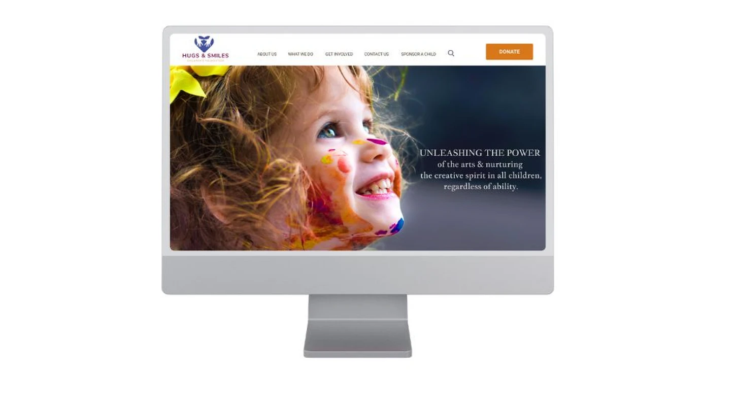
The homepage needed to be redesigned to communicate a more polished, focused, intentional and powerful message for new and potential donors.
ROLE & IMPACT
My role as UX designer allowed me to research, discover user pain points and design solutions to bring value to both business and users which will in turn help the growth of the organization by increasing donations.
HOW WAS THIS ACCOMPLISHED?
PROBLEM STATEMENT
The founder’s financial assessment of the organization determined insufficient incoming donation funds to sustain and help the organization grow.
We were asked to execute a plan to help resolve the problem of low rates of incoming donations.
With 8 weeks to complete the project, the plan of action was as follows:
Gather user feedback and determine user needs
Ideate and identify possible solutions
Test efficacy of the redesign
Not doing this jeopardized the existence of the foundation and its ability to continue serving its community.
Understanding user pain points was crucial in moving forward in a quick yet strategical manner. I started by conducting usability research via a questionnaire.
Researched allowed me to dive deep into user psyche to understand:
Behaviors
Points of views
Emotions
Attitudes
Frustrations
Processing of information
The founder did not realize that before starting the redesign it was important to conduct research. She wanted me to jump right into the design. However, after explaining that gathering data and performing research will positively impact our goals and end result, she was on board with it.
Usability Qualitative Research
The usability research was carried out by recruiting 6 Participants (3 male, 3 female), ages 30-61 to get feedback regarding website appeal, potential problems and what they thought worked well. We did this by sending out a questionnaire asking open ended questions.
All participants were able to find the donate button.
All participants thought current website was outdated and unstructured.
Several participants found that content was hard to read and unappealing.
Most participants were confused as to lack of several payment options.
Several expressed donate button needs to be more visible & more buttons added.
The usability research evaluation resulted in a good variety of data. This data was organized using an affinity diagram to get a clearer picture of what we had on hand and be able to efficiently evaluate our findings and turn them into meaningful insights.
Affinity Diagram
Affinity Diagram was used to identify roadblocks, patterns, common themes as well as pinpoint well functioning features. This in turn helped us get very clear on what areas we needed to ideate and further develop.
Insights
Readability issues due to text style & color
Foundation’s message is not clear/compelling
Frustrated with lack of payment options
Website not aesthetically pleasing. Photos not professional
Donation buttons are not bold or appealing
Our findings helped identify problem areas, gaps and improvement opportunities. We performed a competitive analysis to gather further data that will help our final design plan.
Competitive Analysis
A Competitive Analysis on five other non profit organizations allowed us to carefully dissect and examine elements such as user flow, features, value proposition, accessibility, visual design, content and overall user experience. This data helped us identify key building blocks, ideas and areas of opportunity.
Insights
had had multiple CTA or Donate buttons
had impactful visual elements such as imagery, logo and placement of elements.
had a clear value proposition and excellent user flow
had impactful content and great overall website experience
The competitive analysis helped us understand current shortcomings and brainstorm ways the website can reach its' full potential. We gained a deeper understanding on user experience and the importance of certain elements and how it impacts the user journey. This led us to develop a journey map with empathy and awareness as our pillars to better understand our users.
Research in a Nutshell
Who?
New and potential donors
Attitudes?
They have certain expectations and want to be strongly persuaded when visiting non profit websites before they commit to donating.
Behaviors?
My research indicated that users felt a degree of disorientation and confusion due to the current website’s lack of hierarchy, organization and visual appeal which therefore failed to trigger their desire to donate.
DEFINE
User Journey
The User Journey helped us gain insight on users thoughts, feelings, behaviors and pain points. Having a visual representation of the tasks allowed us to have a clearer understanding of the user experience.
We started by identifying key journey checkpoints, followed by creating a narrative and lastly detailing user actions, emotions and frustrations every step of the way.
Frustrated with lack of multiple payment options & lack of accessibility.
Frustrated with unclear and confusing message.
Had trouble with readability.
Page aesthetic and disorganized structure caused doubt in users minds.
Insights
Site Map
Our goal was to:
Design an organize a clutter free homepage.
We did this by:
Organizing subpages depending on what we determined would be important information for users to easily find on the left and right ends.
Before
After
Improvements
Used the Serial Position Effect. Most important information placed on left and right sides.
Removed “Home” subpage which was redundant.
Removed “Store” subpage which contained sale of unrelated products to the foundation.
Once we had the skeleton of our homepage structure, all gathered and interpreted research data and
insights we were prepared to start our ideation and designing phase and started by crafting our style guide.
IDEATION & DESIGN
In this phase of the process a design system, wireframes, low/high fidelity prototypes were created to help determine variations of the homepage redesign. My job was also to organize and carry out usability studies to find out if user pain points had been resolved, if there were any persistent frustrations and if there are any other areas of opportunities for improvement.
Style Guide
We determined we wanted the website to have a trustworthy, impactful and modern feel to it while maintaining the current fun and bright feel to it. A design system was used to streamline and standardize design components.
Button components were borrowed from Google Material Design library, then color/shaped customized.
Low Fidelity Prototypes
Low Fidelity Prototypes helped us to prepare for usability testing and focus on the functionality of each feature and how placement was important in the overall goal and ultimately assess how well the prototype meets user needs and goals.
Low Fidelity Usability Testing
I prepared for conducting usability testing by developing two scenarios and specifying two tasks for participants to complete. Participants for the testing were the same six users that participated in the initial usability research. We wanted to have the same users so that we can get comparison feedback.
Scenario 1:
Find and click a donate button and complete process.
Scenario 2:
Find and click the sponsor a child button and complete the process.
Summary:
All participants were able to completed both tasks without any problems.
The results of the usability testing showed that:
Users were able to accomplish both tasks smoothly and easily. However, since the testing was done on a basic version of the site, no feedback was received on visual appeal or content. We moved on to the high fidelity design phase.
Stakeholder Buy In
The project was placed on hold halfway through the process. I proceeded with the design because it can prove to be helpful in the future if the founder decides to continue with this work.
I did not obtain “buy in” at this moment of time but this will have to be revisited in the future in the event it is decided she wants to continue.
High Fidelity Prototypes
Using all the gathered data we moved forward and developed a high fidelity prototype. This final version reflected and addressed user frustrations:
Increased the number of donation buttons and made them more visible.
Information about the organization presented in a concise and organized manner with easy readability.
Visual aesthetic and copywrite strengthened.
Multiple payment options added.
Before
High Fidelity Usability Studies
The same 6 participants were asked to complete the same 2 tasks as with first the first usability study to determine if there were any glitches with the flow. They were also asked to give open ended feedback on the high fidelity redesigned page.
Scenario 1:
Find and click a donate button and complete process.
Scenario 2:
Find and click the sponsor a child button and complete the process.
Summary:
All participants were able to complete both tasks without any problems.
All users agreed that this is an incredible design improvement and it is cohesive, easy to read, clear and compelling. Multiple state they would donate to this cause.
PROJECT OUTCOMES
LEARNING & LESSONS
The current website was in need of an overhaul as there was a mismatch between the work they are committed to doing and how that was being communicated to potential donors to persuade them to contribute.
I learned importance of:
Collaboration with team members (In this case the founder and research participants).
Understanding the users and identifying key problems and pain points.
Importance of intuitive, inclusive and impactful design backed by research and how these should mesh seamlessly to allow for an amazing yet useful experience.
Like this project
Posted Aug 15, 2023
My role was to research, discover user pain points and design solutions to help help the growth of the organization by increasing donations.
Likes
0
Views
5