Point of Sales System Redesign to Streamline Customer Experience

Reference: Sydney Doneghy - Senior UX Researcher
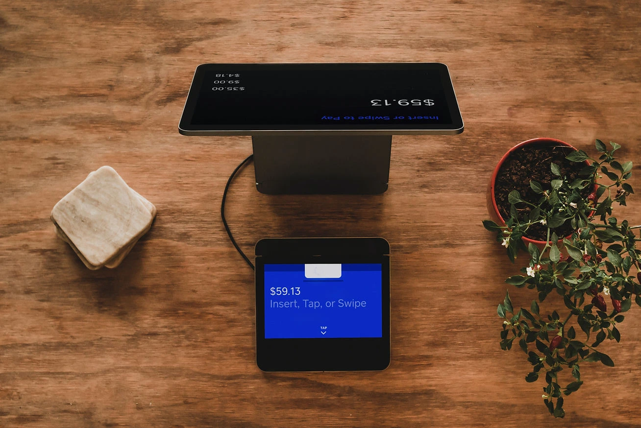
This company’s point-of-sale (POS) system is a technology platform used in its retail drugstores to manage transactions, customer interactions and supports various payment options. The POS system is integrated with other company health systems, including the pharmacy system and inventory management, to streamline operations and provide a seamless customer experience.
ROLE & IMPACT
For this freelance project, I was involved in the research portion of the project with other UX researchers. Our job was to formulate research questions to be used in a moderated mock up testing, analyze the data and create a presentation deck for stakeholders with insights and recommendations.
HOW WAS THIS ACCOMPLISHED?

PROBLEM STATEMENT
The redesign was initiated because the current POS system is over 20 years old and there were lots of system failures that need fixing so the company has decided to create a new POS system in its place.
RESEARCH
RESEARCH PLAN
We started by outlining research goals, defining research methodology and understanding stakeholder agenda. The UX designers delivered 2 different designs for payment and receipt screens that will be tested.
Goals and Objectives:
Gather feedback for the payment and receipt wireframes and determine if uses understand screens and which design they prefer-Design Option 1 or Design Option 2.
Methodology
Moderated study via Microsoft Teams and Qualtrics.com
• 60 minute, 1:1 interviews
• Incentive provided by company
• 6 participants
• Company associates who handle POS system in their stores
USER INTERVIEWS & SURVEYS
We reviewed general questions the stakeholder wanted participants to be asked as they are going through each static screen and animated screen for both design options to understand what they wanted to accomplish.
We formulated and categorized questions. The questions consisted of general and design categories.
Moderated studies were done with all participants via Teams
Participants also filled out a survey on Qualtrics
Reviewed data, organized it in a table, created affinity map and developed key insights.
Due to compliance reasons only the Senior UX researcher was able to carry out the usability studies.
Other team members, including myself, were not permitted to be present.
Snapshot of User Interview Responses
Design Option 1
Design Option 2
Two users were unclear as to what the "+ add" buttons were for
Users felt "view pinpad" button and "payment" button to be redundant
3/6 users do not understand what "transfer basket" means
Users feel that "return to home" is the same as starting new transaction, and are confused by the difference in these functions
The "shortcuts" function is not clear to users
"Click to see details" is inconvenient and users would rather be able to just scroll down instead
General Feedback
Design Option 1 Payment screen :
Was easy to understand
Design Option 2 Payment screen:
Was understandable and easy to use
DesignOption 2 Receipt screen:
Users felt this option is very clear to understand and clean
Design Option 1 Receipt screen:
Screen is overwhelming and "busy"
Users felt that:
AFFINITY MAPPING
We collected a large amount of data from the surveys.These were clustered into an affinity map on Miro. Inisights and recommendations were then derived.
KEY TAKEAWAYS & RECOMMENDATIONS
Users feel more comfortable with the option 2 layout when shown static screens and the animations. is easier to comprehend.
Users felt this was the best option for new colleagues as well to learn as Option 2 provides users better ease of use, and
Users preferred Option 2 on payment, receipt, comparison and animation screens.
Recommendations
On Payment Screen consider:
On Receipt Screen consider:
LEARNING & LESSONS
Like this project
Posted Aug 15, 2023
Executed research, moderated mock up testing, analyze the data and created a presentation deck for stakeholders with key insights.
Likes
0
Views
4


