Kaichain - Website Design
Overview
Kaichain is an upcoming blockchain network that overcomes the current flaws in major ecosystems, such as higher TPS, lower operational costs and environment-friendly transactions. They bring programmability and interoperability adaptable to the masses. It relies on the same POA consensus that is being used by bigger blockchains on date.
Problem & Solution
Being the new kid on the block in cryptocurrency, Kaichain wanted to announce their online presence in a way that’s loud and innovative. Prior to the project, they already had an existing website and our team was approached to improve on that. Aiming to solve the flaws in major ecosystems such as low transactions per second, high operational costs and carbon-emitting blockchain validations, the Kaichain team aspires to make this blockchain the safest, fastest, and most reliable with next to no carbon footprint blockchain in the world.
The brief they discussed with our team was short and concise like their brand goal, “to have a better life”. It felt like they already knew what they wanted for their digital identity, and we simply needed to guide them there to meet their expectations.
The goal for the project was not to market the product but to inform and educate people about it. As someone new knocking on the door of the blockchain industry, they wanted a website leading their potential visitors to documentations that can teach them about Kaichain and what they stand for.
Goals & Requirements
Inform and educate users
Visual style guide for the developers
Effectivity, Durability, and Flexibility
Process
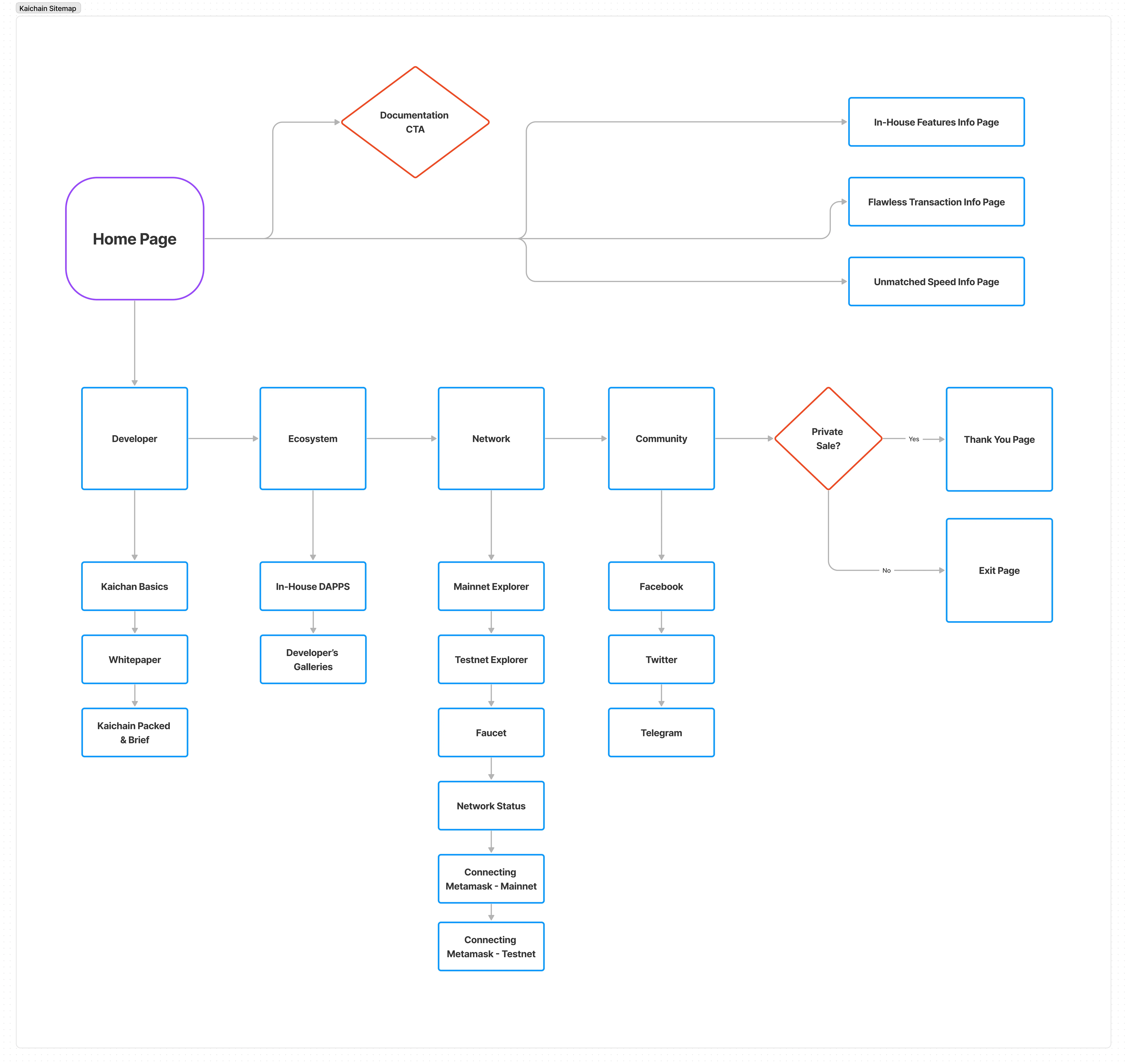
There wasn’t any room to be creative since our team had a very short timeline and the client wanted something very specific. Upon our team discussions, we figured that the best way to attack the project was to simply meet what the client wanted in terms of the art direction and put more focus in creating userflows that are user-friendly and equipped enough to direct them on what the client wants them to find as they navigate the website.
The team started brainstorming by putting out Kaichain’s competitors in the industry on the table. And as each team member reverse engineered the user journeys from the said websites through Figjam. We ultimately narrowed down our options to what we thought might be best suitable for what the client wanted for their own website.
As the UI designer for the team, my task was to bridge the gap between the art direction the client wanted and the style guide that the engineering team could use. With that in mind, I sourced typefaces, colors, and other style elements that are essential in trying to build a small UI kit in Figma.
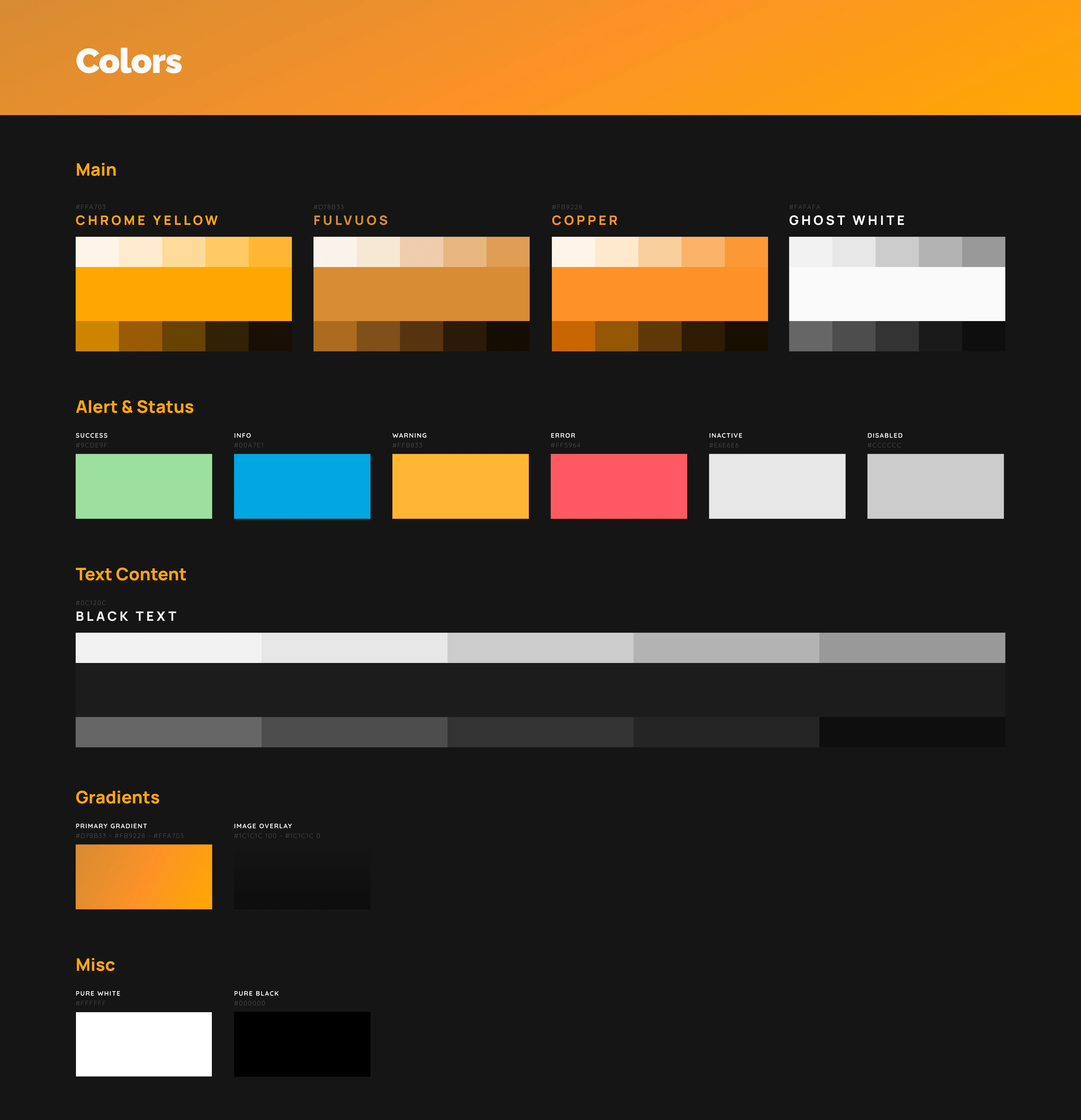
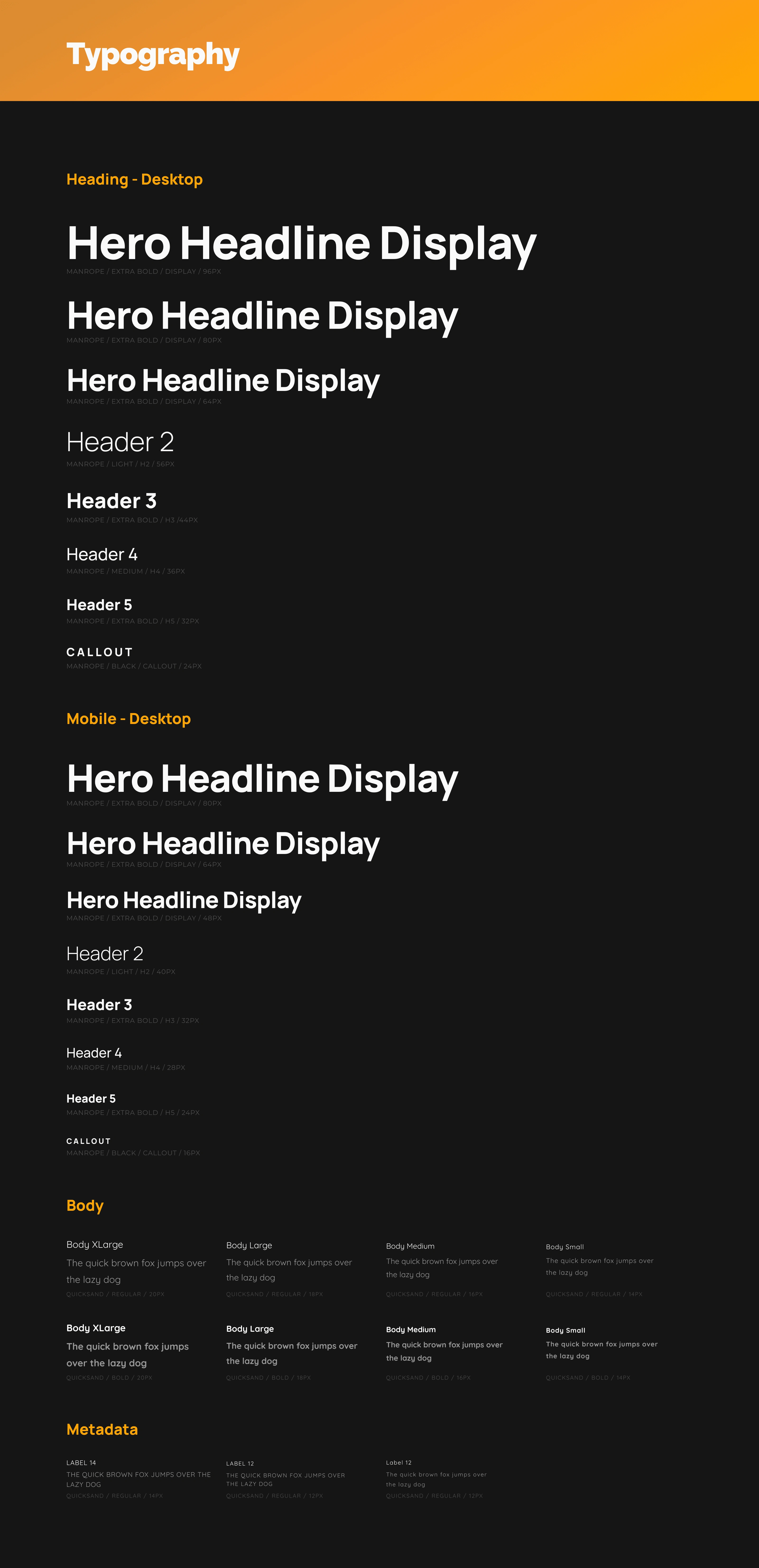
Colors didn’t come as much of a problem, the client had a specific hexcode (#FFA703) in their brief and I used that as a base color when I started building the color library for the engineering team. For typography though, with this project’s focus being to inform and educate, I sourced legible and clean typefaces and tested several combinations aswell and prepared typography options. Eventually, what the team liked best was the Manrope and Quicksand combination. From there, I created the typography design tokens.
Now to remain consistent with the clean type and premium golden color, I approached the icons the same way and tried to find linear monoline icons. However, when we presented this the client, it was then where we realized that their internal team already had some icons created and they wanted to use those. Provided with some still images for the said icons, I recreated them into .svg formats to accommodate flexibility and responsiveness when the engineering team builds the website.
From those base elements, I started creating necessary atomic and molecular components that the development team might need. Components were then properly handed off through Zeplin, and I maintained constant communication for support and queries during the engineering team’s building stage.
Conclusion
With the project constraining some creative direction from our team, it wasn’t as enjoyable as other projects were. However, to stay true to the client’s vision, we had no choice on the matter. The website was launched a week after the project concluded and as per our project manager’s statement, the client was happy about our output. The team was thrilled to learn this since we did have quite the rush timeline for it.
It has been half a year since Kaichain’s website was launched now, and once again, as per our project manager’s statement after some conversations with the client for possibly new features and pages, the website has a steady increase of 2% a week of visitors and about 1.76% of documentation downloads.
Like this project
Posted Sep 20, 2023
Developed a user-friendly website with intuitive navigation, clean interface, and seamless user experience using a custom design language.
