Built with Framer
Mobile & Web Design System
Ribal Sh
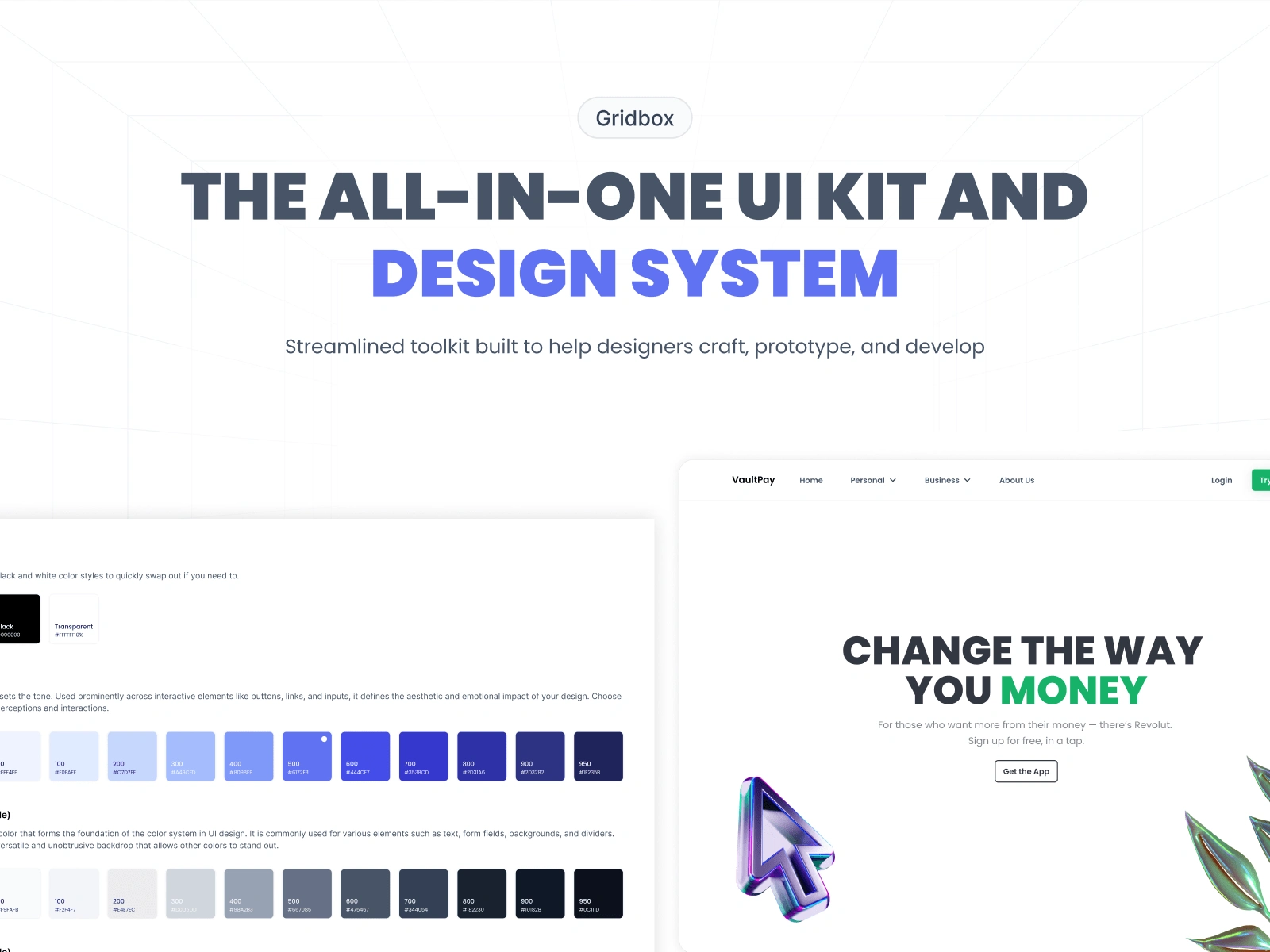
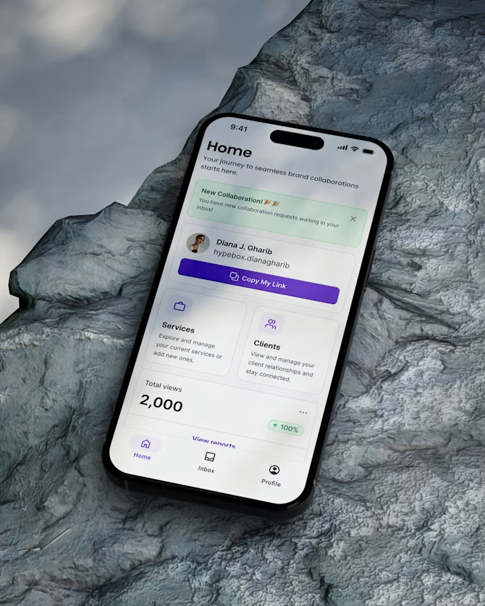
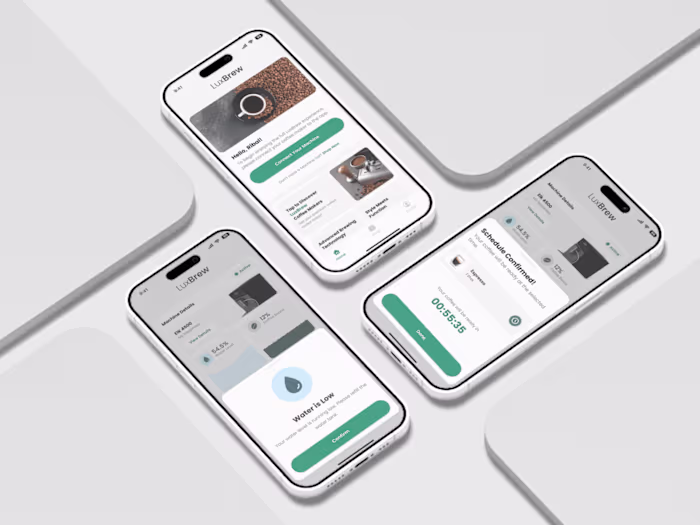
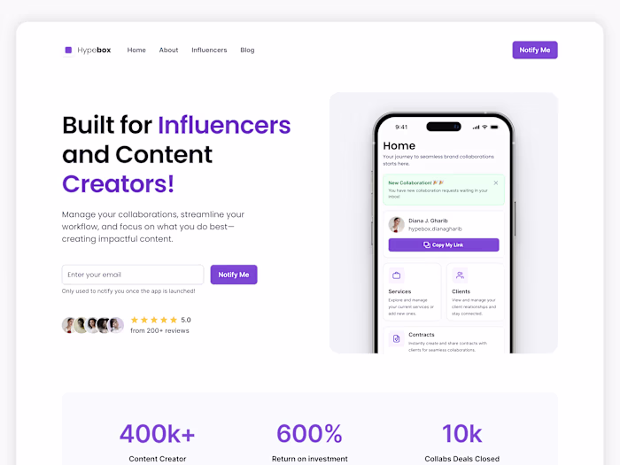
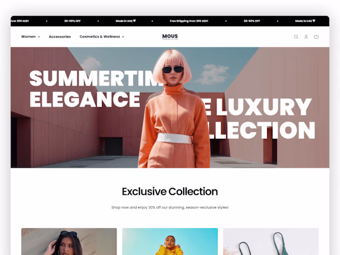
A Scalable Design System for Figma + Framer
Gridbox is more than just a design system—it’s a comprehensive toolkit tailored for designers who want to streamline their workflow, prototype faster, and implement designs seamlessly across multiple platforms. Built with efficiency in mind, Gridbox is designed to work effortlessly within Figma, Framer, and Webflow, ensuring a smooth transition from concept to functional product with minimal friction.
Built for Speed & Consistency
Gridbox was crafted to accelerate design workflows by providing a well-structured component library, typography scales, spacing systems, and pre-configured auto-layouts. The system eliminates the need for repetitive design work, allowing designers to focus on creativity and problem-solving rather than starting from scratch every time.
Fully Modular & Scalable
The system includes flexible, customizable components and design tokens that adapt effortlessly to any project. Whether working on mobile apps, web applications, or marketing websites, designers can leverage a consistent UI foundation while maintaining the creative freedom to iterate.
No-Code Ready for Framer & Webflow
Beyond Figma, Gridbox bridges the gap between design and development by ensuring seamless implementation in Framer and Webflow. Each component is built with scalable, responsive structures, making it easy to export, animate, and publish real-world projects without writing a single line of code.
A Smarter Way to Design
From atomic design principles to design tokens and responsive layouts, Gridbox empowers designers to work smarter, scale faster, and deliver polished, high-quality designs in a fraction of the time. It’s not just a design system—it’s an ecosystem that enhances efficiency, reduces friction between design and development, and helps creators bring their ideas to life effortlessly.
What's Included?
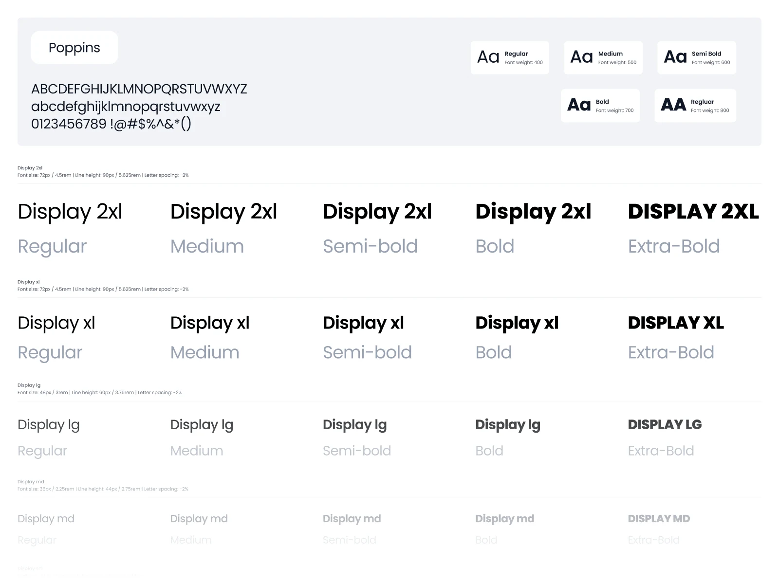
Typography
Our design system utilizes a carefully crafted set of typography styles designed to be both versatile and functional. This typographic scale has been rigorously tested across a wide range of projects to ensure it’s adaptable enough to fit various needs while maintaining a high level of accessibility for all users.
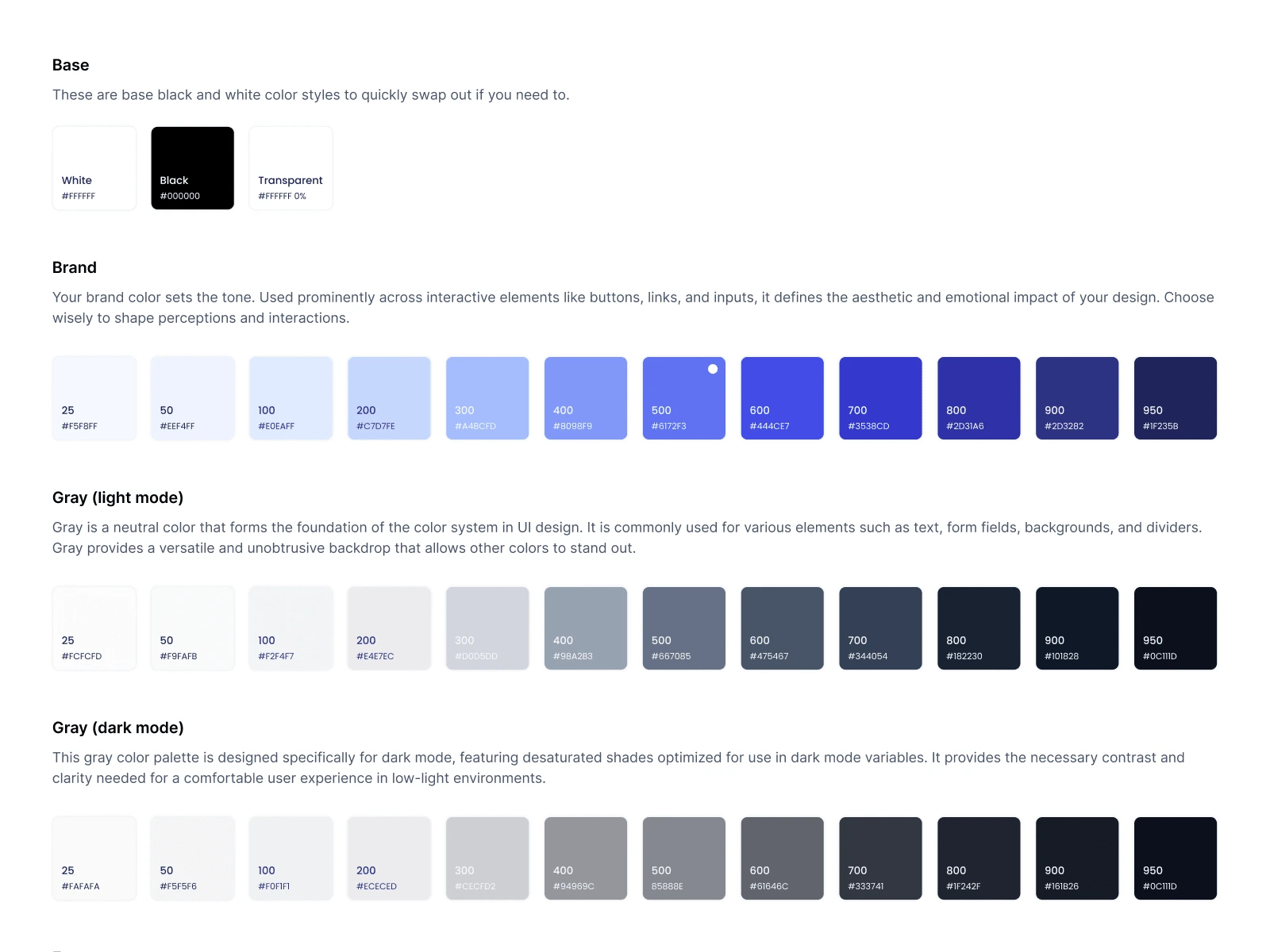
Colors
Explore our curated color palette designed to empower your brand and projects. Prioritize legibility with perfectly balanced contrast to enhance every design.
Icons
Feather is a collection of simply beautiful open source icons designed by Cole Bemis (@colebemis). Each icon is designed on a 24x24 grid with an emphasis on simplicity, consistency and readability. Colors can also be changed via symbol overrides. All strokes in these icons have been converted to single vectors so color overrides are respected within variants.
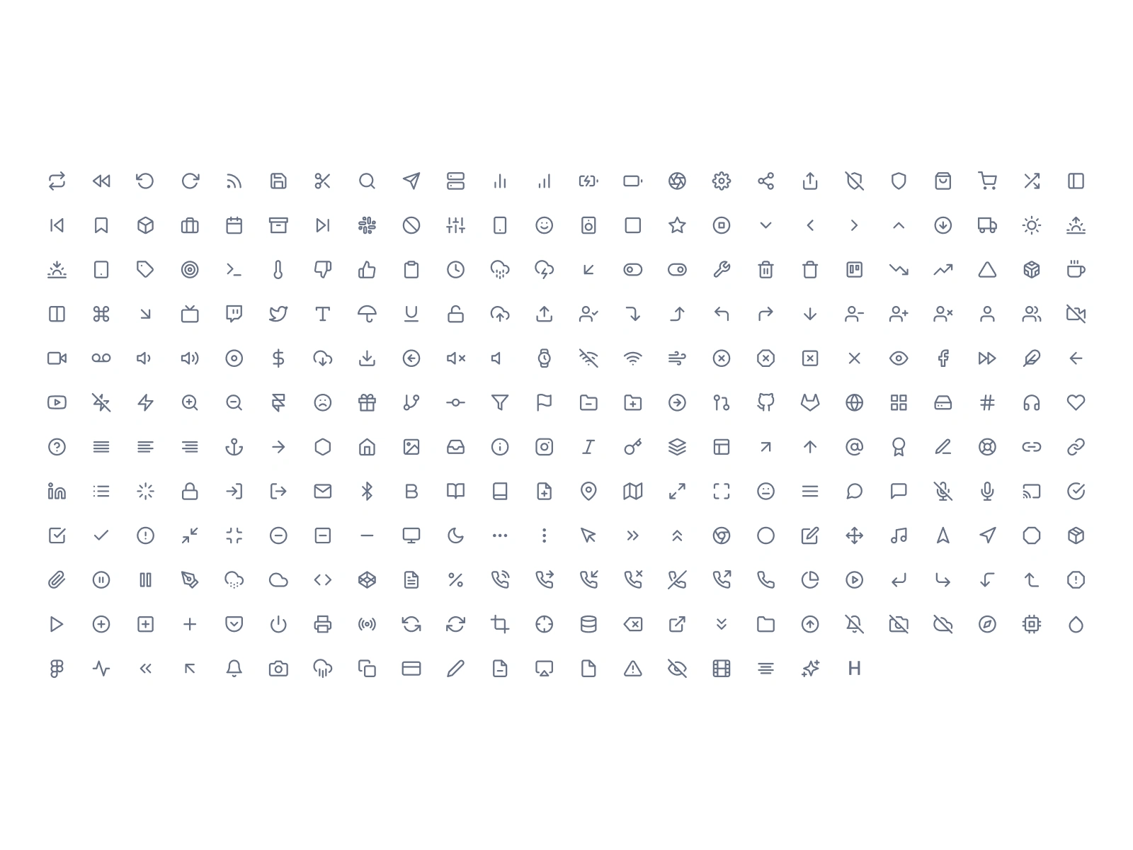
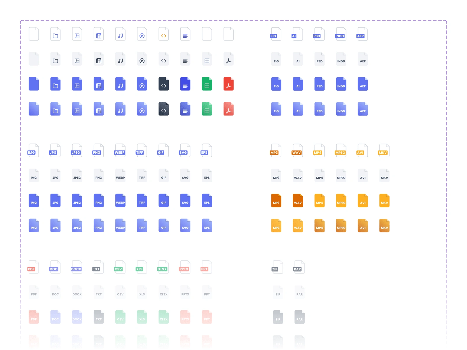
GridBox Icons
GridBox UI Icons is a sleek, versatile icon set created to meet the needs of modern UI design. With a focus on clarity and consistency, these icons seamlessly integrate into any design system, offering a perfect blend of style and functionality for today’s digital interfaces.
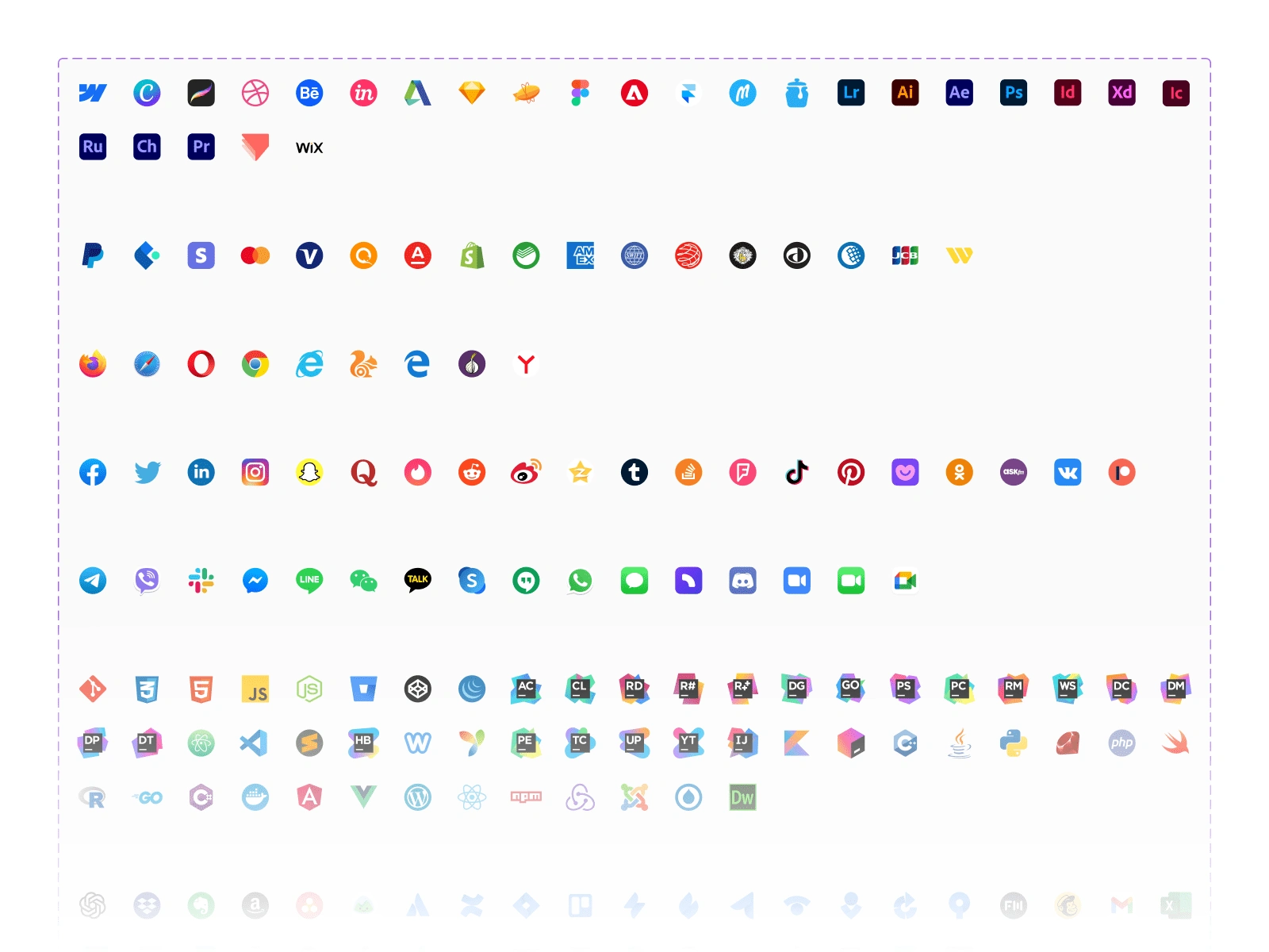
Integration icons
All trademarks, logos, and brand names are the property of their respective owners. All references to company names, product names, and services on this site are for identification purposes only and do not imply any association with or endorsement by their respective holders. Use of these marks does not suggest sponsorship or endorsement.
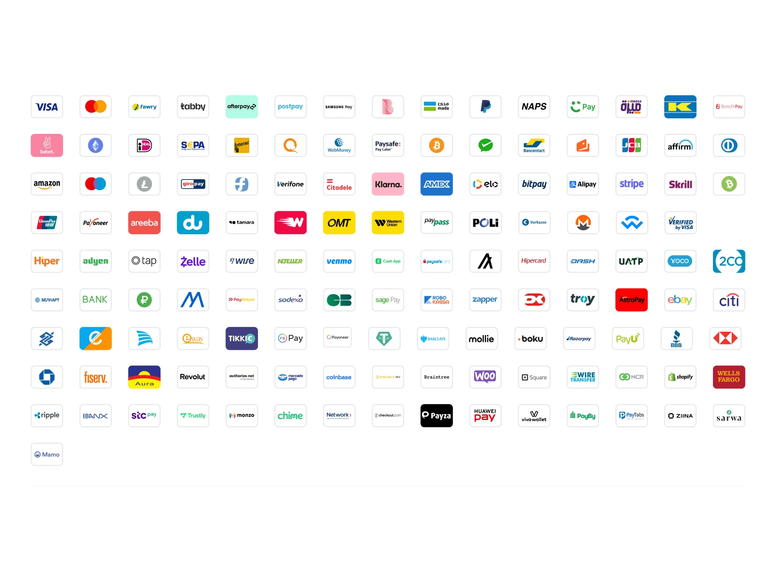
Global Payment Methods Icons
All trademarks, logos, and brand names are the property of their respective owners. All references to company names, product names, and services on this site are for identification purposes only and do not imply any association with or endorsement by their respective holders. Use of these marks does not suggest sponsorship or endorsement.
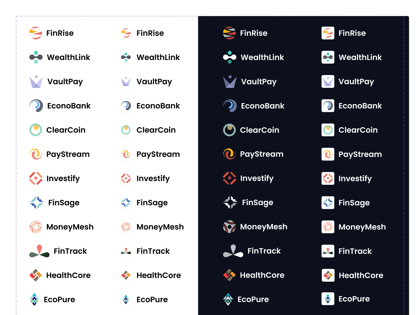
Fictional Company Logos
These logos are entirely fictional and are free to use for both commercial and non-commercial projects.
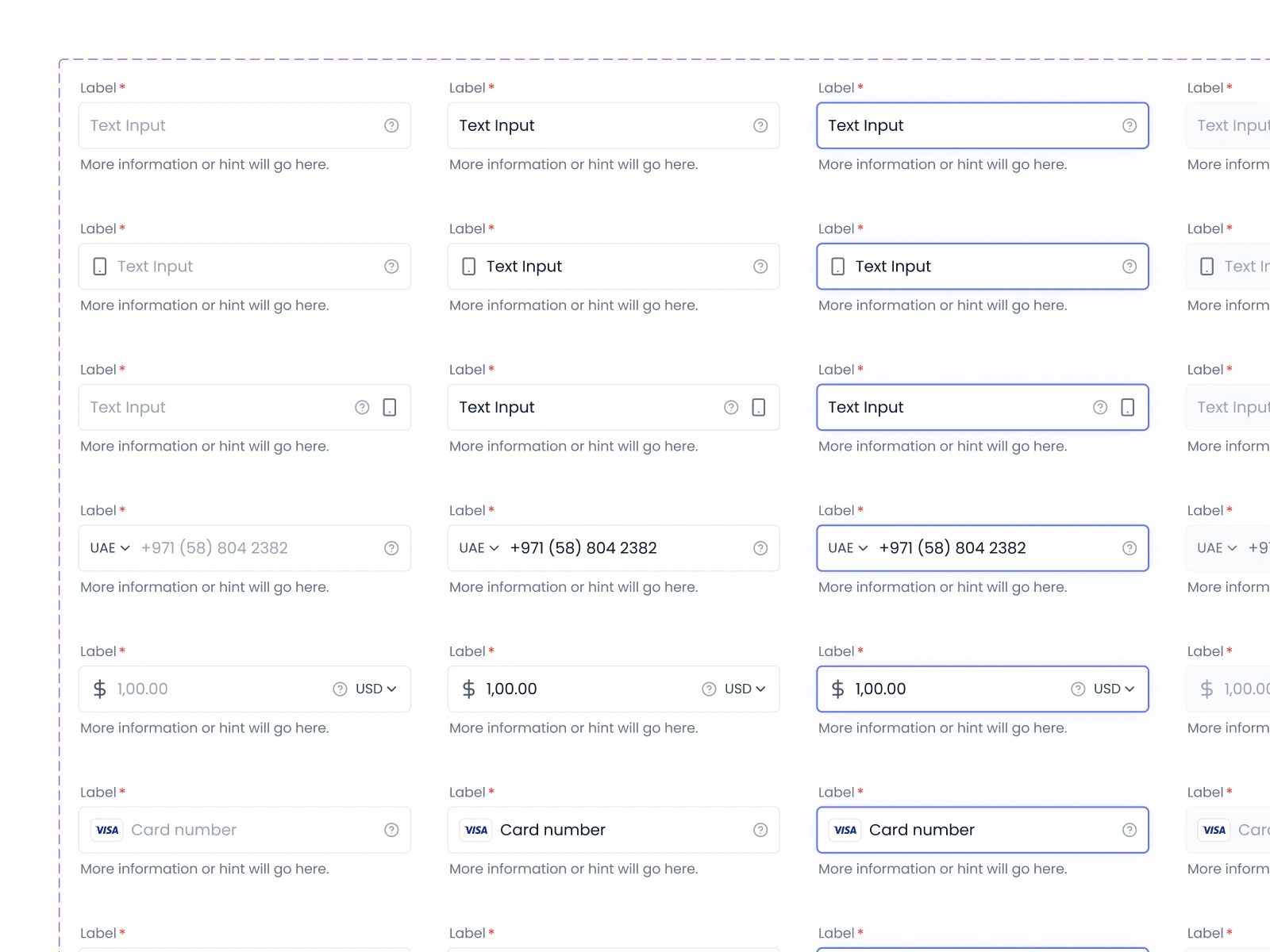
Input Fields
Input fields enable users to input text into a user interface, often found in forms and dialogs.
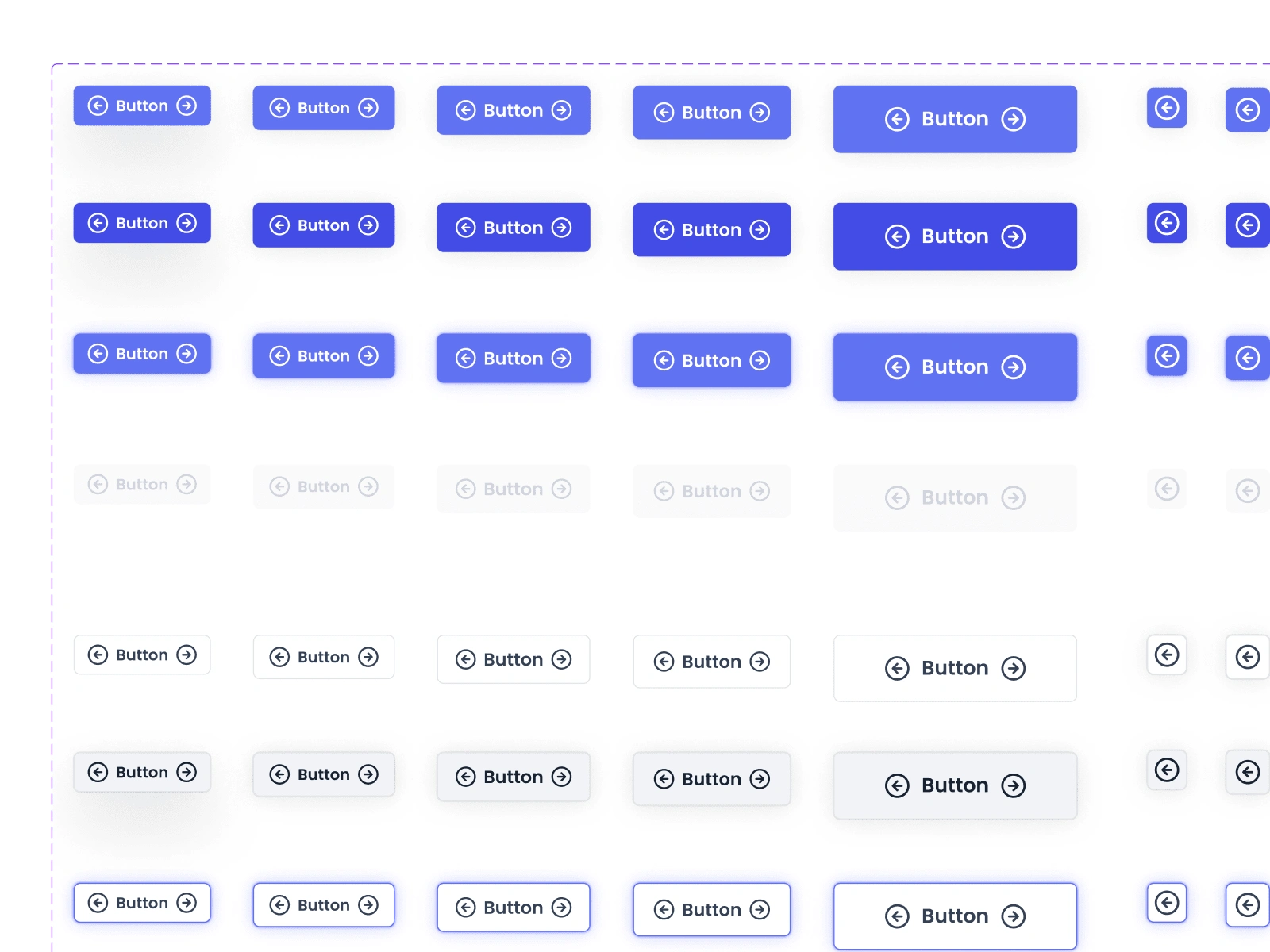
Buttons
Buttons are essential interactive elements in any user interface. This component set includes a variety of button styles designed for different actions, all fully customizable with auto layout and responsive features. Perfect for primary actions, secondary actions, and everything in between.
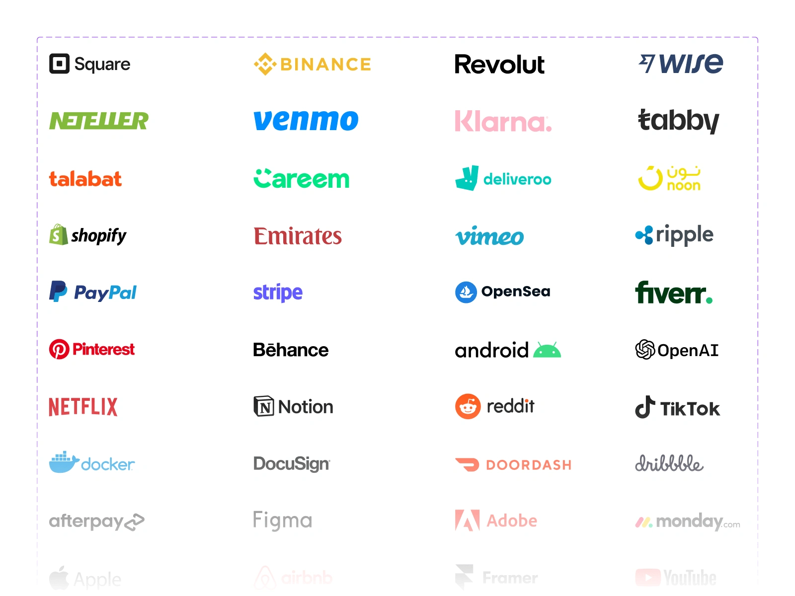
Company Logos
A comprehensive set of company logos from the world’s leading businesses, ideal for mockups and branding projects. All product names, logos, brands, trademarks and registered trademarks are property of their respective owners and are used in this file are for identification and educational purposes only. Use of these names, trademarks and brands does not imply endorsement.
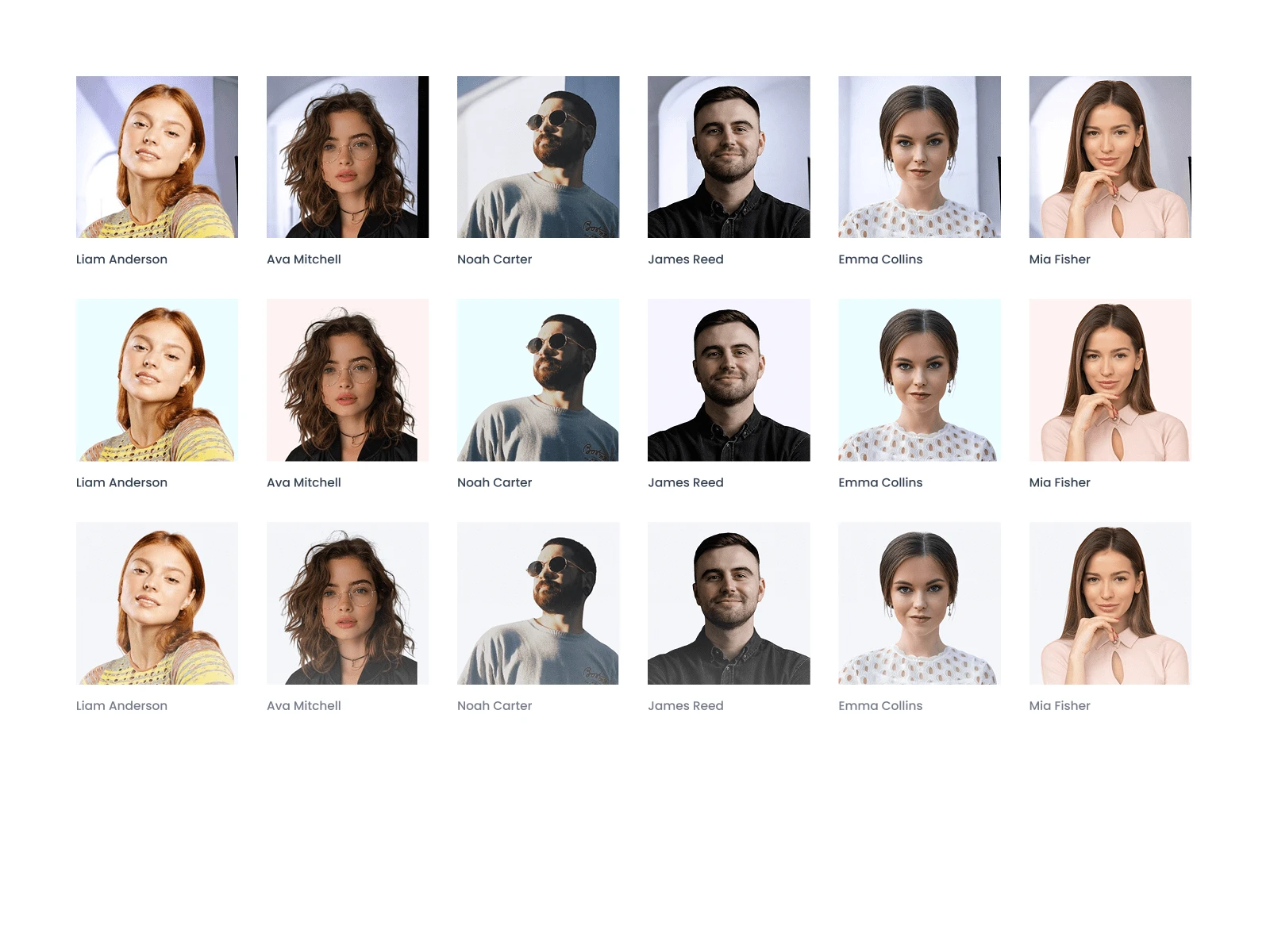
Avatar Images
All images are sourced from Unsplash, AI-generated, and Pexels, and are free for both commercial and non-commercial use. These avatar images are set up as image color styles, allowing you to easily swap avatars.
+500 Other Component!
Let’s Build Together
Need a custom design system for your team or looking to optimize your workflow? Let’s collaborate! Whether you’re a business in need of a scalable design system or a designer wanting access to Gridbox, feel free to reach out.
Like this project
Posted Feb 24, 2025
Gridbox is a powerful design system built for efficiency & scalability, streamlining workflows in Figma, Framer, and Webflow for seamless UI development.