Brand Identity Design for Germina Labs
Cecilia Veloso

Context
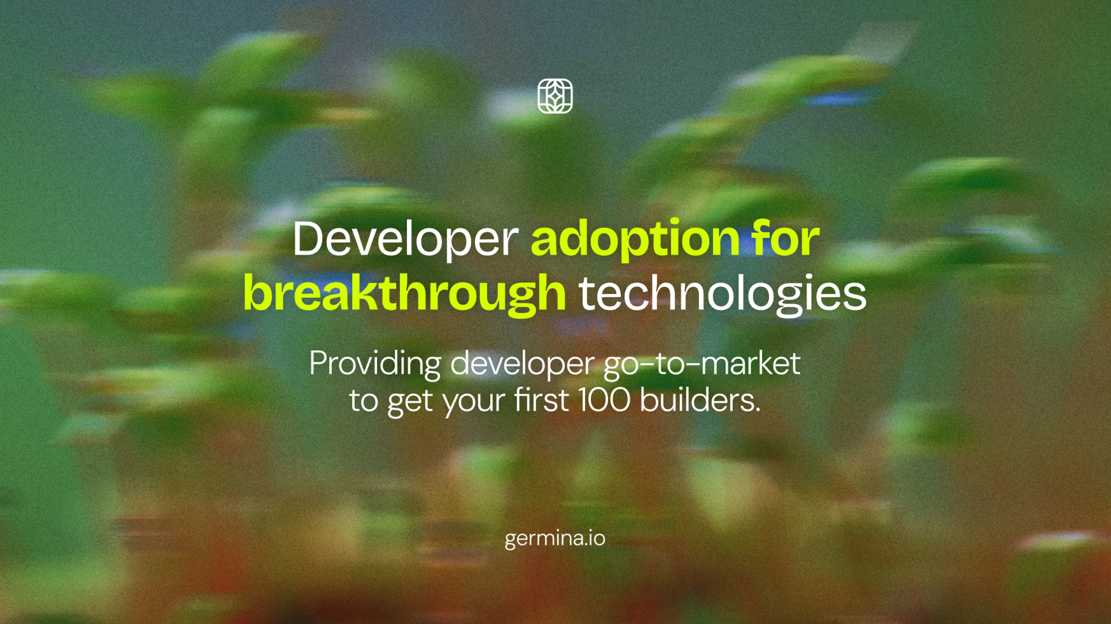
Germina Labs positions itself as “your devrel’s favourite devrels” — a studio operating at the intersection of developer relations, infrastructure, and early-stage Web3 adoption.
The brand needed to feel technical yet human, credible to developers while remaining expressive, modern, and memorable.
Brand Concept
The identity is built around the idea of growth, propagation, and connection — inspired by germination as a metaphor for how developer ecosystems evolve.
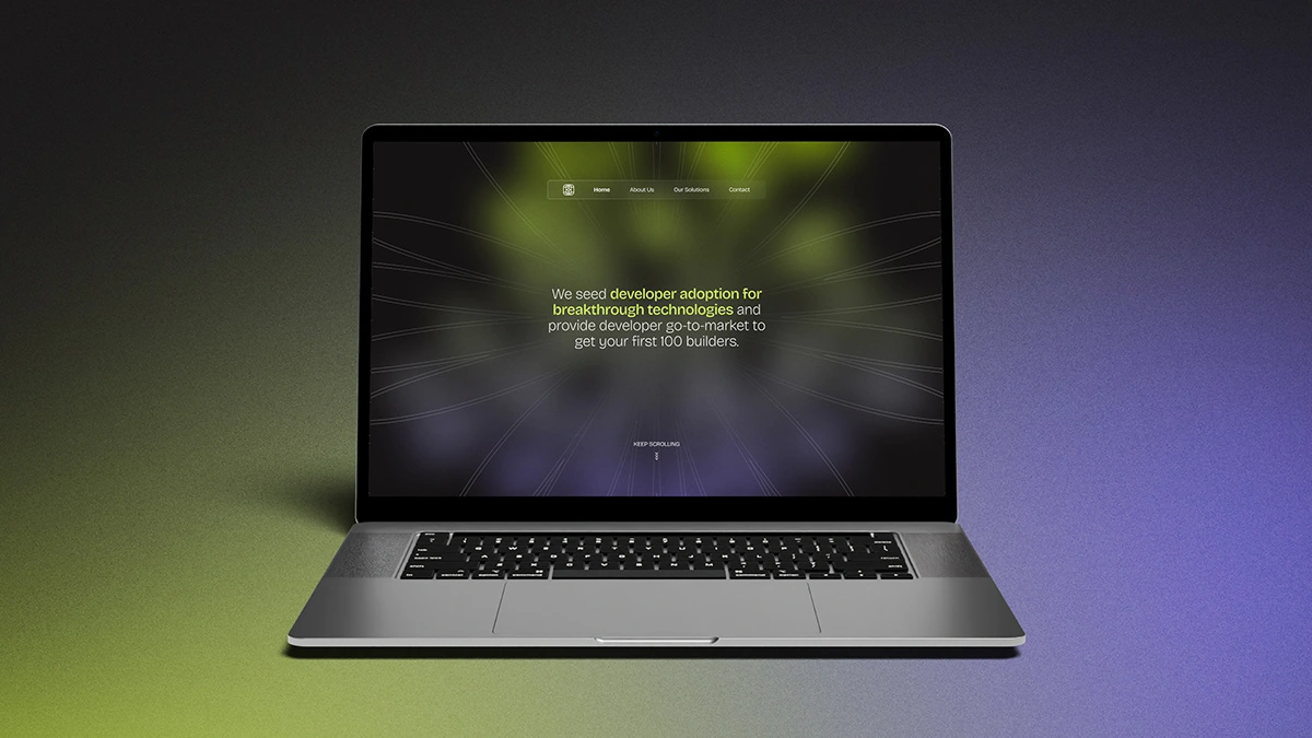
We translated this into a modular visual system that balances structure and experimentation, mirroring how DevRel work connects protocol foundations with real developer communities.
Visual System Communication
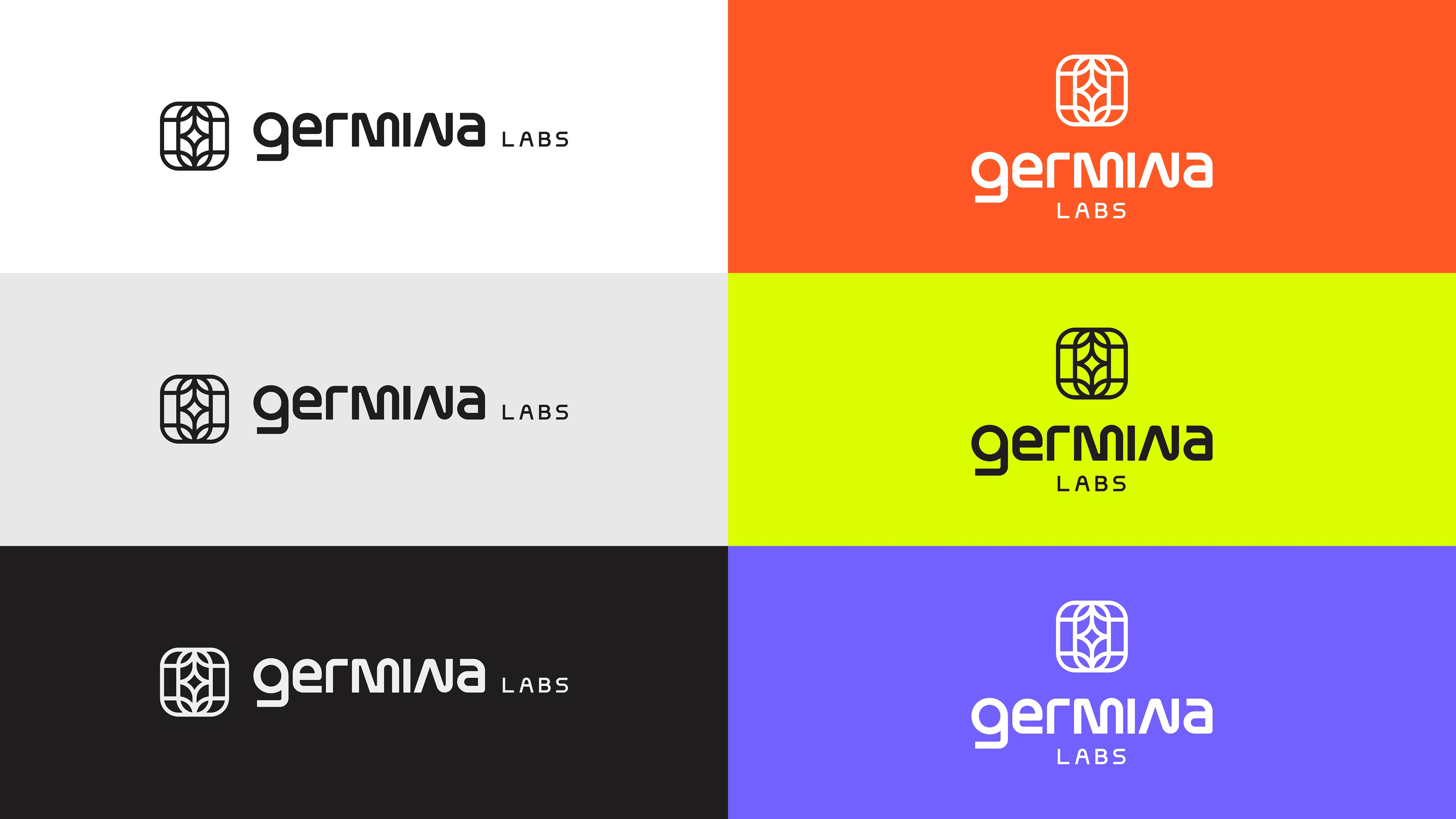
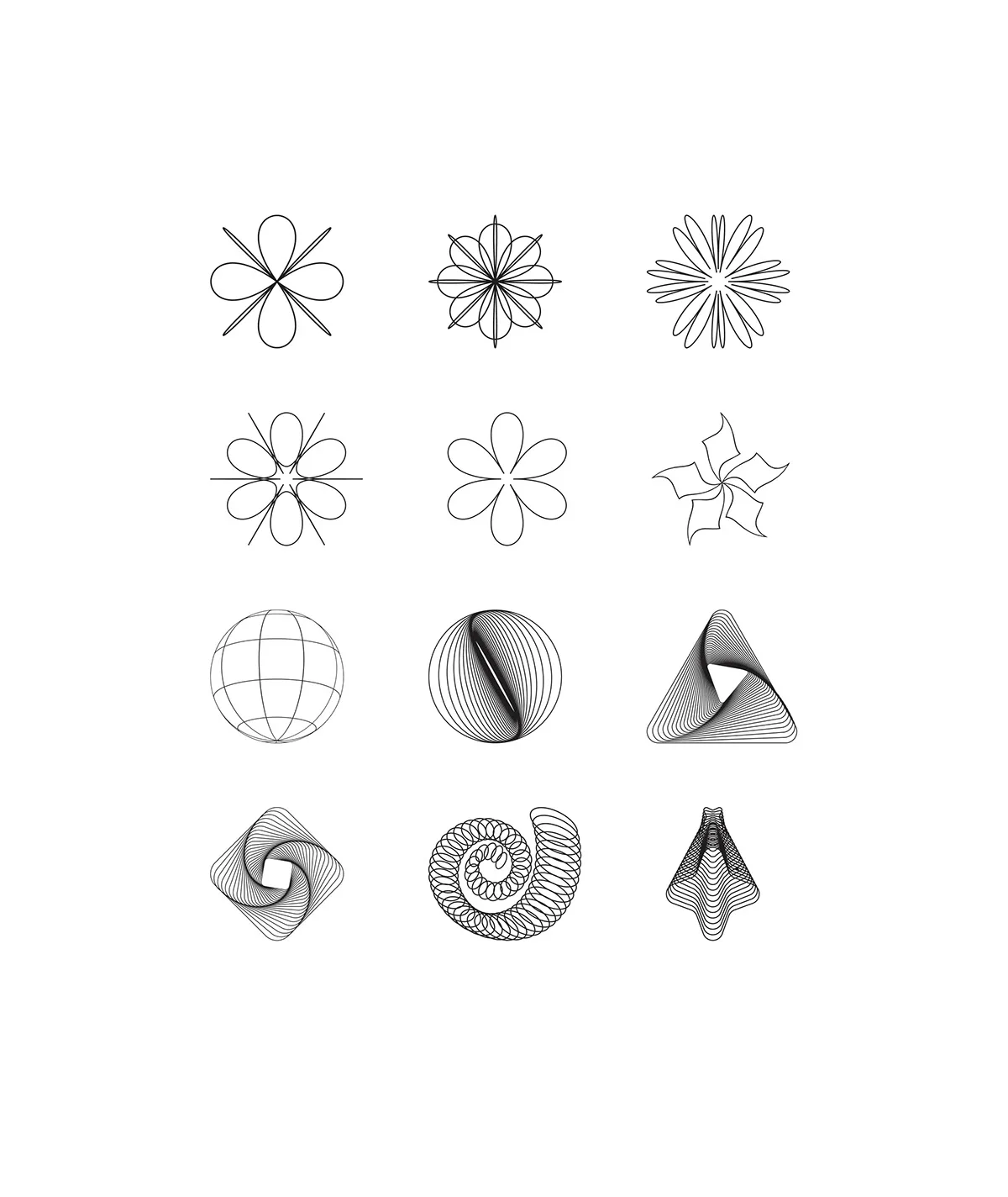
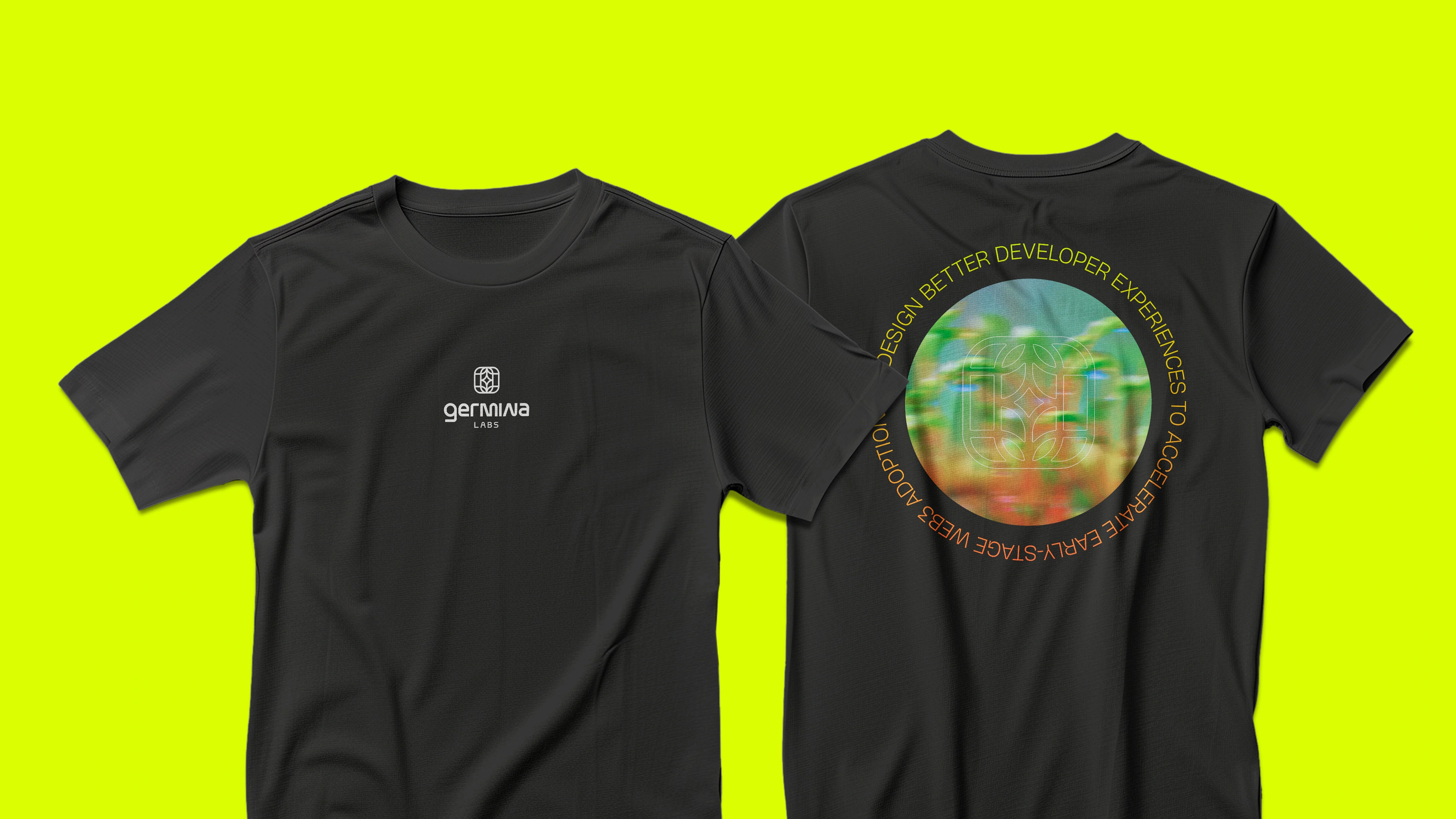
Symbol & Geometry
The mark is derived from organic, generative forms combined with geometric constraints, representing systems that grow through collaboration rather than rigid control.
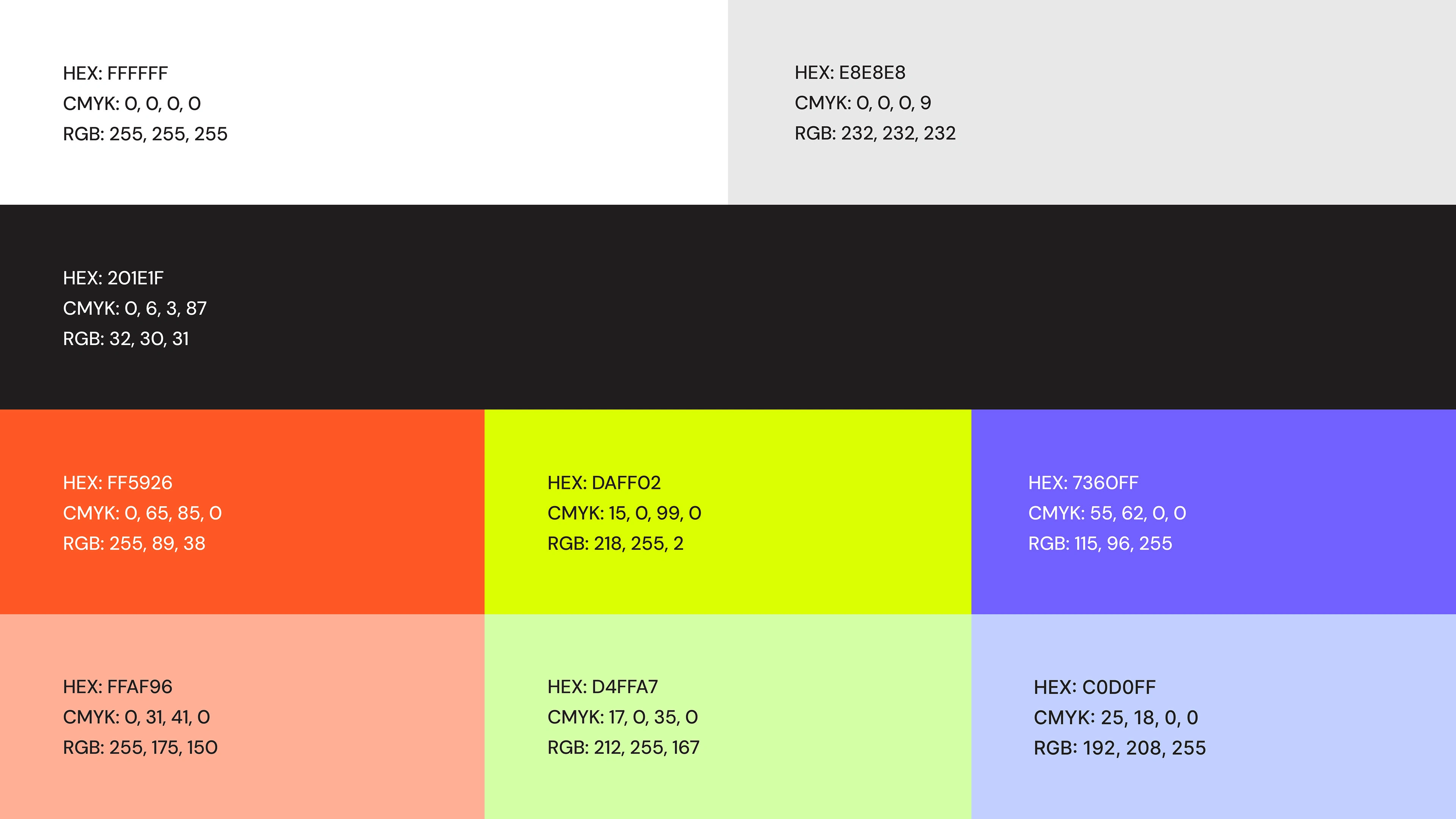
Color Palette
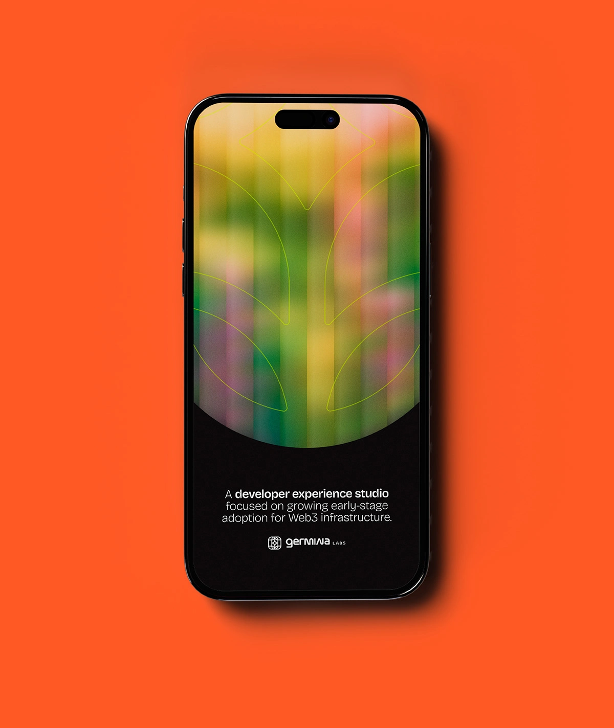
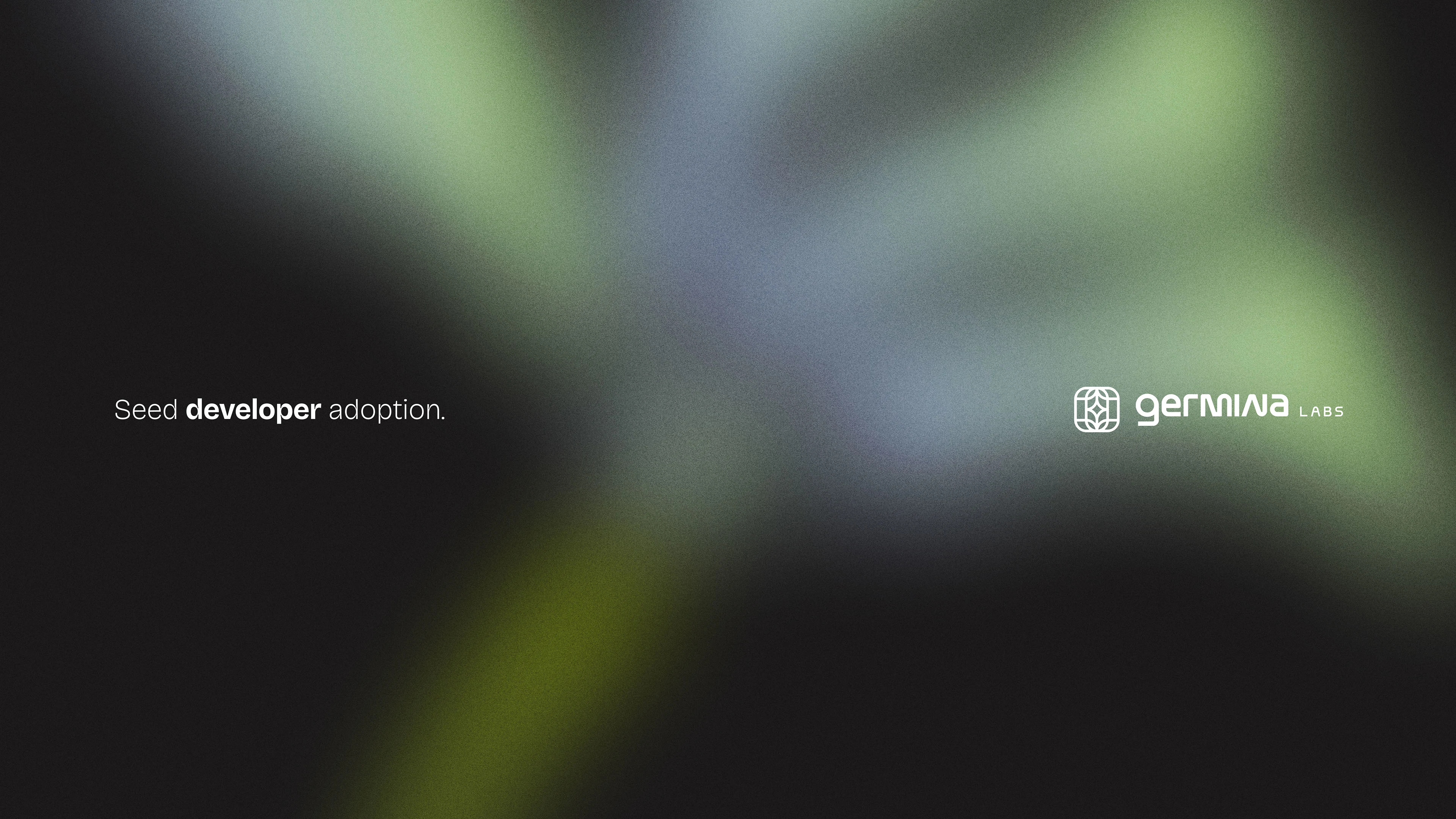
A bold, high-contrast palette was chosen to stand out in technical environments. Vibrant greens, warm gradients, and energetic accents signal growth, approachability, and momentum, while still feeling native to developer culture.
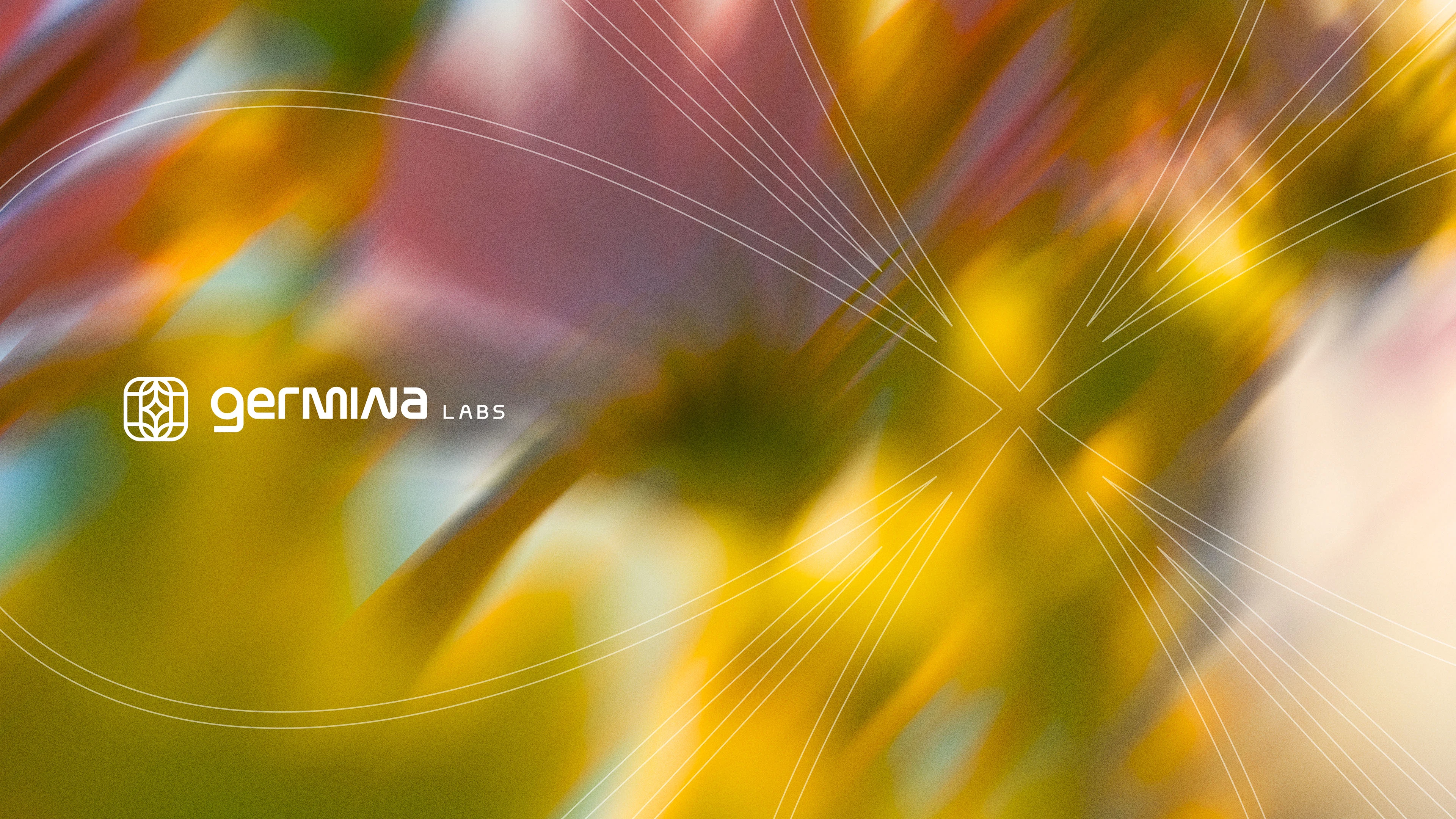
Assets & Patterns
Generative line patterns and fluid gradients reinforce the idea of networks in motion. These assets scale seamlessly across digital touchpoints, from product interfaces to marketing and DevRel content.
Typography & Application
Clean, modern typography grounds the expressive visuals, ensuring clarity and usability across documentation, websites, and presentations.
Outcome
The final brand system gives Germina Labs a distinct, ownable visual language that resonates with developers and ecosystem partners alike. It supports credibility at an infrastructure level while remaining flexible enough for community-driven storytelling and growth.
Like this project
Posted Dec 14, 2025
Developed a brand identity for Germina Labs, balancing tech credibility with expressive visuals.