ServiceTitan Mobile 2.0 Redesign
Denis Lesak
Convincing a startup to retool the tablet app that runs the home-services industry.
As the first design hire at ServiceTitan, I pitched and led a full redesign of the technician tablet app — the surface plumbers, electricians, and HVAC techs use in customers' homes to inspect, quote, collect payment, and close the job.
Problem
Problem
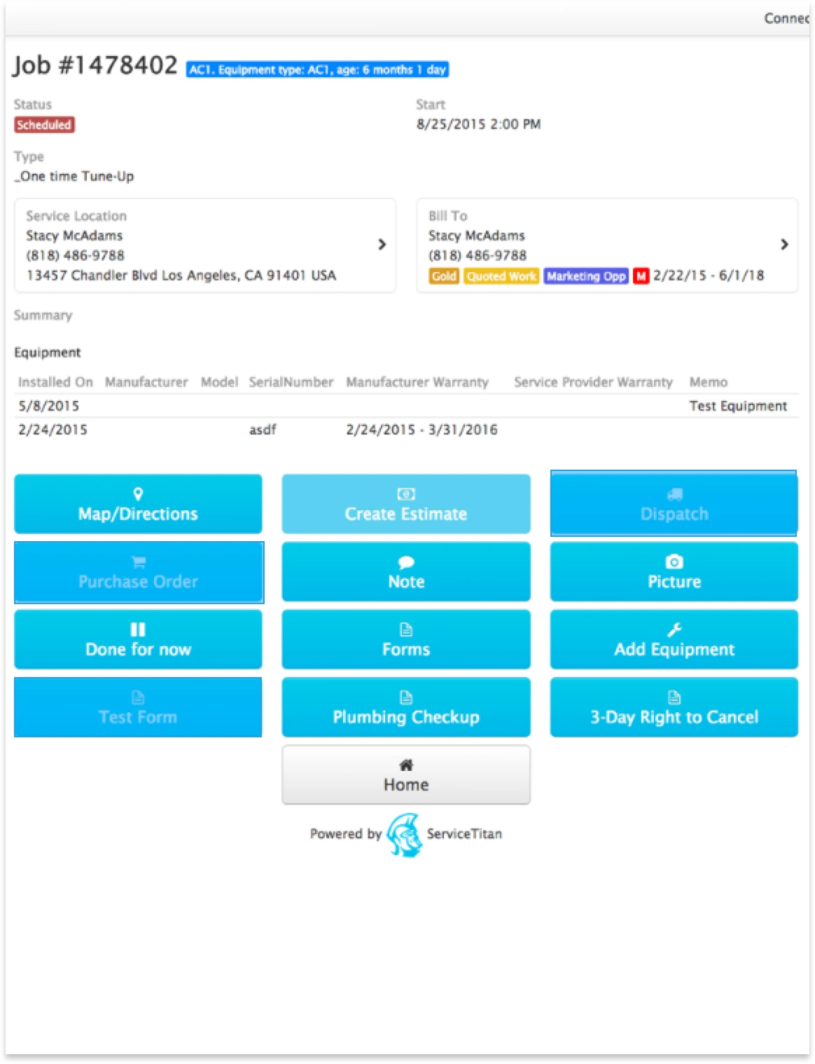
ServiceTitan's suite split across Desktop 1.0 (scheduling, invoicing, reporting, admin) and Mobile 1.0 (the tablet techs carried into homes for inspections, photos, quotes, payment, and receipts). The mobile app had grown feature-by-feature without an operational model behind it — and it was starting to slow the business down.
I joined as the first design resource, right after the Head of Product. The pitch I made to the founders: pause the feature treadmill and use the back half of 2015 to redesign Mobile end-to-end for a late January 2016 release.
Operational friction
Home services is a high-turnover industry. Every week a new technician had to learn an app that mirrored the database, not the job. Quoting required jumping between screens. Inspections lived apart from the photos that justified them. Payment was a separate mental model from the work that earned it.
The cost showed up as long ramp times, abandoned features, and techs falling back on paper in front of the customer.
Systems thinking
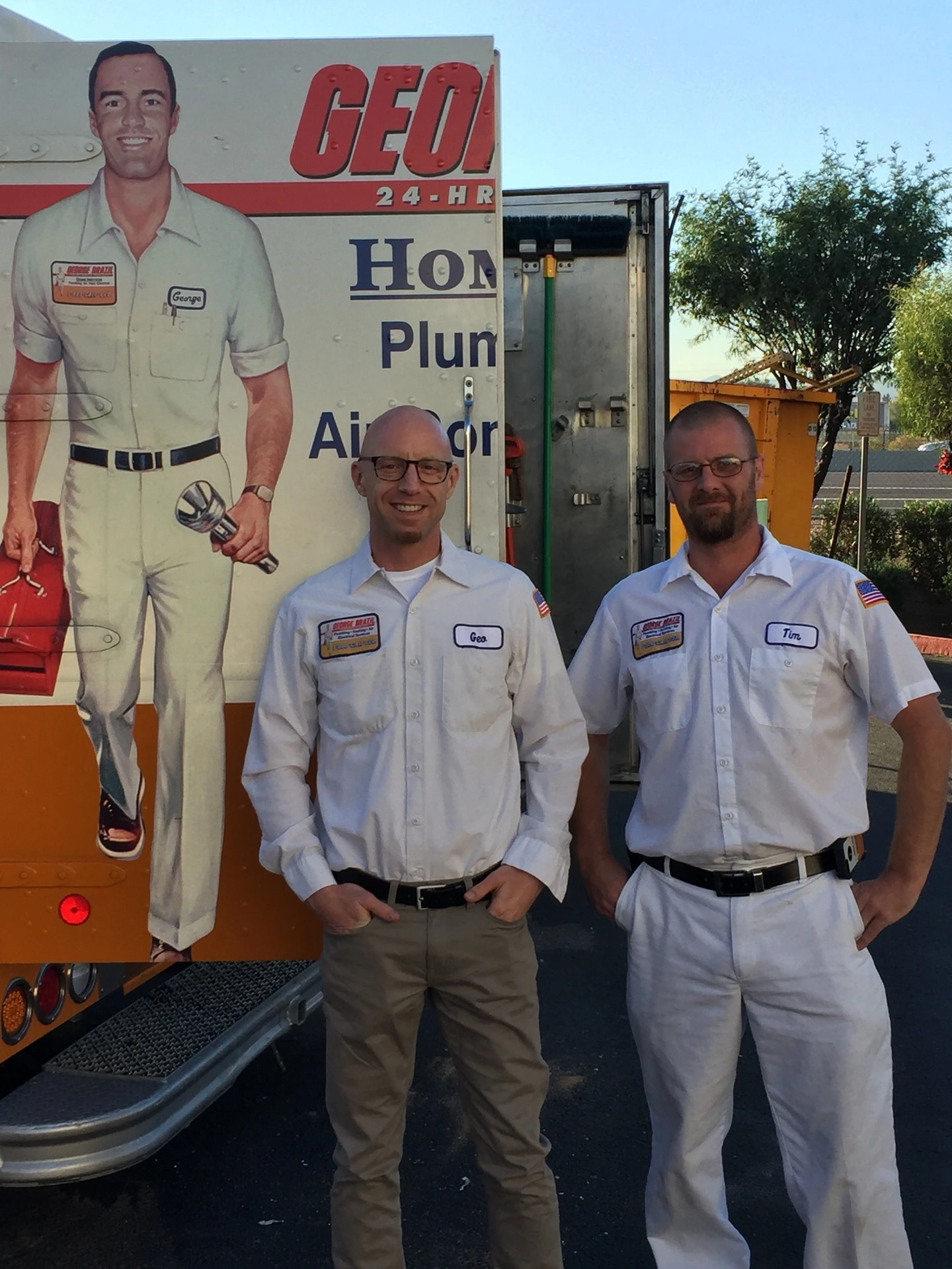
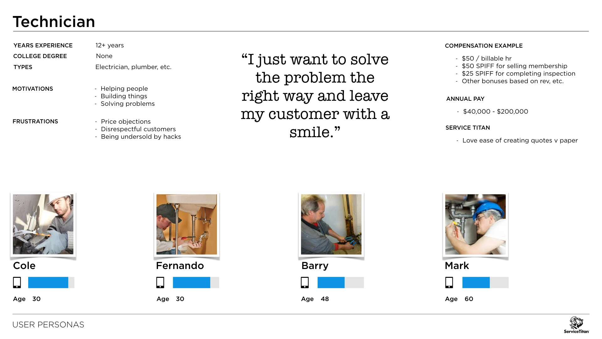
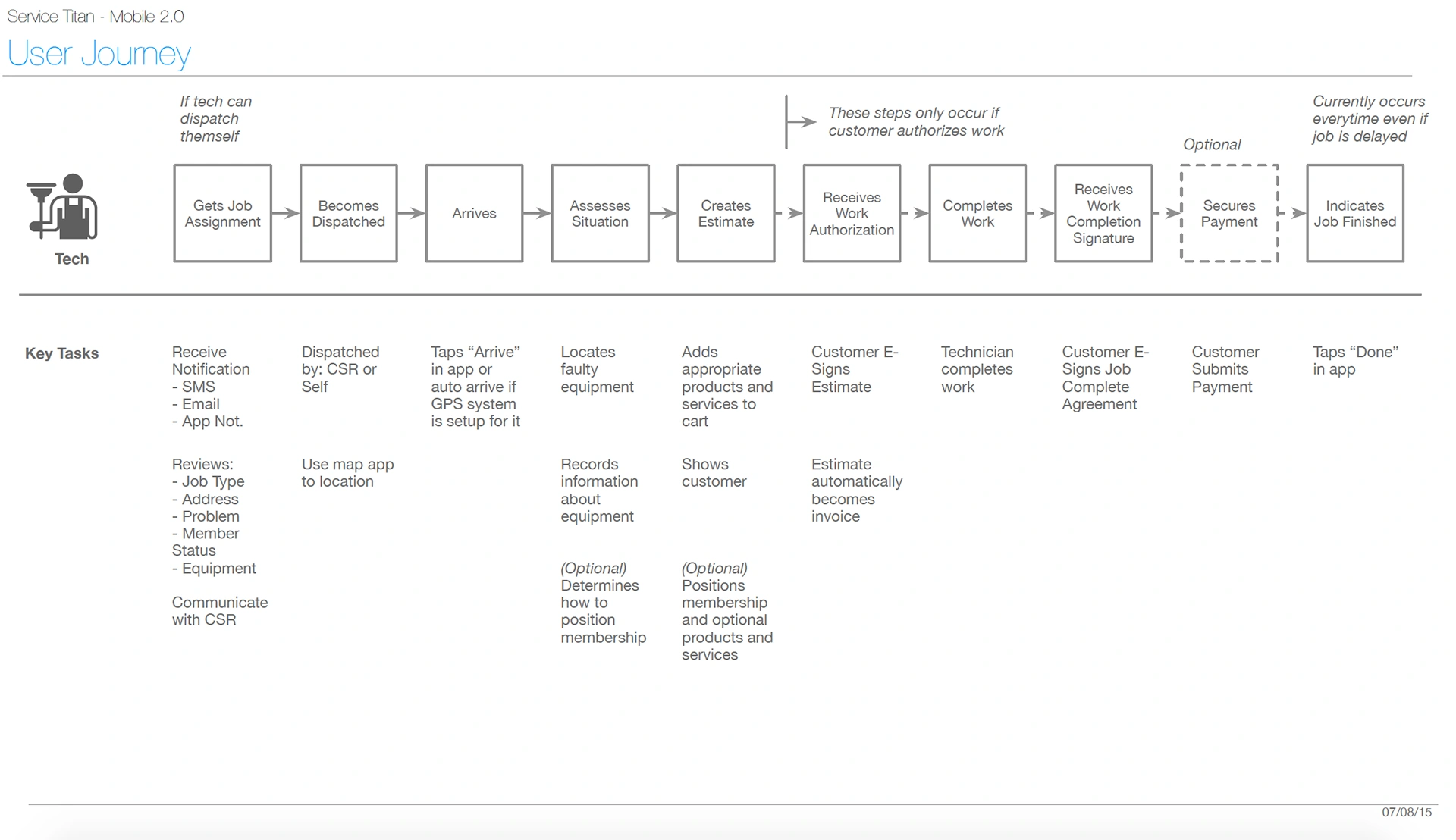
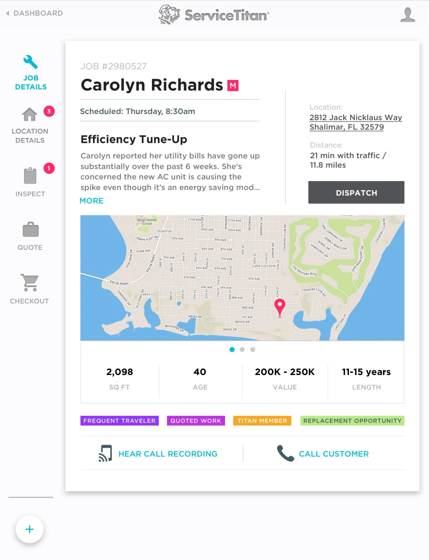
I spent two days riding along with plumbers and electricians — watching them use Mobile 1.0 in actual driveways, basements, and attics — and ran interviews across 20+ field techs plus industry consultants and customers. The unit of work wasn't "a screen," it was the visit: arrive, diagnose, quote, sell, do the work, collect, leave a paper trail.
That reframing — visit-as-workflow — became the spine of the 2.0 redesign and the user journey we validated against.
Key decisions
Pitch the rewrite, then earn it. Convinced the founders and CPO to fund a full Mobile 2.0 as a strategic bet, not a refresh. Scoped it to ship in ~6 months.
Ride-alongs before wireframes. Two days in the field with techs reshaped the IA. Observed behavior outranked stakeholder opinion in every disagreement.
Journey-first IA. Sitemap and navigation were derived from the validated technician journey, not from the existing database schema.
UX → UI handoff as a system. Partnered with the UI designer to build a shared pattern library alongside the redesign, so 2.0 shipped as a system the team could extend.
Workflow architecture
Technician visit — the unit of work
Arrive: customer + job context
Inspect: survey + photos
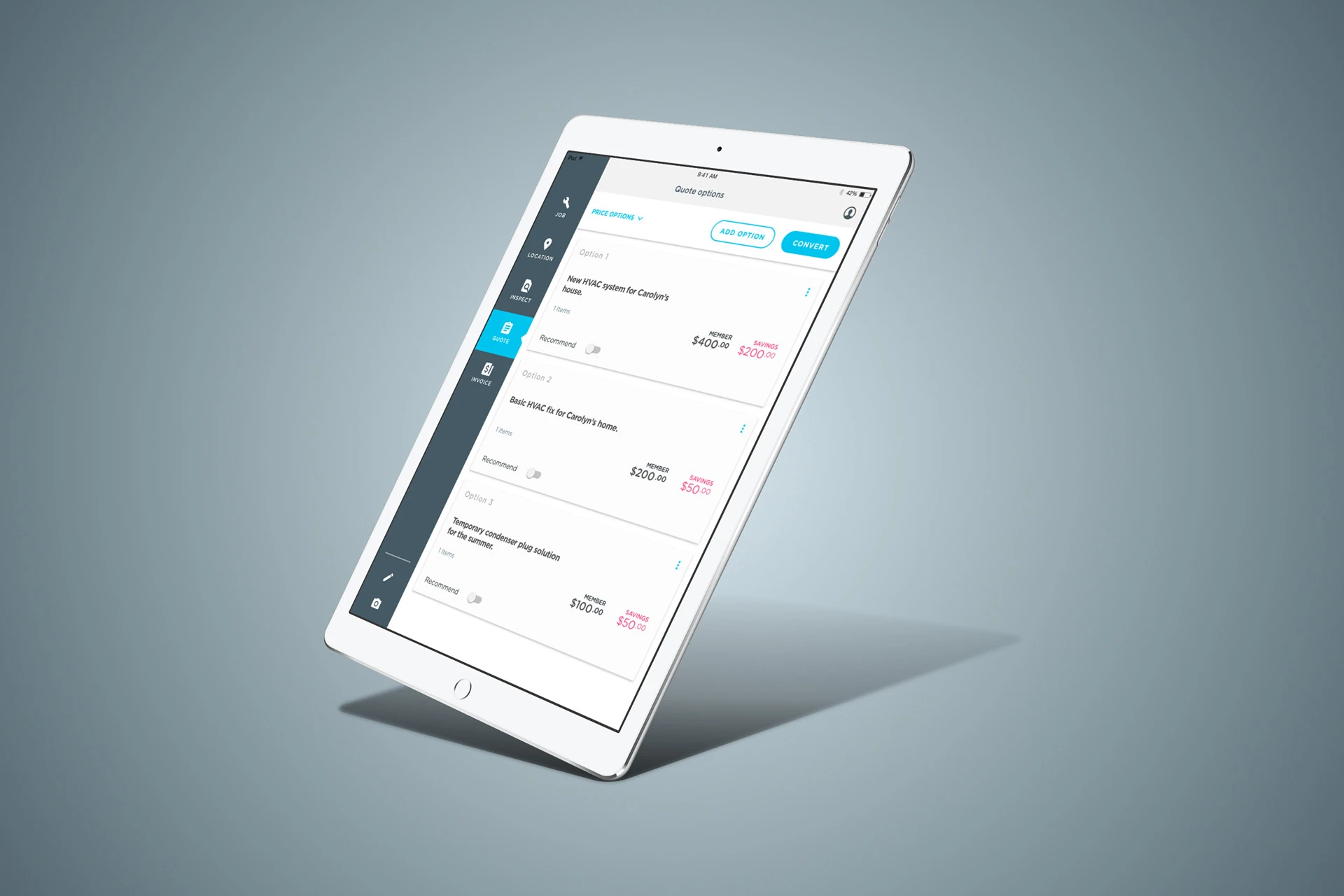
Quote: build + present
Sell: approve on tablet
Collect: payment + receipt
Outcome
Mobile 2.0 shipped on schedule. Time to train a new technician dropped by over 34% — a key metric for an industry where turnover is the operating cost. The pattern library built alongside the redesign became the foundation the mobile team kept extending after launch.
Observation
Ride along before you redesign
Two days in the field told me more about the workflow than two months of internal meetings would have.
Systems insight
Design around the visit, not the screen
When the app's structure matched the technician's job — not the database — training time collapsed.
Business impact
First design hire, strategic bet
The redesign was as much a stakeholder-management exercise as a design one: getting a young company to pause features and invest in the system.
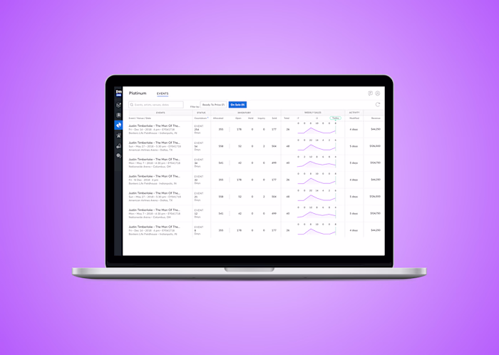
Selected artifacts
Like this project
Posted Jun 26, 2026
Redesigned ServiceTitan's technician tablet app to improve UI/UX and reduce training time.
Likes
0
Views
0