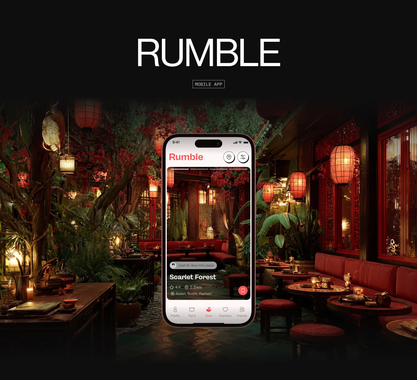
Rumble Food - Restaurant Discovery Mobile App
Anton Zalis
The problem
People are hungry. People are indecisive. And somehow, choosing a restaurant has become a 45-minute group chat, three Google Maps tabs, and one person saying “I’m fine with anything” (they are not).
Rumble set out to fix that.
The idea was simple: make discovering restaurants feel as easy and addictive as swiping on a dating app. No essays. No endless reviews. No analysis paralysis.
The idea
We treated food discovery like a game.
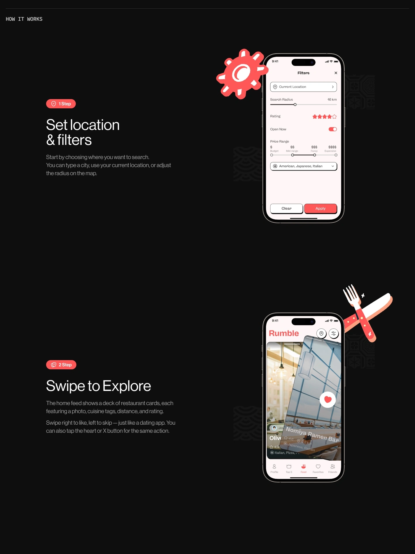
Swipe to explore.
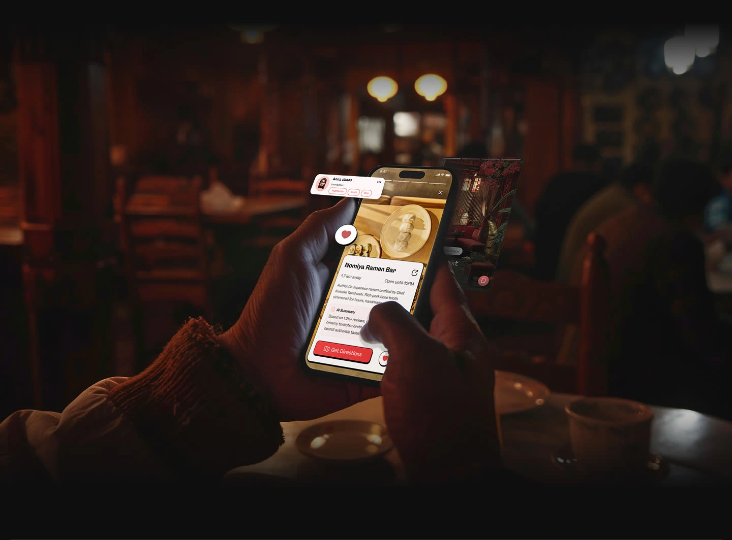
Tap to like.
Instant context.
Zero commitment.
Rumble blends speed, mood, and social signals into one clean, swipe-based experience that lets users decide in seconds, not minutes. If Tinder and Yelp had a very attractive, well-organized child, this would be it.
What we designed
We handled the full product experience, from brand identity to UI/UX and motion.
The interface was designed to feel:
Familiar instantly
Playful without being childish
Fast without feeling shallow
Every interaction is lightweight, intentional, and optimized for one thing: momentum.
Key features
Swipe-based restaurant discovery that feels natural and addictive
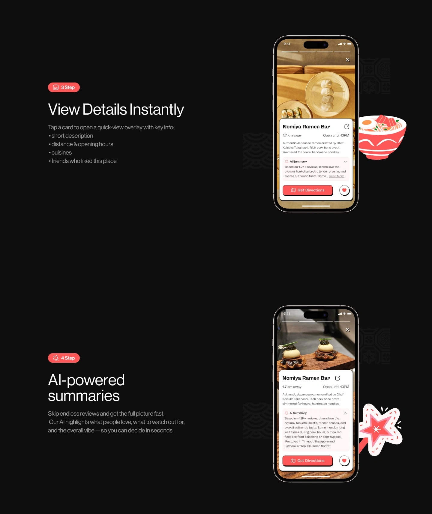
Instant detail views with just enough information to decide
AI-powered summaries that replace reading 200 angry reviews
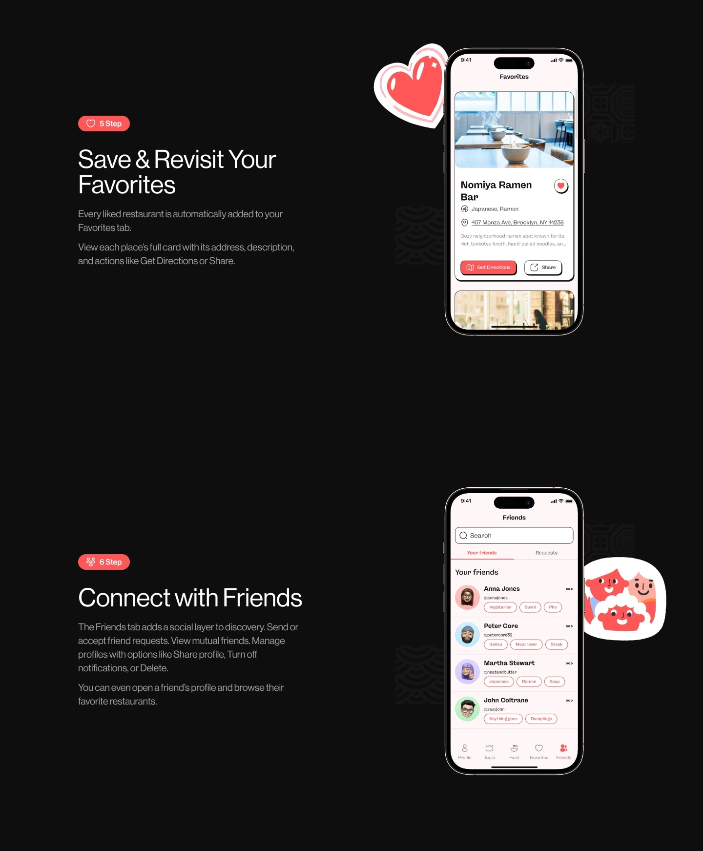
Favorites system for saving and revisiting places
Social layer to see what friends like (and judge them silently)
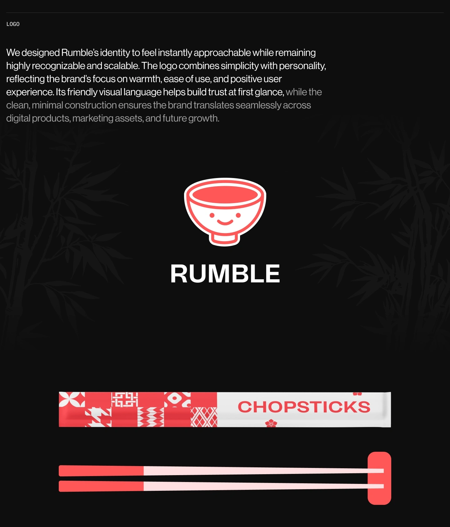
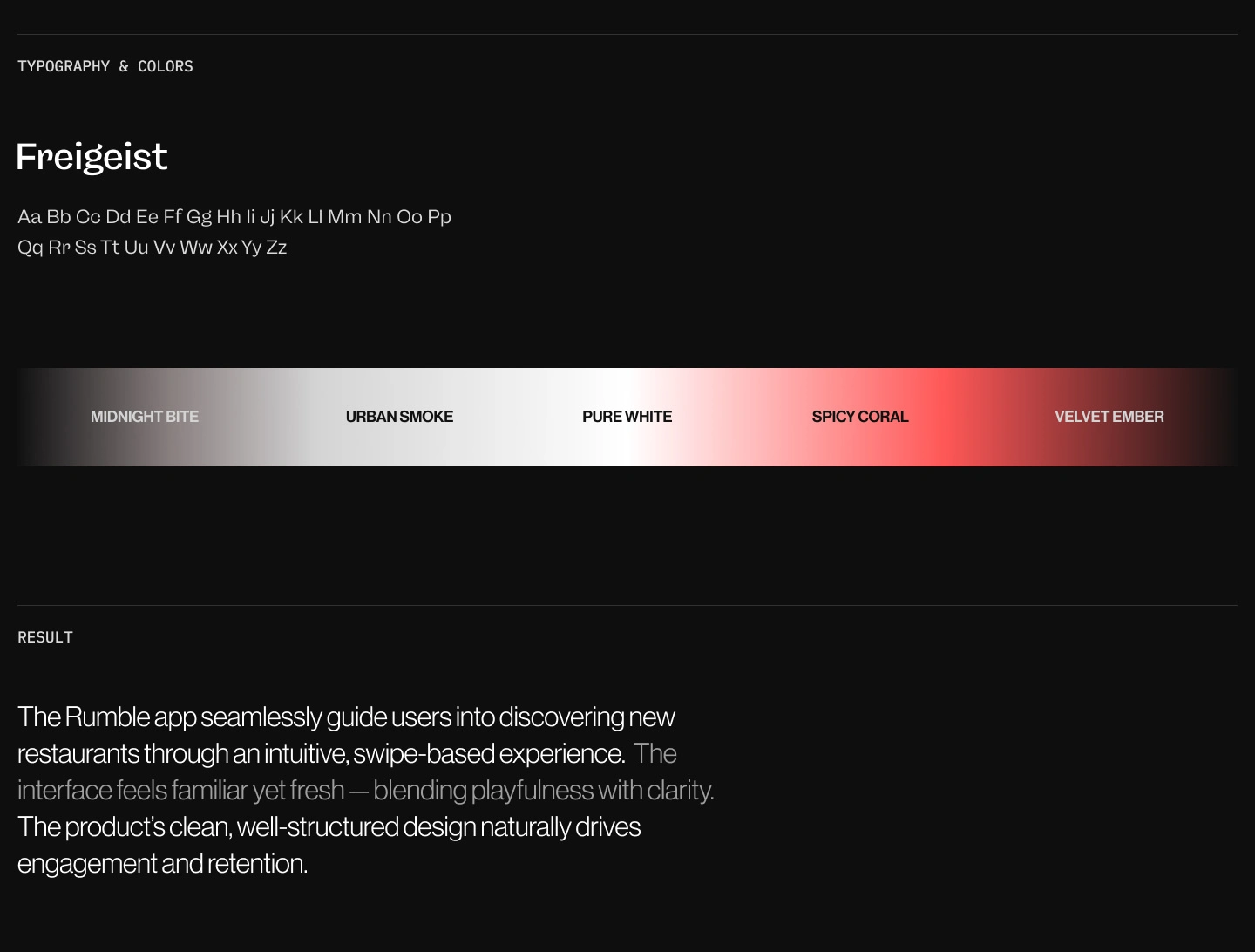
Branding & visual language
The brand had to feel friendly, warm, and recognizable without turning into a food emoji explosion.
We designed a logo that’s simple, expressive, and scalable, supported by a bold but controlled color palette and clean typography. The result feels approachable on day one and strong enough to scale into a real product ecosystem.
The result
Rumble turns restaurant discovery into something people actually enjoy. The app feels fast, intuitive, and oddly satisfying to use, encouraging exploration without overwhelming the user.
Instead of asking “Where should we eat?”
Rumble quietly answers it.
Why this project matters
Rumble is a perfect example of our product-first approach. We didn’t design screens, we designed behavior. The result is an app that feels obvious in hindsight, which is usually a very good sign.
Like this project
Posted Jan 26, 2026
Rumble is a swipe-based app that makes finding restaurants fast and fun, using smart summaries and social signals to eliminate food decision fatigue.
Likes
0
Views
16