Brand Identity for Premium Bakery
Nabha Shetye
Client: Angels in My Kitchen
Objective: Develop a cohesive, whimsical, and memorable brand identity that reflects the brand's premium, artisanal bakery offerings while fostering an emotional connection with customers.
The Brand Concept: "Touched by Angels"
The core identity of Angels in My Kitchen is built not just as a bakery, but as an experience that brings a touch of magic and warmth to everyday indulgence.
Design Strategy
The visual identity employs a whimsical and illustrative aesthetic that sets it apart from traditional, minimalist bakery branding.
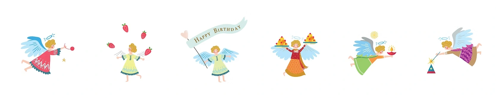
Illustrative Storytelling: Central to the design are recurring character illustrations of angels. These figures appear throughout the packaging and collateral, acting as brand ambassadors that reinforce the name and add a sense of playful charm.
Color Palette: The brand utilizes a vibrant, high-contrast palette (pinks, oranges, yellows, and teals) to evoke feelings of joy, celebration, and appetizing warmth.
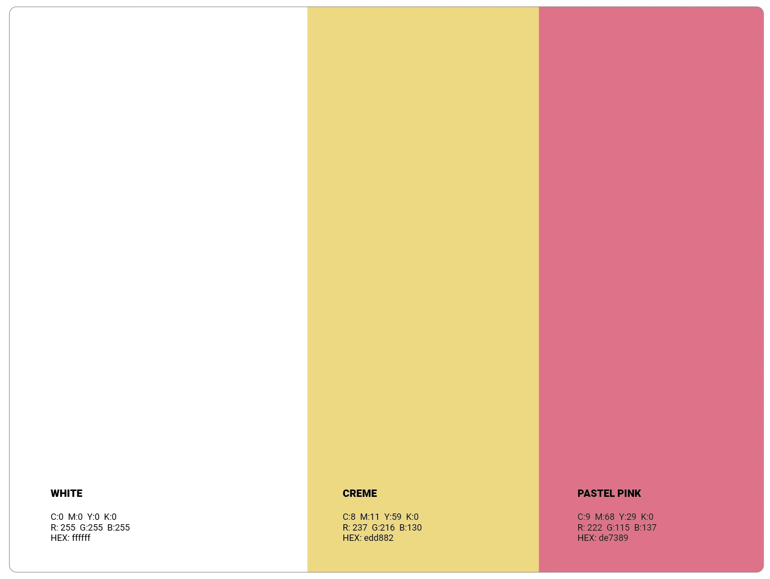
PRIMARY COLOUR PALETTE
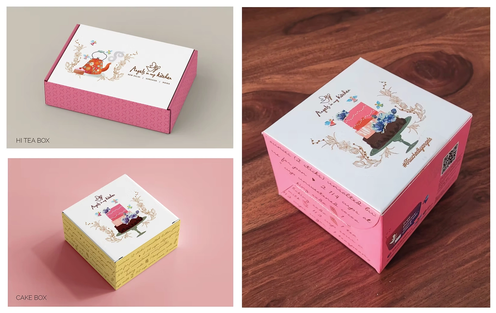
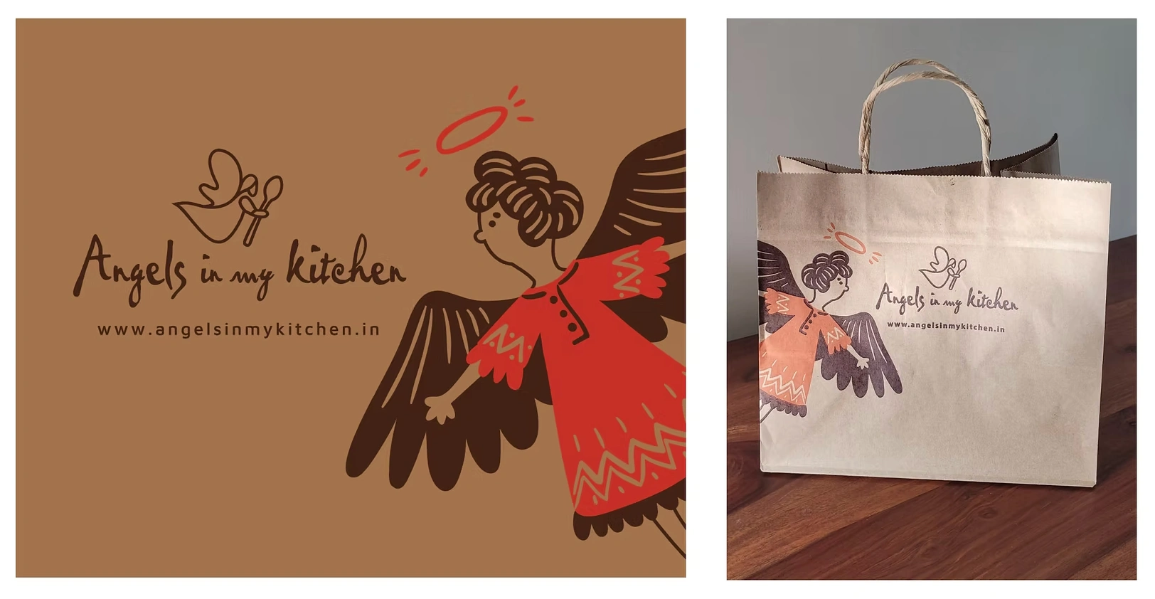
Packaging Architecture: From custom-designed cookie and chocolate sleeves to tiered cake boxes, the packaging balances functionality with decorative flair. The use of intricate line-art, "angelic" motifs, and recipe-style text on box sides creates a premium, giftable feel.
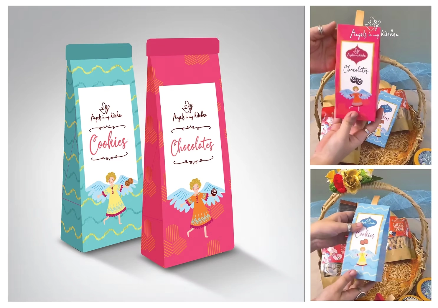
CHOCOLATE PACKS
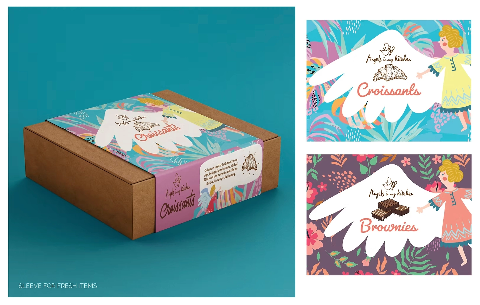
PACKAGING SLEEVES
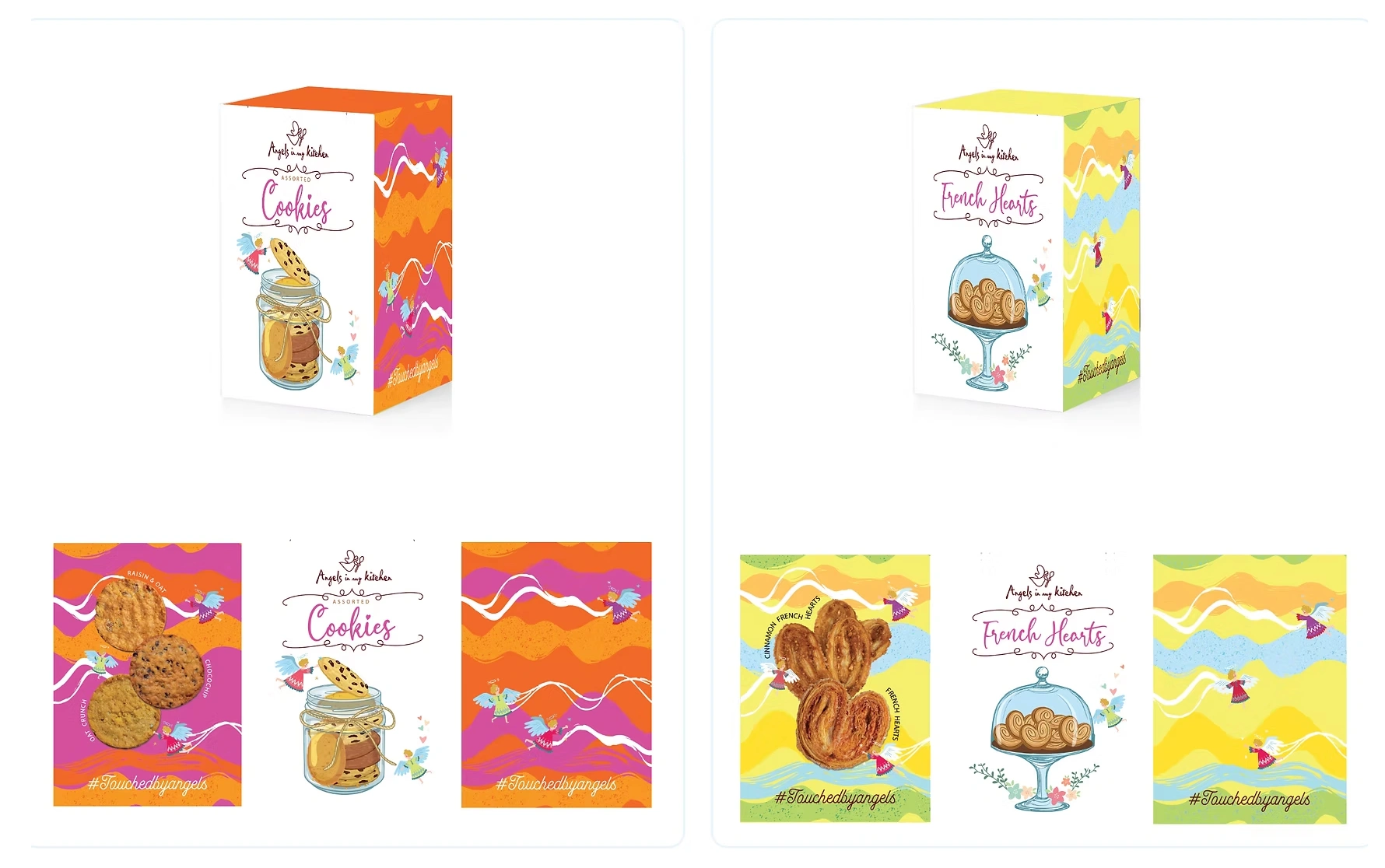
COOKIE BOX DESIGNS
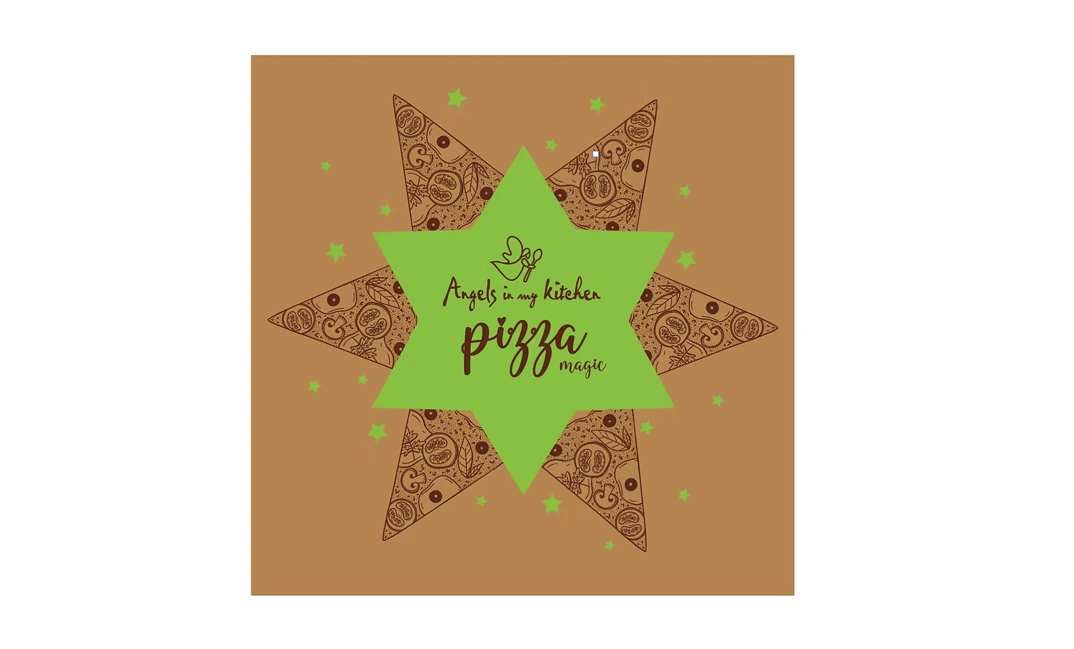
PIZZA BOX
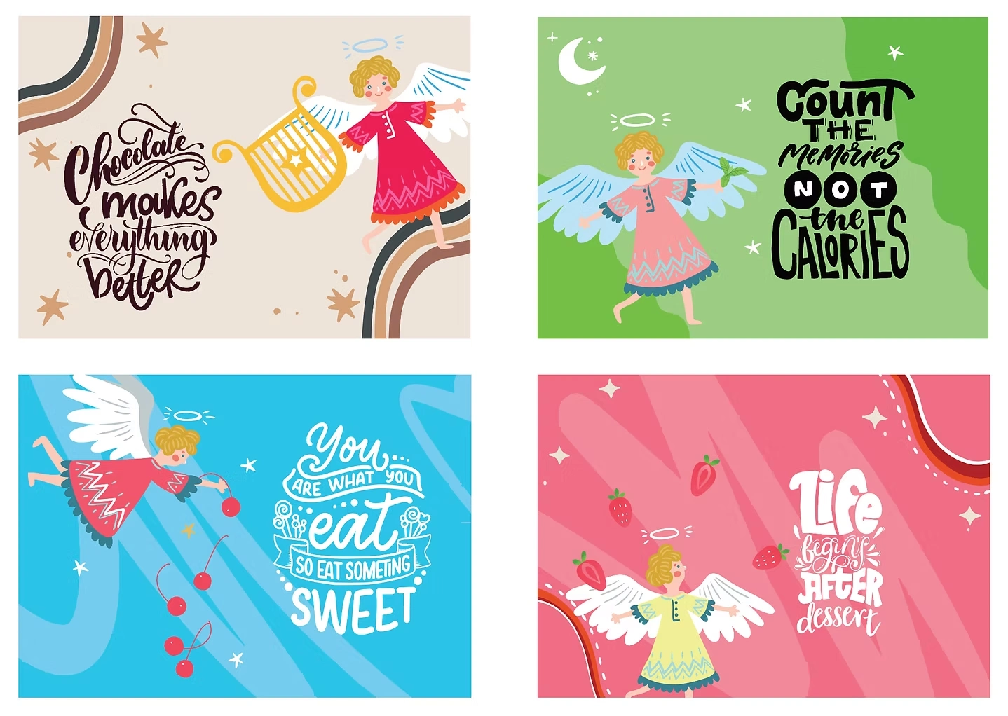
PLACEMATS
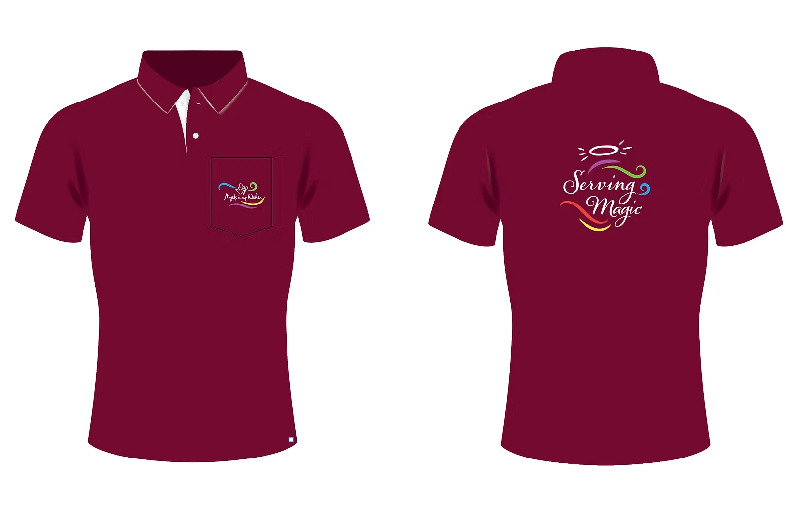
STAFF UNIFORM
The resulting brand identity succeeds in turning every product package into a "gift." By blending high-quality graphic storytelling with a warm, celebratory tone, Angels in My Kitchen has effectively established a distinct visual language that is instantly recognizable.
The Cakebox design has been loved by the customers and remains in circulation unchanged for more than the last 10 years.
Like this project
Posted May 22, 2026
Created a memorable, whimsical brand identity for Angels in My Kitchen bakery.
Likes
0
Views
2