NutmegLabs Interactive Map UI
Nutmeglabs Map Animation Interface
Nutmeg helps all in the tourism and leisure industry with IT services that improve the customer experience. They operate in San Francisco and Tokyo.
Their challange was to create a new, updated mobile UI/UX of existing digital booking experiences. Thanks to their team, they clearly told me all the necessary informations, as well as reference apps.
I conducted some some competitor analysis and current user behaviours on app. Analyzed similar competitors like Disneyland, Sixflags and other similar applications like Google maps.
Project Milestones were:
1. Analysis and Conceptualization (Day 1): A thorough examination of the existing prototype and alignment of design concepts with the Disneyland app-inspired theme.
2. Design Iterations (Days 2-2.5): Crafting intuitive and engaging screen designs, focusing on the main map screen, interactive info window, item information pane, search interface, filter pane, and showtimes layout.
3. Feedback and Revision (Day 3): Getting feedback from client and potential users and making necessary revisions to ensure the design aligns seamlessly with NutmegLabs' vision and goals.
The presentation:
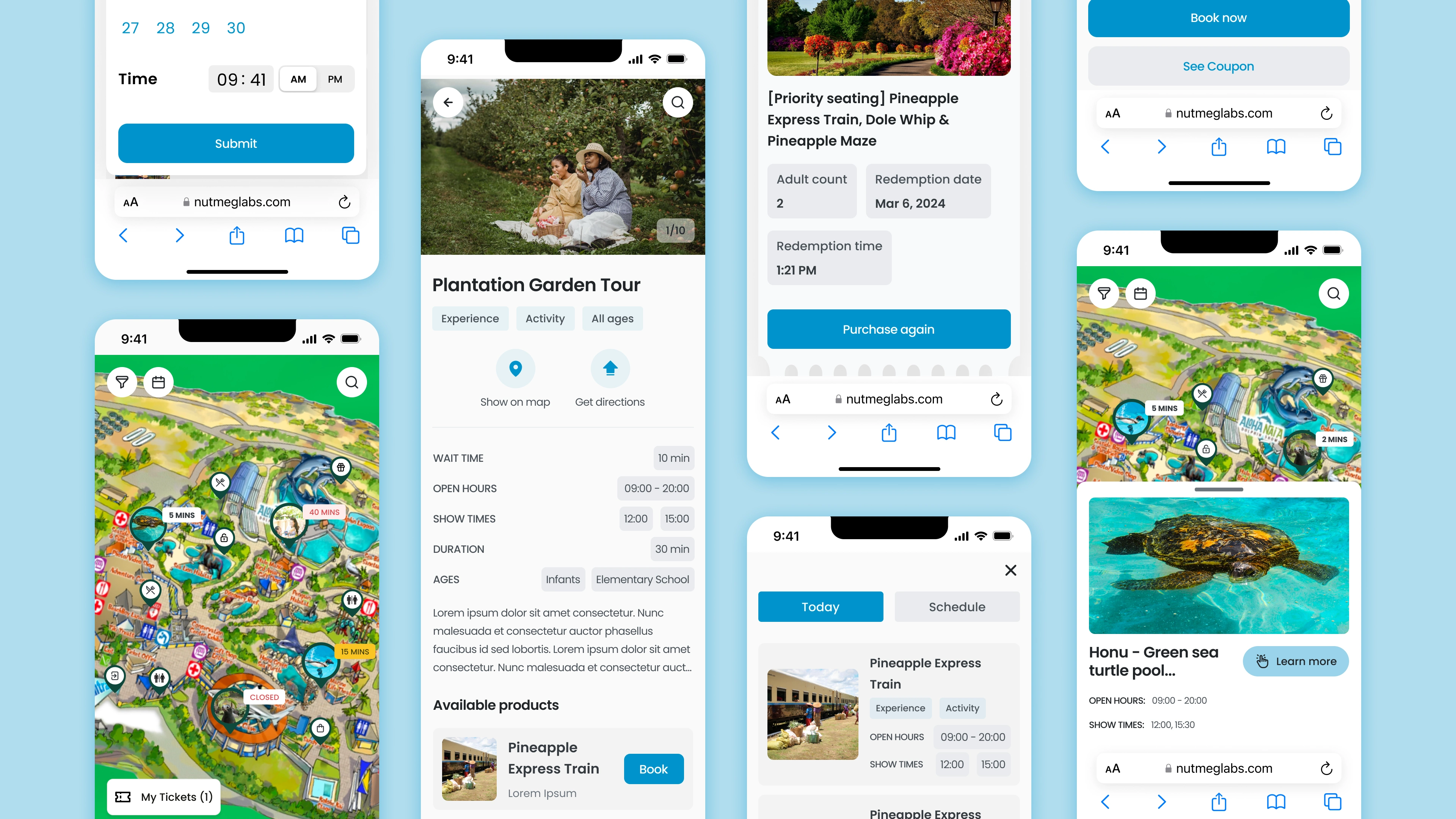
Nutmeglab Application Interfaces
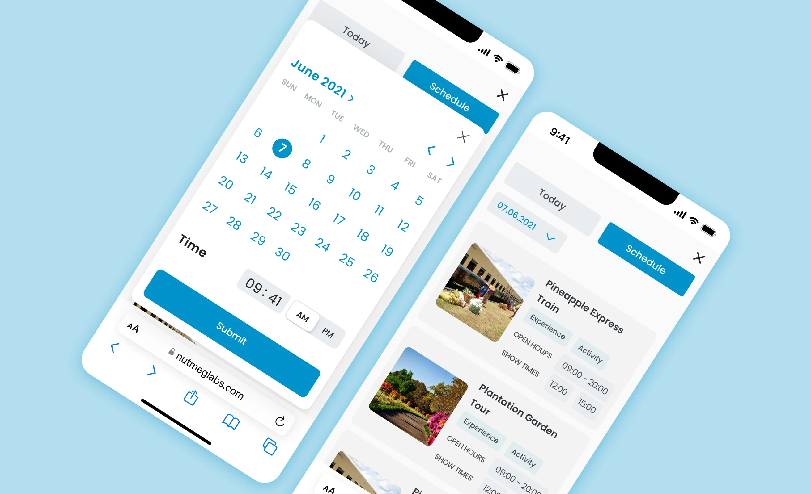
Calendar and Events
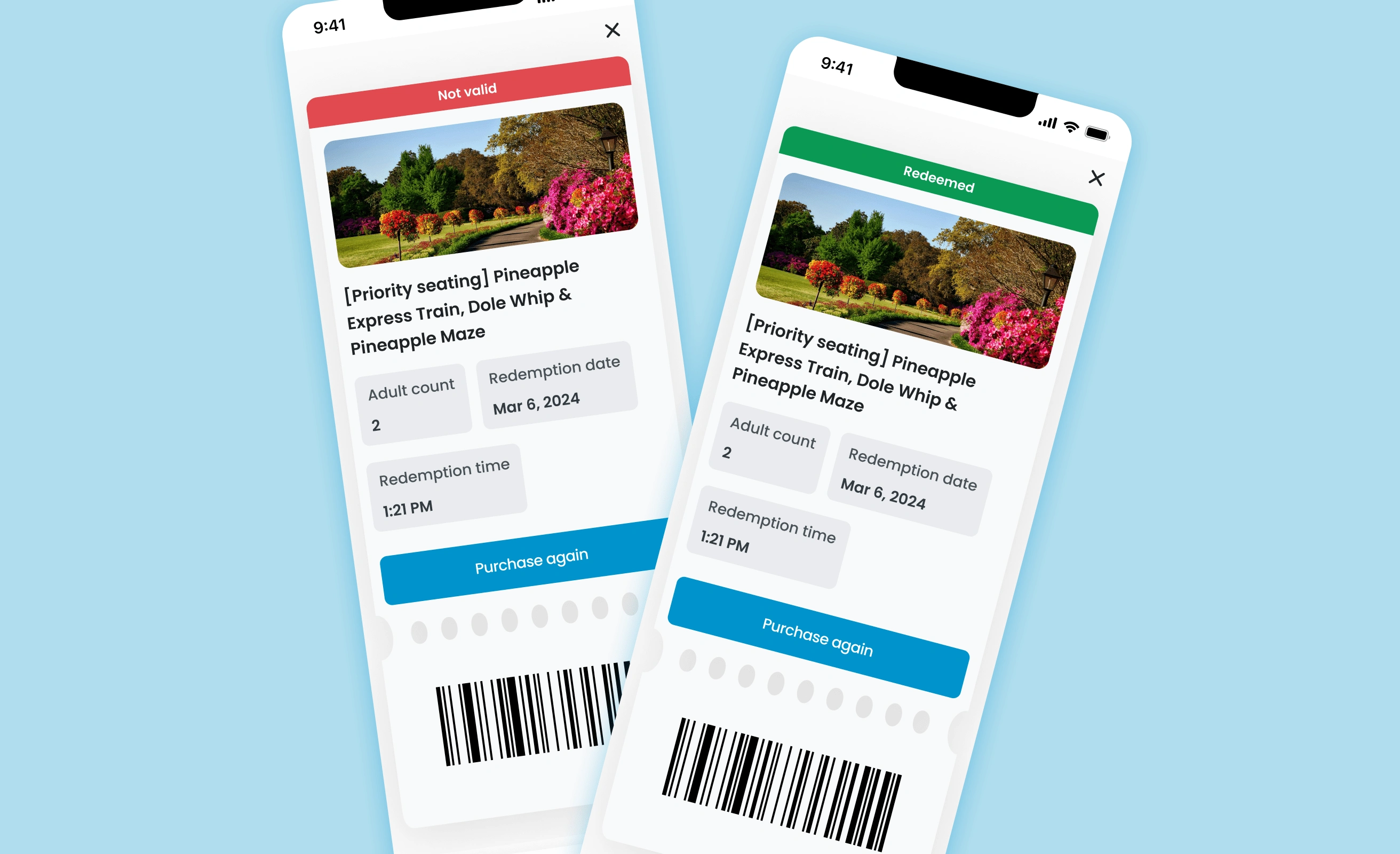
Digital Tickets
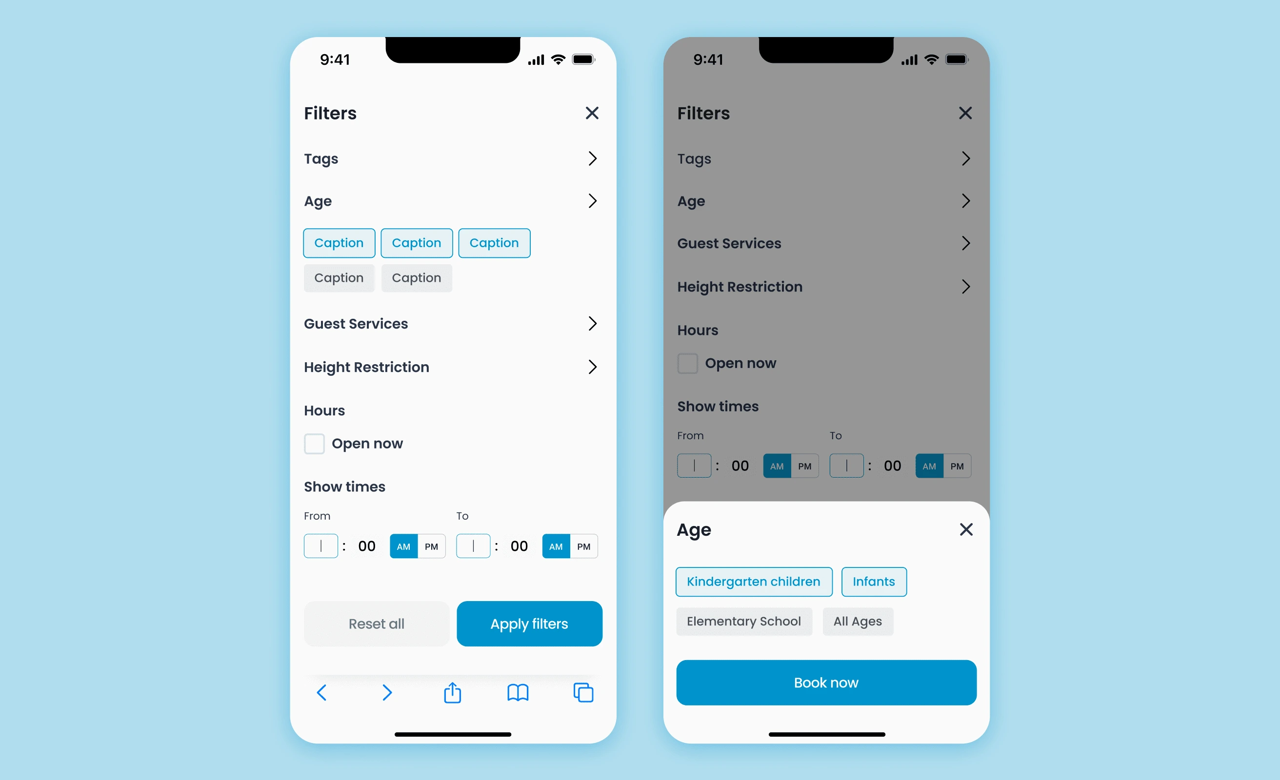
Filters
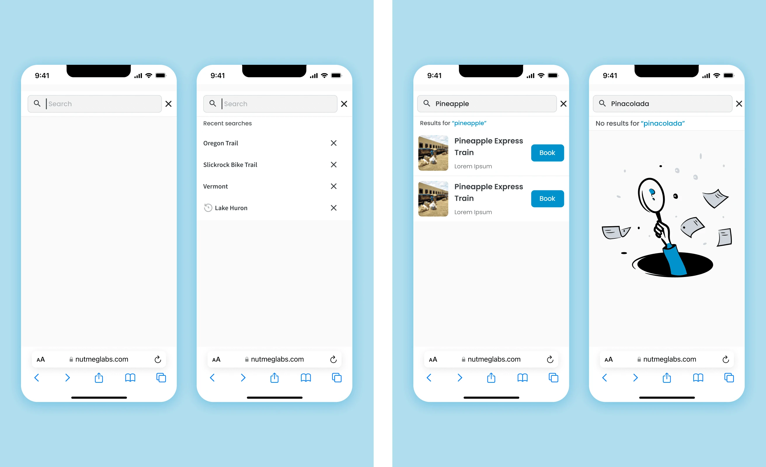
Search
Thanks for your attention :)
Want to start your new project or improve existing one?⚡️💥 Want someone to deep dive into your product and be your team member?✅
Reach me now to discuss your project🪄🙌🏻
Contact:
jeihunalizadeh@gmail.com
https://calendly.com/jeihunalizadeh/discussing-your-project
Like this project
Posted May 7, 2024
Nutmeg helps all the tourism/leisure industry with IT services that improve the customer experience. My mission was to improve the UI/UX of the digital booking.
Likes
3
Views
120
Timeline
Mar 22, 2024 - Apr 1, 2024
Clients
NutmegLabs

