Built with Webflow
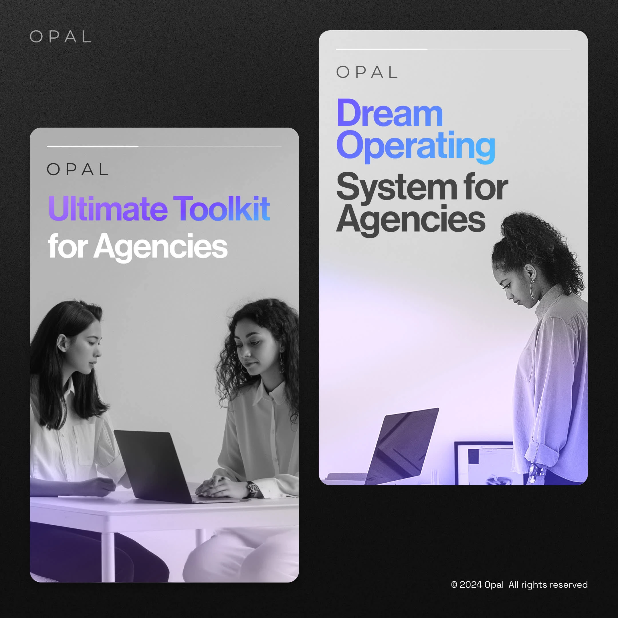
GetOpal: Interactive Webflow Website
Anuj Singhwal
Overview
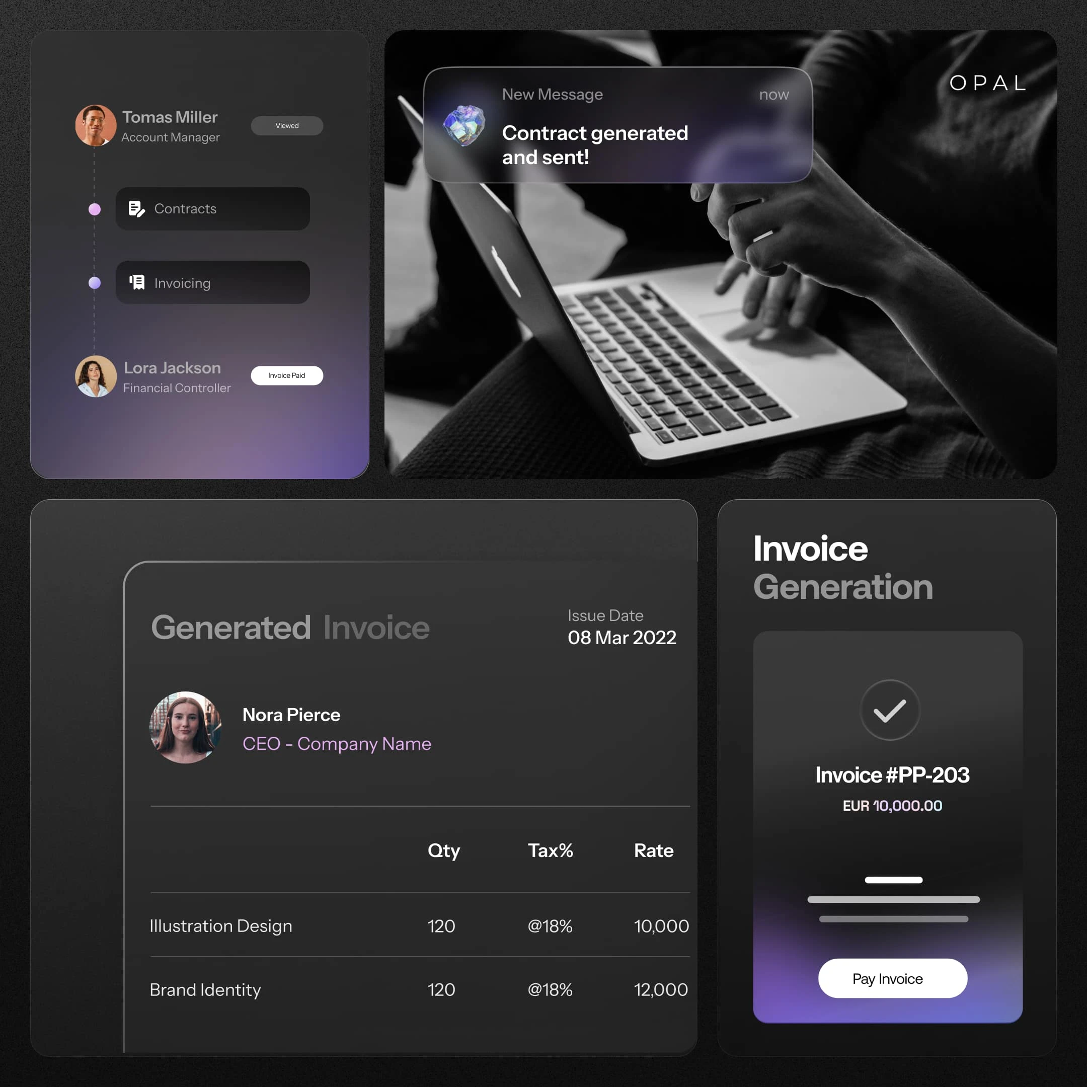
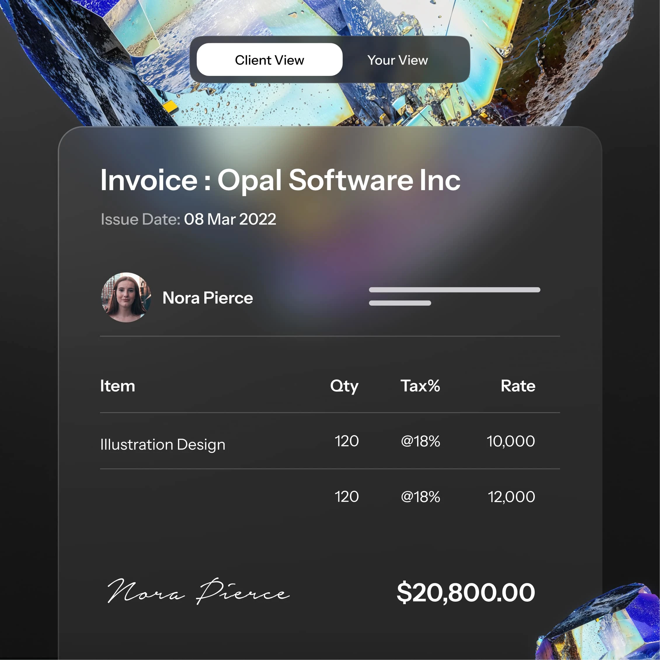
Opal, a platform designed to automate back-office operations for creative agencies, approached us with a clear goal: to develop a brand identity that could communicate simplicity, efficiency, and innovation, all while resonating with the creative pulse of its target audience. The brand needed to feel as dynamic as its mission—empowering agencies to focus on the work that matters by seamlessly handling operational tasks in the background.
Challenge
The challenge was to visually represent automation in a way that felt organic and inspiring rather than technical or rigid. Opal wanted an identity that would resonate with agency owners and creatives, capturing both the sophisticated and efficient nature of the platform while embodying the vibrant, innovative spirit that defines the creative industry.
Solution
Drawing inspiration from the opal gemstone, we crafted an identity centered around its iconic, vibrant play of color. The opal became the brand's signature visual element, symbolizing clarity, depth, and transformation.
For Opal’s brand identity, we harnessed the mesmerizing, prismatic allure of the opal stone to embody the platform’s purpose: bringing clarity and efficiency to complex back-office operations for agencies. The opal serves as a visual anchor, with vibrant, shifting colors representing Opal’s transformative approach to automation. Just as opals reveal hidden depth through color and light, Opal’s platform simplifies hidden layers of work, empowering agencies to streamline tasks with elegance and ease. This identity not only reflects functionality but also communicates Opal’s commitment to fostering creativity and focus, letting agencies shine where it matters most.
Like this project
Posted Nov 21, 2024
Opal, a platform designed to automate back-office operations for agencies. Pixeto helped Opal with Branding and Strategic Webflow Website.
Likes
0
Views
23