BCAM Annual Report Design
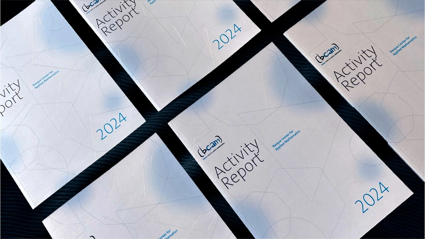
I had the opportunity to design the Annual Report for BCAM – Basque Center for Applied Mathematics, a publication that gathers the center’s projects, initiatives, and achievements throughout 2024.
The main goal was to transform complex, data-heavy content into a visually engaging and accessible narrative. The design balances BCAM’s corporate identity with a more contemporary and dynamic approach: a clean and well-structured layout, a strong typographic hierarchy, and a color system based on bright gradients that bring rhythm and personality to the information.
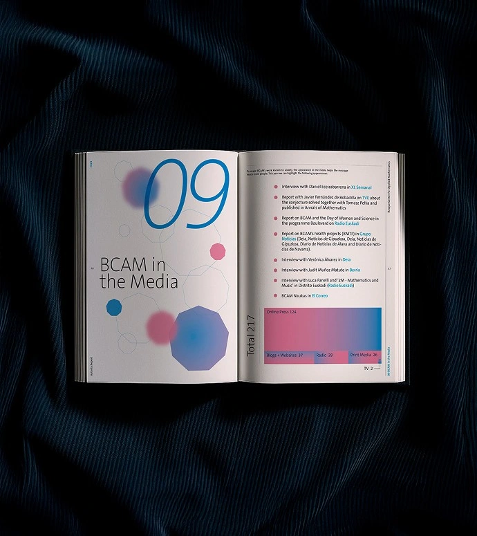
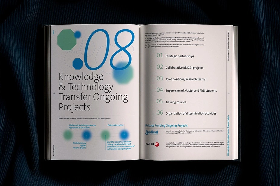
Custom icons and geometric graphics were developed to represent different research areas, making the content easier to read and visually cohesive while reflecting BCAM’s innovative spirit.
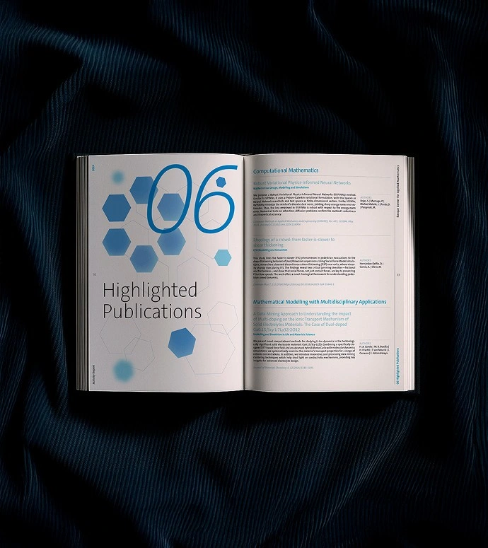
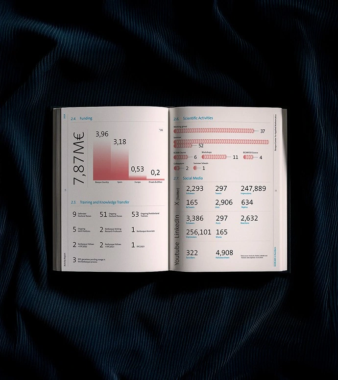

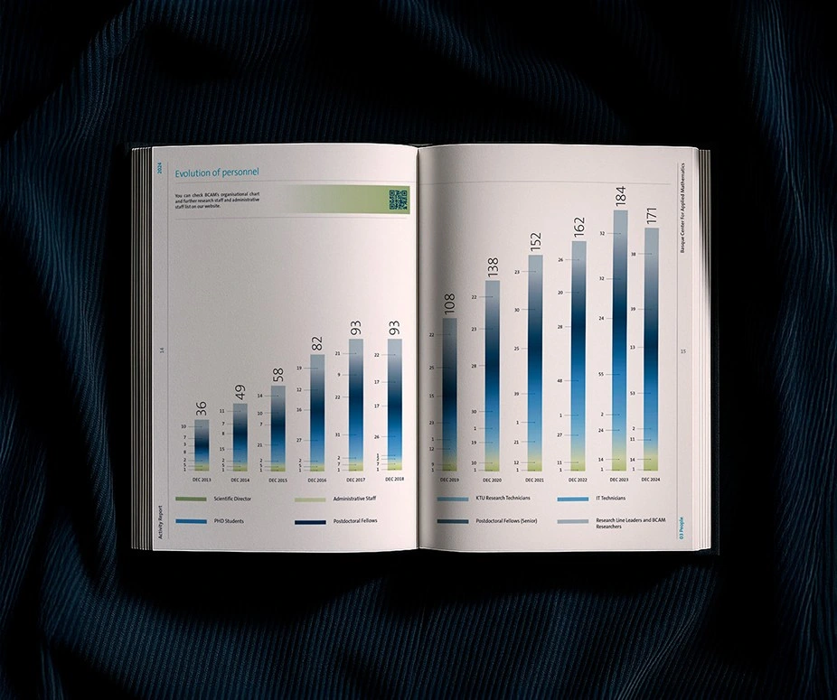
A clear, modern, and visually distinctive publication that turns data into a dynamic visual story. Celebrating a year of scientific achievement through design.
Like this project
Posted Jan 20, 2026
Designed a visually engaging annual report for BCAM – Basque Center for Applied Mathematics

