Jetkryp: Website & Brand Identity Design
Overview
Jetkryp, formerly JKCryptohub, has set out to revamp its overall experience and brand identity. The goal is to become a top player amongst its niche competitors and in the fast-paced crypto trading market. The challenge was creating a brand and website experience that captured the essence of speed, efficiency, and innovation.
Objectives:
Rebrand JKCryptohub to Jetkryp:
Develop a Brand Strategy for Jetkryp
Develop a new name that captures the essence of speed and crypto trading.
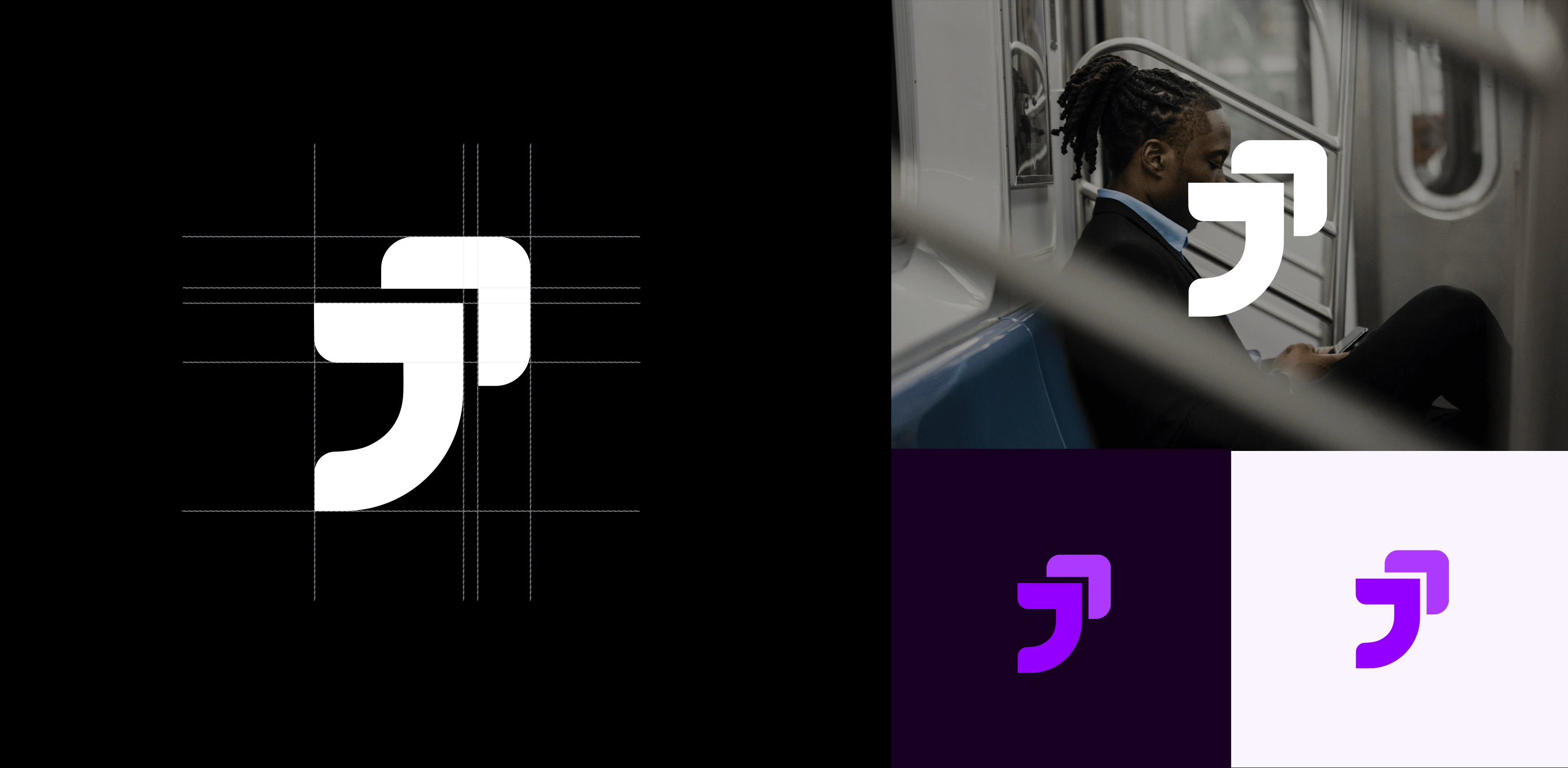
Create a memorable and impactful logo.
Design a Cohesive Visual Identity:
Establish a modern and dynamic visual language that resonates with crypto enthusiasts, tech professionals, and Gen Z.
Ensure brand consistency across all platforms, including the website, mobile app, and social media channels.
Enhance Brand Perception:
Position Jetkryp as a trusted and efficient platform for buying, selling, trading, and swapping cryptocurrencies.
Communicate the brand's commitment to innovation and user-centric design.
Website Experience
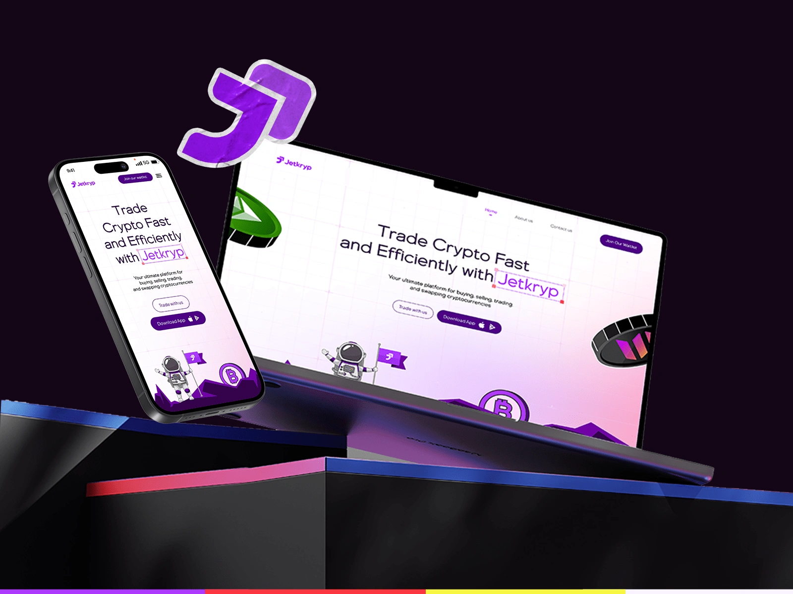
A website design that captures the brand's essence, features and offerings.
Process & Deliverables
Conducted extensive research of the market, competitor analysis, and audience insights. This resulted in the crafting of conceptual directions and brand strategy for the brand.
Logo Design
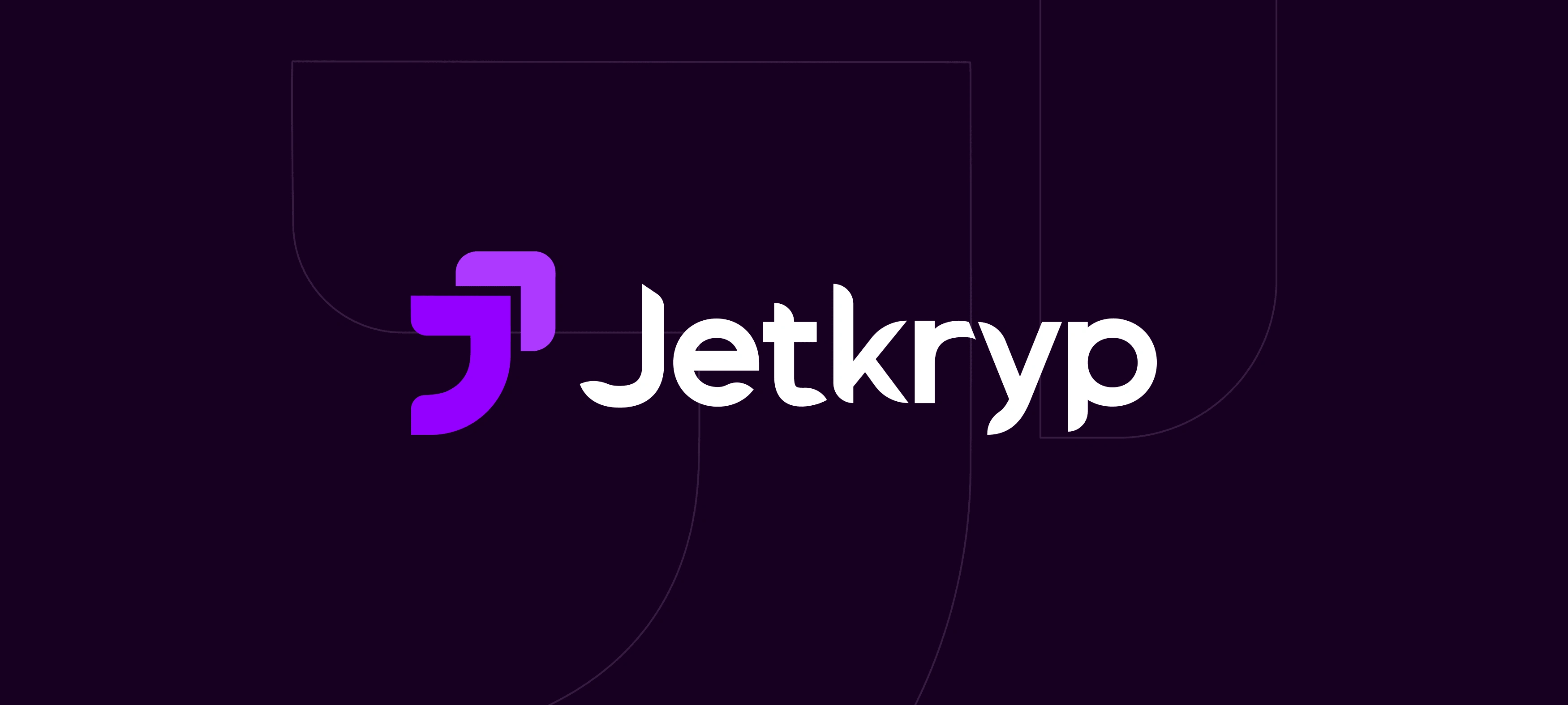
"Jetkryp" to emphasize speed (Jet) and crypto (Kryp).
Jetkryp's Imagery & Experience

The product “Jetkryp” designed to rejig the way crypto enthusiasts buy sell, and trade cryptocurrencies, with an emphasis on security, speed, efficiency, intuitive user experience and unmatched support, aims to become the go-to solution for all.
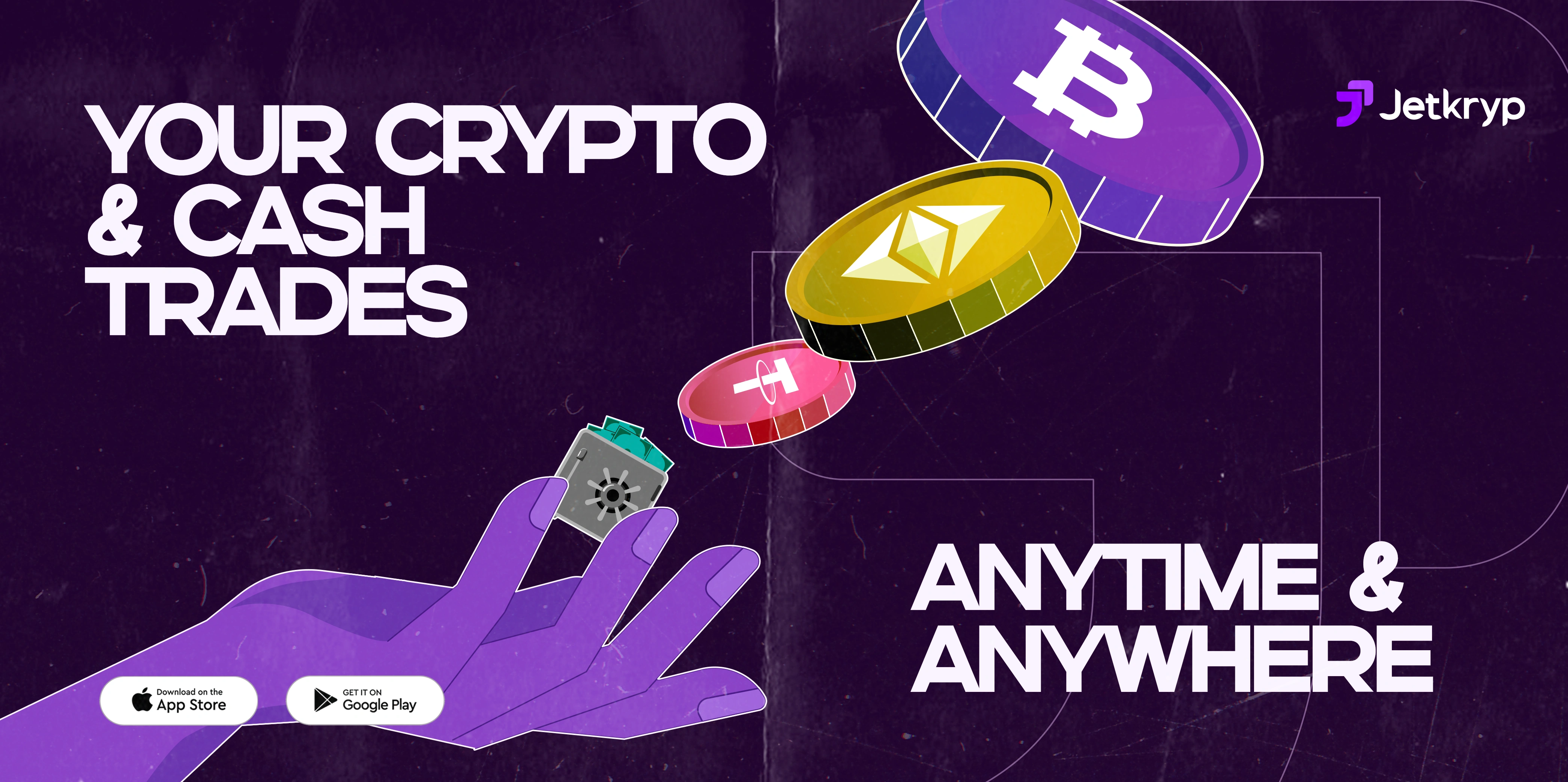
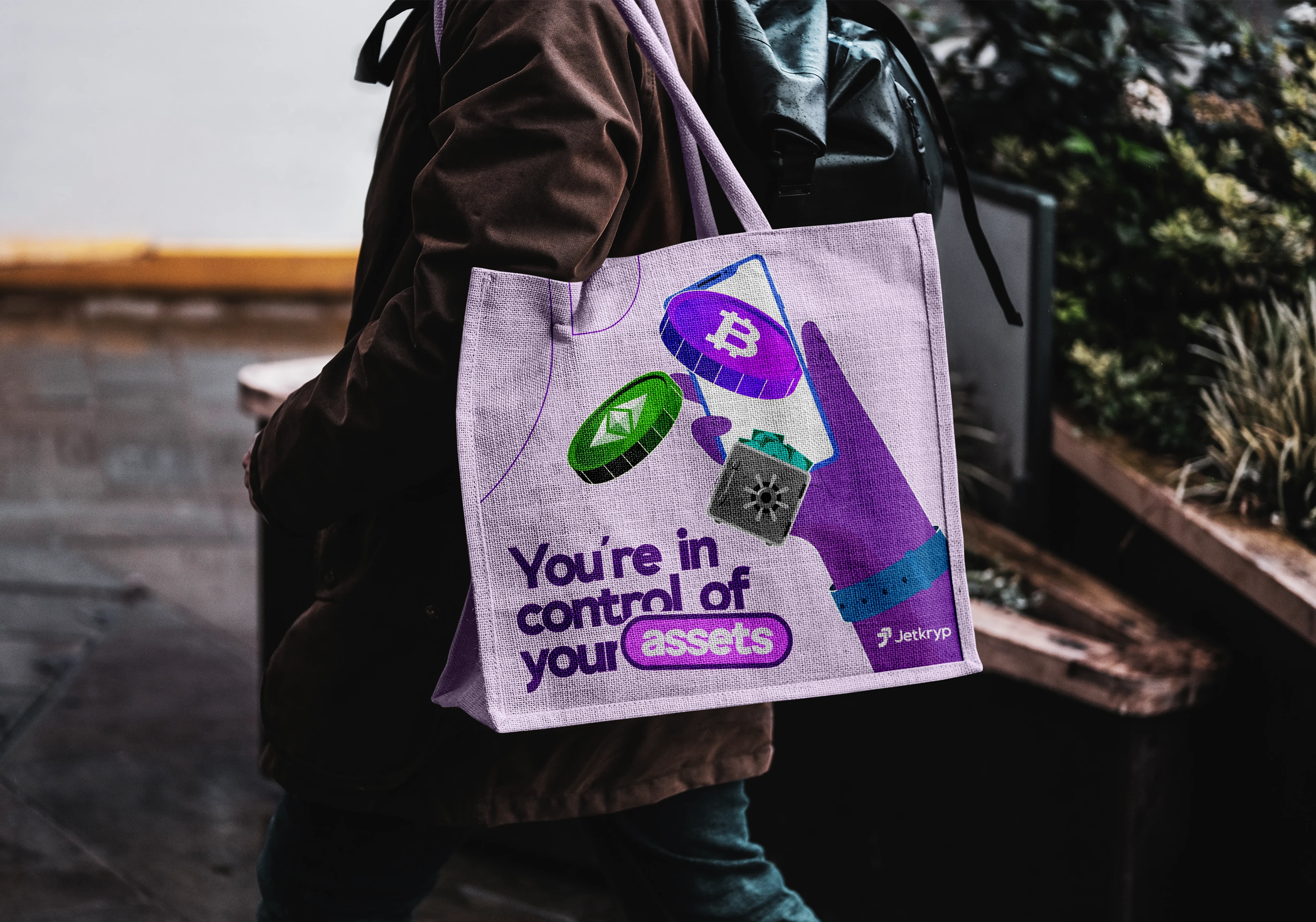
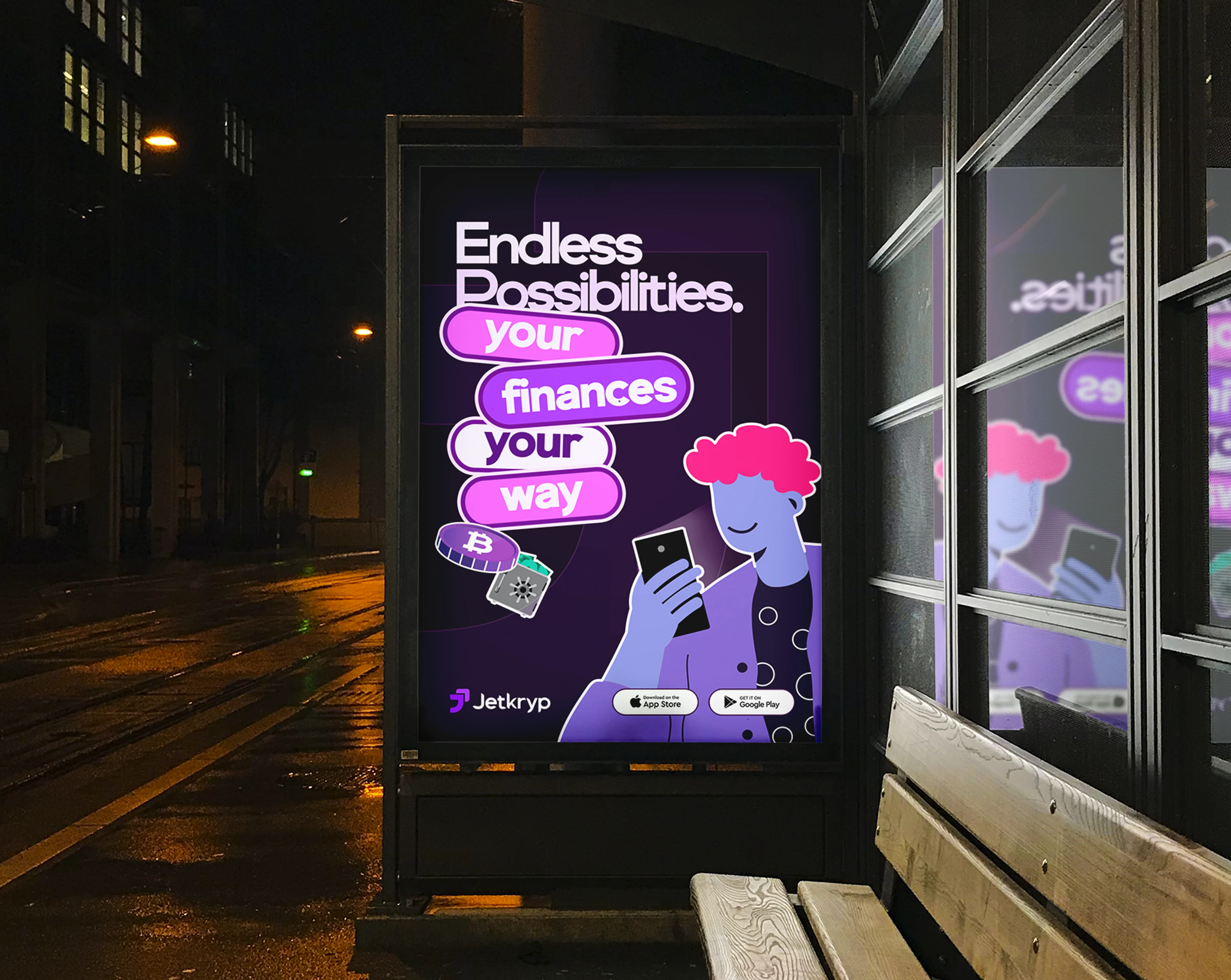
Jetkryp's Imagery is centered around the use of bold elements and colors with high contrast giving a Neubrutalism feel and also the introduction of human images to portray relatable emotions and scenarios.
Visual Identity
Brand Colour & Typography
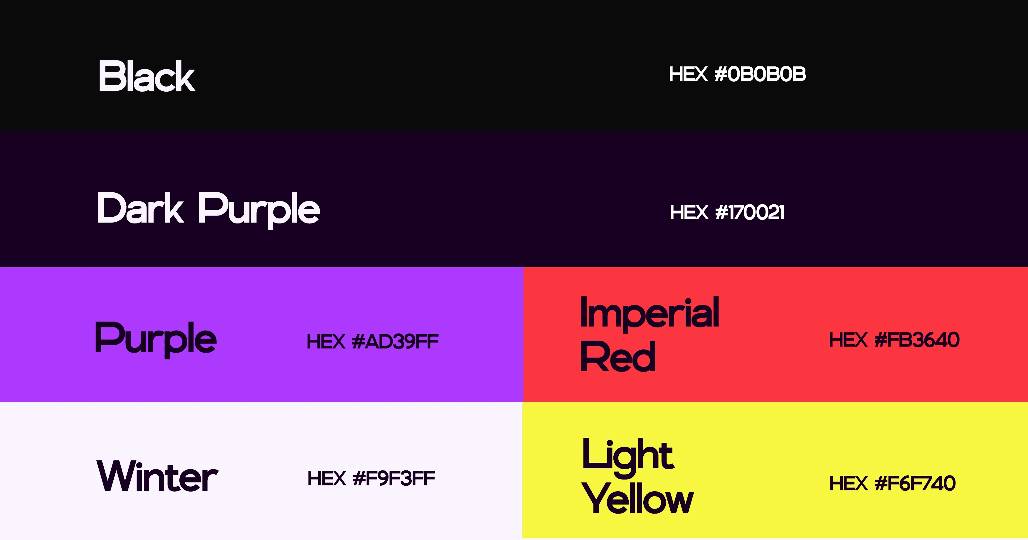
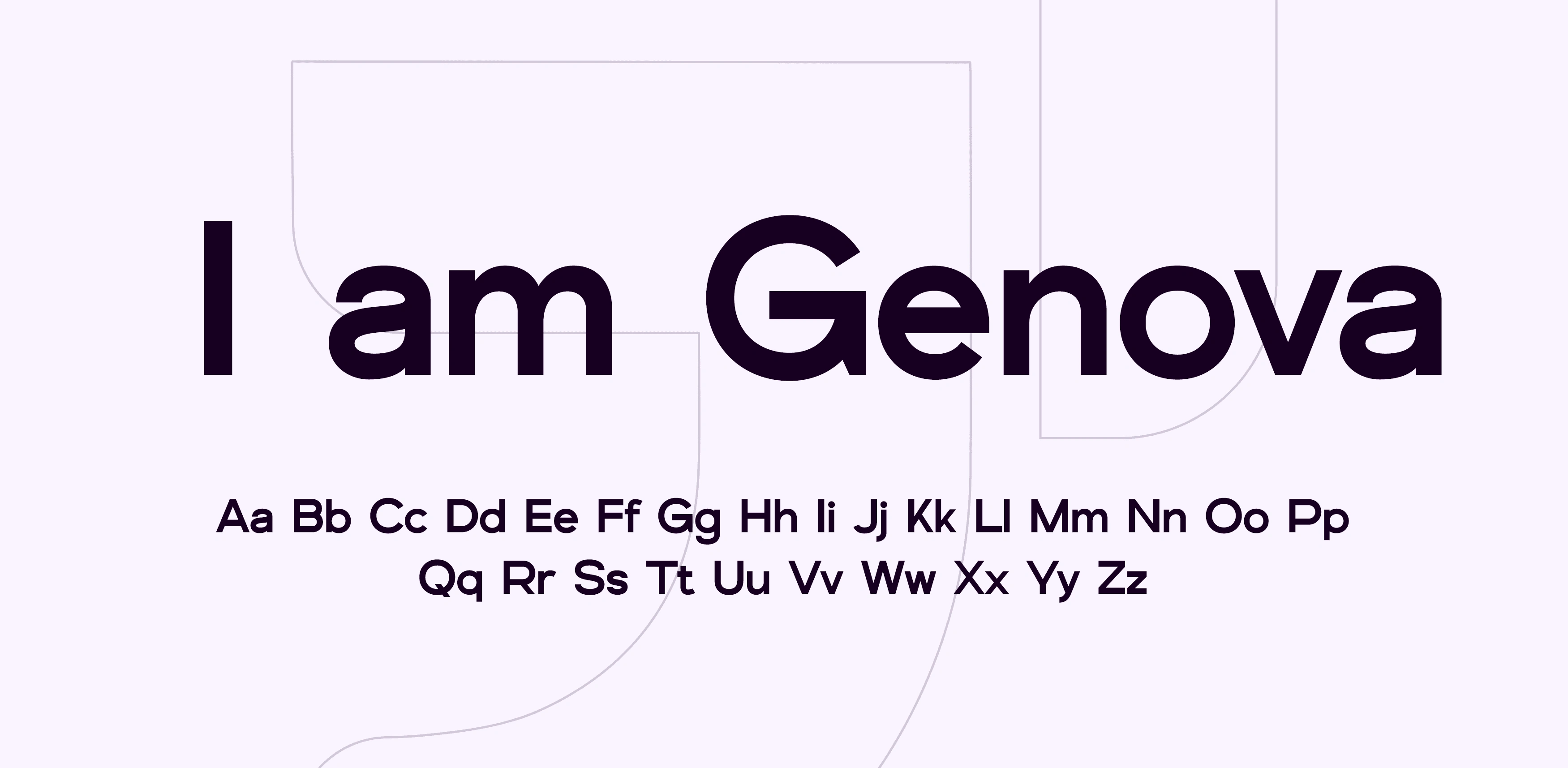
A bold color palette and a font that has a harmonious and beautiful shape that makes it perfect for all needs reflecting the brand’s energetic and forward-thinking nature.
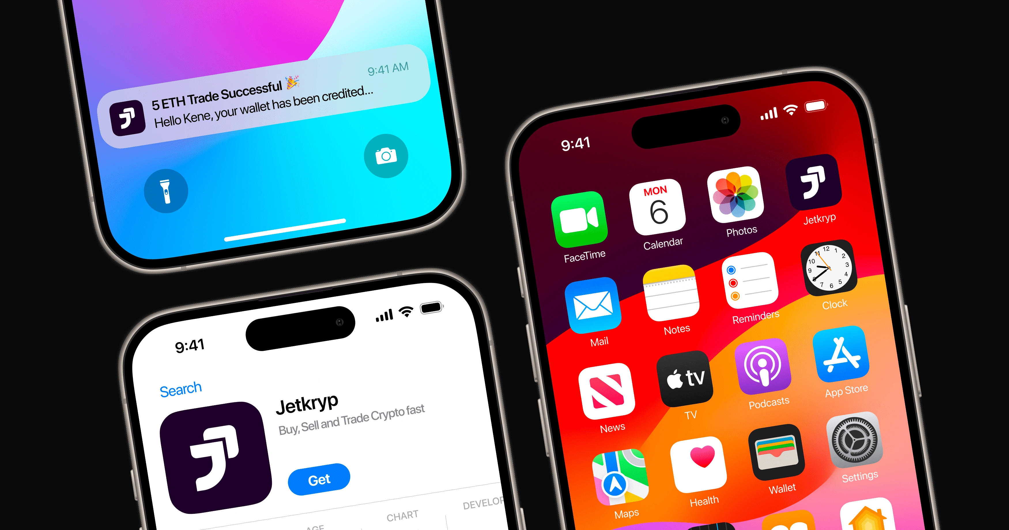
App Icons & Notification
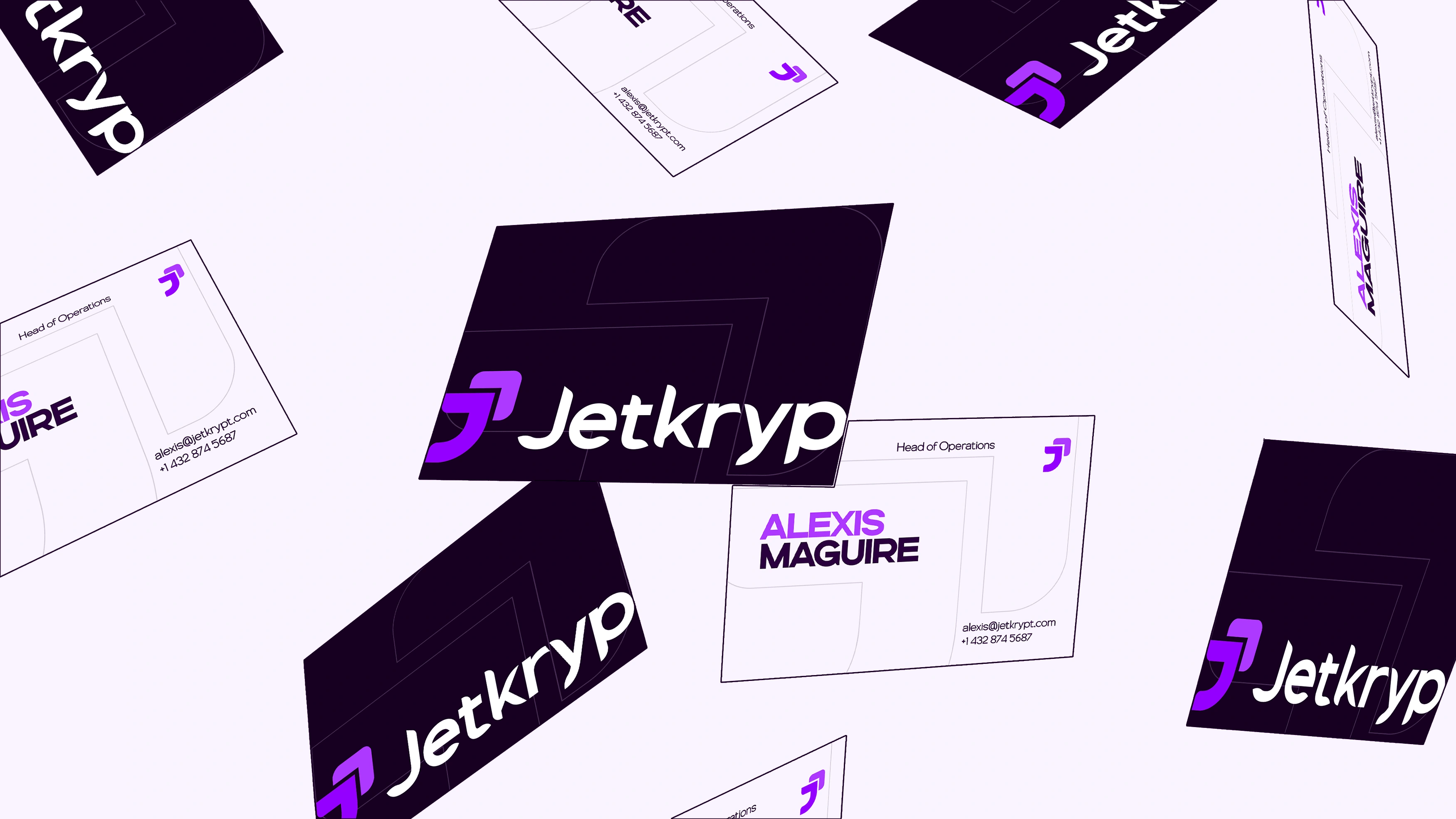
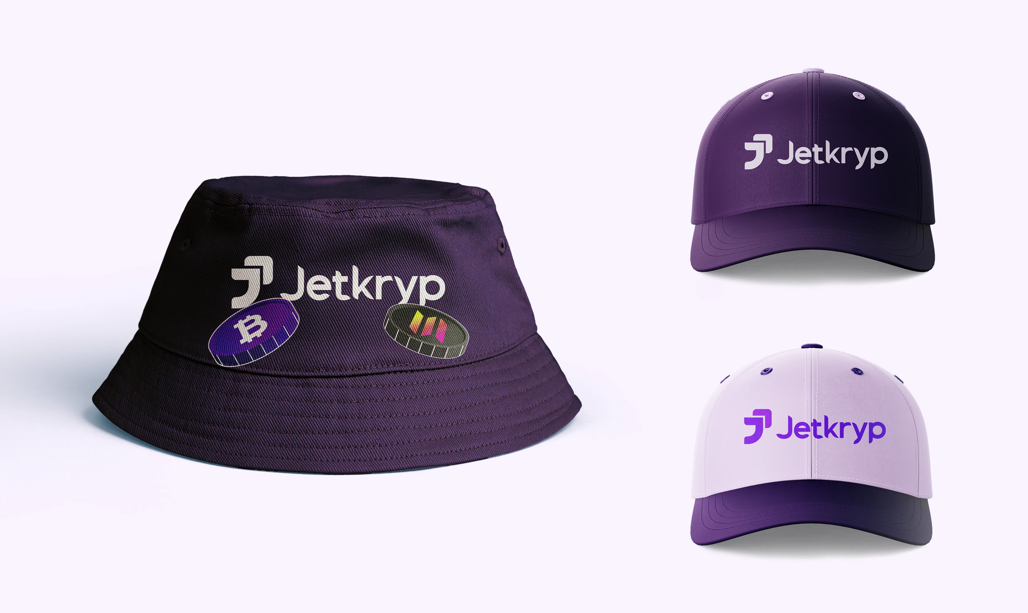
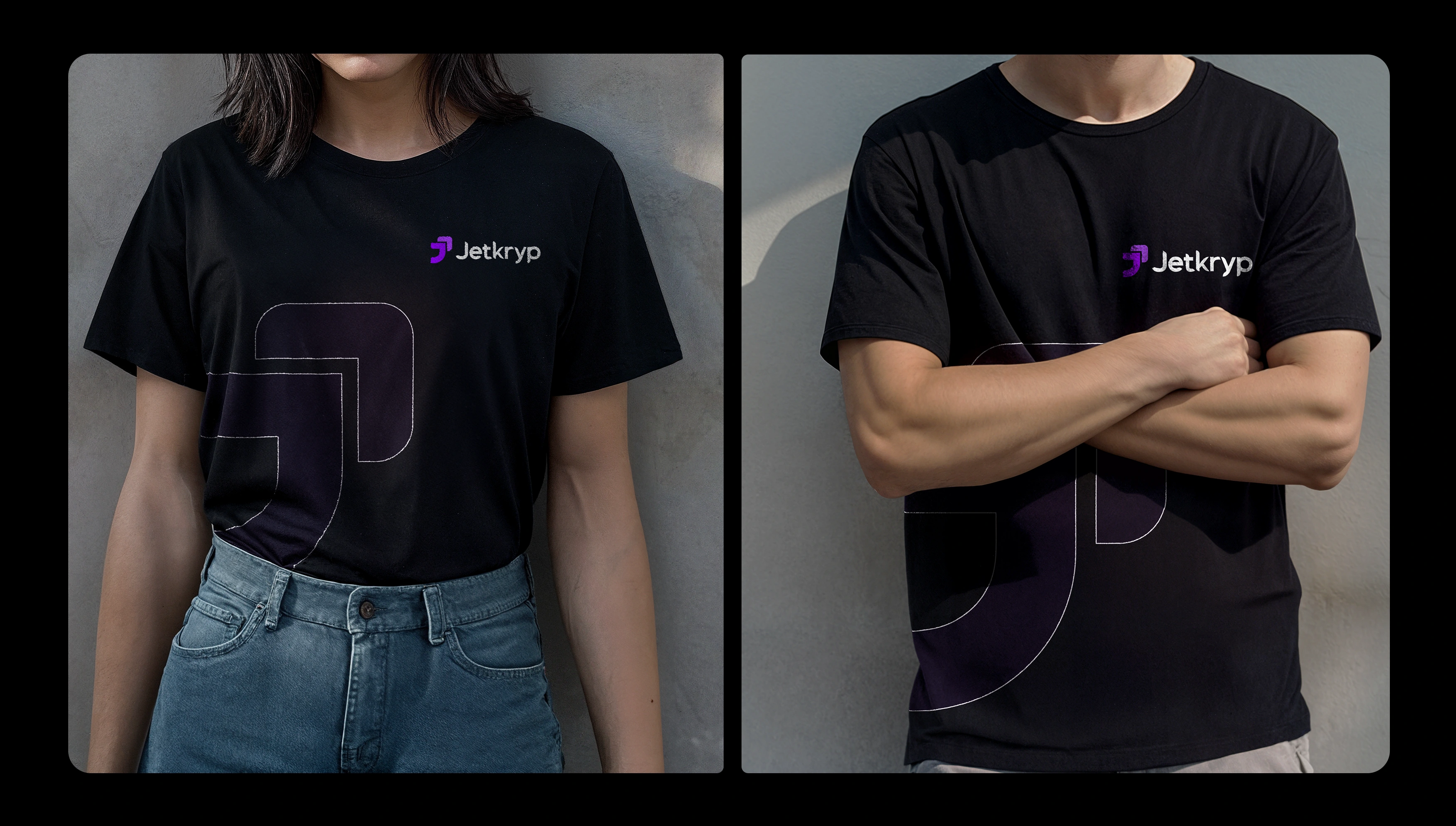
Merch and other assets

Website Experience
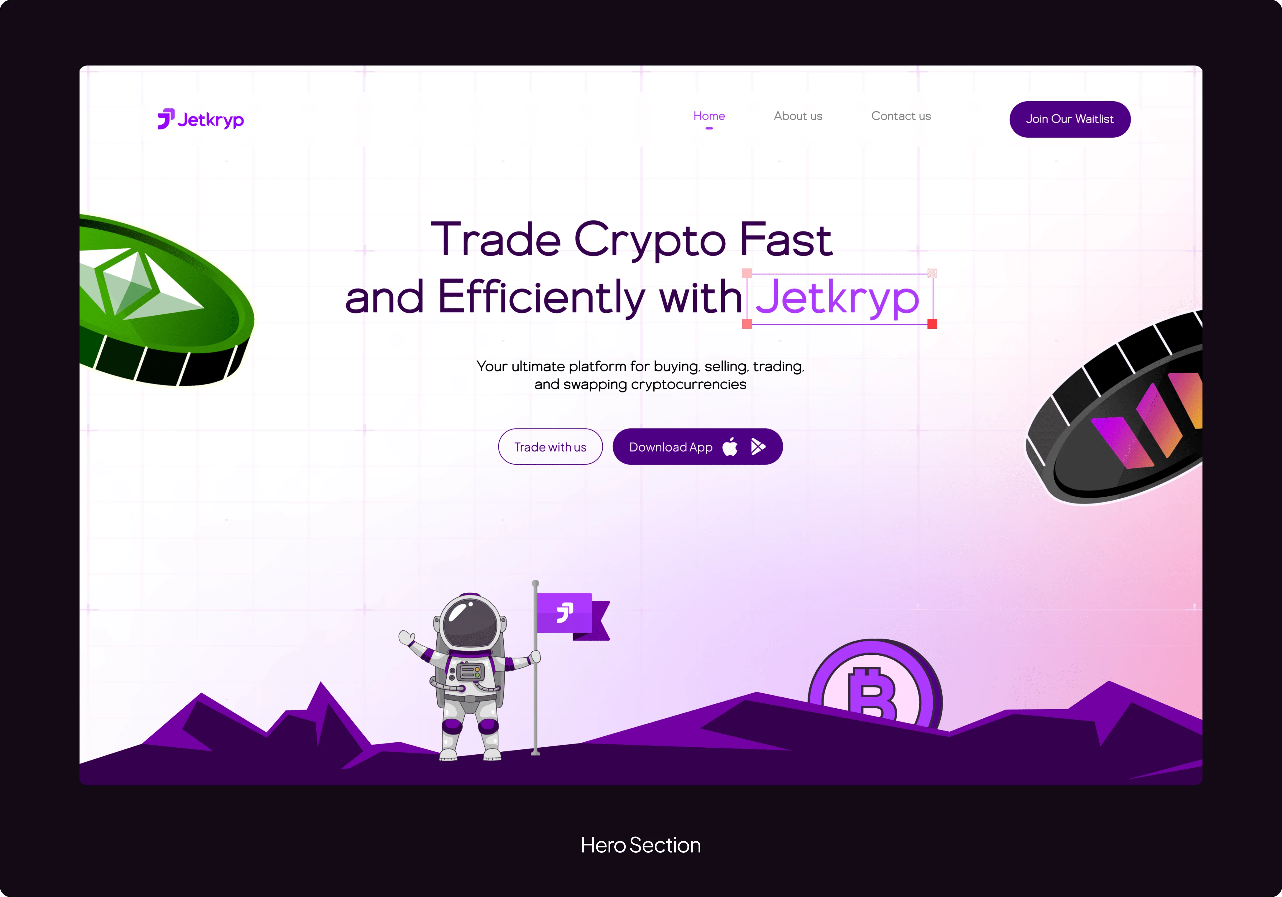
Hero Section
The hero section immediately captures users' attention with a bold headline that emphasizes Jetkryp's core values. The clean, modern visuals paired with a clear call-to-action invite users to start trading right away, setting the tone for a seamless and intuitive experience.
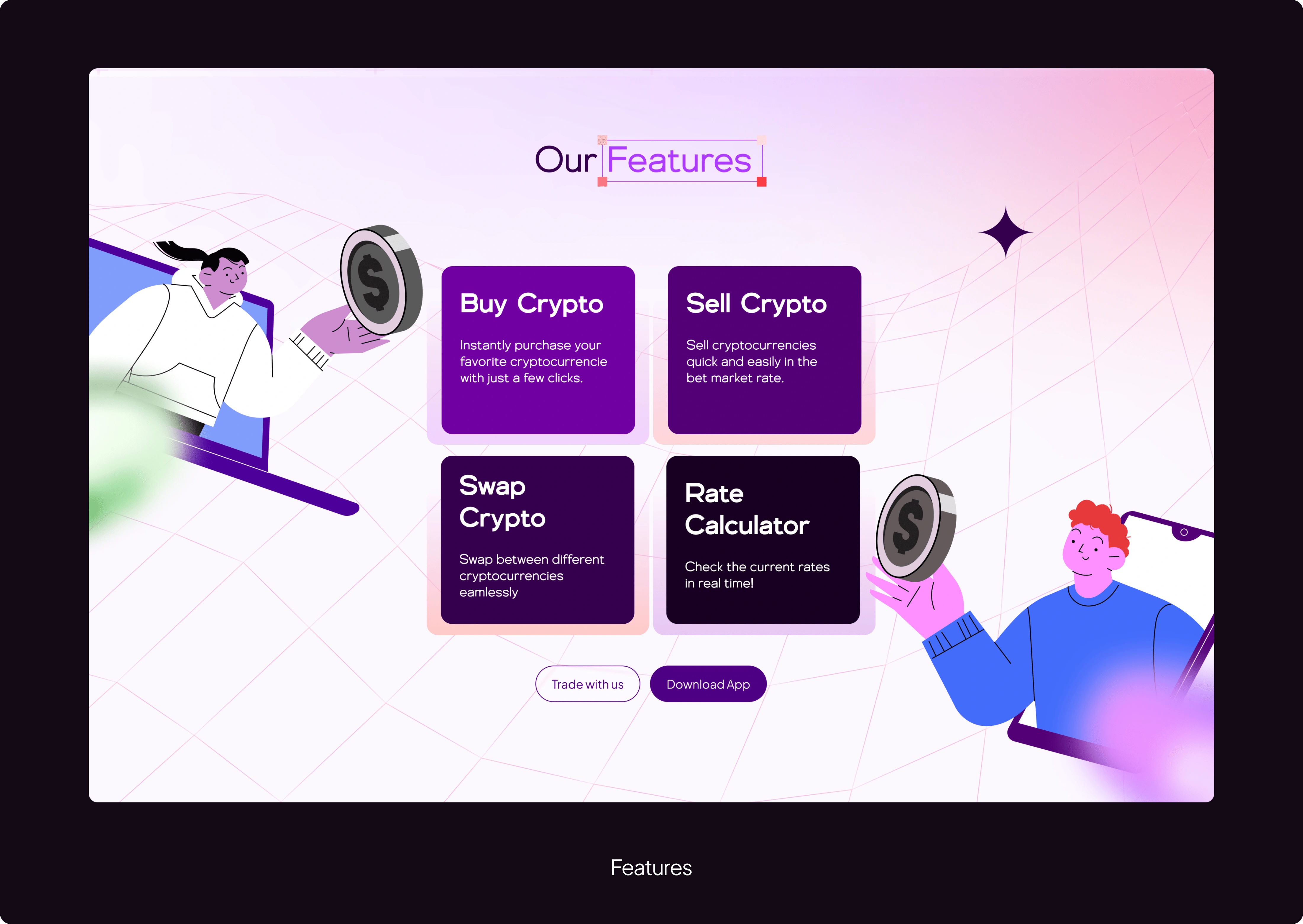
"Our Features" Section
In this section, I highlighted the core functionalities — selling, buying, and swapping crypto —alongside a rate calculator, in a brief way to showcase the full range of Jetkryp’s offerings and keep the viewers' attention alive.
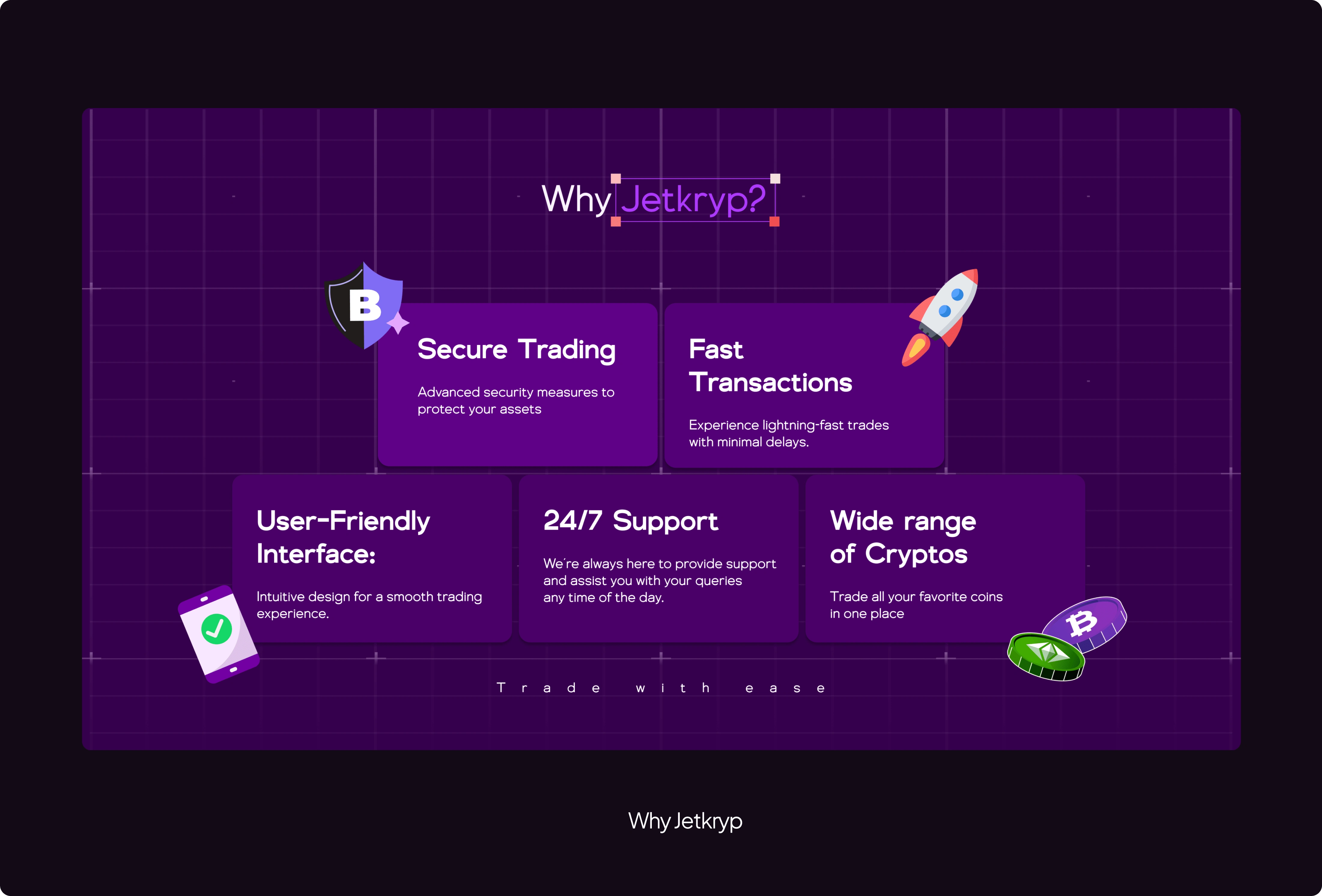
"Why Jetkryp?" Section
In the section, I crafted a compelling narrative that outlined the key reasons for choosing Jetkryp.
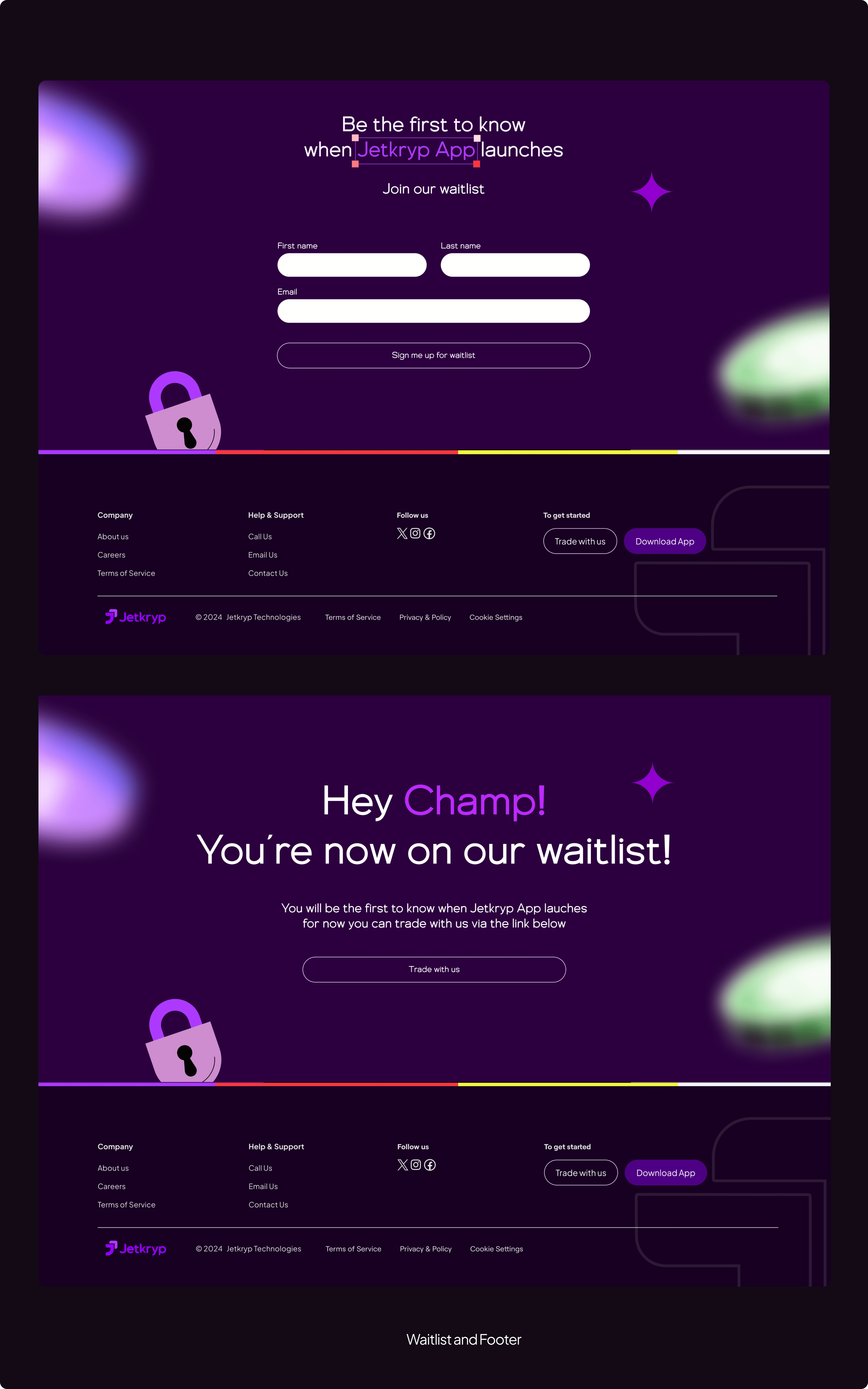
"Join our waitlist" & "Footer" Section
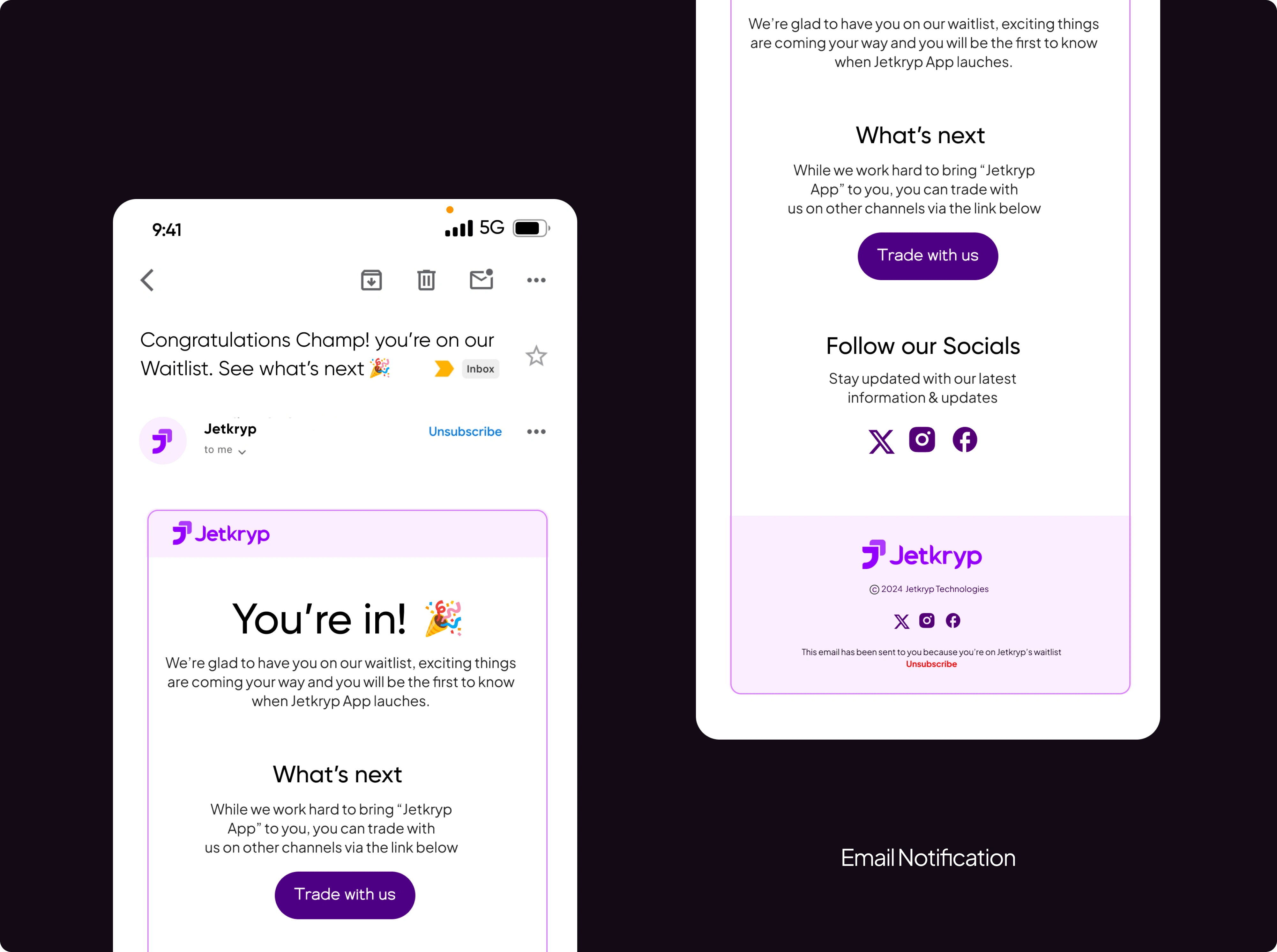
This section encourages visitors to sign up and be the first to know when the "Jetkryp app" launches. Upon successful submission, it displays a confirmation notice and an invitation to trade with Jetkryp via other channels with a clear call-to-action.
Email Notification
Designed an email notification to be received upon successful submission of the waitlist form.
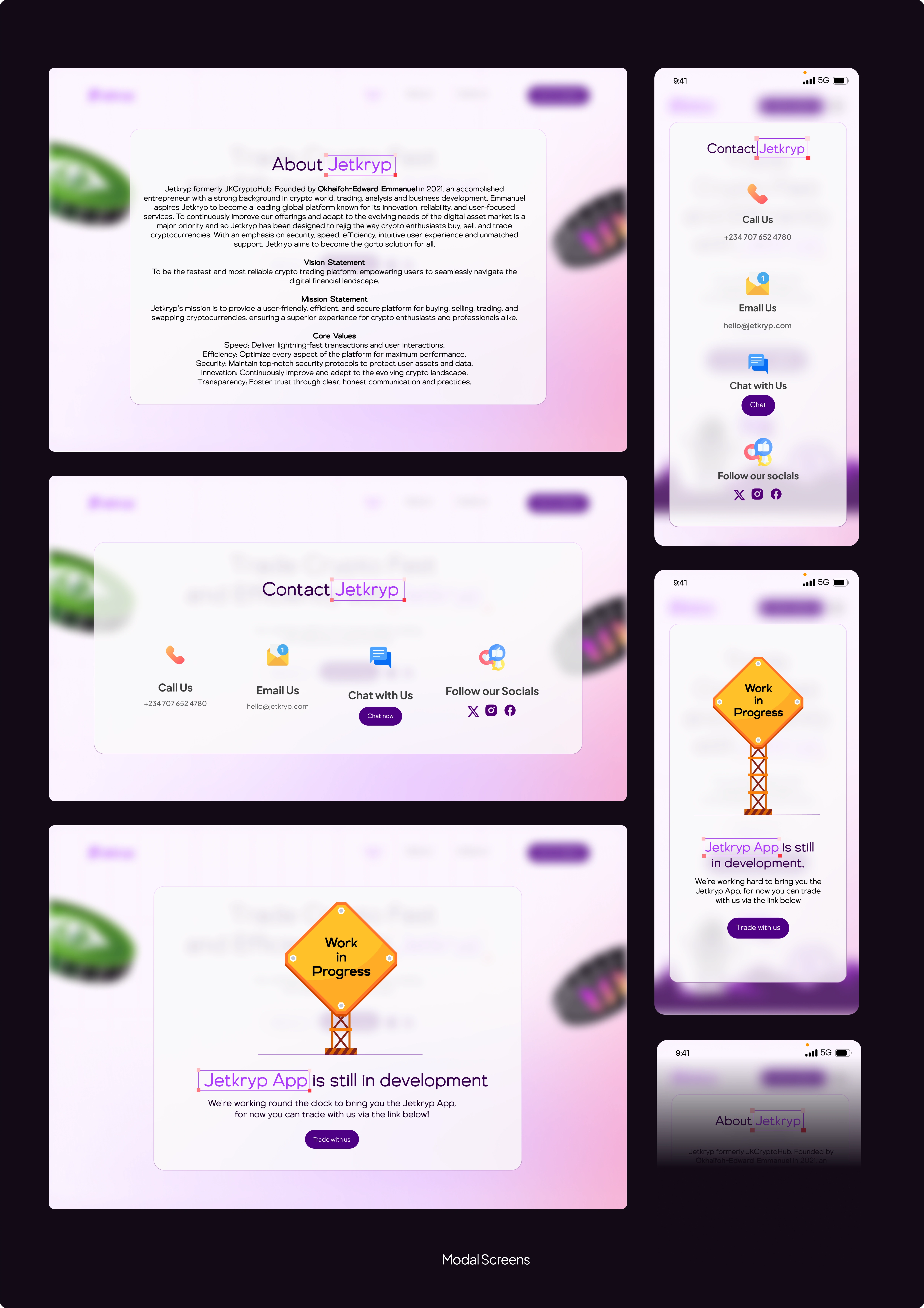
Modals
To streamline navigation in the first version of Jetkryp's Website, I designed the 'About Us' and 'Contact Us' sections as modals. This approach allows users to quickly access key information without leaving the main page.
Visit Jetkryp's website
Mobile App Design coming soon...
Like this project
Posted Jul 8, 2024
Website & Brand Identity Design for “Jetkryp” designed to rejig the way crypto enthusiasts trade cryptocurrencies.


