
Toronto-based Rekindle candles needed a new brand design to represent their sustainable family business.
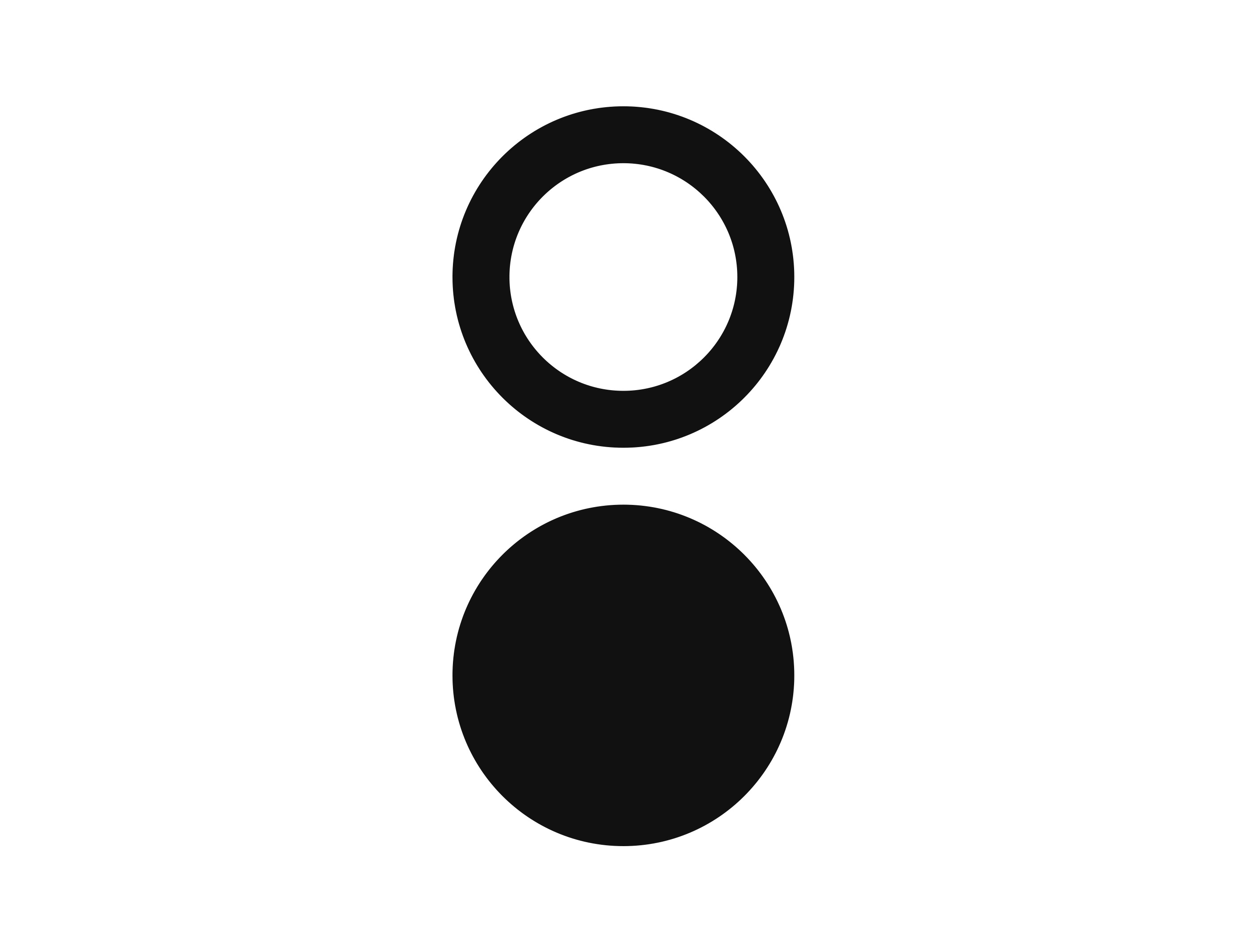
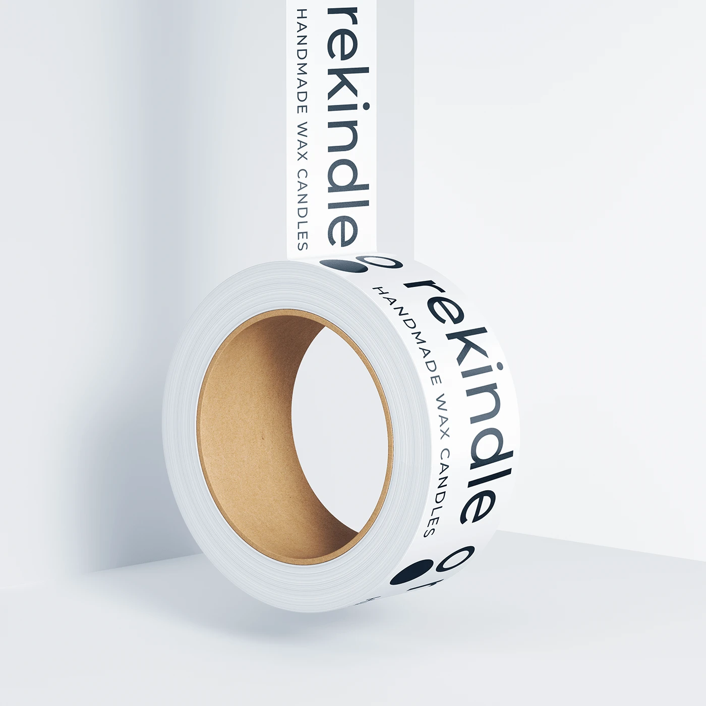
The new logo that carries the main concepts of the brand - a women-owned company by two sisters. The result is a minimalist logo of geometric shapes and a combination of san serif fonts to resemble the strength and independence and two circles to reference two owners in a sense of candles' forms.
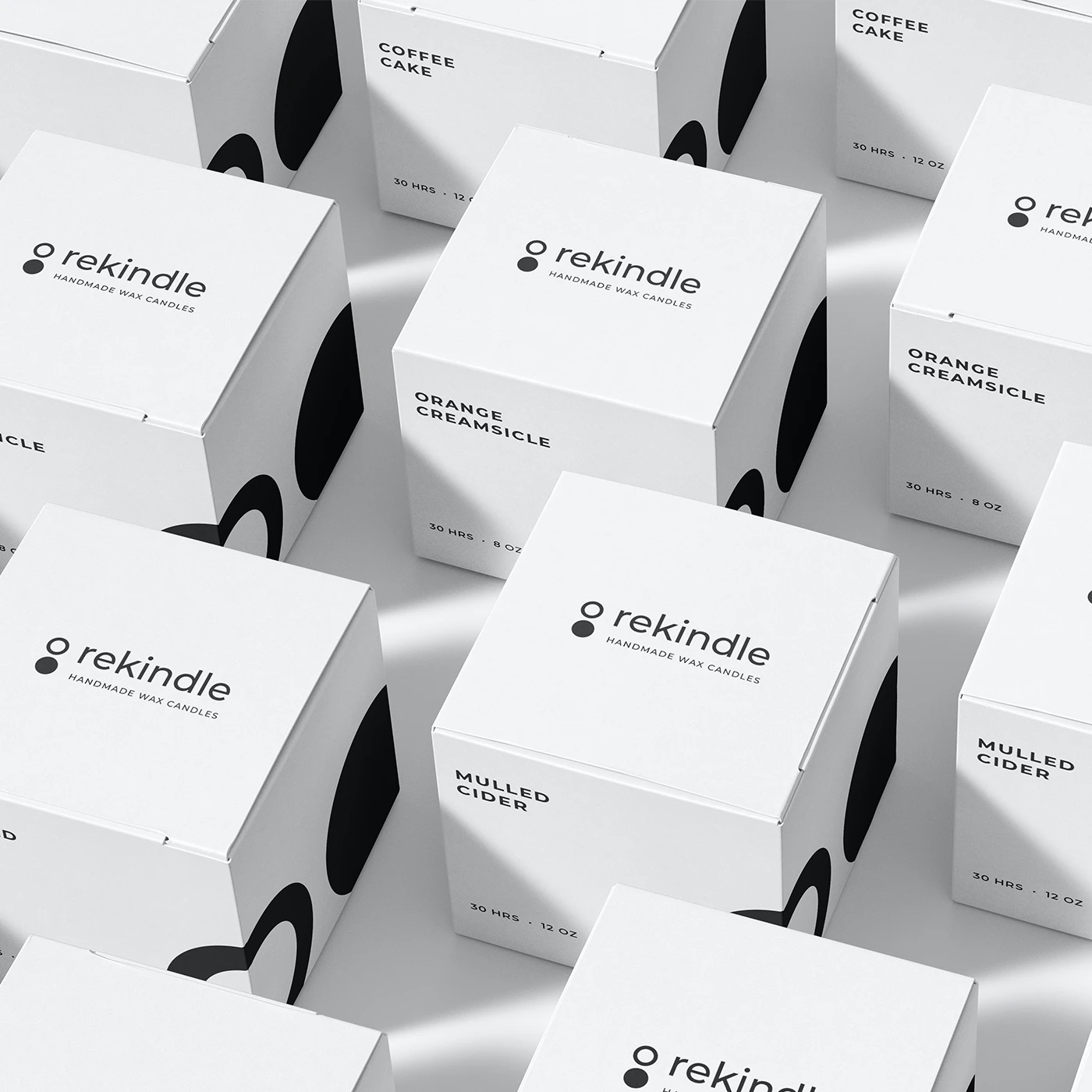
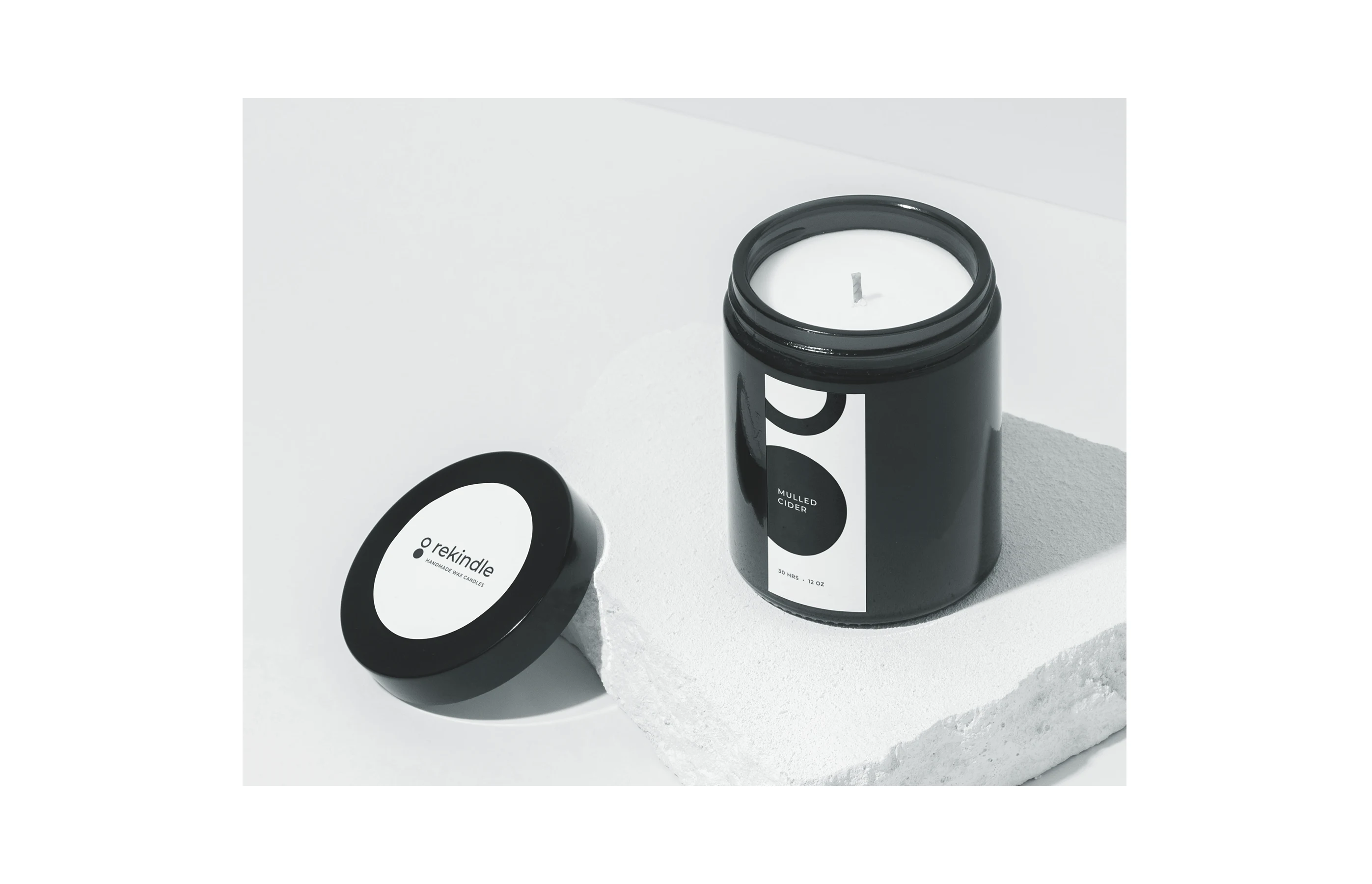
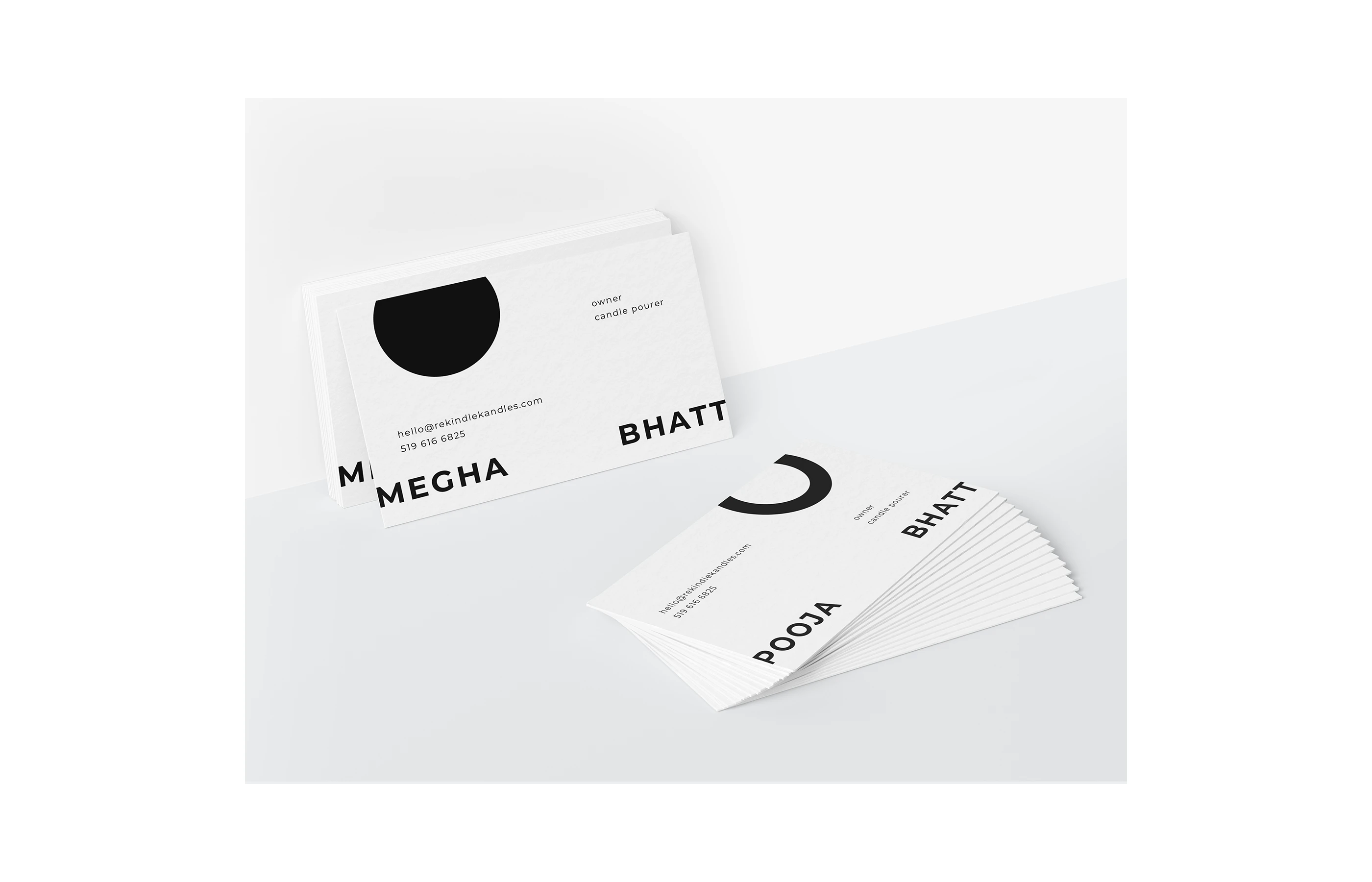
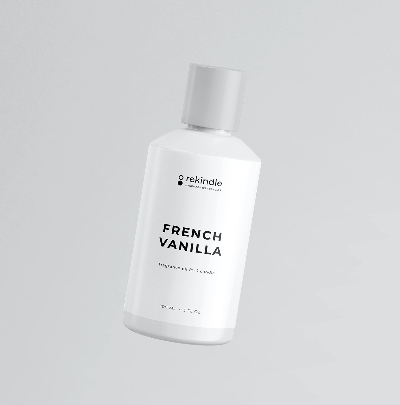
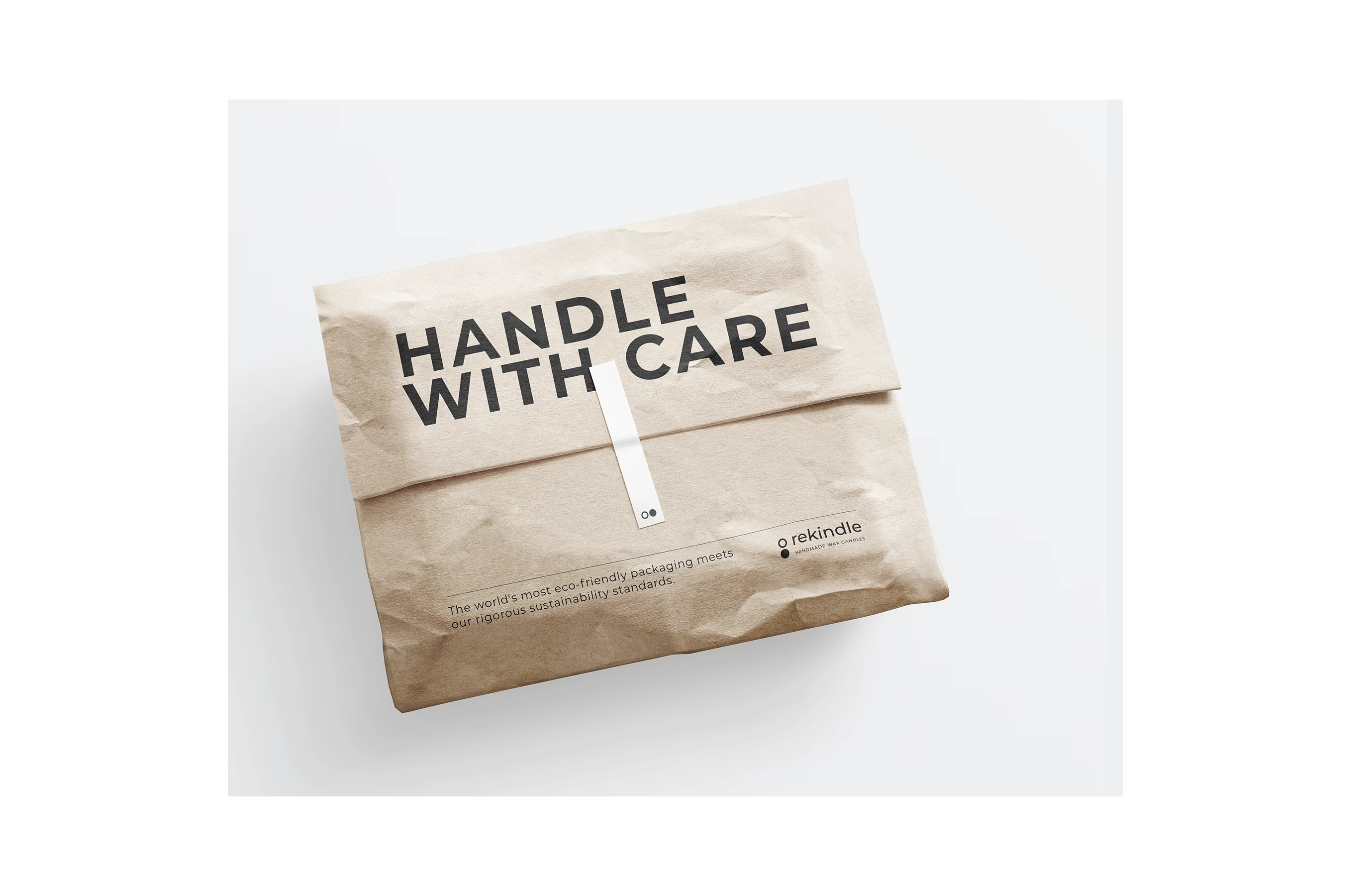
The new stand-out identity carries throughout Rekindle's packaging digital appearance, reflecting the brand values and championing women-led artisan culture.





0 likes · 8 views · Oct 4, 2024
Toronto-based Rekindle candles needed a new brand design to represent their sustainable family business.

