Branded Wedding Design & Planning
Taylor Fournier
When Mike & I first got engaged, there were two things on my mind. First, that I couldn't wait to marry the love of my life. Second, that I was going to have the time of my life designing our wedding.
All those years spent spent learning & studying & practicing brand design had prepared me for my biggest project to date. I could feel it in my bones that this was what I had been training for. Not only would I be taking up the role of wedding planner (and bride, of course), I'd also be stepping into a role as the sole creative director, brand strategist, & designer—all the way from initial concept through final production.
This project required every tool in my arsenal, and then some. It's been my most challenging project thus far, & by far my most rewarding.
Creative Direction
Once we were ready to begin the planning process, I scheduled a brand strategy & creative direction meeting with my husband-to-be. He's an aircraft mechanic, so design isn't his forte, but he was a great sport regardless. He was very involved in the process from start to finish, always sharing his opinions, casting a tie-breaking votes, & talking me off the ledge when it all became a bit too much.
I created a custom questionnaire for us to go over during our meeting. We already knew a few things, like our venue (a historic Tudor-style mansion with an elegant, countryside estate feel) and our date (October 17th, because I have always wanted a fall wedding).
We discussed, first & foremost, how we wanted our wedding to feel. Not just for us, but for all of our guests that would be attending. After all, branding isn't just about what everything looks like on the outside—it's about the experience.
We decided on a few adjectives: classy, warm, whimsical, luxurious, & welcoming.
From there, we worked the rest of our way through the questionnaire, discussing things like the style we were going for, who we were & what we liked as a couple, how we wanted people to remember our wedding, and what inspires us & others the most about our relationship.
Once we completed the questionnaire, I got to work compiling an inspiration board to define our visual target.
Our goal was to create a space & experience that felt classy, but not stuffy. Stylistically, our visuals combined the structure & geometric sensibility of the art deco movement with the organic softness of the art nouveau movement. We wanted our wedding to feel luxurious & grandiose, while remaining intimate, warm, welcoming, & a little jazzy. Our venue complemented our direction, contributing an almost Bridgerton-esque vibe—historical & vintage, but still colorful & playful.
We also wanted to weave in personal meaning throughout the experience, which really came out in the illustrations & collateral.
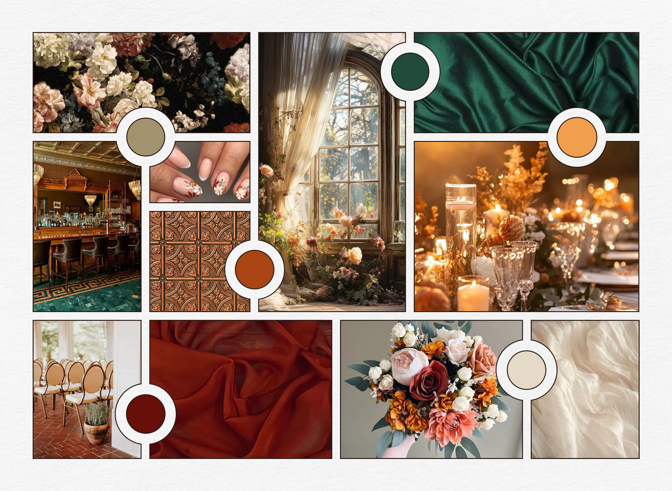
The original inspiration board I created for our wedding.
Logo & Color Palette
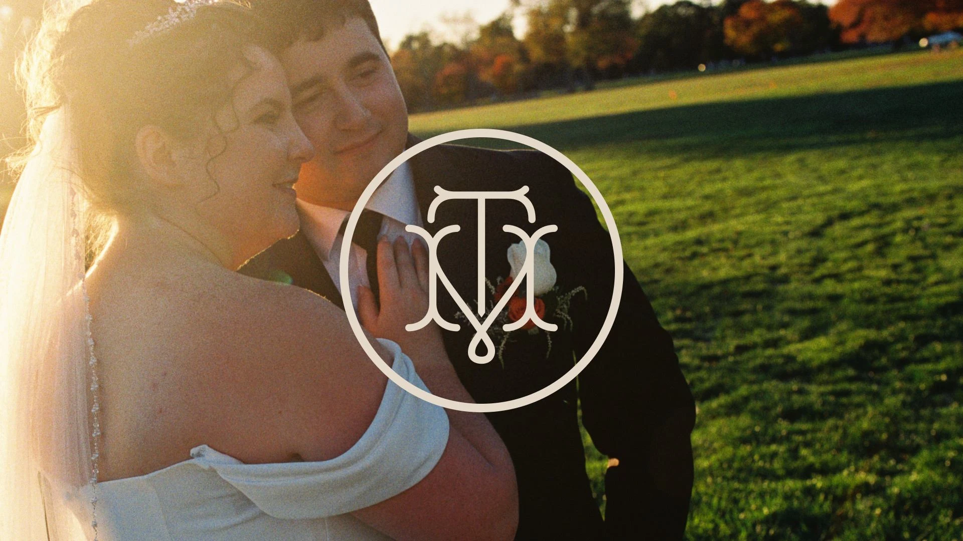
Once we had our creative direction nailed down, I went to work crafting our logo. I loved the idea of having a personal monogram of our initials—something we could use beyond the wedding in order to apply our own personal touch to everything from letterheads to wax seals. I wanted it to be geometric but soft, reflecting the art deco // art nouveau fusion of our creative direction. After much type research, countless sketches, & several prototypes, I created the winner—I combined our two initials, T & M, using a modified version of the font Royale. This logo was the most versatile part of our brand, being featured on almost all signage, stationery, & collateral.
Deciding on the color palette was probably the most effortless part of the branding process (which is not true of most of my other projects). Because we were having a fall wedding, I wanted to stick with fall colors, reminiscent of New England foliage in October. I balanced it out with a jewel-toned teal (the color of my bridesmaid dresses, intentionally chosen because it's the color that looks best on me when I wear it), and a neutral olive green, which happens to be one of my favorite colors (second to rusty orange, which was also used in the palette).
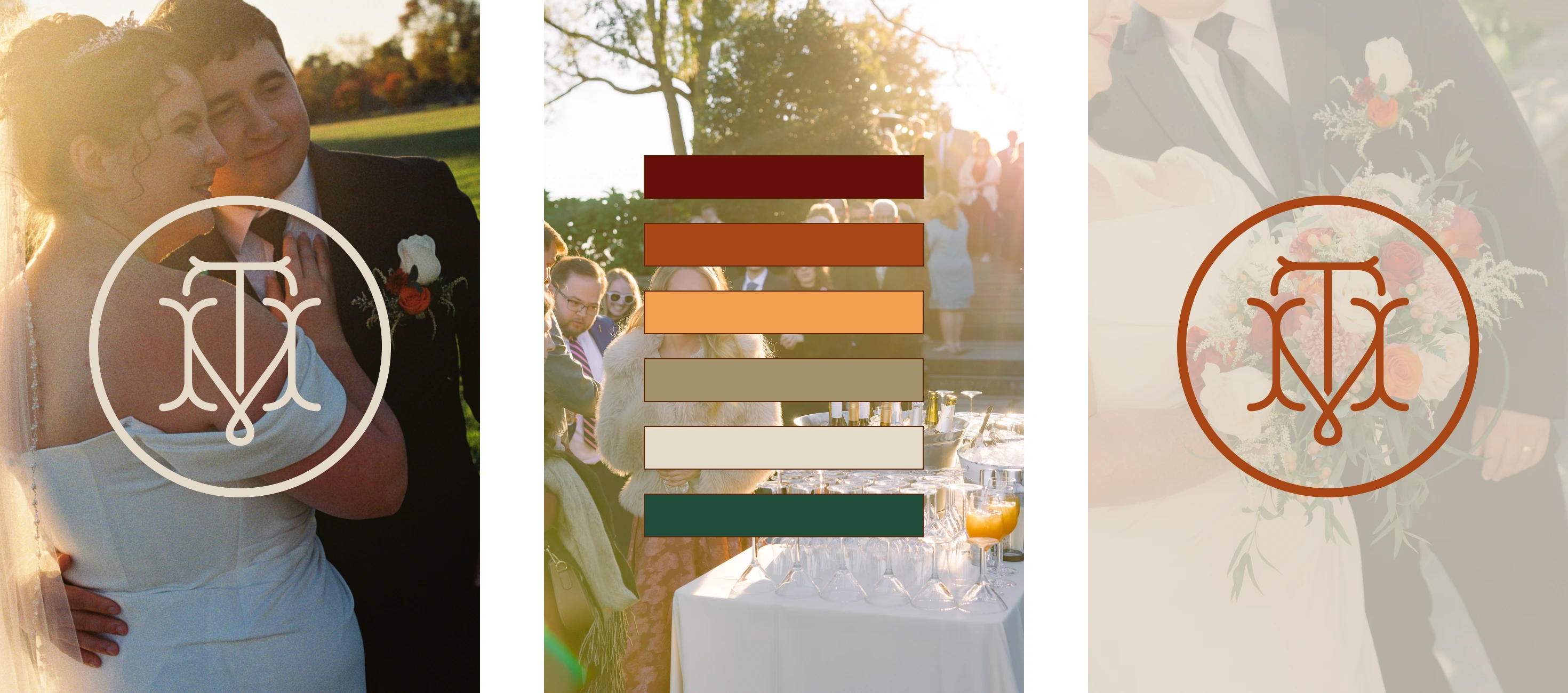
Our wedding logo & color palette.
Stationery & Invitation Suite
The invitation suite was the first major tangible piece of the project. This saw the introduction of tangible elements like custom wax-seal magnets & linen paper, as well as floral illustrations that would weave their way through the visuals of the entire project.
My priority at this stage was to establish a design system in the interest of maintaining consistency across the guest experience (which can be a difficult thing to do when you're rolling out different parts over the course of a year). Save the dates were the first & most time-consuming piece on the timeline, as I was painstakingly aware that they would set the tone for everything that followed.
For our illustration system, featured heavily throughout our stationery, signage, & collateral, I combined the rigid lines & structure of art deco with the flowing, organic lines of art nouveau. The floral illustrations are infused with personal meaning—I used lily of the valley to represent Mike's birth month of May, and chrysanthemum to represent my birth month of November. They vine up through the card and turn into marigolds at the top, the flower of October, the month we got married.
Once all the decisions were made for our initial design system & our save the dates were sent off, carrying it through to the invitation suite design felt a bit more effortless. This was where I started to make more experiential decisions—how to present the suite, what cards to include, & how I could leave a lasting impression on our guests from the moment they opened the envelope.
One of the things I'm most proud of is the addition of wax seal magnets included in each envelope. Hand pressed & assembled by me, they feature an imprint of our logo. As a self-proclaimed design evangelist, I'm always looking for ways to emphasize function before form in my design process. A handmade, branded magnet seemed like the perfect way to solve the problem of displaying the invitation, while also driving home the core of our wedding brand's ethos—making our guests feel impressed & important.
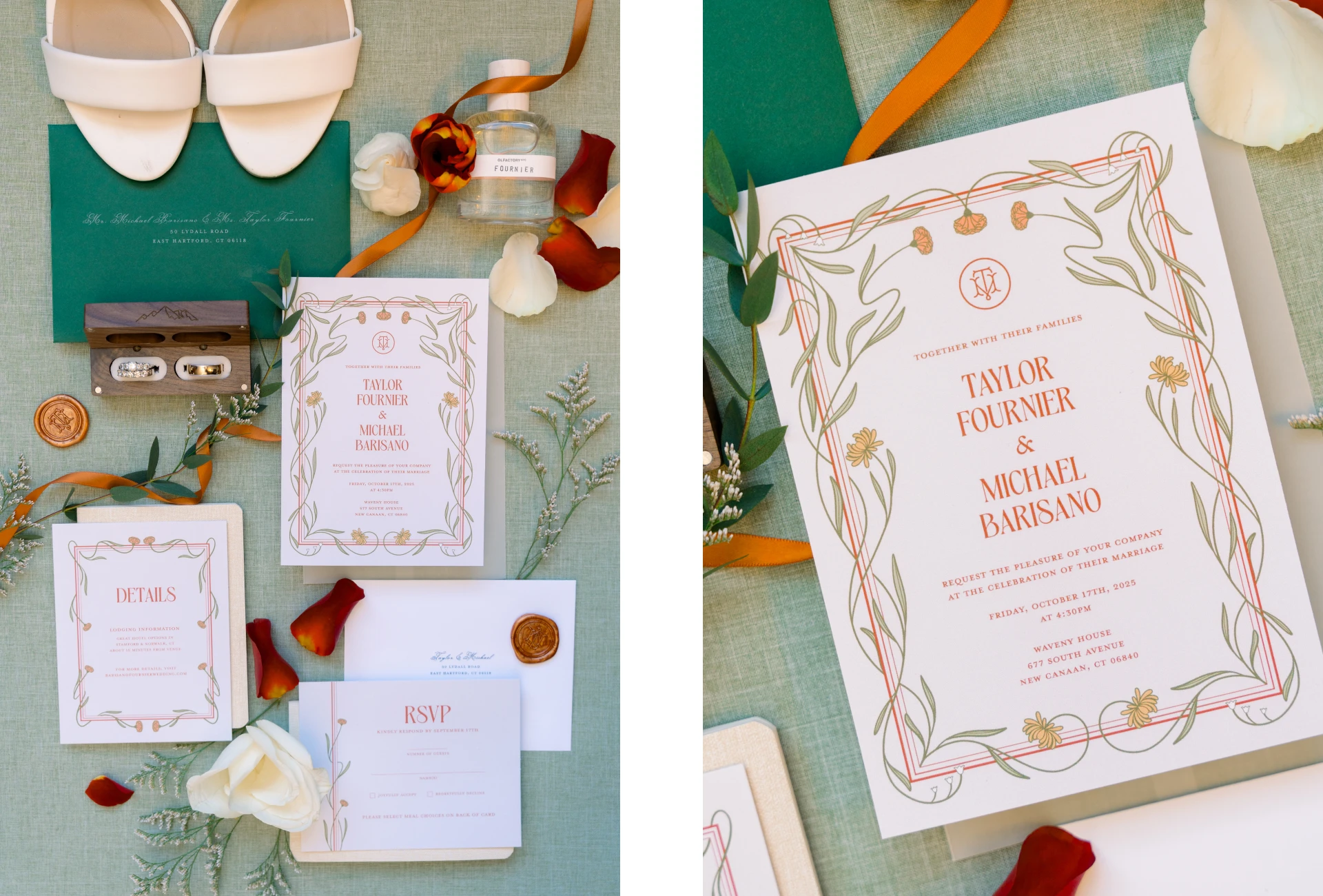
Our invitation suite, complete with custom wax seal magnets, vellum packaging, & orange ribbon to tie it all together.
Signage
The illustration system established at the beginning of the project was carried through to various signage placed across the venue. This required working with a local vendor to produce all the signs in a timely manner.
Most of these were designed & printed within the last 3 weeks before the wedding. With the deadline closing in, and with all of my other wedding planning priorities happening in tandem, I had to make the decision to simplify a lot of the less important signage while still maintaining consistency across visuals.
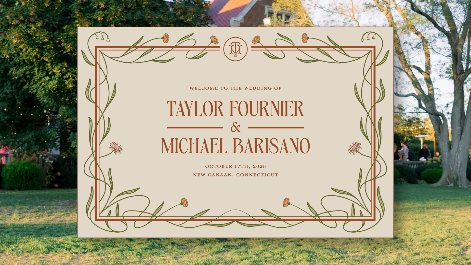
The digital version of our welcome sign, which was placed at the front of the venue to welcome guests as they arrived.
One of my favorite parts of the process was our bar signage. I love a good cocktail (both drinking & crafting one) so I jumped at the chance to put even more of a personal touch on the day with our own drinks. I didn't stop at 1 or 2, but instead built out a menu of 5 signature drinks, all reflective of different parts of us & our union.
Mike's favorite drink is a Manhattan, so his was pretty self-explanatory. But my drink, the Tea for Taylor, featured my own handmade earl grey syrup, handed off to my caterer the week before. This was a callback to my tea party themed bridal shower (and indicative of my love for tea in general).
The Fall 25 was an autumn-themed twist on a French 75 (one of my favorite cocktails), and represented our wedding season & year.
Our two signature martinis, the Nero-tini (espresso martini) and the Olive-tini (dirty martini) represented our two cats, who also made appearances on our cocktail napkins.
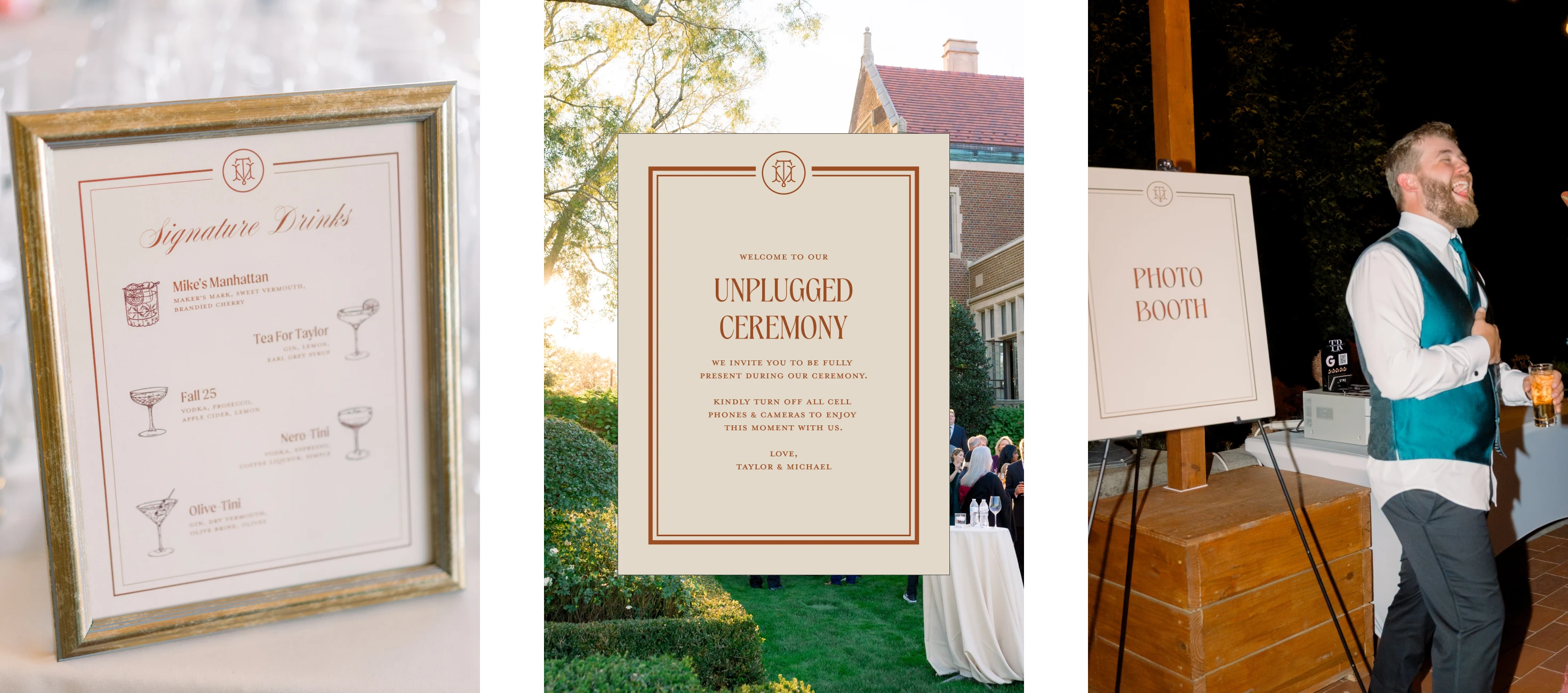
Various signage across the venue, including signature drink signs for the bar, a sign for the photobooth, and a classic "unplugged ceremony" sign.
Environment
Our venue, Waveny House, did a lot of the heavy-lifting in terms of environmental experience. The interior design was spectacular, from the dark wood interiors, to the woven tapestries, to the chandeliers, to the grand stone fireplaces in each room.
I worked with my mother-in-law very closely to manage wedding vendors & rentals, ensuring our linens, napkins, & centerpieces stayed in line with our wedding brand guidelines.
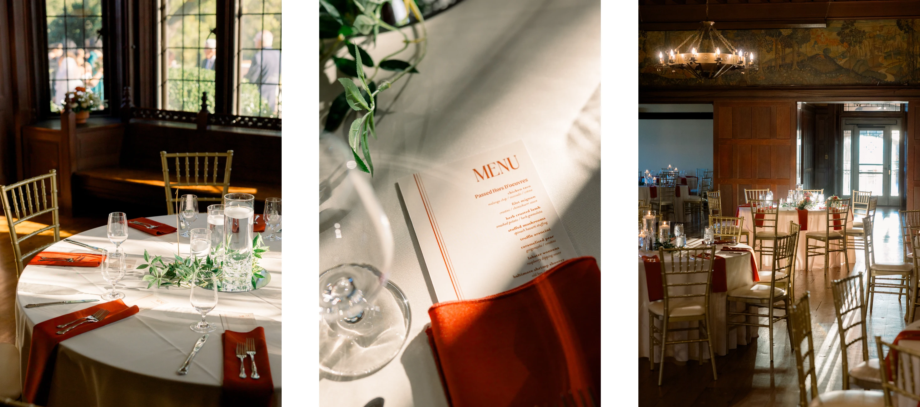
Our indoor dinner set up, complete with on-brand table decor & custom menus designed by me.
Guest Book, Well Wishes, & Favors
As I mentioned before, our guests' experience at our wedding was very important to us. When deciding on favors, we wanted something that matched the vibe of the event, while also having utility beyond it (again, function over form is my guiding principle).
We landed on bottle openers in the style of old vintage keys, paired with custom tags for each person that doubled as a seating chart system. My one regret about these favors is that I didn't post a sign explaining what they were. The bottle openers were so convincingly disguised as keys that a lot of our guests didn't even realize what they were!
I also created custom advice cards with our logo, & set out a vintage glass box to keep the finished ones. And because of my background in photography, I styled our guest book around polaroid cameras, having people snap pictures of themselves & leave personalized notes alongside them.
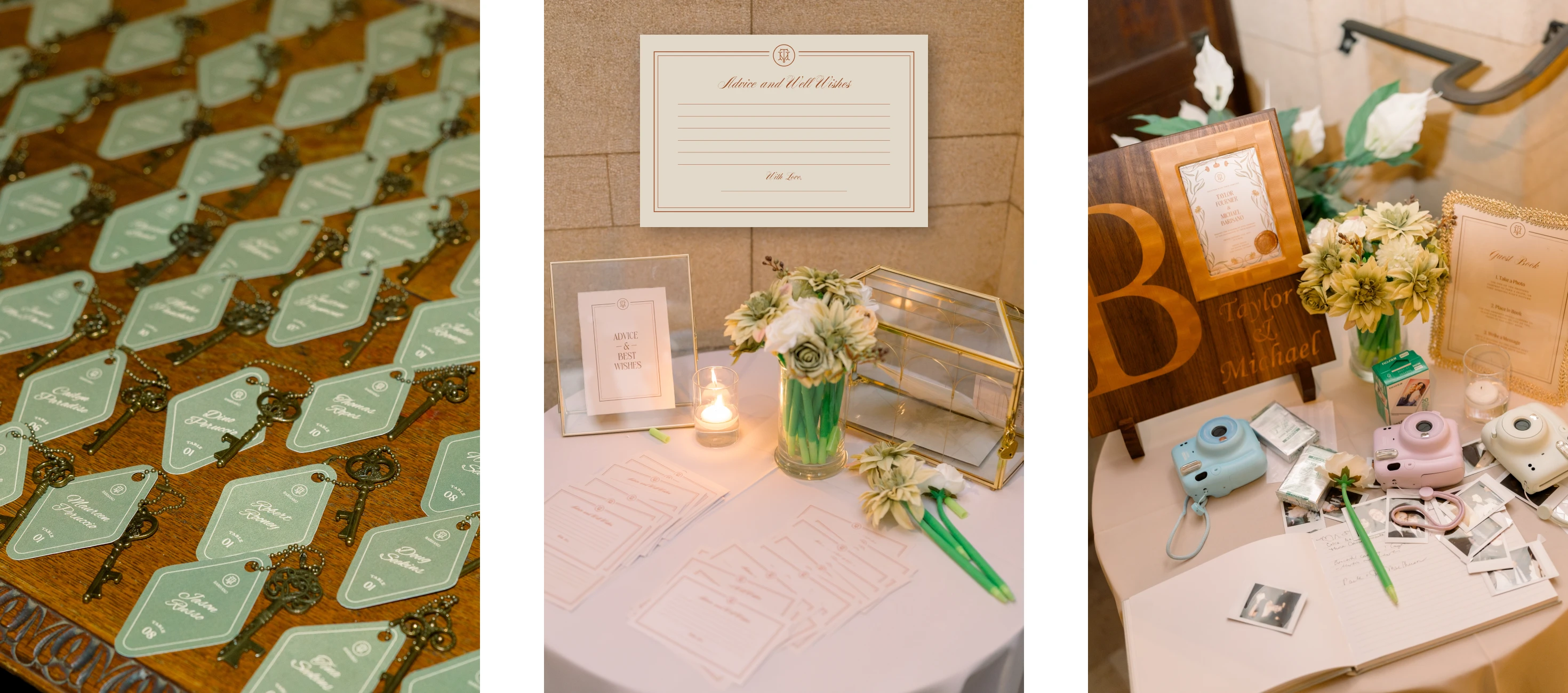
The favors from our wedding, our advice & well-wishes station, and our guest book setup.
Other Miscellaneous Collateral
Once the major parts of the project were out of the way, we brainstormed ideas for supplementary collateral to make sure our personal touch was omnipresent.
Throughout the entire planning process, I had known I wanted cocktail napkins with our cats' faces on them. But as the day got closer, and I got more overwhelmed with other wedding planning tasks, it started to feel like a gargantuan task. One night, 2 weeks before the wedding, I had a breakdown in response to the sinking feeling that I had waited too long, and it was too late to start the design process for them. Mike, with the patience of a saint, helped me talk through the process of what we'd need to do to get them in time. And within 60 minutes, the design had been illustrated, exported, & sent to vista print with an estimated delivery date 4 days before the wedding (and they even ended up coming early).
I'm usually pretty good at solving problems, but it's really great to know I married a guy that can guide me through the process when I'm feeling like everything is a bit too much.
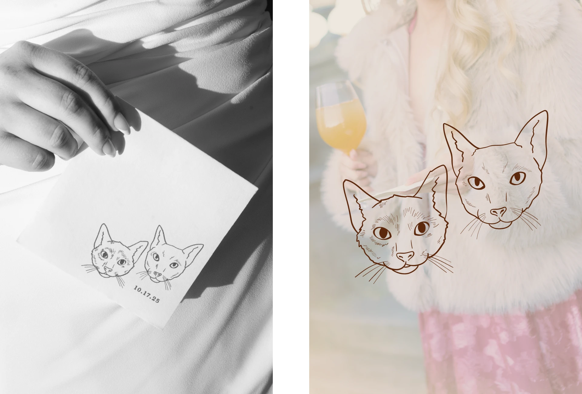
Cocktail napkins featuring illustrations of our cats, Olive & Nero. We also named two of our signature drinks after them.
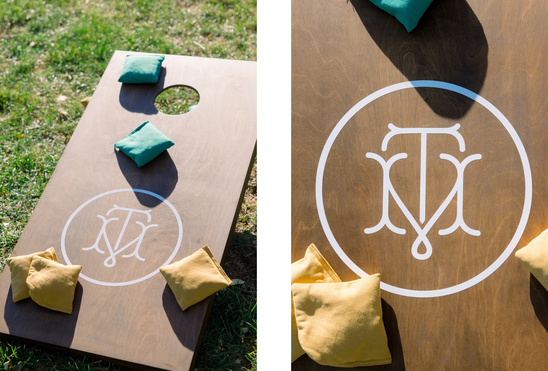
We decal'd our own cornhole boards to put out for guests during cocktail hour.
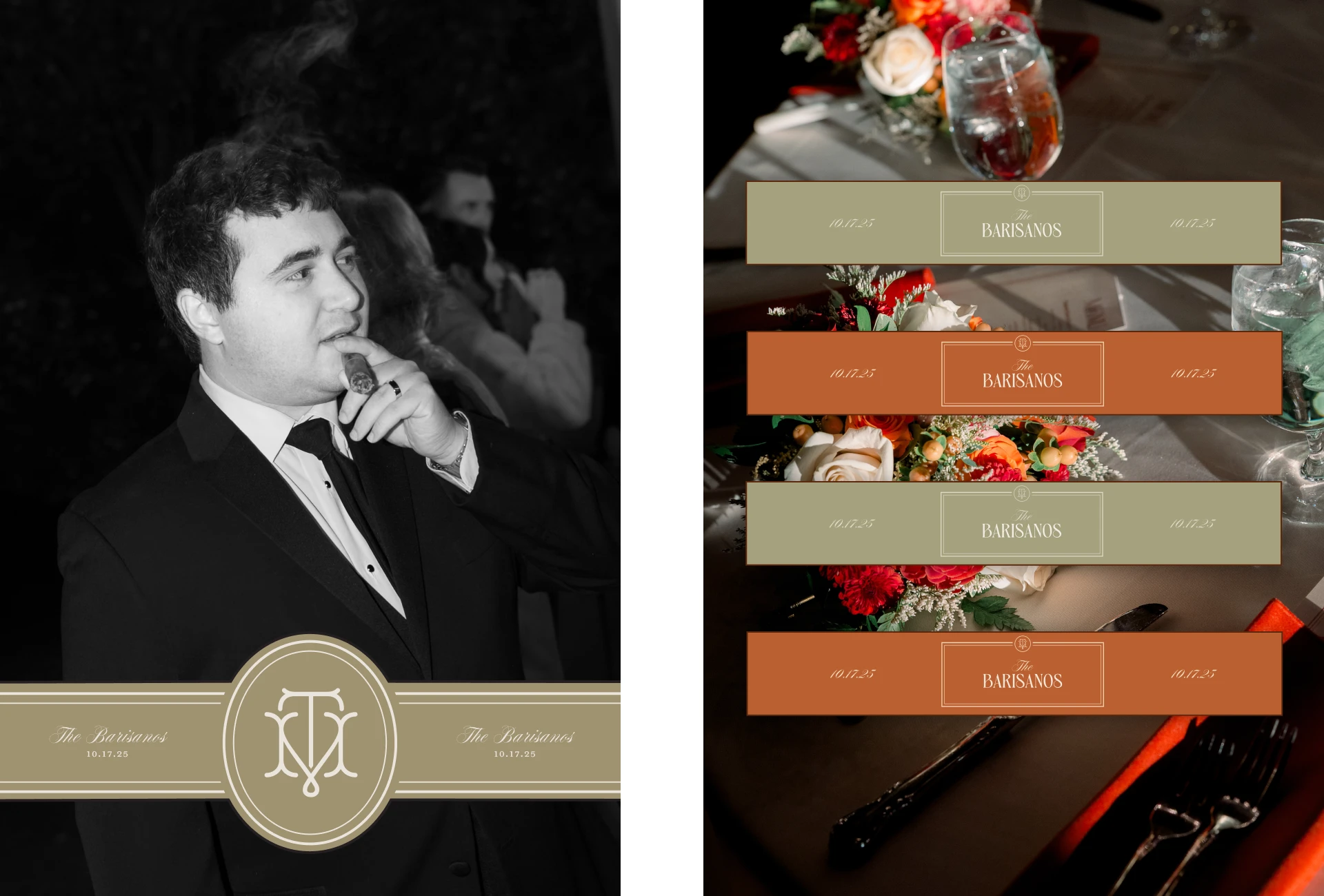
Custom cigar bands and water bottle labels I designed to make the standard items at our wedding feel a little more bespoke.
I also worked with our photobooth vendor to customize the screens & photostrip designs to ensure they remained visually consistent with the other pieces of brand collateral.
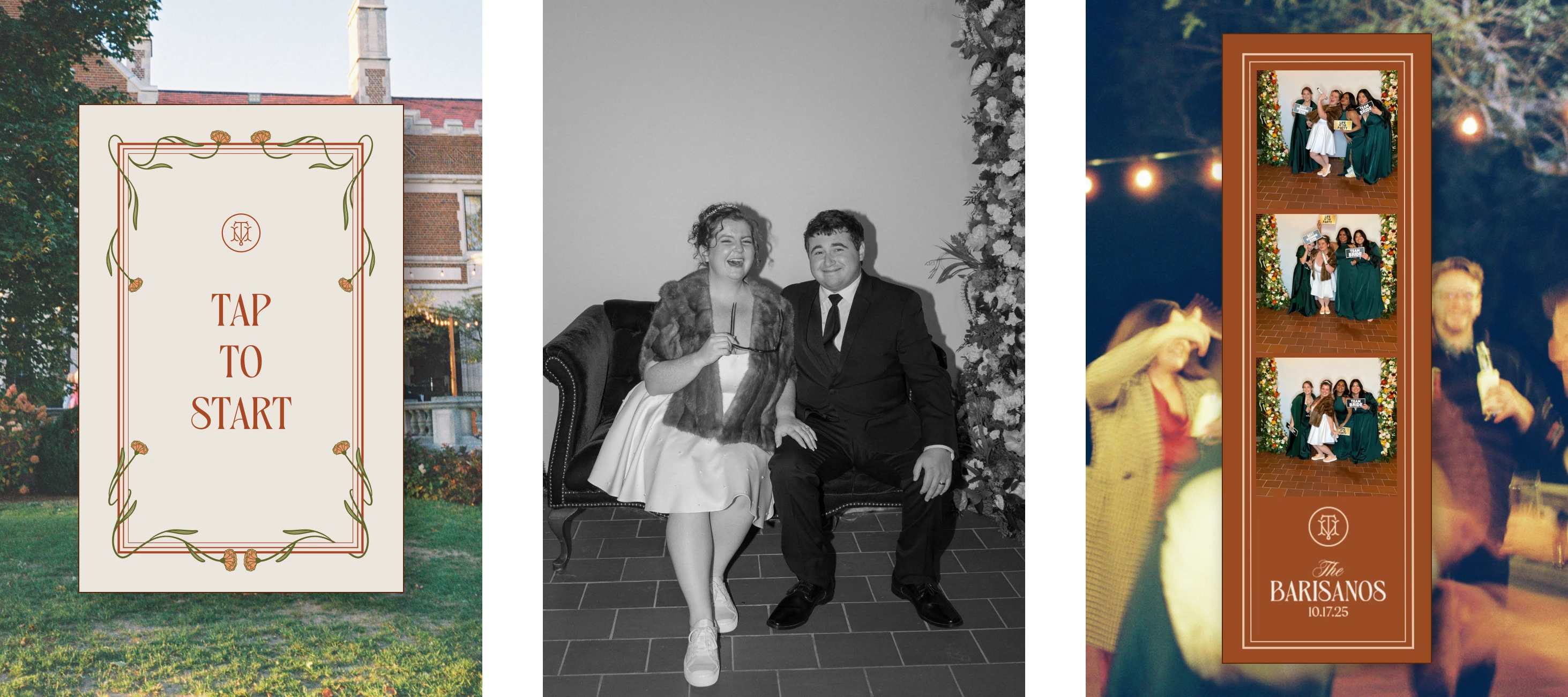
Custom digital screen and photostrip design for our photobooth.
Not only was my wedding day the best day of my life, it was also the culmination of the best project I have ever worked on (though I'll admit it sounds a bit biased).
I enjoyed the process so much that I'm tempted to pivot my career entirely to designing more wedding brands for couples.
I also want to give a shoutout to Molly Mia Photography, who did the most amazing job capturing our day for us.
If you or someone you know is interested in creating a strong brand for their wedding day & marriage beyond, please reach out!
Like this project
Posted Apr 2, 2026
Creative direction, brand strategy, & design for an elegant, colorful, fall-themed wedding—created completely from scratch by me, the bride.
Likes
4
Views
15
Timeline
Jun 16, 2024 - Oct 17, 2025