Mythus Studio Brand Identity Development
Taylor Fournier
1 collaborator
The definition of "mythus" is "the interrelationship of value structures & historical experiences of a people, usually given expression through the arts."
True to their name, Mythus Studio is a branding agency that seeks to make the world a more beautiful place through the cultivation of creative, socially conscious, visionary brands. As advocates for conscious capitalism, they strive to make humanity the forefront of their work.
I had the pleasure of working on the brand identity for Mythus Studio, capturing their classy, yet contemporary aesthetic & blending it with their magnetic & collaborative personality.
Brand Guidelines Development
Our biggest priority with the Mythus Studio brand was to create a set of guidelines that they could carry forward into all of their brand decisions going forward. This living document included 34 pages of guidelines on their brand strategy as well as their brand identity.
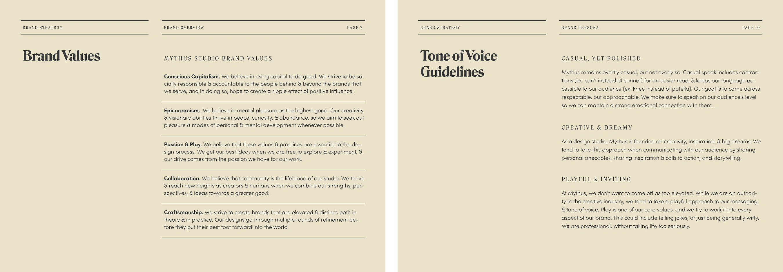
To create this document, we delved deep into discovery with the Mythus team in order to clarify their brand beyond their visual identity, defining things like their mission, brand promise, values, messaging & tone of voice, & overall personality.
This discovery phase informed the rest of our creative process as we translated our findings into the visual identity for Mythus Studio.
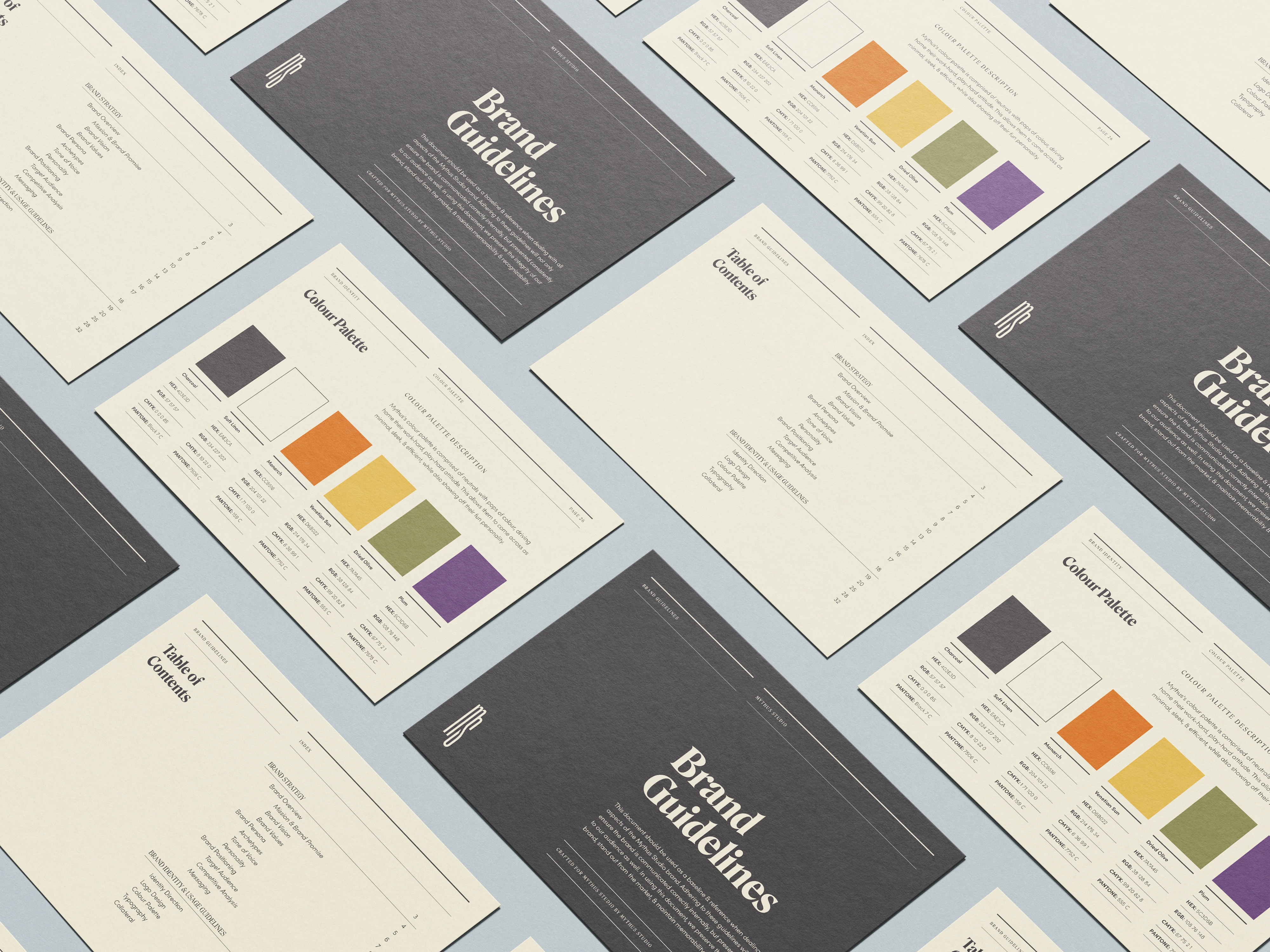
An overview of Mythus Studio's brand guidelines document.
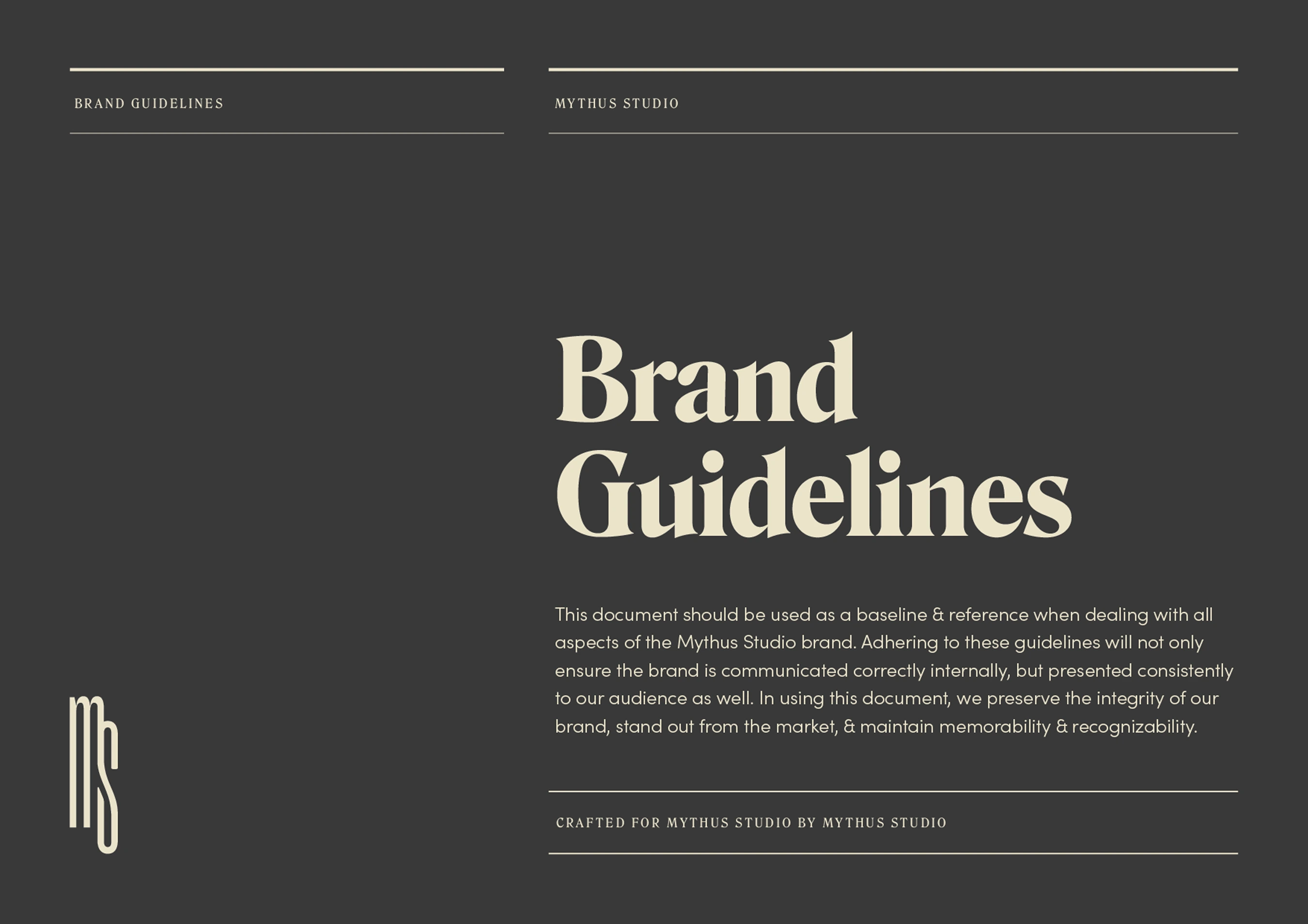
The cover of the 34-page brand guidelines document.
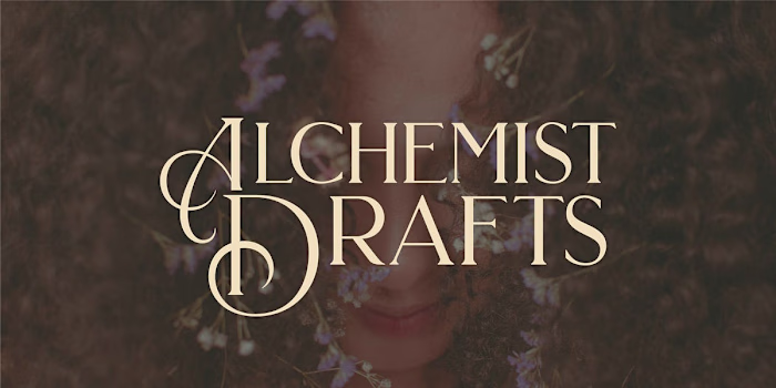
Logo & Submark
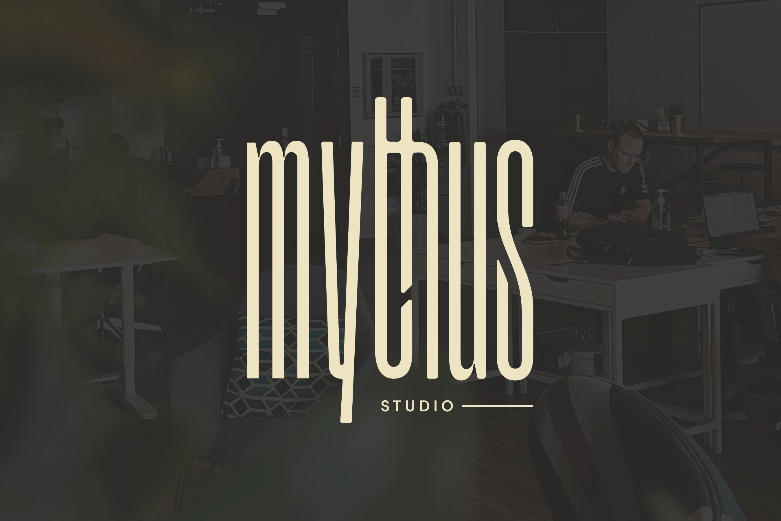
We wanted Mythus Studio's logo & submark to evoke a sense of grandiosity while also appearing trendy. Using the font Grandmaster, we modified the typeforms to give them a bit more softness & connectedness, reflecting Mythus Studio's personality & commitment to connecting to & through their artisanal clients.
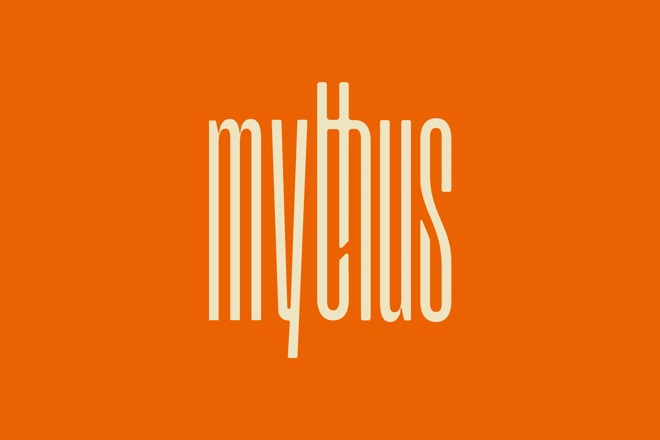
The primary logo for Mythus Studio.
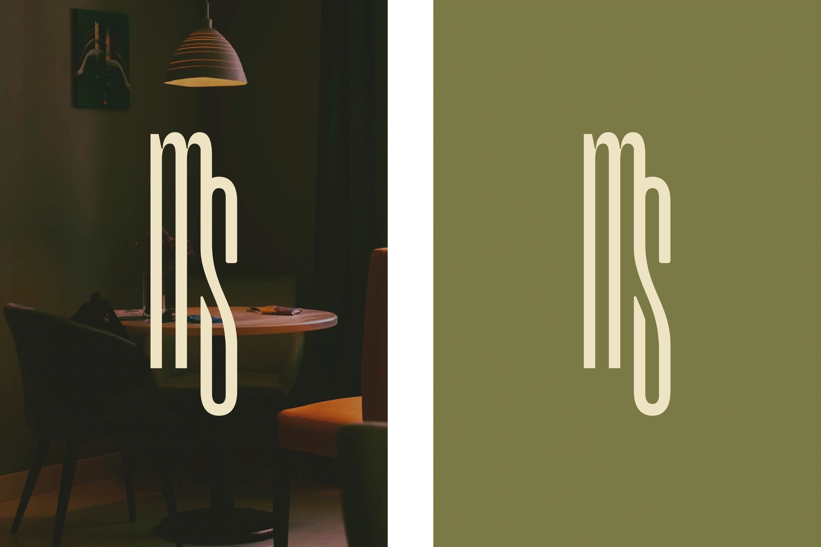
The submark for Mythus Studio.
Color Palette
Because the logo for Mythus is so strong, we wanted to be mindful of the intimidation factor & balance it out with playful pops of color & soft neutrals. Harmony between brand elements was the goal here.
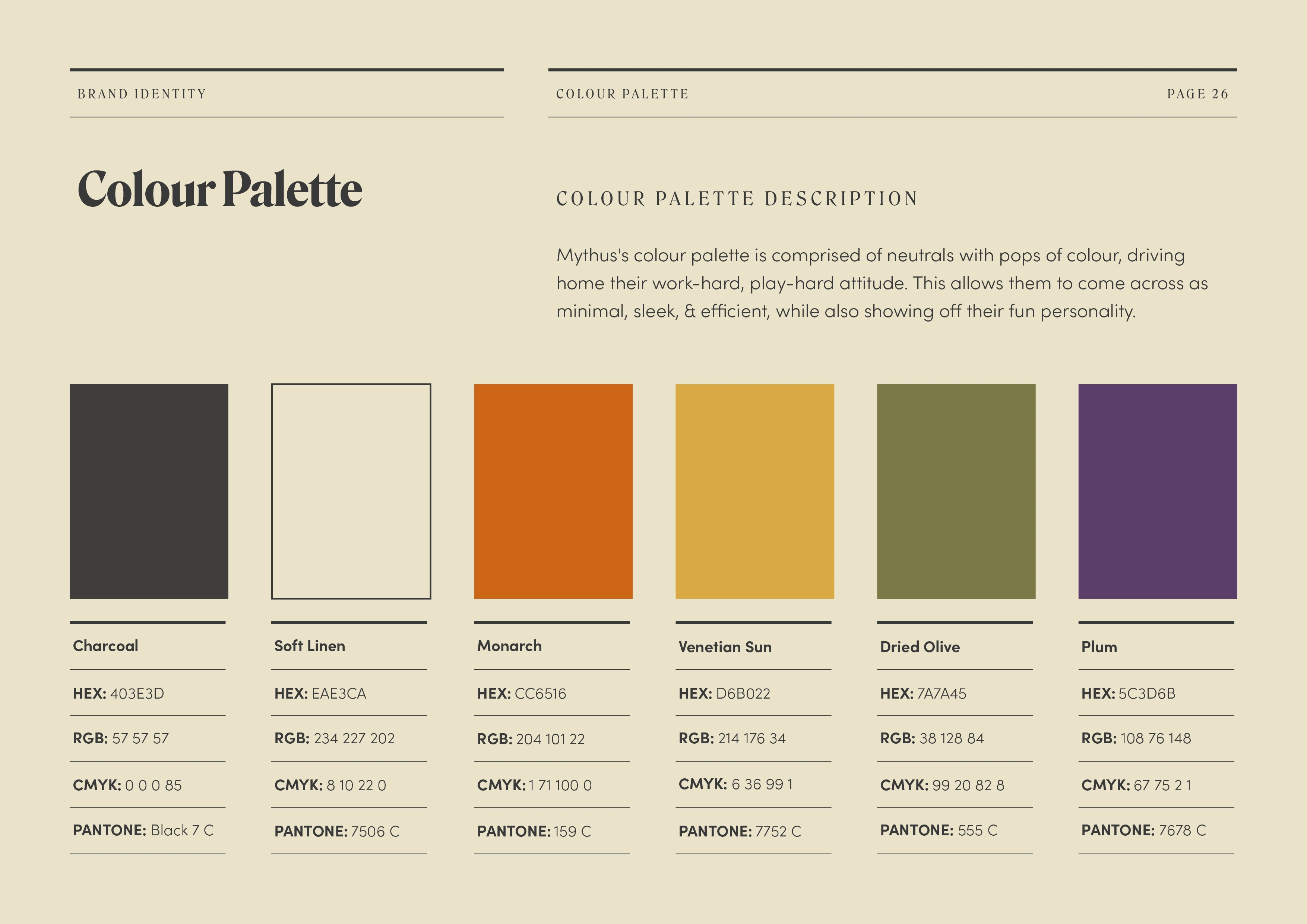
The color palette for Mythus Studio.
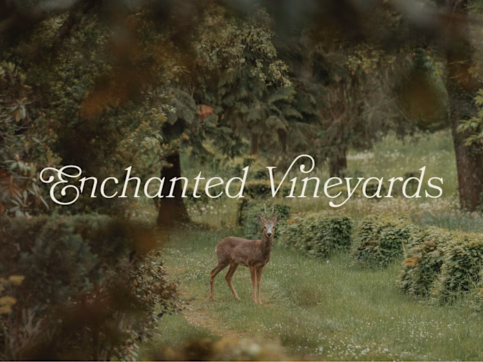
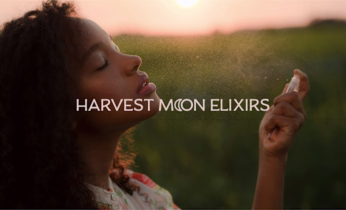
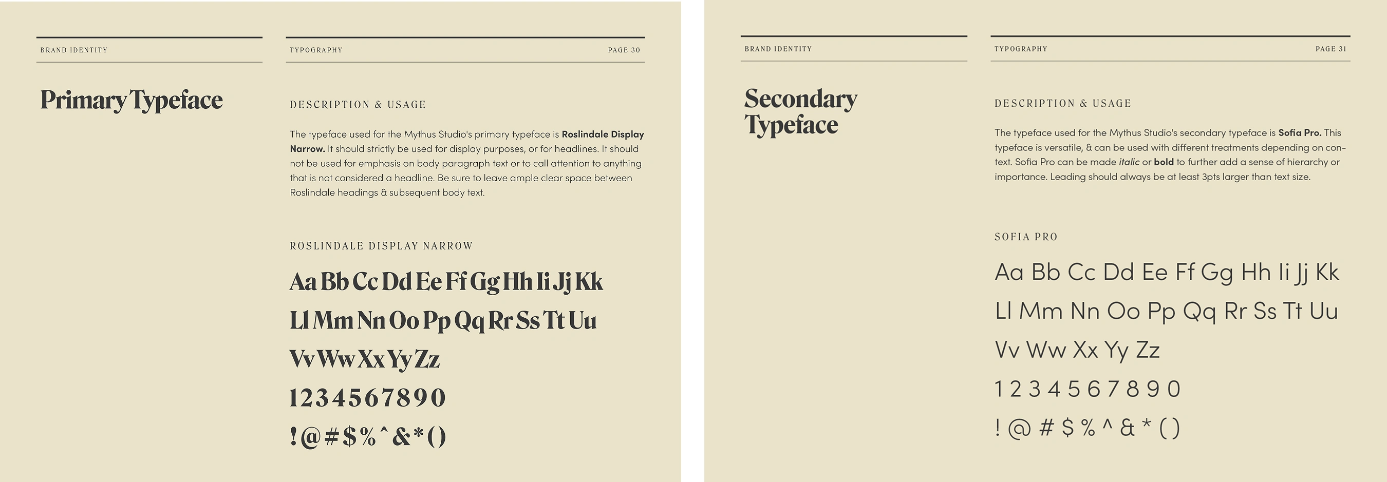
Typography
The typography direction for Mythus Studio is classic & clean, yet exciting. The primary typeface, Roslindale, is expressive, sharp, & high-contrast, giving them a polished, yet lively look. The secondary typeface, Sofia Pro, is the perfect complement, adding a bit of softness while still maintaining a clean presence in order to ground the pairing.
Closing Overview
The Mythus Studio brand is one of my favorite projects to date. It was initially created as a passion project between myself & my best friend, when we had big dreams of founding our own brand agency together.
Though we worked on a lot of projects together (and still do), our career paths took us in slightly different directions than we originally planned for. Mythus Studio may have never officially gotten off the ground. but it remains a testament to some of our most closely held values, & our loftiest goals for the future.
Like this project
Posted Apr 6, 2026
Brand strategy, identity design, & brand guideline development for Mythus Studio, a branding agency serving community-centric artisanal creators.
Likes
14
Views
225
Timeline
Mar 6, 2021 - Aug 28, 2021
Collaborators