Traverse- Engineering & Consulting Agency Website Design
Charul Bhati
Introduction:
When Traverse, a consulting and engineering agency, approached me, they had a clear vision: they wanted a website that felt bold, modern, and impactful—something that not only reflected their expertise but also created an immersive digital experience for their clients.
Unlike traditional consulting firms, Traverse goes beyond offering solutions. They craft strategic, digital pathways for businesses, ensuring that every touchpoint is thoughtfully designed to drive real results. Their goal for the website? A visually engaging, highly interactive platform that seamlessly blends innovation with usability.
This is the story of how I brought that vision to life.
Research and Strategy
Before jumping into design, I knew I needed to deeply understand their industry and competitors. I started by analyzing websites of leading consulting firms, paying close attention to:
How they structured their services and solutions
What user experience strategies they used to improve retention
How they implemented interactivity and micro-animations
I didn’t just want to create another “good-looking” website—I wanted to design something that was strategic, conversion-focused, and deeply aligned with Traverse’s identity.
After competitive research, I shifted my focus to Traverse’s services. Consulting, design & development, and product strategy are their core offerings. The challenge? Ensuring that each service was highly visible, easy to understand, and effortlessly accessible.
Crafting the UX Strategy
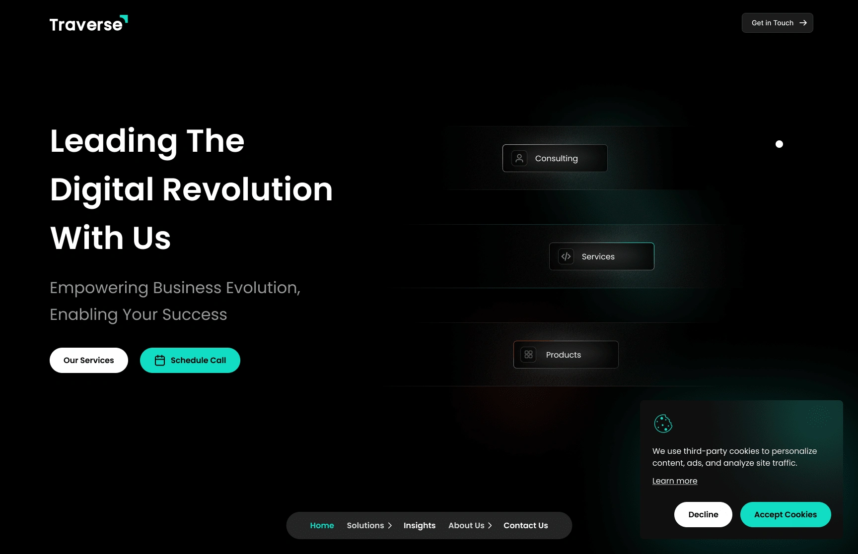
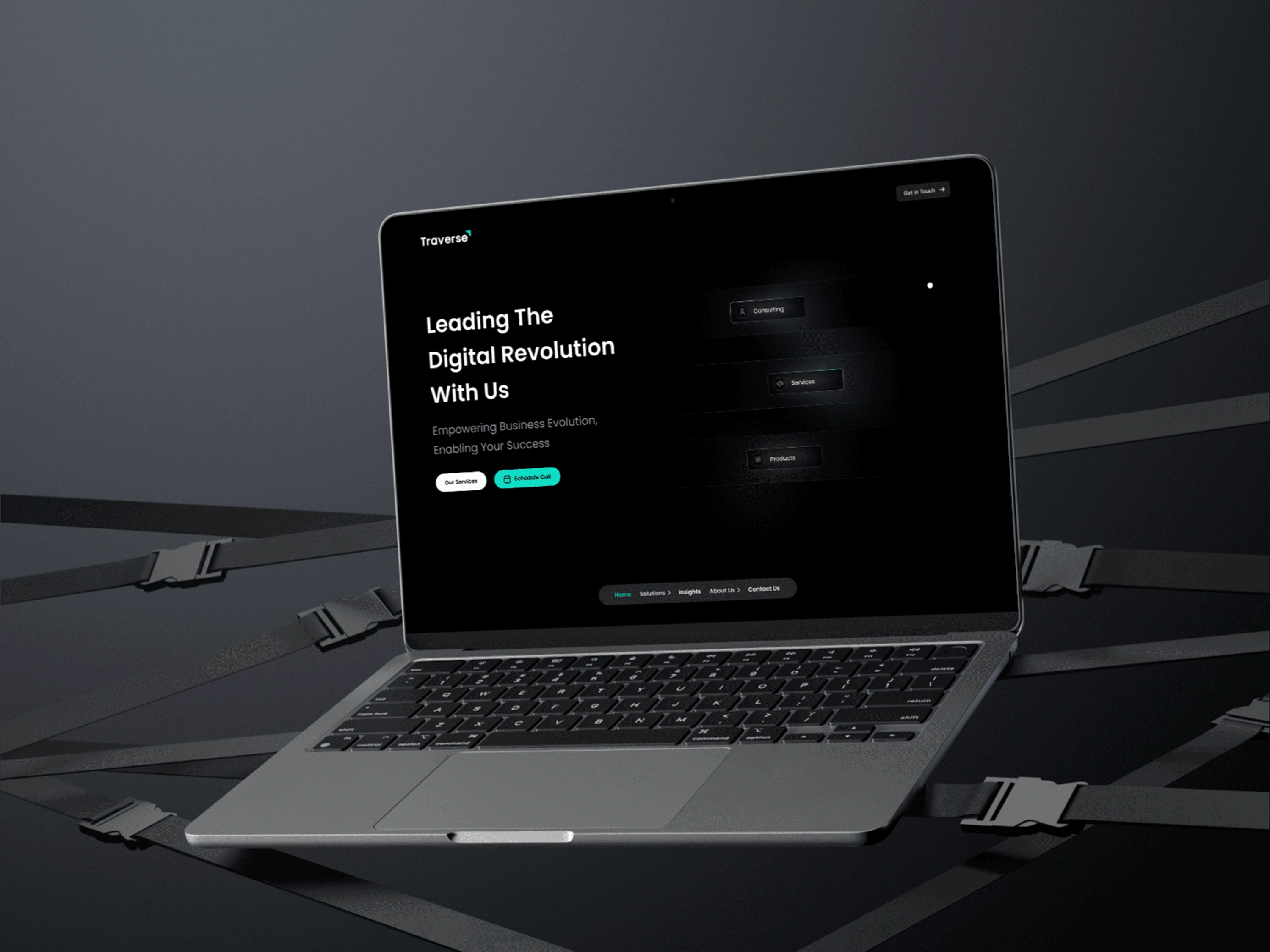
Hero Section
Once I had a strong grasp of their business needs, I mapped out the entire user flow.
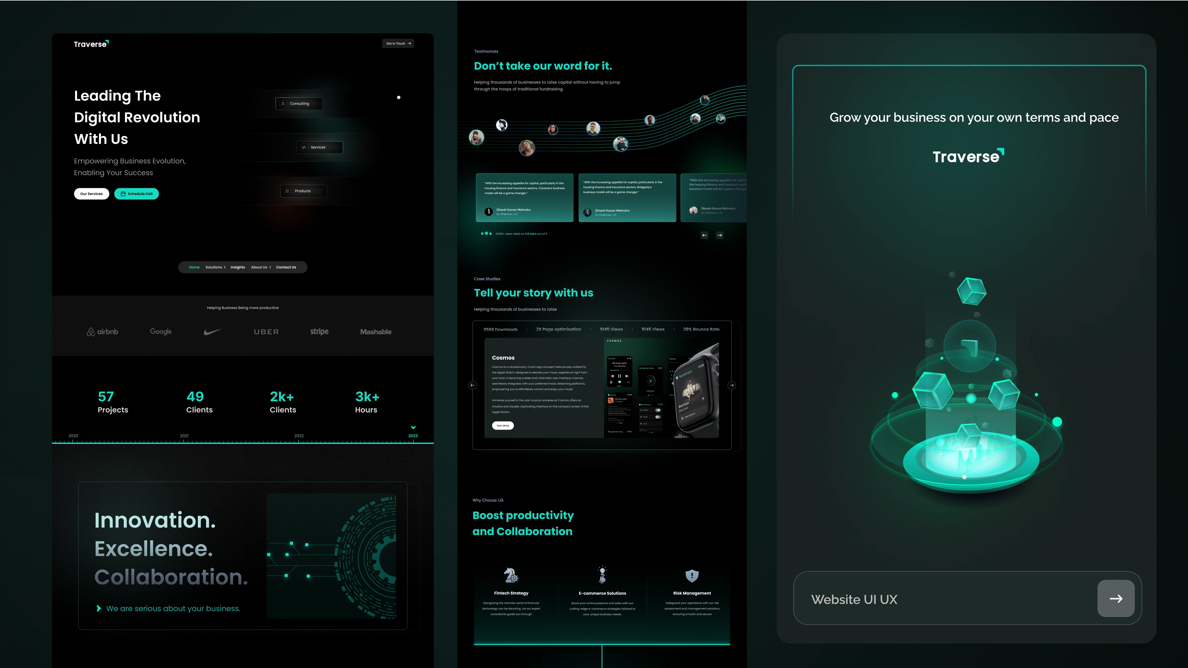
I structured the website around five key sections to ensure smooth navigation and clarity:
🔹 Homepage – A bold introduction to Traverse’s mission, expertise, and impact
🔹 Solutions – A deep dive into their three main services: Consulting, Design & Development, and Product Strategy
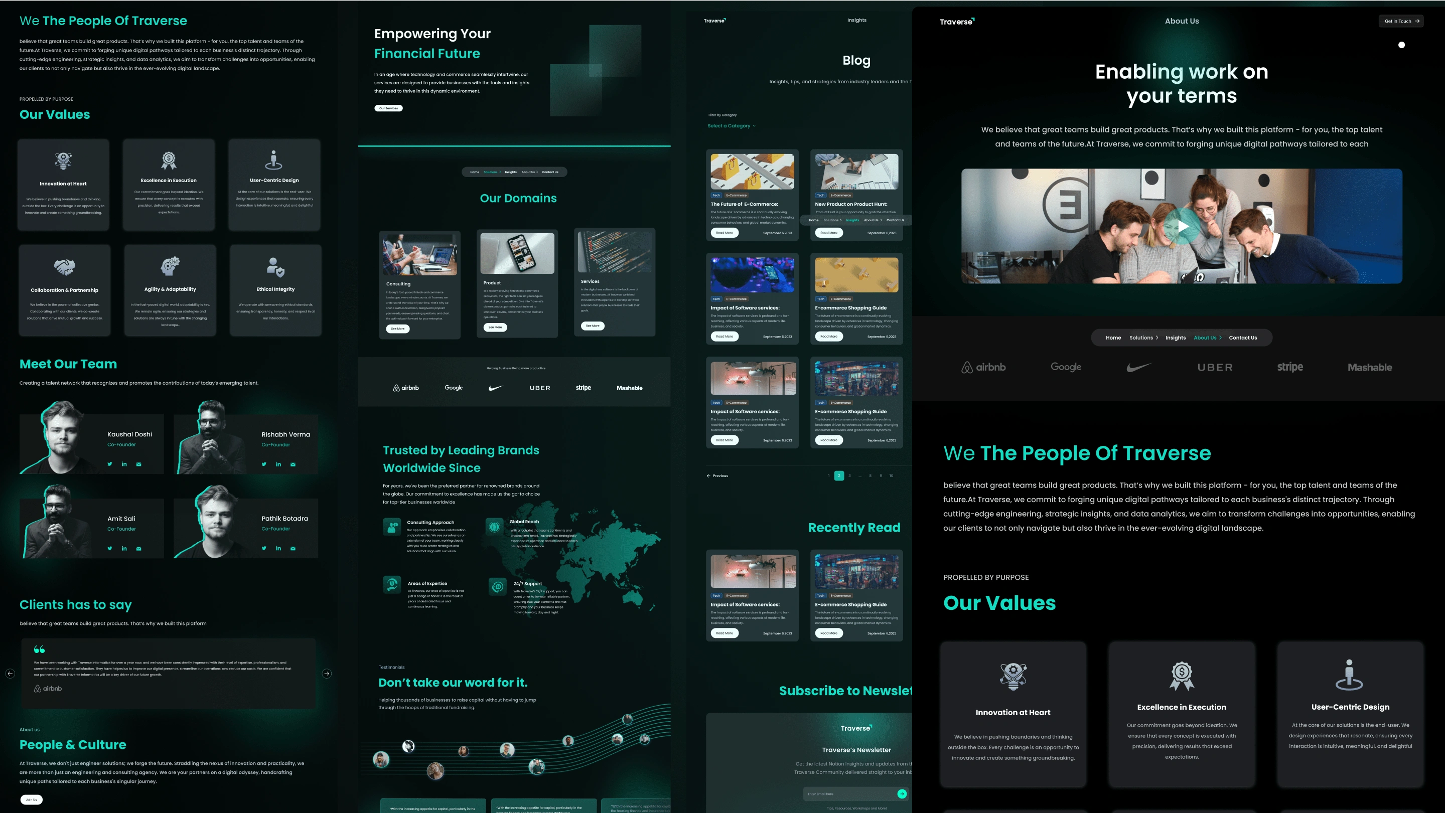
🔹 Insights – A knowledge hub featuring Blogs and Career opportunities
🔹 About Us – A glimpse into the company’s story, values, and expertise
🔹 Contact Us – A seamless way to connect with the team
One crucial addition was the 30-minute free consultation booking feature. Instead of burying it somewhere deep in the site, I placed it strategically in:
✔️ The top navigation bar for instant access
✔️ The end of every service page to encourage conversions
This way, visitors could easily schedule a consultation at any point in their journey, boosting lead generation and engagement.
Designing the Experience – A Bold, Futuristic Look
With the UX foundation in place, it was time to bring the visual identity to life.
The Aesthetic Direction
From the start, I knew this couldn’t be a generic corporate website. Traverse wanted something bold, digital, and modern—so I went for a dark-themed UI with neon accents.
🎨 Color Palette & Effects:
Dark background to enhance contrast and create an immersive feel
Neon turquoise (#0FDDC4) as the highlight color, giving the site a futuristic and modern energy
Glassy UI elements & light neon glow effects to create depth and visual interest
Bringing It to Life with Micro-Interactions
To keep users engaged and immersed, I carefully integrated subtle micro-animations throughout the website:
✅ Hover effects that add dynamism without overwhelming the user
✅ Smooth scrolling animations to guide users effortlessly through the journey
✅ Interactive service cards that respond to user actions, making the experience more engaging
The goal was to make the website not just visually appealing but also interactive and memorable.
Ensuring a Seamless Experience Across Devices
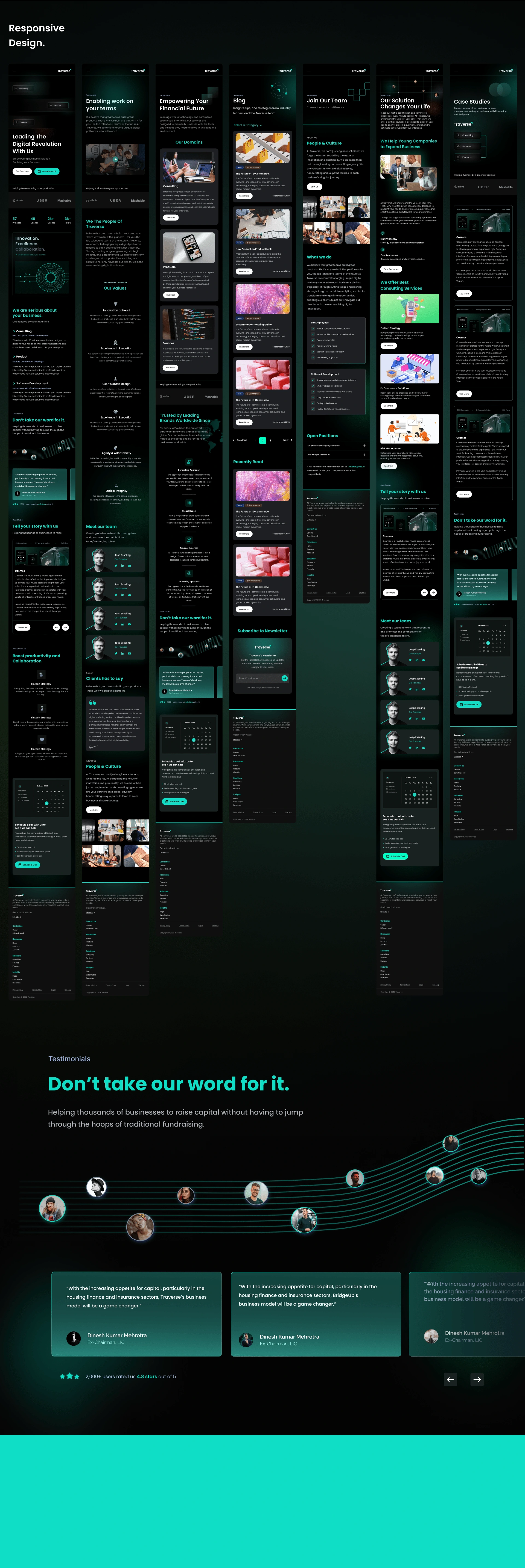
A beautiful design means nothing if it doesn’t perform well across all screens. So, after finalizing the desktop version, I meticulously worked on the mobile and tablet designs.
📱 Mobile Optimization
Touch-friendly buttons and interactions
Optimized text readability
Adjusted layouts to maintain clarity and flow
💻 Tablet Adaptations
Responsive grid adjustments
Fine-tuned micro-animations to ensure smooth performance
The result? A seamless experience regardless of where users access the site.
Team & Collaboration
While I took the lead on UX strategy and UI design, this was a collaborative effort. Working alongside Deepak Yadav, Saurav Wagh, and Harshita Jaiswal, we combined our expertise to ensure that the final product was nothing short of exceptional.
My key contributions included:
✨ Leading UX Research & Strategy
✨ Designing the complete user journey & navigation
✨ Crafting the visual identity & interactions
✨ Ensuring a responsive & accessible experience
Together, we created a website that truly embodies the Traverse brand—bold, digital, and impactful.
Final Thoughts – More Than Just a Website
The new Traverse website is not just a showcase of their services—it’s an experience. Every detail, from navigation to UI animations, was intentionally designed to enhance usability, engagement, and conversion.
Through strategic UX decisions, a futuristic design approach, and seamless interactivity, we transformed their online presence into a powerful digital asset that reflects their vision, expertise, and bold identity.
🚀 This project reaffirmed my belief that great design is not just about aesthetics—it’s about crafting experiences that drive real impact.
Like this project
Posted Aug 7, 2024
As a UI/UX designer for Traverse,I crafted a usercentric interface with intuitive navigation,responsive design, trust-building elements,an interactive dashboard
Likes
0
Views
19
Timeline
Feb 1, 2024 - Apr 5, 2024
Clients
Traverse