Typographic Instagram Grid Redesign

Vera Sadko

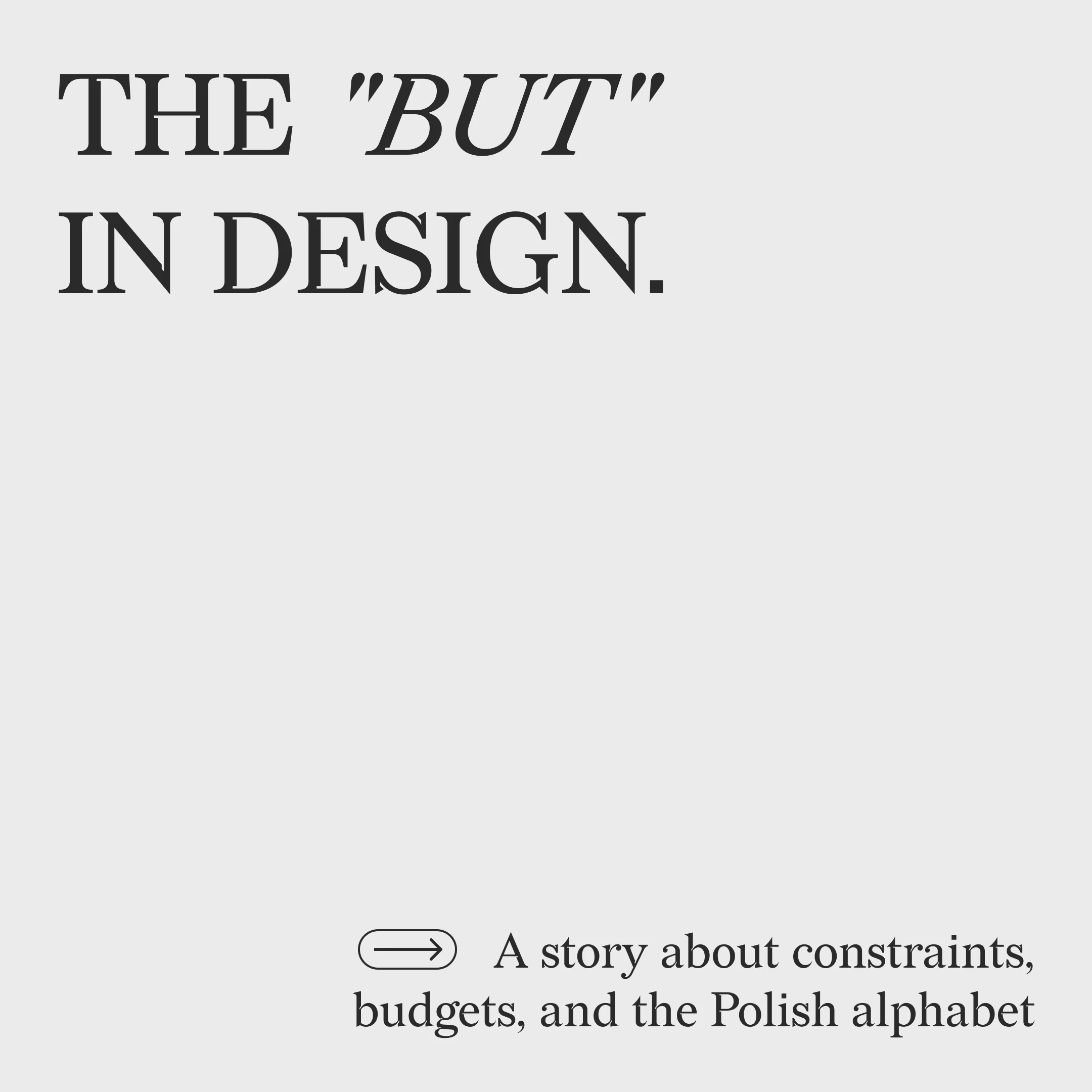
Finding Beauty in Constraints: A Typographic Instagram Grid for an Agency
Overview
This project is a masterclass in turning strict technical limitations into a powerful visual identity. I was tasked with redesigning an Instagram grid using nothing but typography—no images, no complex graphics, just the raw power of fonts.
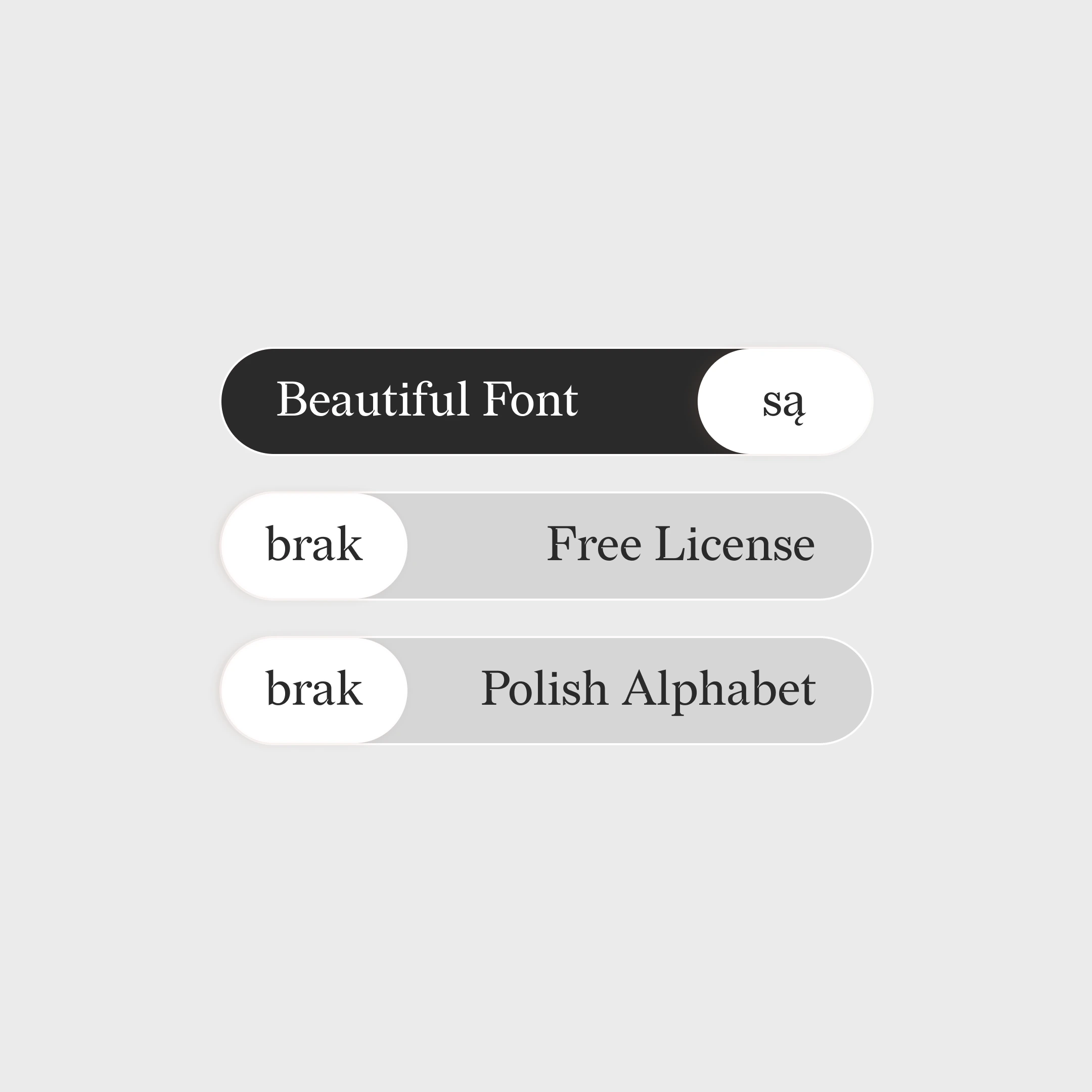
The Challenge & Constraints
In portfolio concepts, you can fly high with no rules. In reality, design lives within boundaries. For this project, the creative space suddenly felt incredibly tight due to two major roadblocks:
The Budget Limit: The initial trendy fonts from the brief were paid, with only a couple of basic weights available for free. Building an entire typographic identity on just two weights is a dead end.
The Alphabet Trap: The content had to be localized for the Polish market. Most of those sophisticated, trendy fonts simply didn't support the Polish alphabet ("brak" support for crucial diacritics).
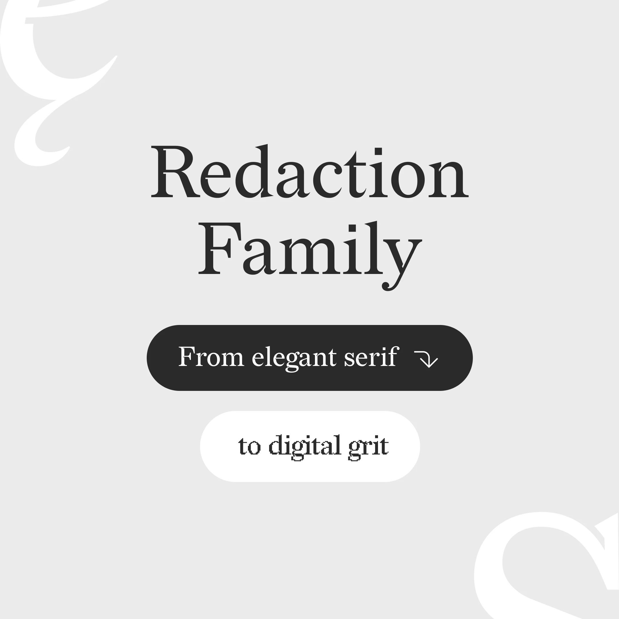
The Solution: Tactical Typography
To break the stalemate, I discovered and implemented the Redaction type family. It became the perfect tactical tool for this business challenge:
Evolution of Form: Redaction doesn't just play with classic weights; it evolves from a crisp, elegant serif into a beautifully degraded, rebellious pixelated form.
Visual Rhythm: Those bite-sized pixel cutouts in the curves and sharp, textured transitions allowed me to create a rich variation across the grid without turning the layout into digital noise.
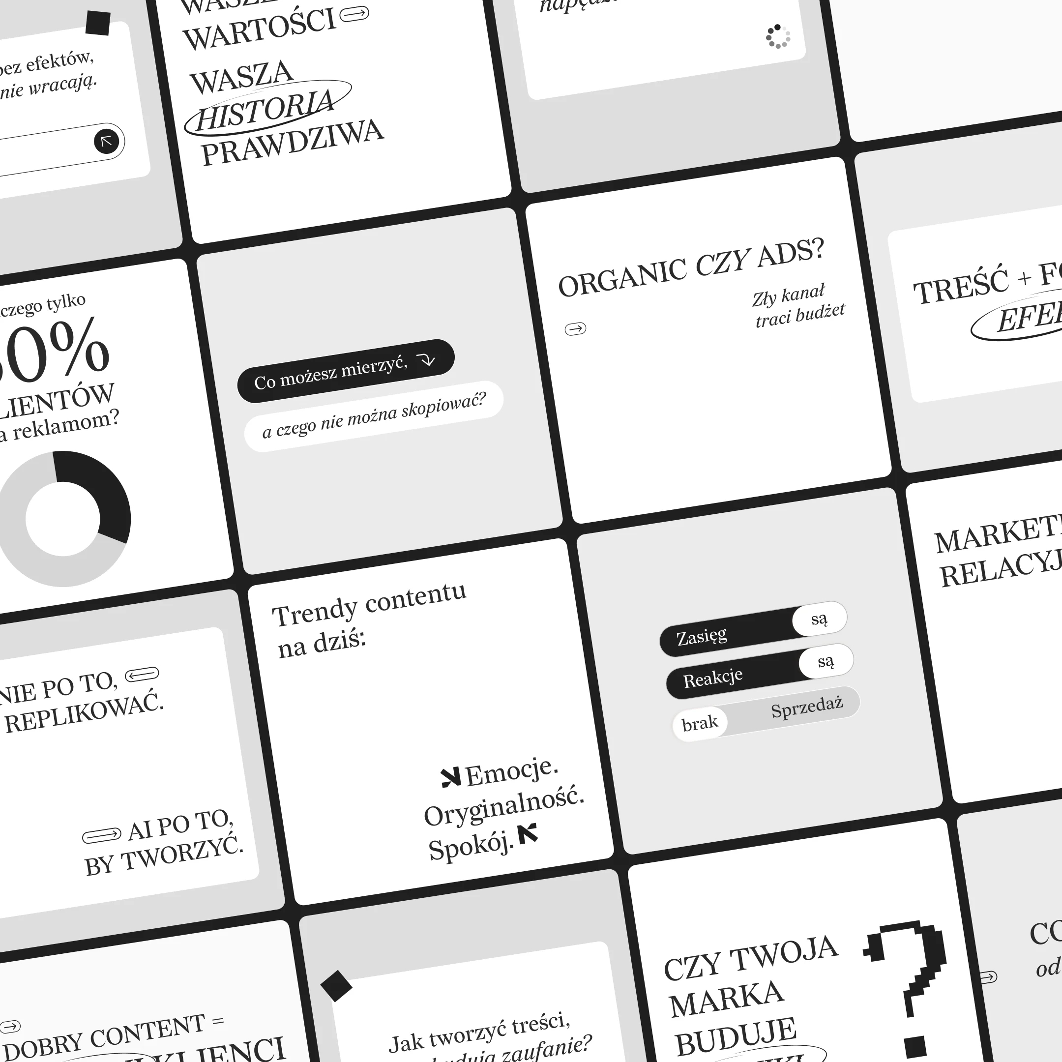
The Result
The Redaction system was approved, localized, and it now holds the entire visual grid together seamlessly. It proved that true expertise isn’t about running away from restrictions—it’s about finding breathtaking solutions right where they hit the hardest.
Design for business, not for ego.
Like this project
Posted Jul 8, 2026
A typographic Instagram grid redesign that solves budget and Polish language localization constraints using the Redaction type family.
Likes
0
Views
8
Timeline
Jun 29, 2026 - Jun 29, 2026