Comprehensive UX/UI Redesign for AeroBelService Tour Operator

Vera Sadko

AeroBelService: Comprehensive UX/UI Redesign for a Major Tour Operator
About the Project: This is an end-to-end redesign of a massive web portal for a leading regional tour operator. The goal wasn't just to update the visuals, but to completely untangle years of accumulated structural chaos. Through deep UX analysis, I restructured the site's information architecture, built clear user pathways for completely different target audiences, and designed a fully responsive, scalable ecosystem of 60+ unique screens.
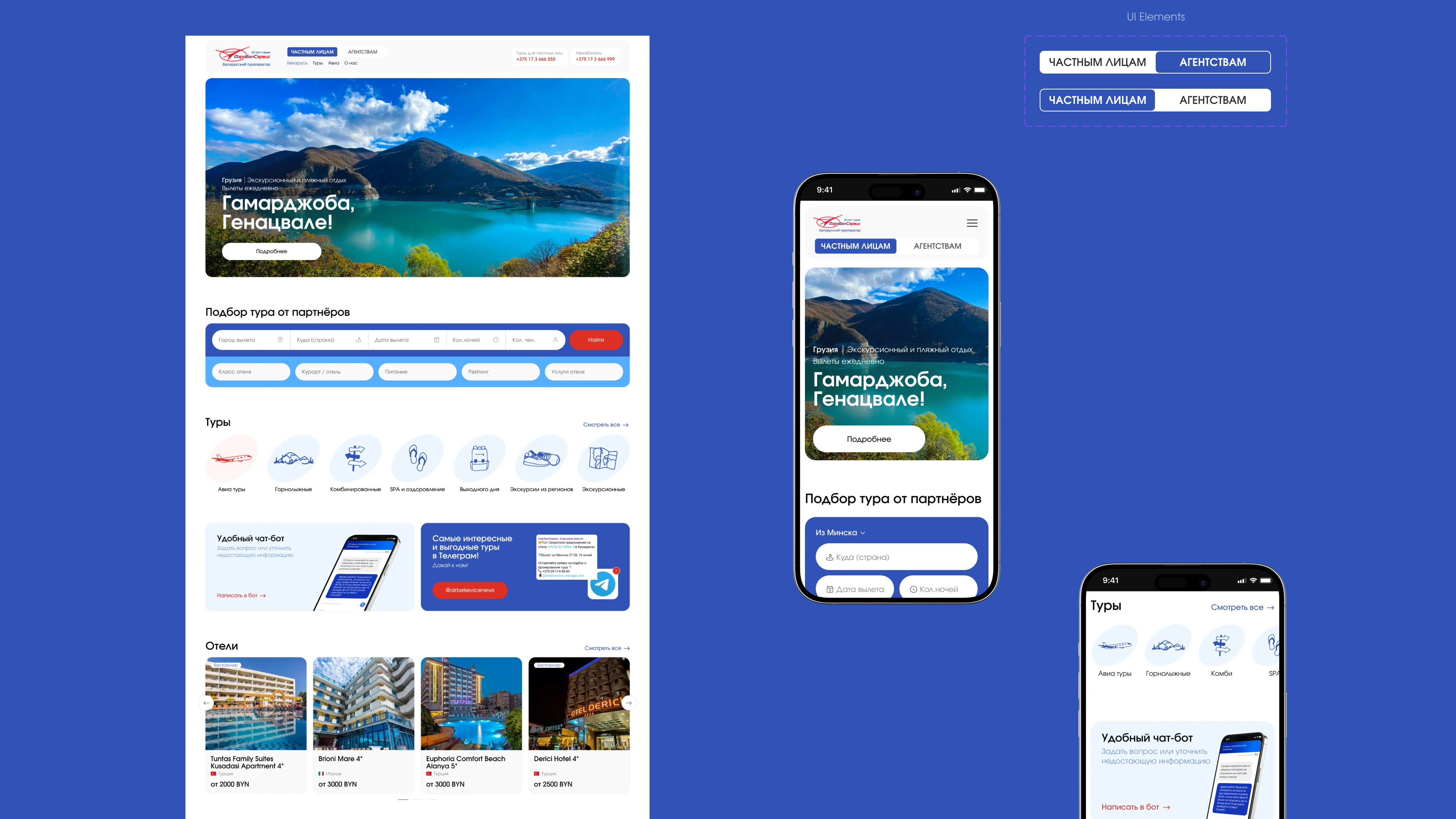
The featured cover showcases the new homepage and mobile layouts, highlighting the transition from text-dense blocks into a clean, scannable modular grid built for fast search and cross-platform consistency.
The Starting Point: Analyzing the Legacy Website
Before diving into Figma, I conducted a deep UX audit of the original platform to identify why it was failing both users and the business.
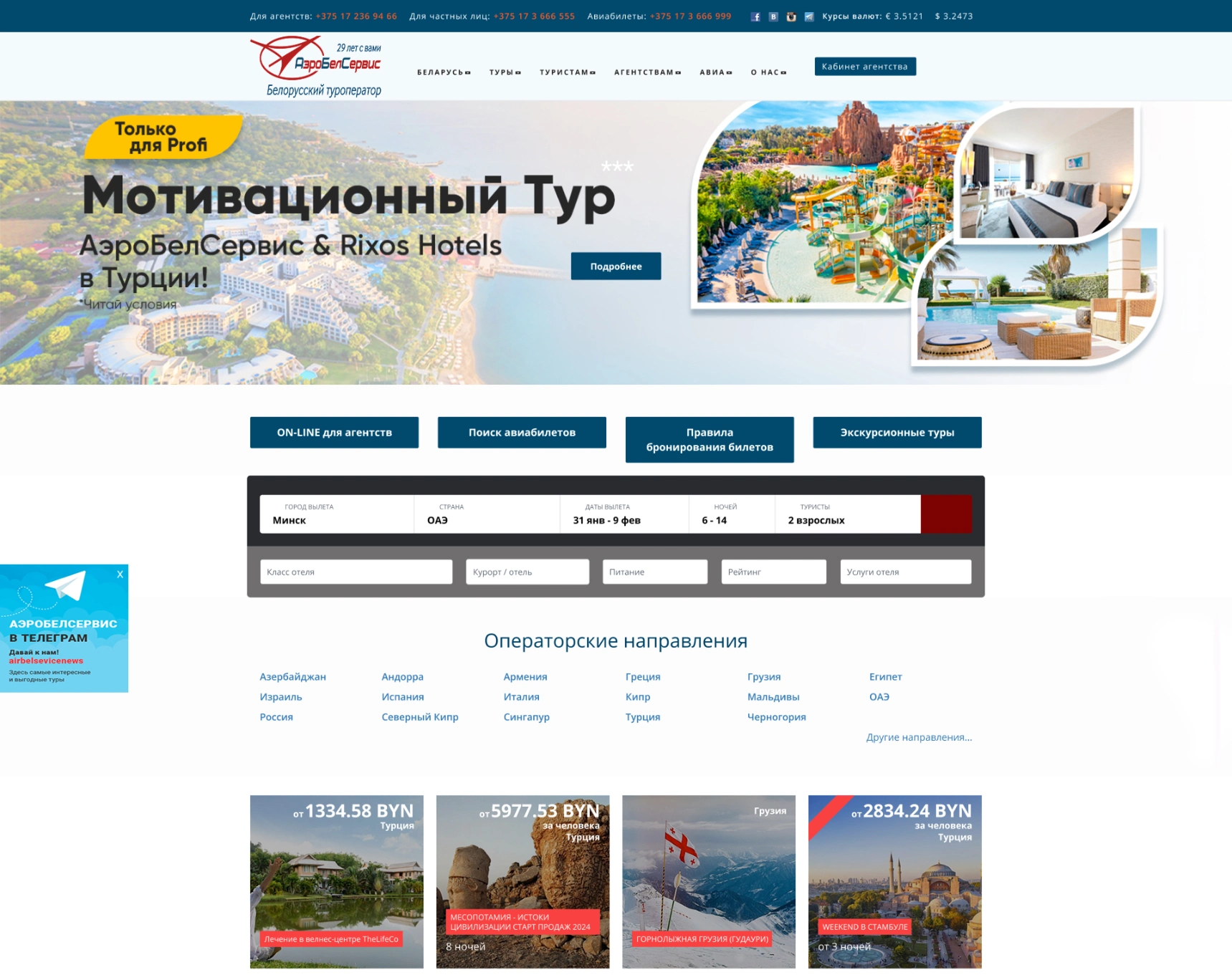
The legacy homepage before the redesign — overloaded with text and structurally broken
Key Issues Uncovered:
Audience Collision: B2B marketing banners for travel agents were mixed directly with B2C search tools for regular tourists, confusing both user groups.
Rigid Technical Script: The central search engine operated on a restrictive, two-tier third-party code that created massive visual clutter and a heavy cognitive load.
Navigation Redundancy: The interface suffered from overlapping navigation patterns. Users had to navigate complex multi-level dropdowns in the header, which were then duplicated in bulky sidebar menus on internal pages.
Overwhelming Filtering: Internal search layouts relied on endless vertical checkbox lists that forced users through exhaustive scrolling just to find basic trip types.
Poor Content Hierarchy: Popular travel destinations were dumped into a messy, plain-text list under the filter, while important company info was trapped in unreadable layout blocks.
Information Architecture: Separating B2C & B2B Pathways
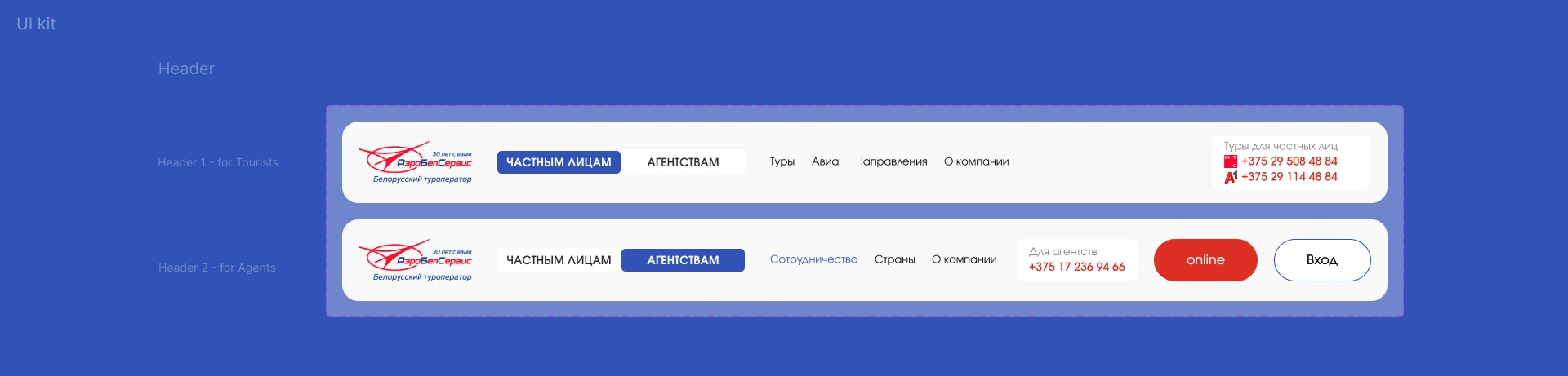
Advanced navigation engineering — switching between standalone B2C and B2B header states
The biggest structural win of this redesign was separating two entirely different target audiences that were previously fighting for the same screen space. Instead of a messy corporate layout, I built a smart toggle system that completely adapts the website’s entry point based on user intent:
Header 1 (For Tourists / B2C): Focuses entirely on travel content. The menu adapts to fast product navigation (Tours, Flights, Destinations), and the contact block prioritizes direct consumer hotlines.
Header 2 (For Travel Agents / B2B): Instantly shifts the portal into a dedicated workspace. It reveals professional cooperation links, introduces a prominent "Online" button for direct booking tools, and provides a clear "Login" entry point to the Agent Dashboard.
Smart Filters & Easy Navigation
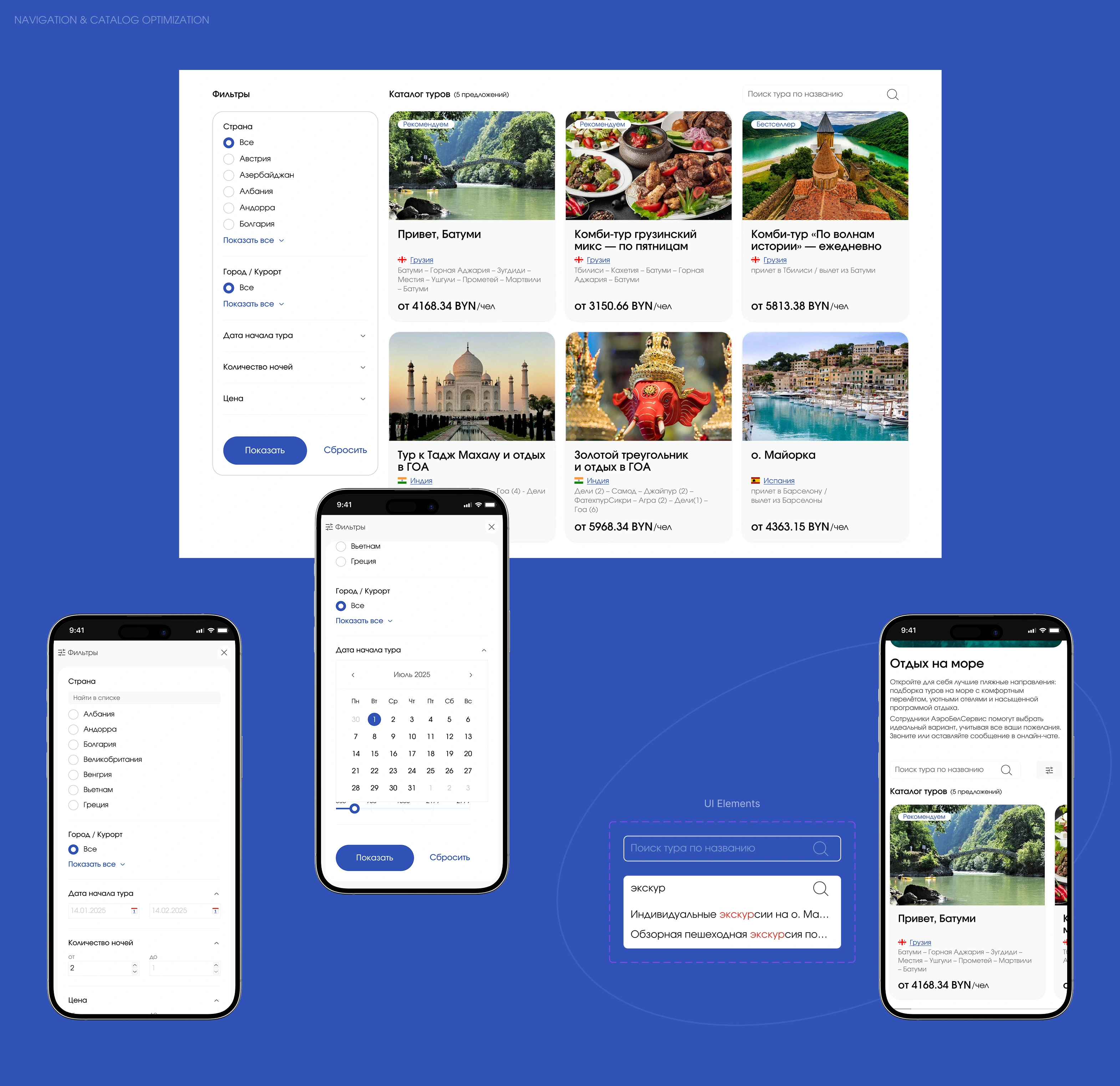
Clean catalog layout with a collapsible sidebar filter for desktop and optimized touch-friendly controls for mobile
To save users from endless vertical scrolling through hundreds of destinations, I redesigned the catalog and filtering system to be clean, fast, and intuitive.
Smart Desktop Filters: Grouped exhaustive checkbox lists into clean, collapsible accordion sections so users can expand only what they need.
Search Inside Filters: Instead of scrolling through a massive list of countries, users can now type the name directly into an integrated search bar inside the filter.
Flexible Card System: Created a uniform layout for content cards (tours, hotels, special offers). Important details like price tags and destinations are now instantly readable.
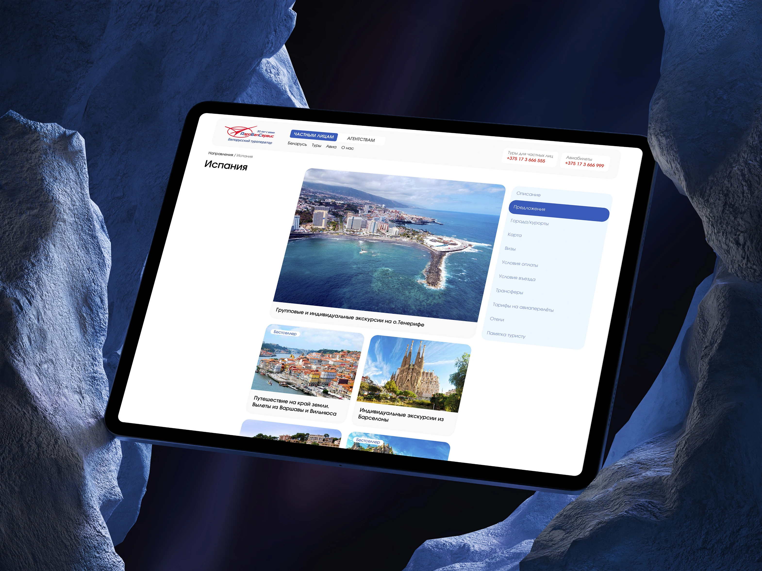
Clean internal pages featuring streamlined tabbed layout for seamless browsing
Structured Side Navigation: For content-heavy sections, I introduced clear sidebars and tabs. On mobile, these complex nested menus smoothly transform into horizontal, swipeable bars that are easy to reach with a thumb.
Redesigning the Core Experience: Homepage & Cross-Platform UX
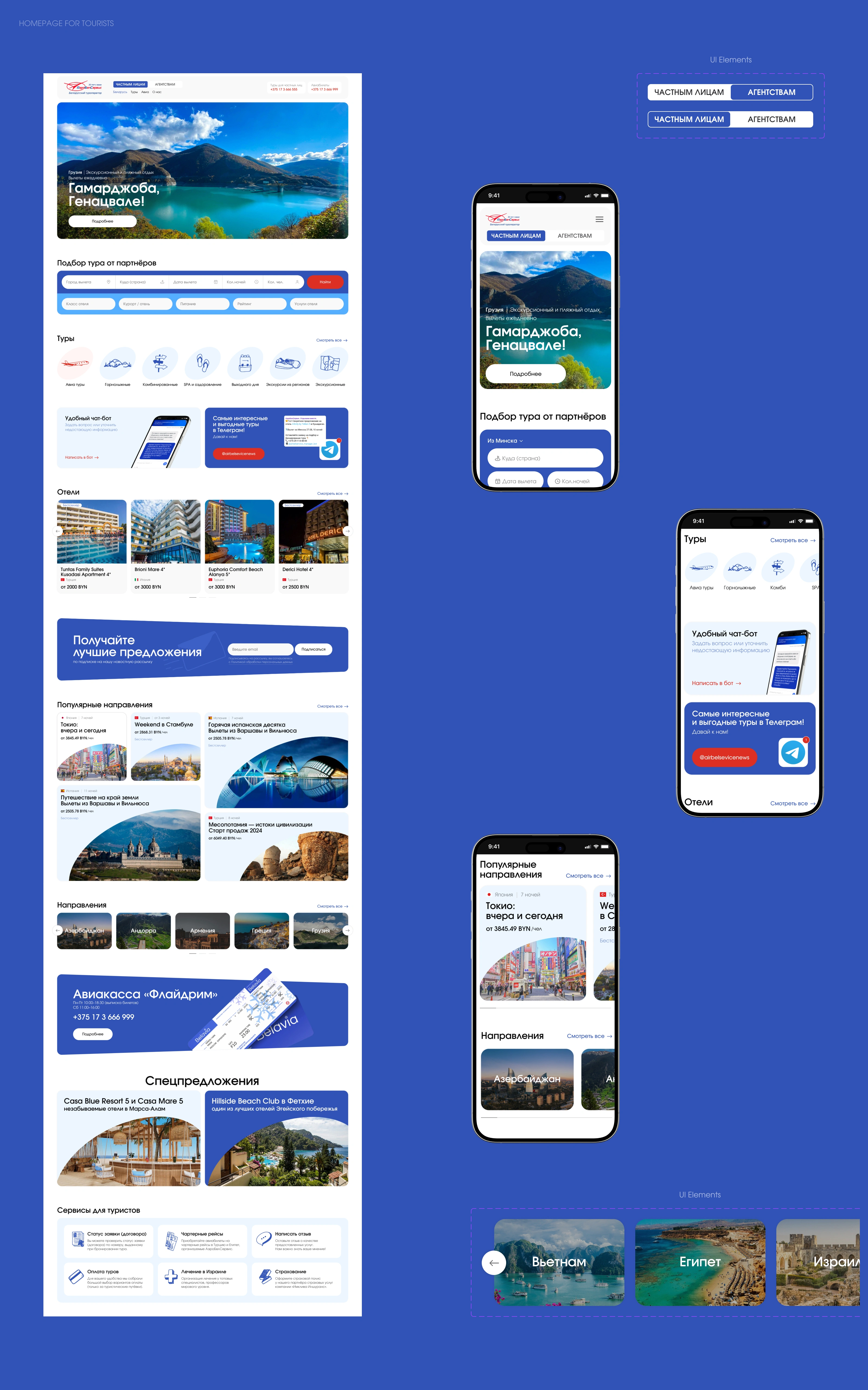
The full-length homepage layout paired with responsive mobile screens
The new homepage balances corporate functionality with an engaging travel experience. Instead of a chaotic, text-heavy portal, the layout guides users naturally from inspiration to booking.
Visual Storytelling: Cluttered banners were replaced with clean, high-impact hero sections that sell the destination instantly.
Optimized Mobile Architecture: The long desktop layout was completely adapted for smaller viewports. Content blocks, forms, and interactive slides stack into touch-friendly modules, making it effortless to explore destinations on any device.
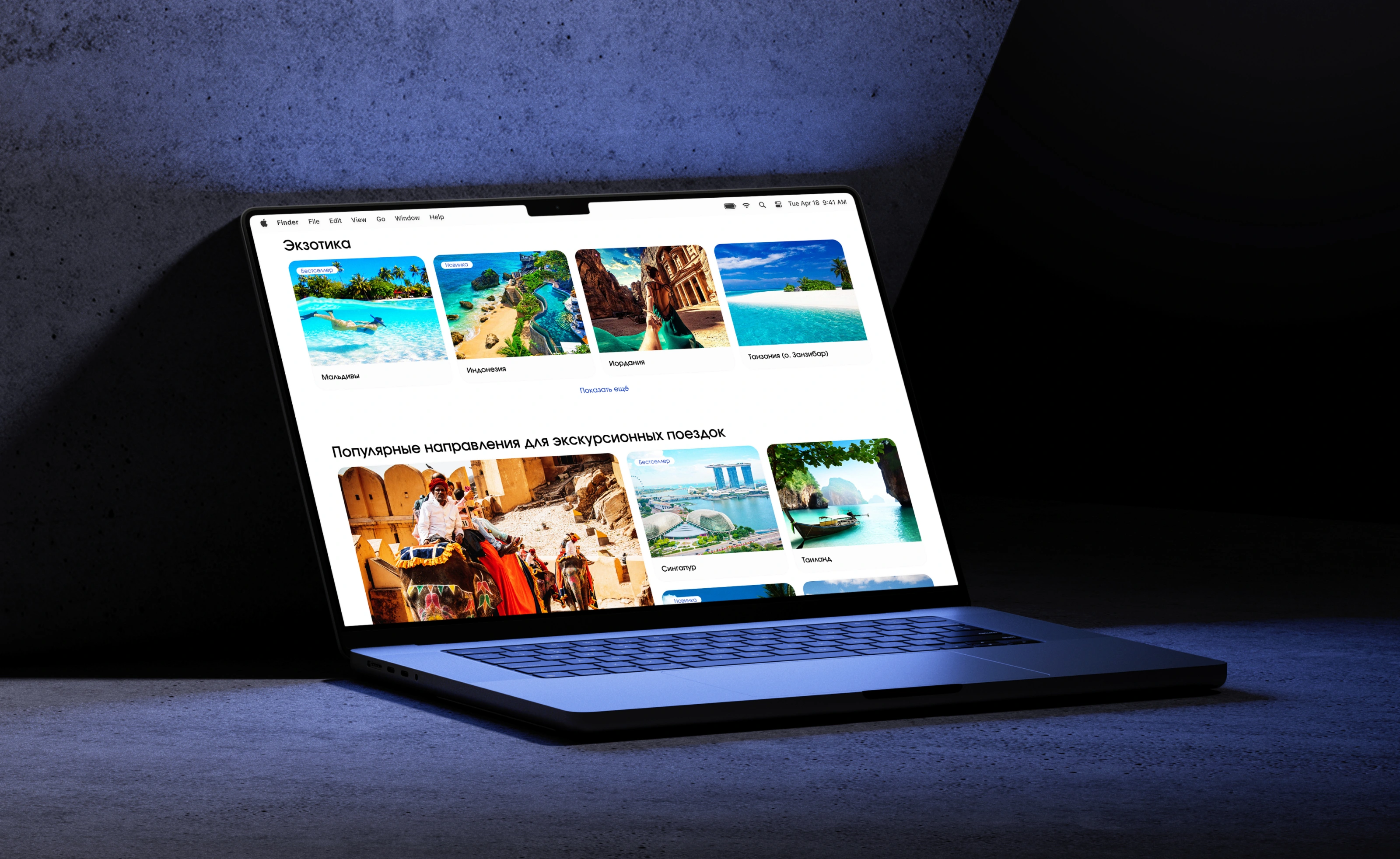
Clean, modular visual design applied across commercial content sections
Consistent Design Language: From hot deals to exotic destination highlights, every card and section follows a rigid grid system. This clean presentation increases content scannability, making it much easier for clients to browse options and compare tours without feeling overwhelmed.
Project Scope: Crafting a Scalable System
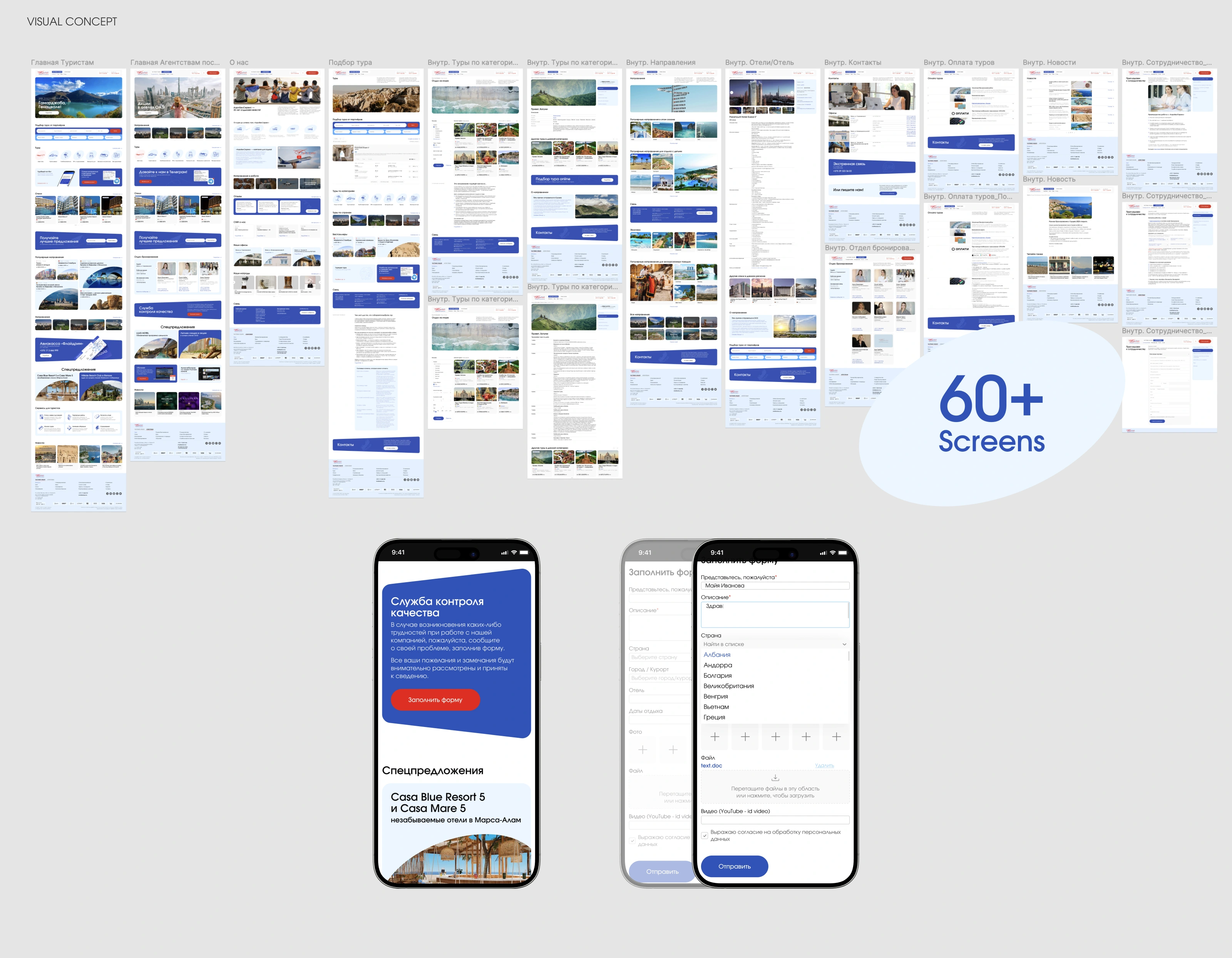
The complete design system layout, spanning over 60 custom-engineered user screens
This redesign was more than just a visual update — it was a full-scale digital transformation. By deeply analyzing the needs of both travelers and business agents, I designed a scalable ecosystem from scratch.
The Final Delivery Included:
60+ High-Fidelity Screens: Mapping out every user flow, including intricate B2B agent dashboards, corporate verification steps, and customized forms.
A Unified Component Library: Built completely in Figma, ensuring that any new pages, tabs, or filtering categories can be easily deployed in the future while keeping the interface completely consistent.
Note: The live platform may contain minor layout shifts and post-launch updates implemented by the client's development team, differing from the original design concept
Like this project
Posted Jul 12, 2026
End-to-end UX/UI redesign of a major travel portal. Structured complex B2B/B2C flows, optimized search, and delivered a scalable system of 60+ screens.
Likes
0
Views
4