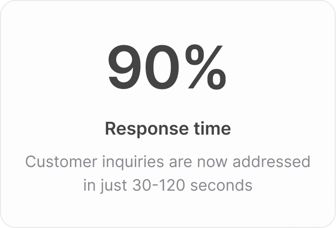
Reducing customer communication response time by 90%
almostbroke® Studio

My Role
I was responsible for product strategy, user flows, visual design, interaction design and prototyping.
Team
I lead design in an experienced team which consisted of a Product Designer (Me), CEO (Ryan), Frontend Engineer (Facu) and CTO (Martin)
Duration
6 weeks (3 weeks in Feb 2023 & 3 weeks in Apr 2023)
Overview
Reply Pro is a customer communication tool tailored for Homeowners Association (HOA) management companies.
Problem
Messages from homeowners sit unanswered for as long as 48 hours before a reply, even while location managers are working overtime.
Outcome
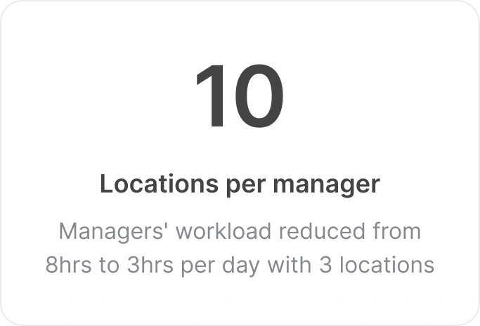
Inquiries are now addressed in just 30-120 which is 1.8x more than our initial goal, plus managers' workload was reduced from over 8hrs/day to 3hrs/day.
Final Design
Key terms:
HOA: Manages shared spaces, enforces rules, and provides services (like maintenance) within a residential development.
Managers: Oversees daily tasks, communication with residents across multiple locations, and ensures compliance with HOA regulations.
Homeowners: Own property within the HOA, pay dues and participate in decision-making within the community.
Problem… the struggle to keep up
Every single day, the HOA receives hundreds of messages from homeowners with various needs and requests. It's the managers' responsibility to handle these requests for each location they oversee. But when messages flood into a centralized inbox from ALL locations, not just the ones they're directly managing, it becomes impossible for them to keep up. The result?
A homeowner said “The HOA manager eventually responded and expediated repairs. It took time, but I appreciated the effort.
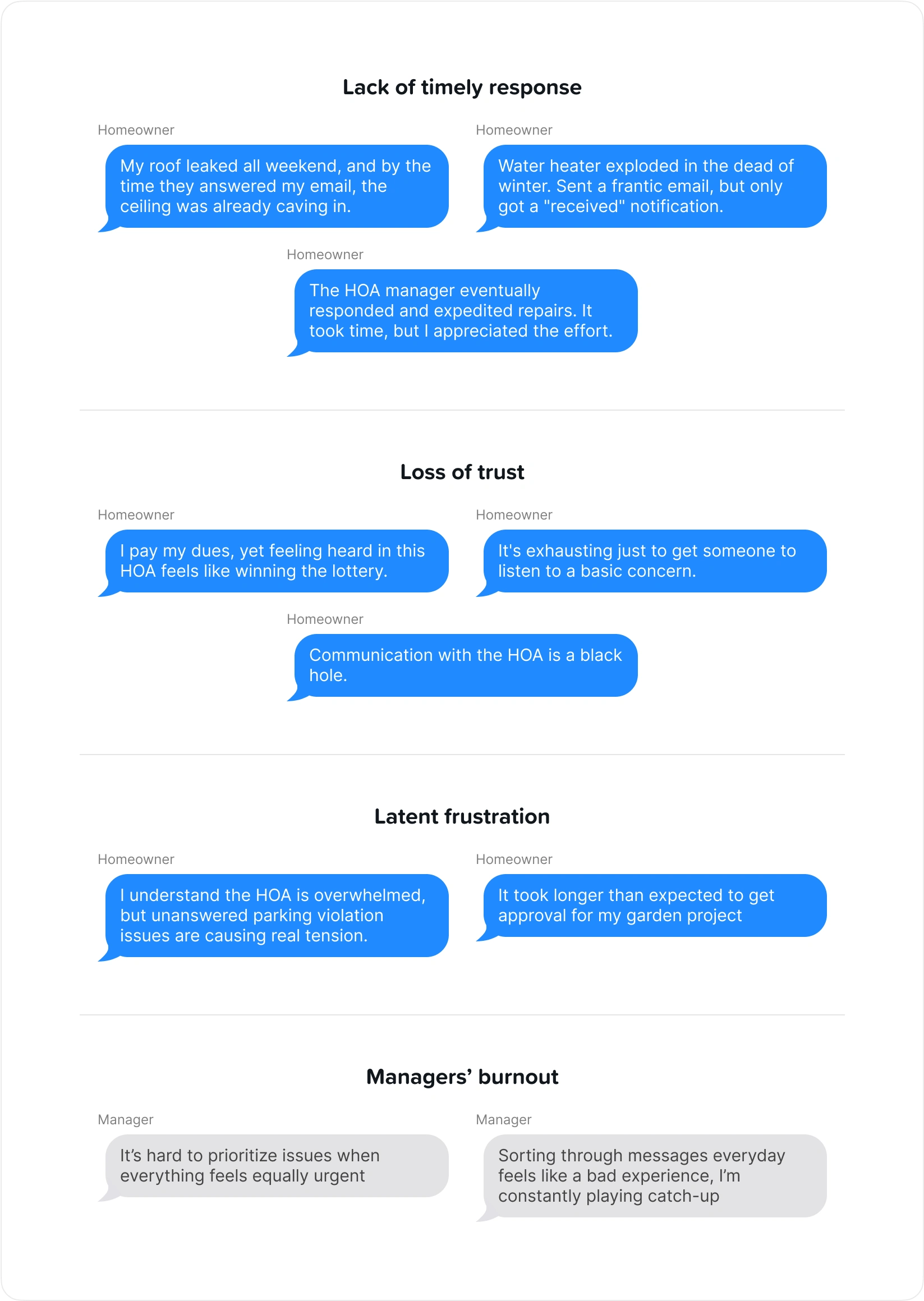
Homeowner frustrations and managers’ burnout
Messages sit unanswered for as long as 48 hours before a reply, managers spend more time scrolling through the backlog than actually addressing the complaints, leaving them working overtime, feeling overwhelmed and accomplishing very little. Homeowners felt neglected and trust in the HOA's abilities dwindled.
We had to do something, but what?
Goals & Objectives
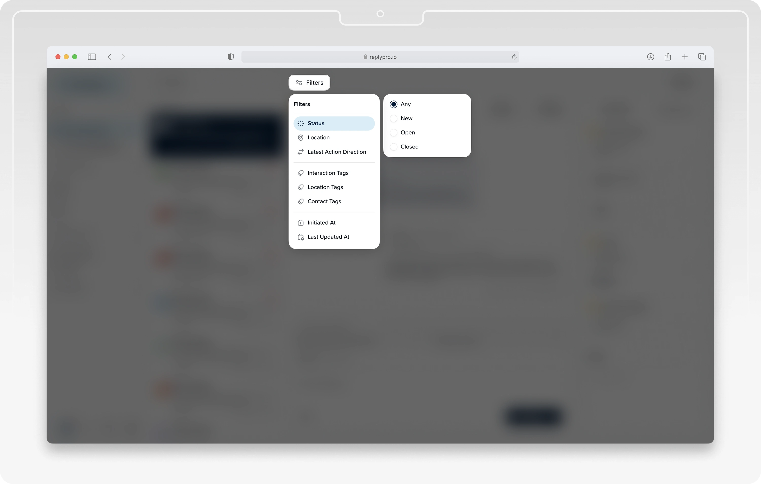
Implement a reliable filtering system for managers that shows messages only from homeowners in the locations they manage. This saves them from scrolling endlessly through messages from all locations. The filtering system should enable managers to sort requests by urgency, making sure important ones get handled first. It should also help them categorize urgent requests by type e.g. parking violations or garbage disposal issues. This way, every request gets addressed promptly, easing homeowners' worries and rebuilding trust. To make this happen, the filtering system should have multiple levels.
Reduce response times by 50%
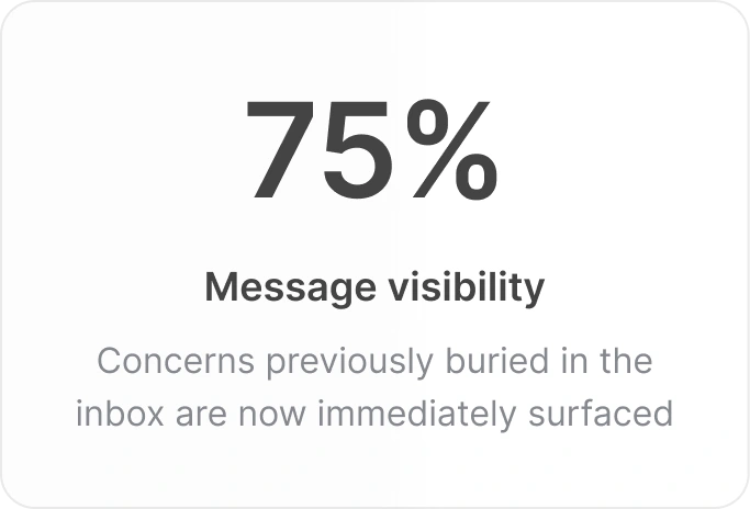
Increase message visibility by 75%
Boost resident satisfaction by 20%
Reduce managers’ overtime by 40%
Objectives
Multi-level filtering system
Powerful search
Intuitive interface
Focus on relevant messages. Avoid burnout. Guarantee timely responses.
Find specific messages quickly. Save time. Reduce frustrations. Build trust.
Make life easier. Spend less time scrolling and more time getting things done.
Sprint Grooming & Planning
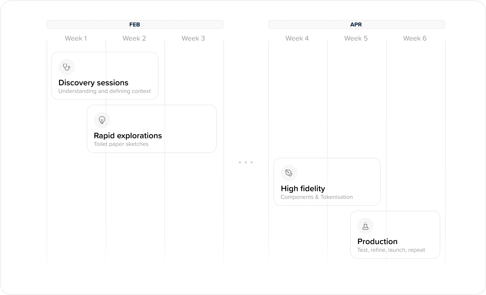
Project timeline and process
North Star design principles
OnTarget: Residents get the right help the first time, every time, without wasted effort or frustration.
SightLine: Actions are categorized and routed instantly, ensuring complete visibility into the resolution process for both residents and managers.
RadarVision: Managers work smarter, not harder, creating a productive and positive environment for everyone.
FutureProof: The system is designed to adapt and evolve based on user feedback and data insights, ensuring it remains efficient and effective over time.
Not that straightforward
Designing the filtering system turned out to be more complicated than expected. Creating the filters wasn't the hard part—it was making ones that managers could actually use. With so many parameters to consider, the first design was not the most intuitive—in short, it was a mess. Managers had to scroll forever, making it so frustrating that they ended up avoiding it altogether.
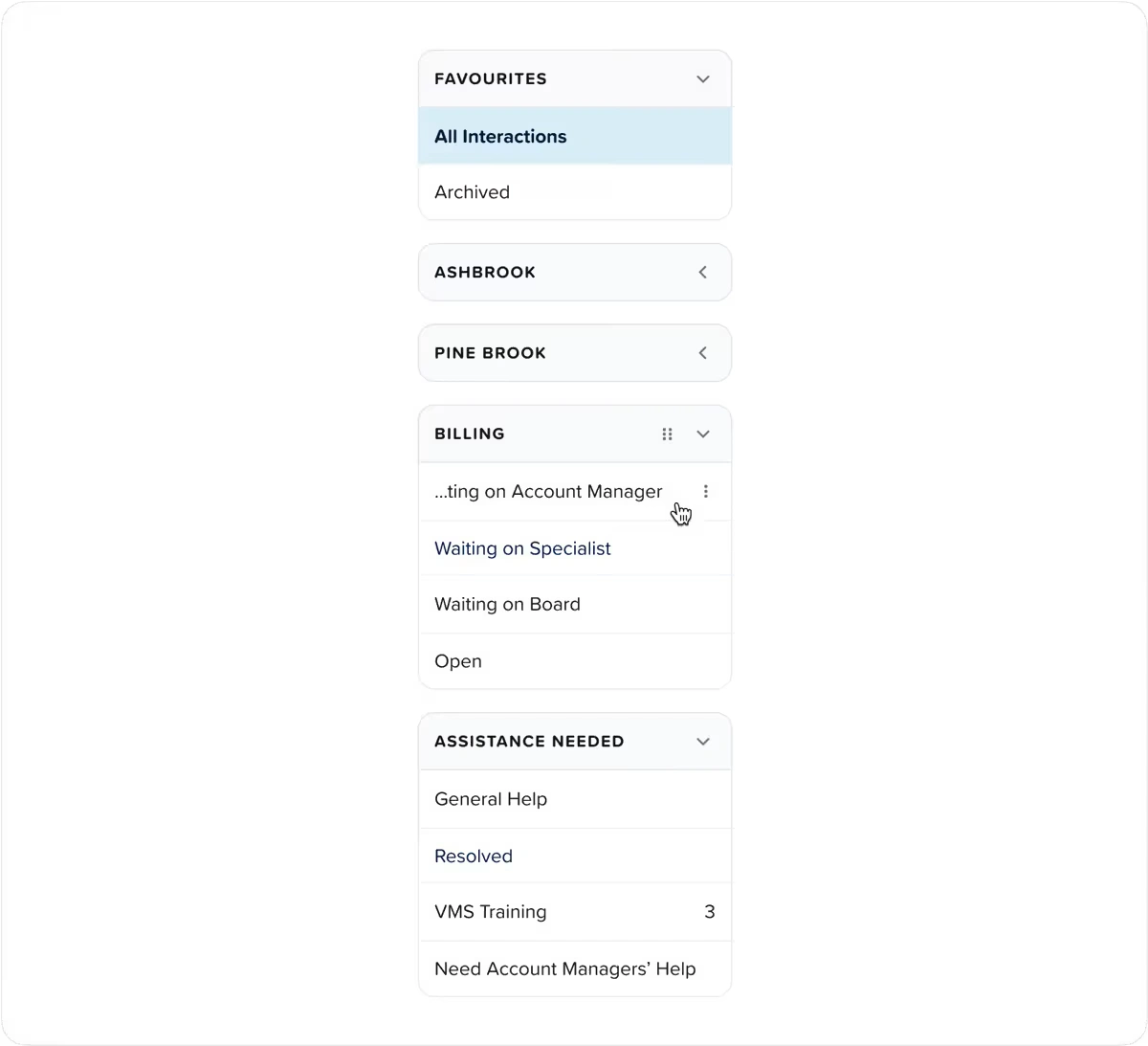
Audit & User Research
User interviews with 5 managers showed that they relied on the general inbox to view messages rather than the filtered view for a more streamlined messaging experience. The filters needed improvements for these reasons:
Inefficient organization
Unbearable scrolling
Confusing layout
Lack of clarity
Old design:
Disorganized, confusing, inefficient, cluttered.
Back to the drawing board
The first design didn’t fail because it had too many unnecessary parameters. Surprisingly, we were able to transfer almost everything from the old filters to the new ones and even added better features like date ranges. The real issue was how the filters were presented, so we knew the User Interface needed a facelift.
The parameters needed to be robust but not overwhelming, precise yet flexible, and detailed without causing cognitive overload. So, we focused on the managers' needs—what makes sense to them in a filtering system?
As a manager, I need to see messages:
only related to my location
that are new, open, or closed
if either the resident or I sent the last action
sent by a specific resident or group
between certain times
with certain tags
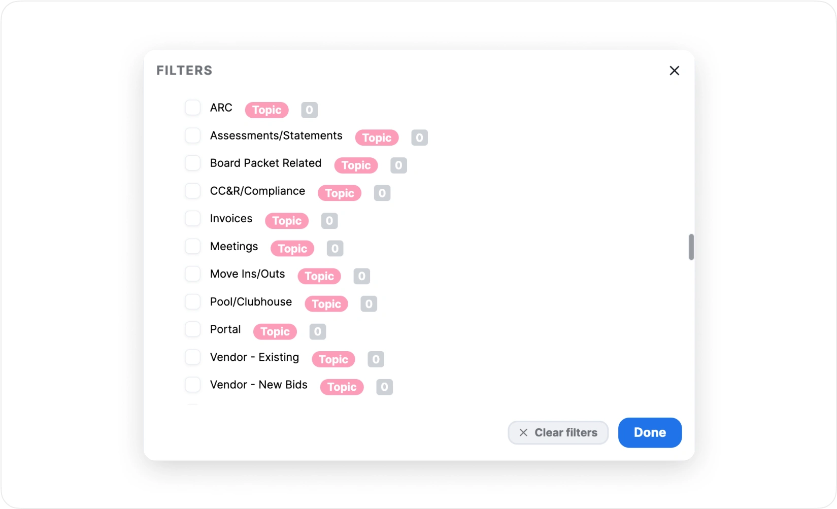
More autonomy for managers
We thought about ways to make the filters even better. That's when we came up with using tags. By grouping filters with tags, we could make the process even more precise and streamlined. Since our system already had tags that users were familiar with, it was easy to introduce this idea.
New design:
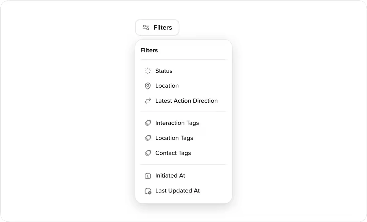
Filter groups organized and categorized for clarity
A missing piece
The new filtering system worked much better than the old one! However, early observations revealed a recurring pattern in usage. Managers often needed to reference old conversations while resolving new issues. So, they'd search for keywords, hoping to find what they needed, but the system's search feature wasn't reliable and it often came up empty.
To make things easier for managers, we had to create a better search function. After some interviews, we found out what managers usually looked for:
Who sent the message
Who received the message
The message subject
The message content.
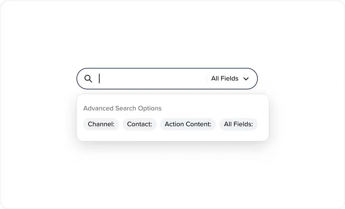
Search parameters
More complexity
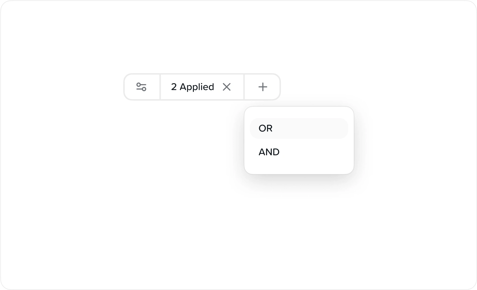
Creating the search feature led us to ask a crucial question: "What if a manager needs to search using a combination of several criteria?" Through interviews, we found out they often do. For instance, a manager overseeing ten locations might want to see only "urgent" maintenance requests from a specific community (AND) tagged with "water damage" (OR) "leaking pipes".
This revealed a need for AND/OR logic not just for the search feature, but also for the filters.
Intuitive AND/OR logic in the filters drastically cut down on irrelevant messages and helped managers find what they needed faster.
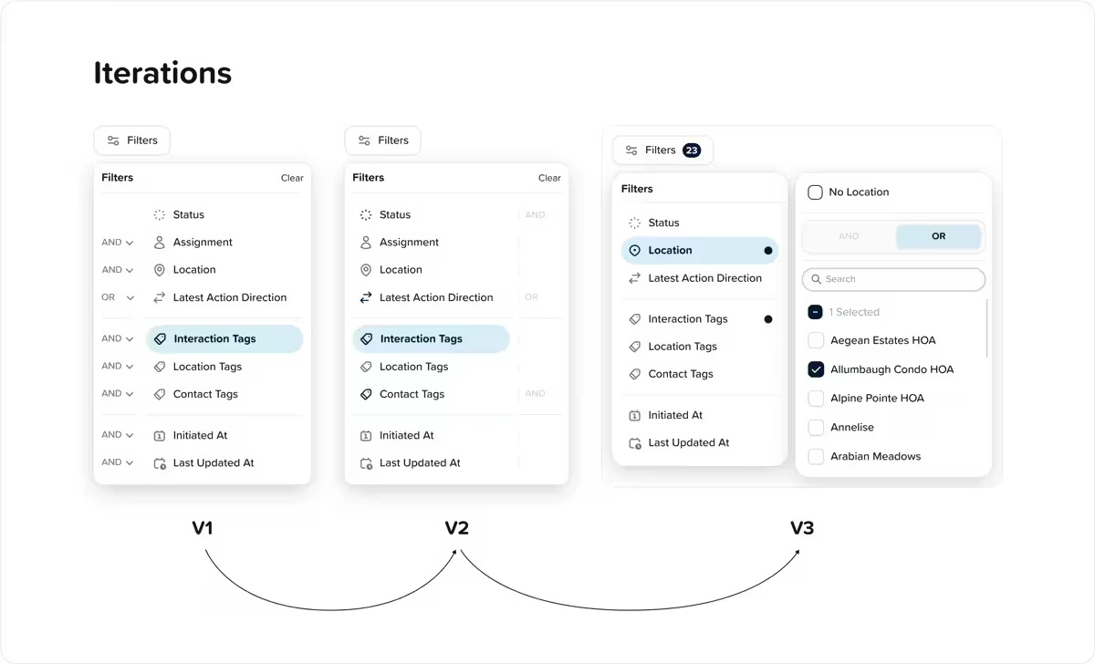
Improving AND/OR logic over three iterations
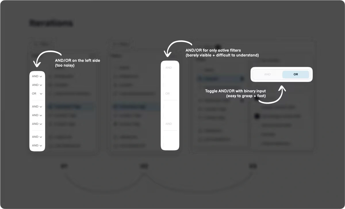
Highlights of changes to AND/OR logic over three iterations
First round of test
Feedback on our progress uncovered some loopholes. During the first test, we realized that managers' needs for AND/OR use cases were more complicated than we thought. They didn't just need multiple filters with AND/OR logic, but also AND/OR logic between each filter.
So, a manager might need to see (filter 1) “heater installation” OR “leaky roof” tagged “older than 2 days” (filter 2) AND “water damage” OR “plumbing” concerns tagged ”urgent”.
This presented another layer of complexity we were excited to tackle. And we thought, “if we’re going to add AND/OR logic between each filter, we might as well add it to the search feature”. So, we did. 😎
Multiple filters with AND/OR logic
Harmonizing the features
All the work on filters and search got me thinking: "How do we make using them effortless for our users?" We wanted it to feel like second nature, so users could focus on solving complaints instead of navigating the system.
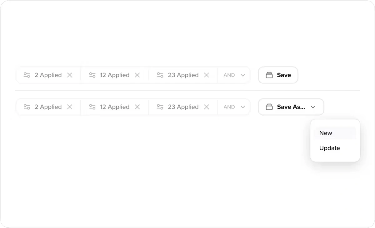
So, we added a 'Save' and 'Update' feature to the filters:
If you filter something new—not identical to any of your saved views—a “Save” button appears.
If you filter something that matches a saved view, or if you click on a saved view, an “Update” button appears
This simple change had an enormous impact 👇
The right combination of words
The first round of testing revealed that the search terms were just plain confusing. We didn't want words that made users stop and think—that would distract them from their main task of solving complaints.
We needed words that managers could quickly understand and relate to.
This required rapid iterations until we found words that resonated with managers instantly.
Old Copy
Channel | Contact | Action | Content | All Fields
New Copy
To | From | Subject Line | Message Content | All Fields
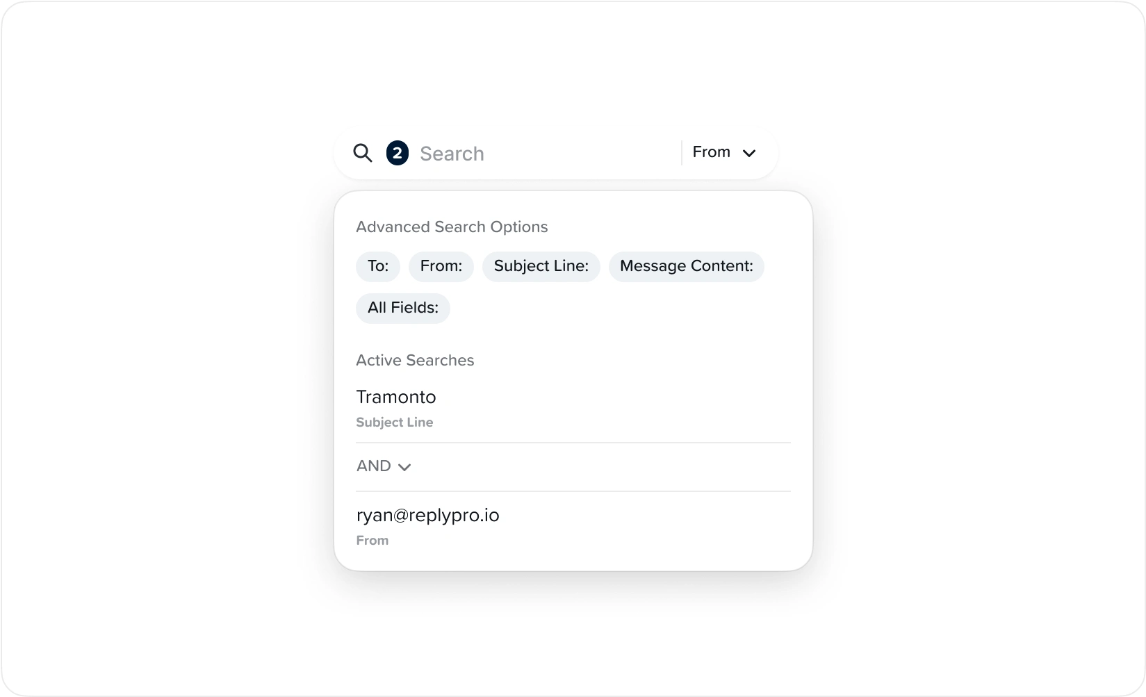
Improved search options
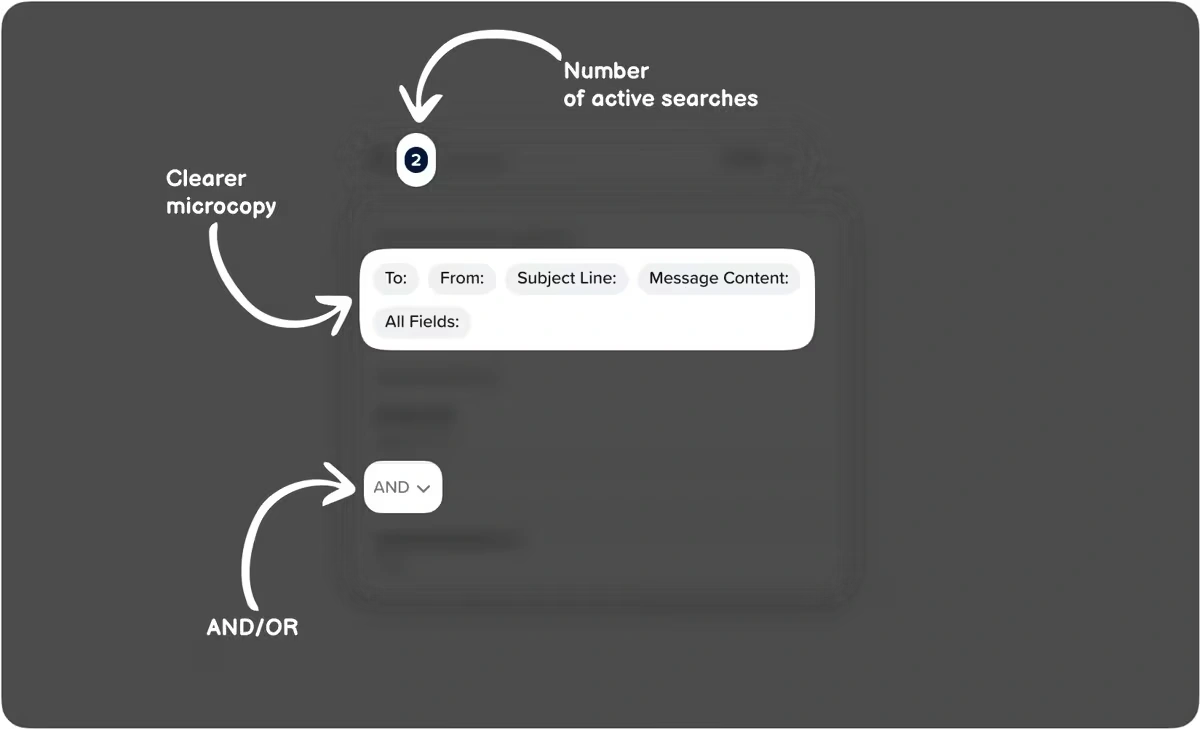
Updated search options featuring AND/OR logic
Second round of tests
We were making good progress, but there was still a problem. Our complex filter feature was causing issues (like overlapping elements) on smaller screens. This made the user interface worse. Yikes! ☹
Letting users create endless filters was chaotic and confusing. So, I teamed up with the Frontend team and set a limit for users to only have up to 3 filters open at a time.
While pushing changes to production with the frontend team, we almost broke the whole system:
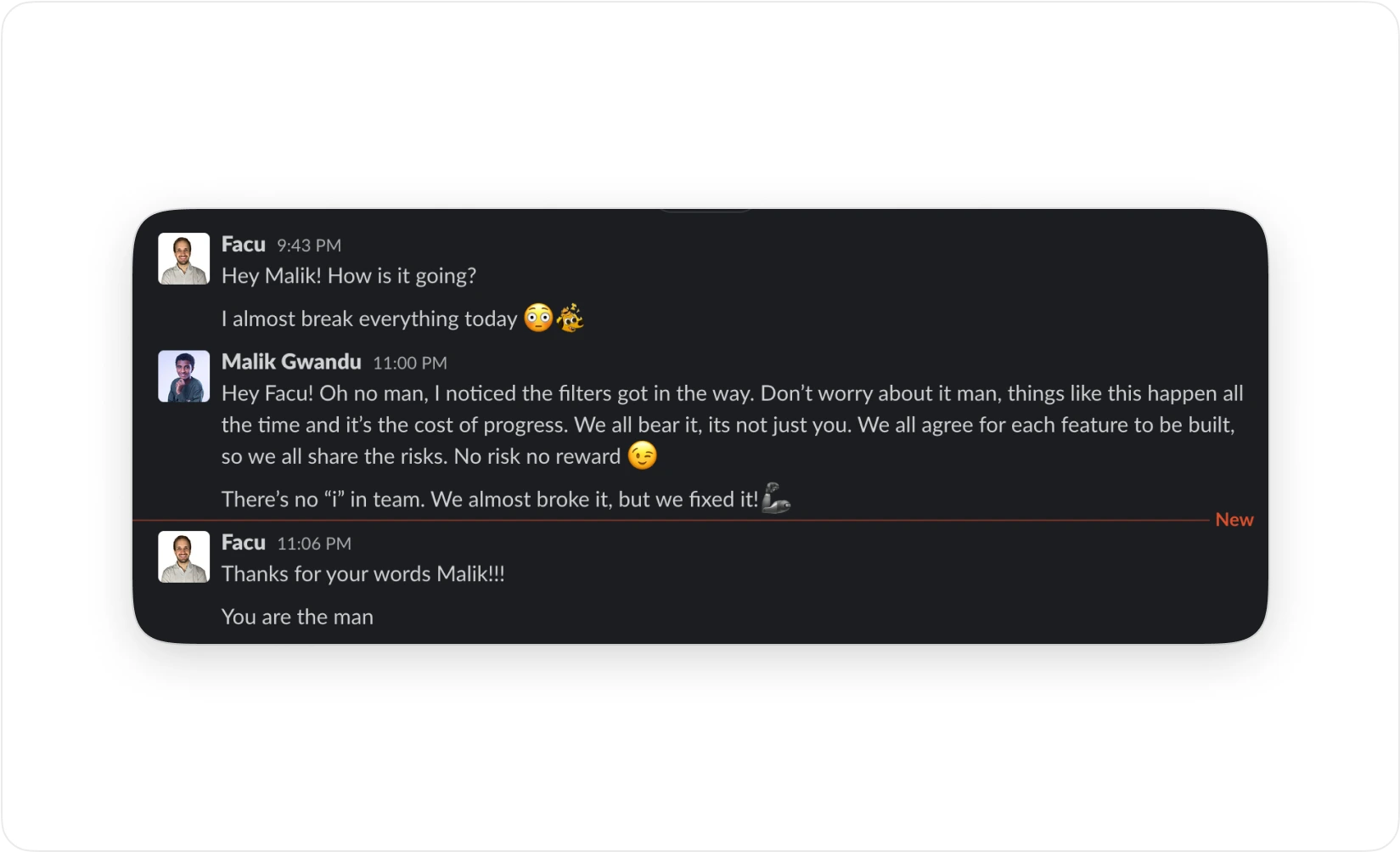
Team members collaborate and offer support
Home stretch
The search and filter functions were a hit! Testing went smoothly, giving me time to direct my focus on the overall project. That's when I saw a chance to go above and beyond with saved views!
It wasn't enough for managers to search and filter by location every time they log in. So, we let them create their own saved view of frequent searches and filters, and easily make new ones if needed.
Each manager has their own saved views, so they only see what's relevant to them and can focus on their own tasks. Plus, if a manager was absent, another could log into their saved views and cover for them.
Saved views in action
A remarkable discovery
After observing managers use the new system for a longer period, we noticed that the “filters” and “saved views” features were so effective that managers hardly ever used the search feature. Maybe we made it too complicated? But it's still a win!
Old process: log in > search > filter > resolve complaints
New process: log in > resolve complaints
Impact: Managers aren't missing messages, and homeowners are getting the prompt attention they deserve!
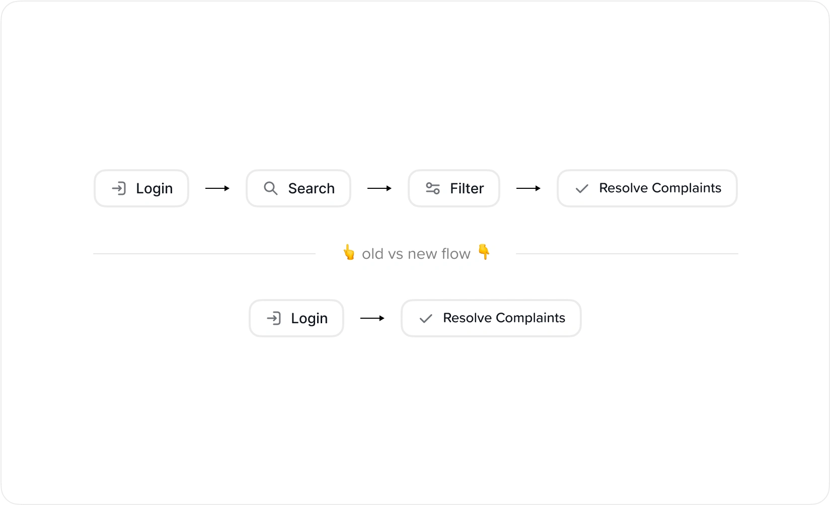
Comparison between the old and new workflow
An effortless experience
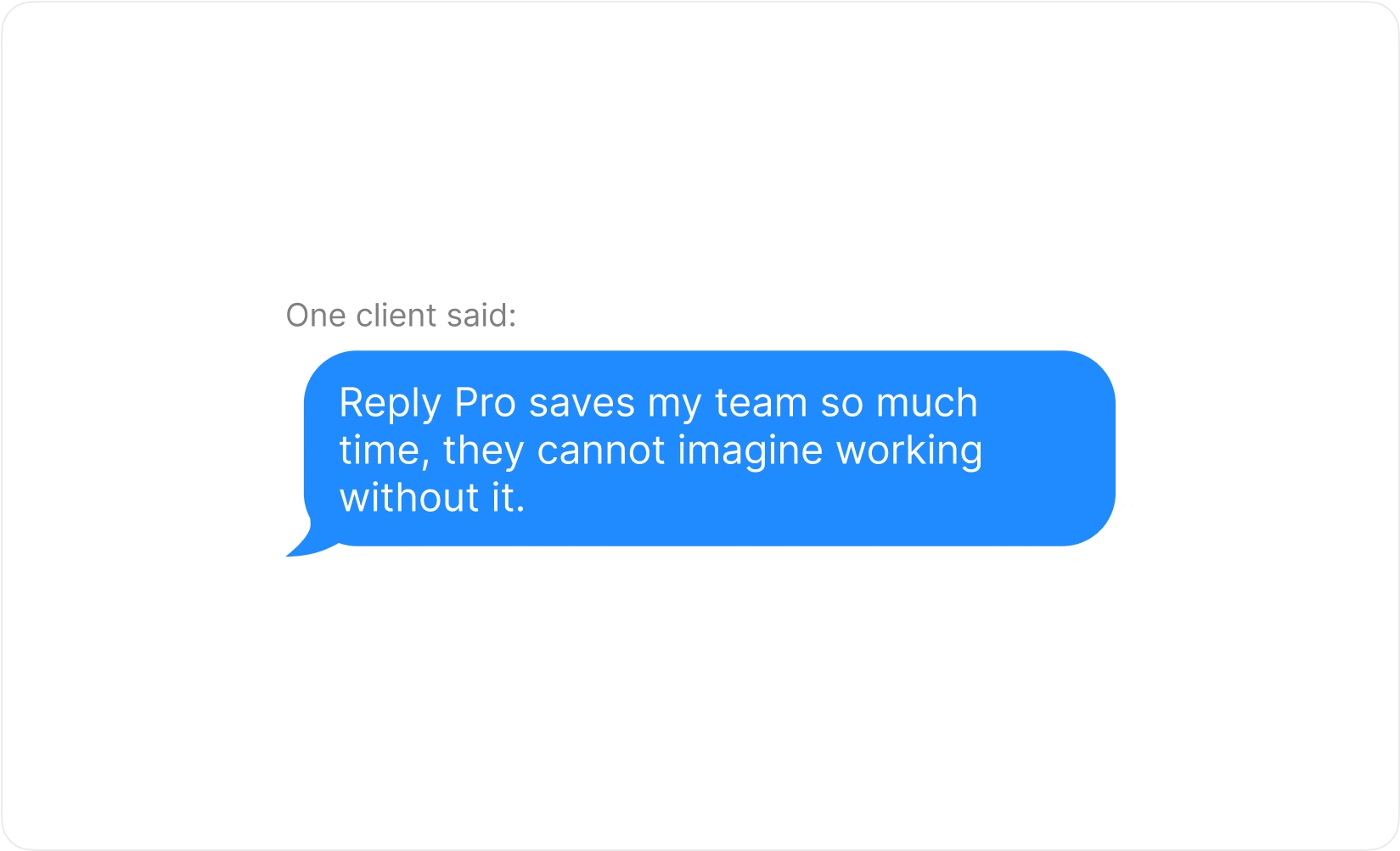
Positive feedback
Takeaways
Finding the opportunity to overdeliver
Constantly seeking perfection helped introduce a new feature that was key to the project’s success.
Implementing early and ongoing testing
Iterative testing helped us address issues promptly throughout the project.
Observing user patterns and behaviors
Noticing the need for a search feature proved crucial to the project’s journey.
Prioritizing user experience
Recognizing that even if something works technically, user frustration can overshadow its effectiveness, as seen with the old clunky filter design.
Success can surprise you
Realizing that success can emerge in unexpected ways. Despite our focus on enhancing the search feature, users found the real value in the filters and saved views.
To protect confidential information, details within this case study have been modified or omitted. The presented information reflects my understanding and analysis, and may not fully align with the company's specific practices or viewpoints.
Like this project
Posted Dec 22, 2024
Reply Pro is a customer communication tool tailored for Homeowners Association (HOA) management companies.
Likes
1
Views
13