Vegan Product Packaging Design + Flyer Branding
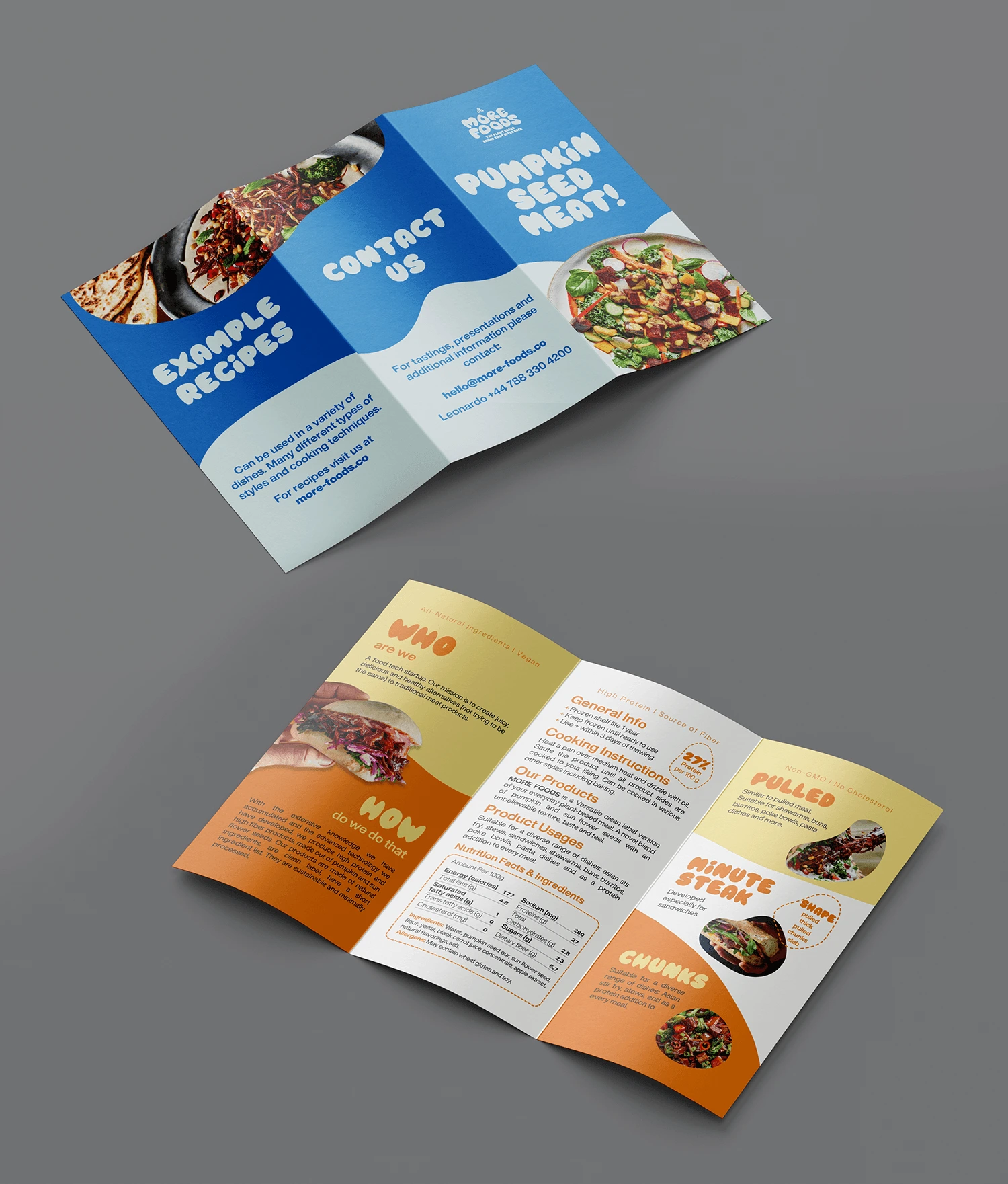
TASK:
To create trifold brochure and packaging design for a vegan meat brand.
CHALLENGE:
To keep it playful and similar to logo and other brand products but yet to keep all the info readable and clear.
SOLUTION:
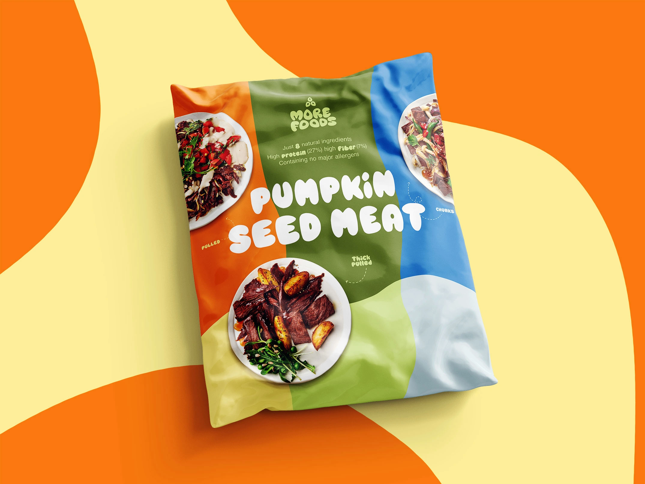
I used bold brand colors and played with space and shapes. As soon as brand font is very heavy, I used it only in big headers, combining it with classy sans serif paragraph texts. For the side with the most essential product info I left white background. I added food examples to make it fresh and desirable but yet not distracting from the text.
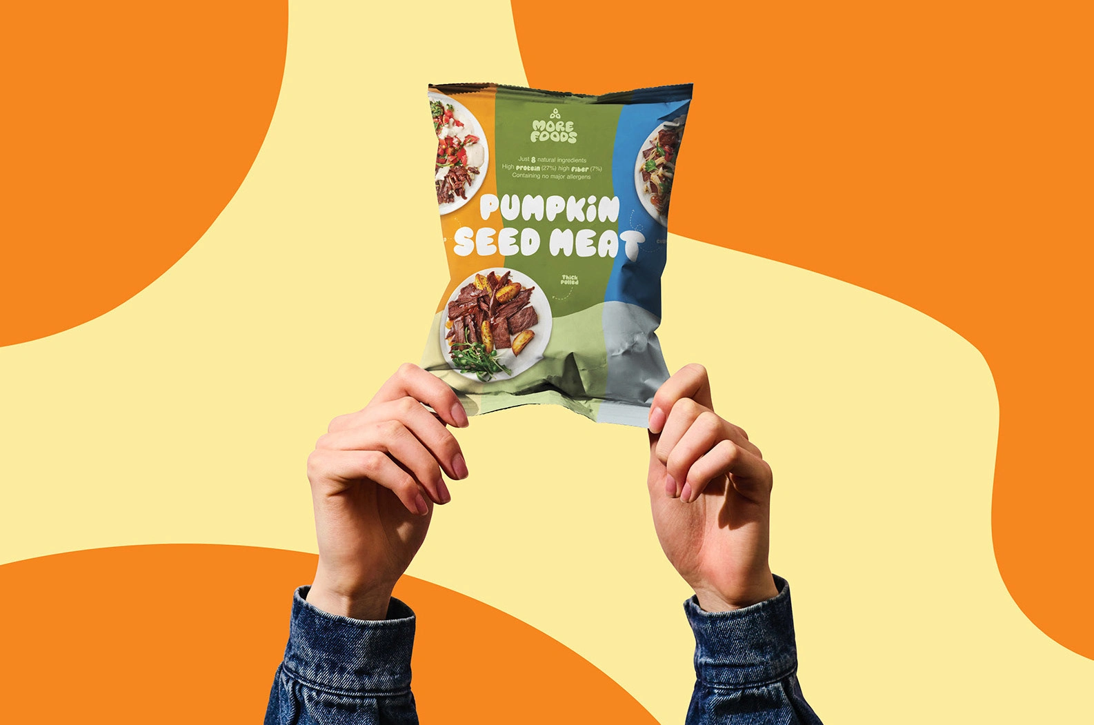
For the package design it was important to make it bright and noticeable as well as understandable from the first sight.
Like this project
Posted Apr 3, 2024
Vibrant, bold, and full of life: conveying the essence of a plant-based brand while ensuring that the product stands out in a crowded market

