Cloud Service Monitoring Experience Redesign

Rameen Ghafoor


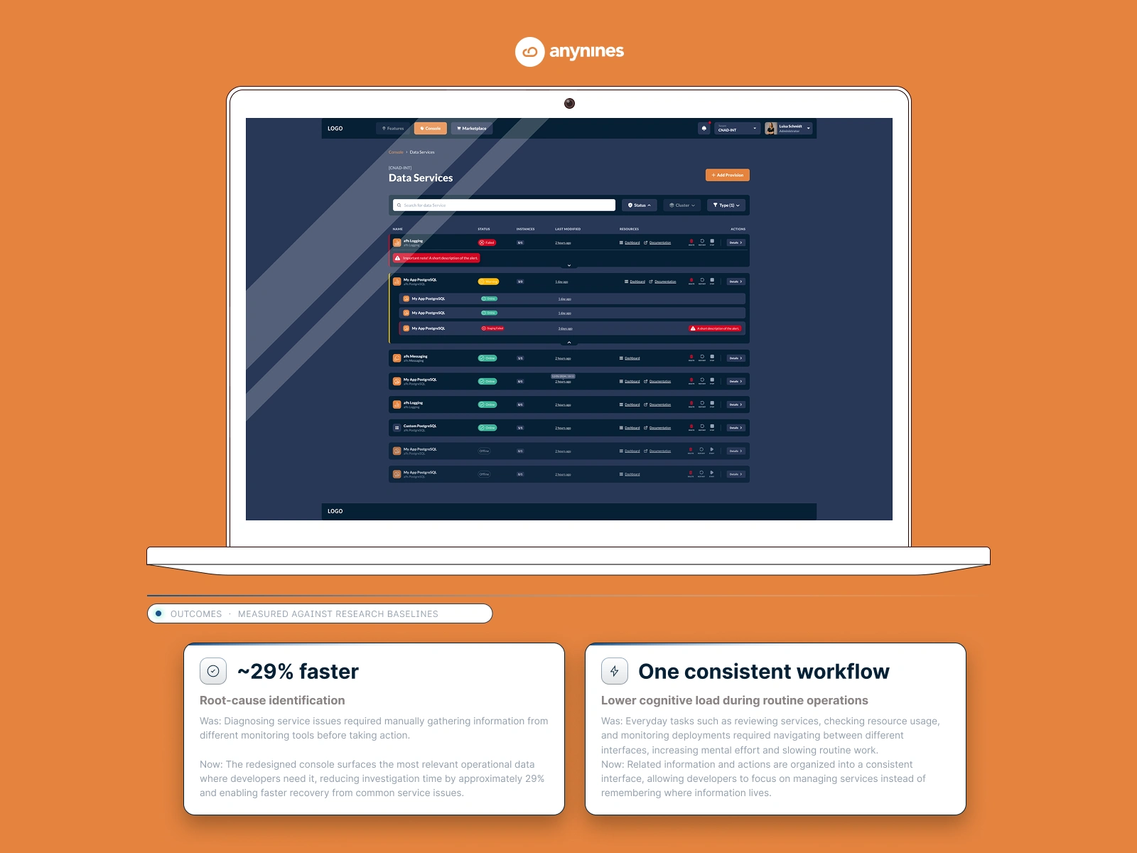
The goal was to redesign a developer-facing service monitoring experience that operators used to diagnose and resolve cloud failures.
Related information and actions are organized into one consistent interface, so developers focus on managing services instead of remembering where things live.
Was: routine tasks required navigating between different interfaces, increasing mental effort.
The redesigned console surfaces the most relevant operational data where developers need it, enabling faster recovery from common service issues.
Was: diagnosing issues meant manually gathering information from different monitoring tools before acting.
Needs a unified platform to oversee the health of services and their capacity management.
I was embedded with the engineering team, owned end-to-end product design.
Shadowing Sessions
To understand real workflows, I conducted:
analysis of support tickets, reviews of infrastructure documentation, interviews with developers and operators, shadowing of debugging sessions
Research Findings
Logs were the main debugging tool, but hard to access: When something failed, developers immediately looked for logs. But logs lived outside the platform — in Kubernetes, in external terminals, in tools the platform didn't know about. The diagnostic process started by leaving the product.
Fear of mistakes slowed decision-making: in regulated environments, a wrong action during an incident doesn't just slow things down — it triggers compliance consequences. Operators were hesitant to act because the system gave them status without context. They could see that something had failed. They couldn't see why, or whether their next action would make it worse.
This wasn't just a UX problem. It was a product positioning problem: a cloud platform that required external tools to debug wasn't a complete platform.
Surfacing the operational data at the point of decision
Scenario
When services fail, developers need immediate visibility into root causes.
Problem identified
Users didn’t want “better logs.” They wanted faster cause-and-effect tracing, “why did this fail and what should I do next?”
Decision I advocated for
Implemented contextual log surfacing:
Expandable inline panel for quick glance.
Dedicated modal viewer with pagination (“Cycle between error messages”) for deeper inspection.
Metadata (timestamp, error type, source) surfaced for orientation.
Outcome observed
Minimize cognitive switching by co-locating diagnosis with the problem. Enabling flow-state debugging without leaving the operational interface.
A central health view — status without hunting
Scenario
Once services are provisioned, developers monitor the fleet’s health (OK, Warning, Failed).
Problem identified
Engineers didn’t want prettier dashboards, they wanted contextual states: “Is it my service or infrastructure?” “Do I need to act now?”
Decision I advocated for
A hierarchical service list view:
Compact rows for overview.
Color-coded health indicators (Online, Warning, Failed).
Expandable detail rows for immediate context. By default expanded view if warning or error state.
Inline “Documentation” and “Dashboard” links for direct jump to action.
Push, attention demanding items above
Outcome observed
Deliver actionable visibility instead of passive monitoring. Visual hierarchy reduces visual noise while surfacing urgency through color and structure.
The contextual log solution gave operators visibility — but visibility is still passive. What I'd explore now is an AI layer that surfaces a probable cause and suggested next action alongside the logs. The system has seen thousands of similar failures. It should use that. That's the difference between showing operators what happened and helping them decide what to do next — which is exactly where Avelios is heading with their AI diagnostics module.
Like this project
Posted Aug 10, 2026
Redesigned service monitoring experience for cloud operators focusing on faster diagnosis and recovery.
Likes
0
Views
0
Timeline
Aug 1, 2022 - Jan 30, 2026
Clients
anynines