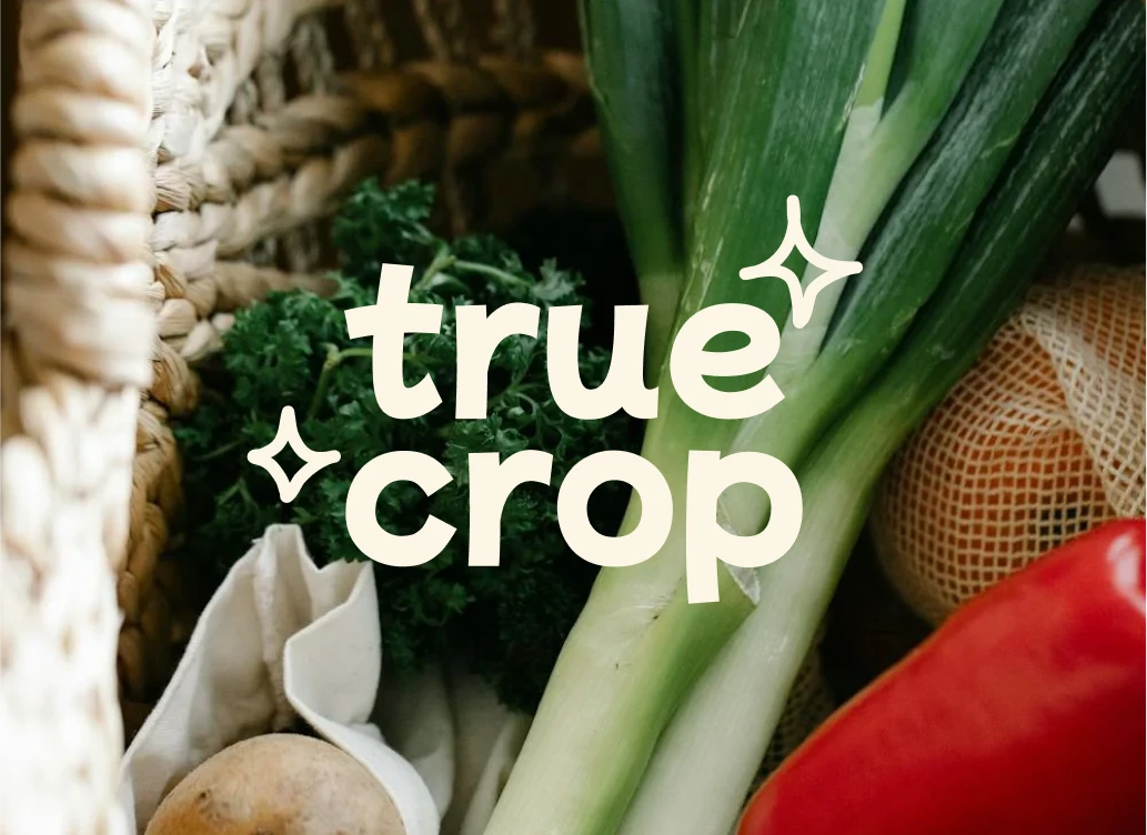
True Crop
Ashita Seth
The Brief
With new products flooding the grocery space every day, it’s harder than ever for brands to truly stand out. This design challenge was all about changing that—by choosing an existing grocery product and building a thoughtful, standout brand identity around it.
The goal was to create a brand that could sit proudly on the shelves of curated stores like Popup Grocer or Erewhon—places known for celebrating design-first, visually striking products.
Why Fruits & Vegetables?
Among all the flashy packaged goods in grocery aisles, fruits and vegetables often get overlooked—despite being the most essential items in the cart.
That’s why I focused on organic produce. It felt like the perfect challenge:
Can clean, honest food be branded in a way that’s fun, modern, and still rooted in trust?
True Crop was built to answer that—with a brand that makes fresh food feel exciting again, without losing its authenticity.
About the Brand
True Crop is a modern organic food brand that sells fresh vegetables and fruits. The focus is on 100% organic produce—grown without chemicals, harvested with care, and delivered at its natural best.
It’s built for people who value purity, taste, and the trust that comes from knowing exactly where their food comes from.
Why the Name "True Crop"?
The name “True Crop” says it all—real, honest produce from real farms. It’s simple, memorable, and feels both grounded and premium.
There’s no fluff, no overpromising. Just a name that reflects what the brand stands for: pure food, grown right.
Brand Story
At True Crop, good food starts with good roots.
The brand was born from one idea:
What we eat should be as honest as the hands that grow it.
True Crop isn’t just about selling vegetables. It’s about reconnecting people with food that’s grown naturally, without shortcuts.
The produce is sourced from local farmers who nurture the soil with care and integrity. Everything is harvested at its peak and delivered fresh—flavorful, clean, and full of life.
When it's real, you can taste it.
When it's pure, you can trust it.
When it's True Crop, you know it’s done right.
Target Audience
True Crop is designed for people who care about what they eat. That includes:
Health-conscious consumers focused on clean, organic eating
Busy urban families who want farm-fresh food without the farmers’ market trip
Premium grocery shoppers who look for honest, well-branded produce
The tone is premium but the visuals stay colorful, warm, and modern—to feel accessible, not intimidating.
Core Values
Purity – No chemicals, no shortcuts
Trust – Grown with care, sourced with integrity
Taste – Freshness you can see and flavor you can feel
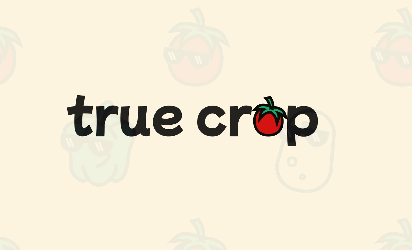
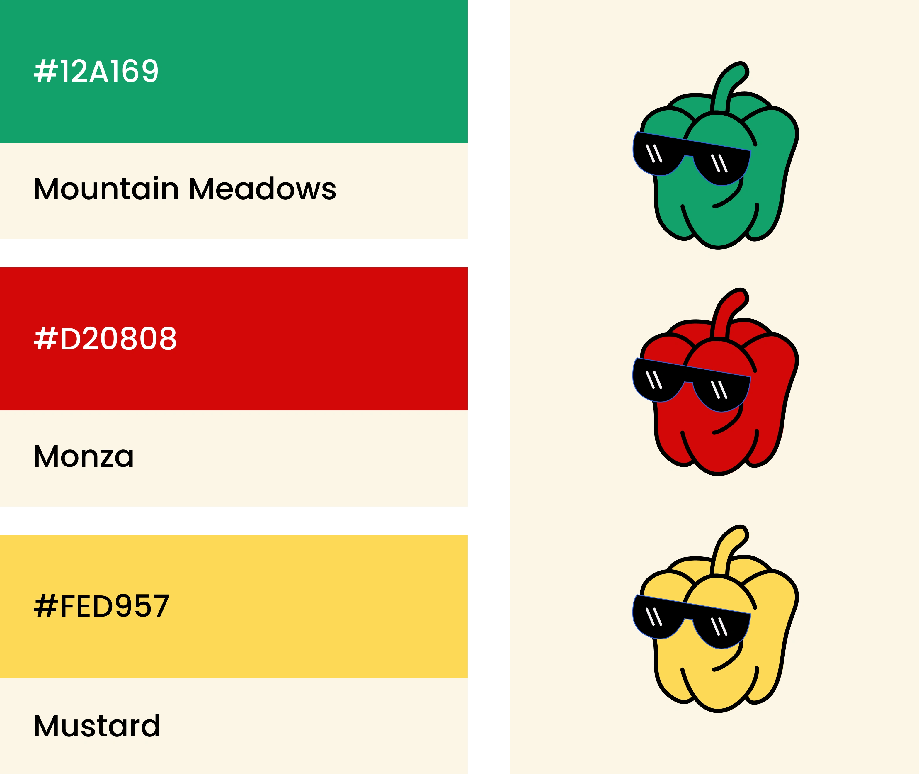
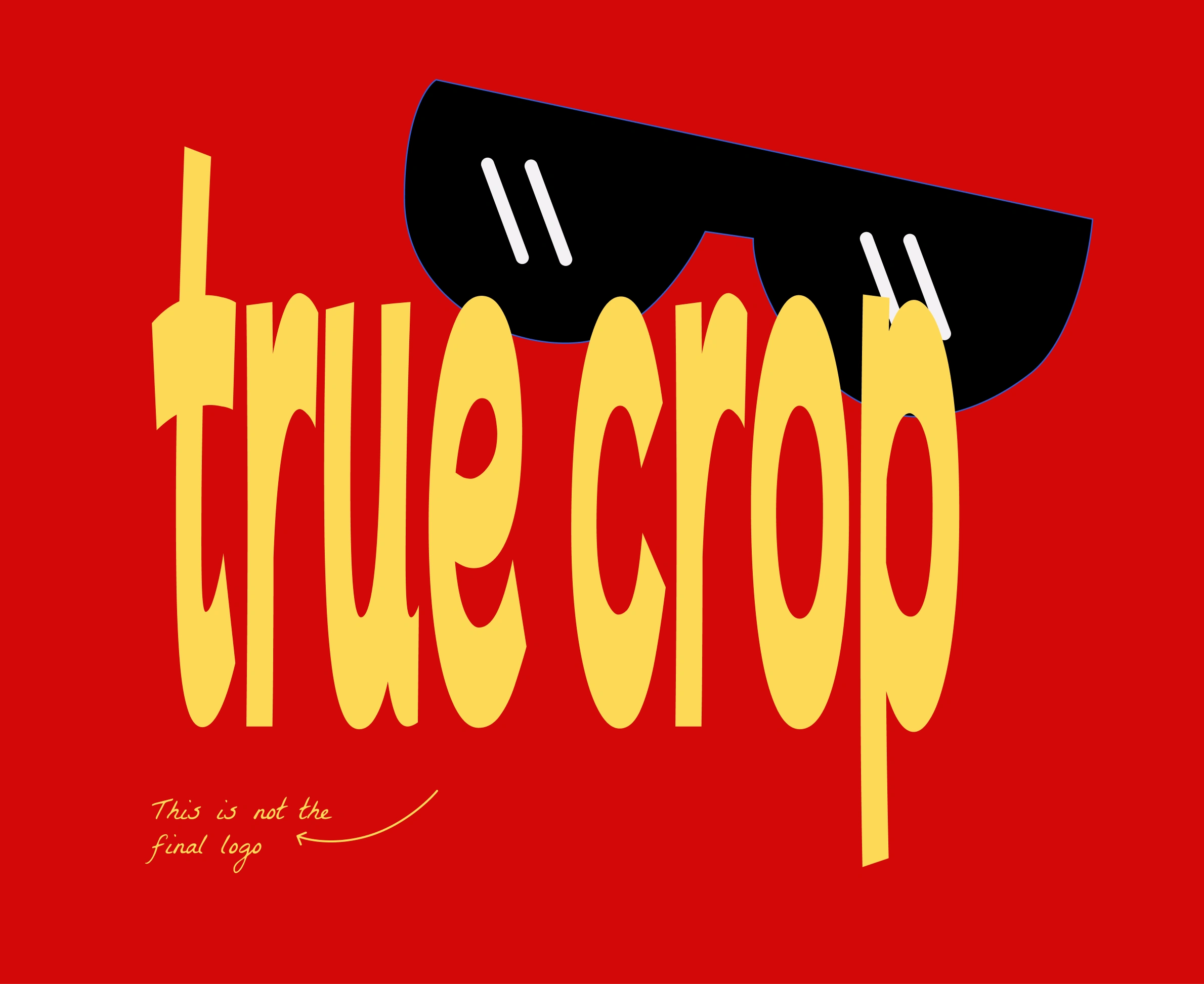
The Logo
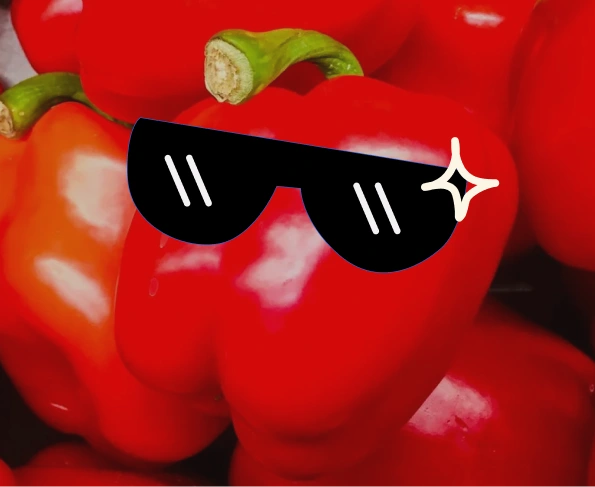
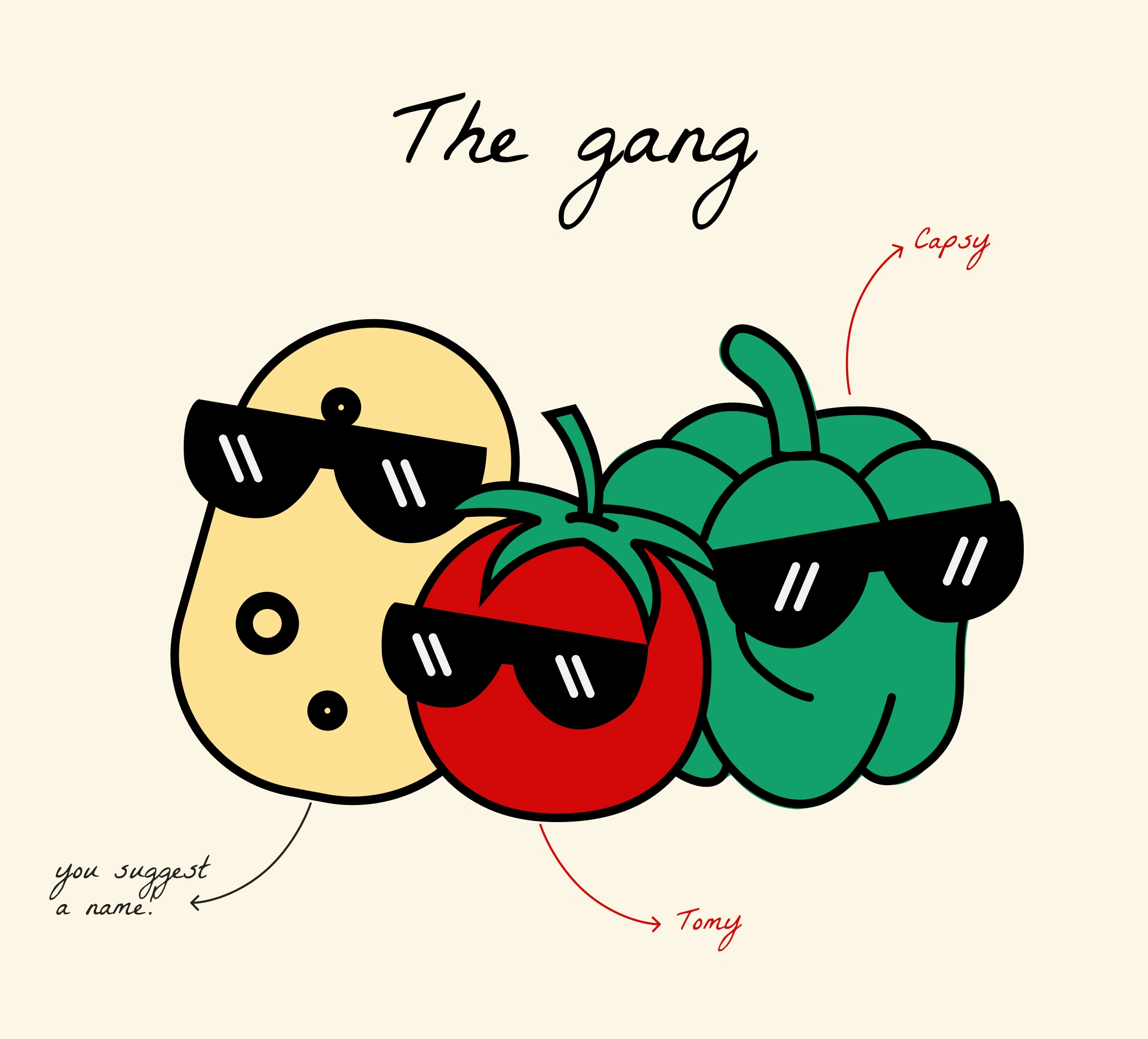
At the heart of the True Crop brand is a cool tomato mascot—and it’s not just there to look cute.
The tomato is the main character in real life too. It’s bold, balanced, and full of flavor—just like the brand.
Tomato is scientifically a fruit and culturally a vegetable. The perfect metaphor for a brand that blends health, flavor, and fun.
The tomato stands as the “True One”—a leader in the world of produce with a dual identity that bridges both sides of the food spectrum. It represents everything True Crop is about:
honesty, versatility, and a little unexpected charm.
This makes the mascot not just memorable, but meaningful.


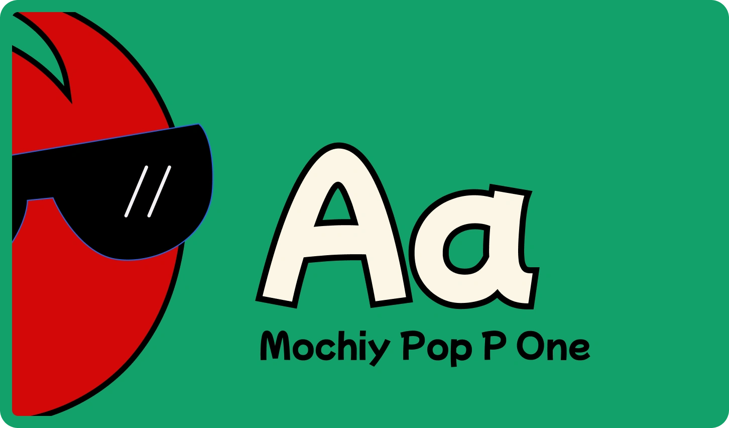
Typography
The typeface used is Mochiy Pop P One.
It gives the logo a soft, lovable feel while still feeling bold and expressive. This font makes the brand feel premium, but not distant—perfectly balancing quality and approachability.
Color Palette
The color palette is inspired by the simplest source—fresh bell peppers.
Using red, green, and yellow, the brand captures the natural vibrancy found in everyday vegetables. These colors are:
Bright and relatable
Naturally appealing
A direct nod to freshness and flavor
By drawing straight from real produce, the palette feels warm, honest, and full of life—just like the food True Crop brings to the table.
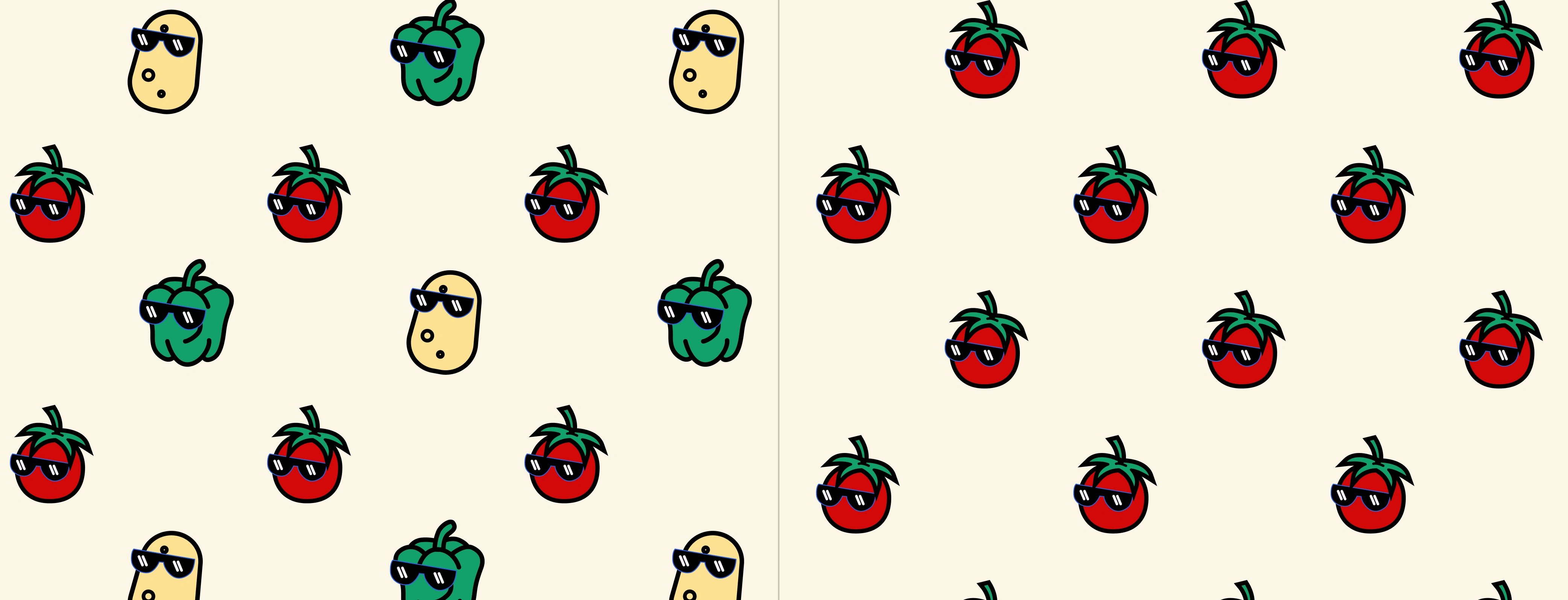
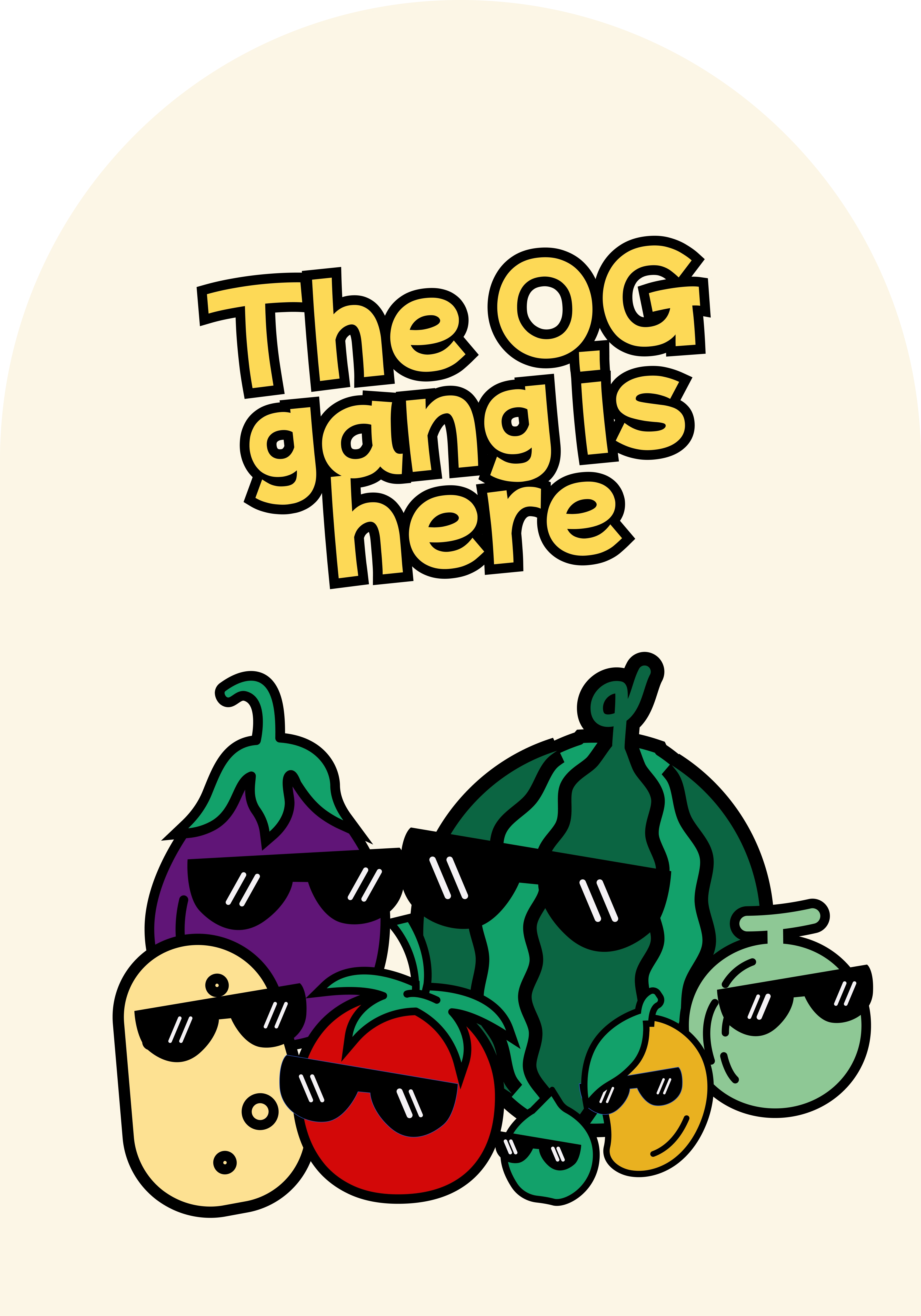
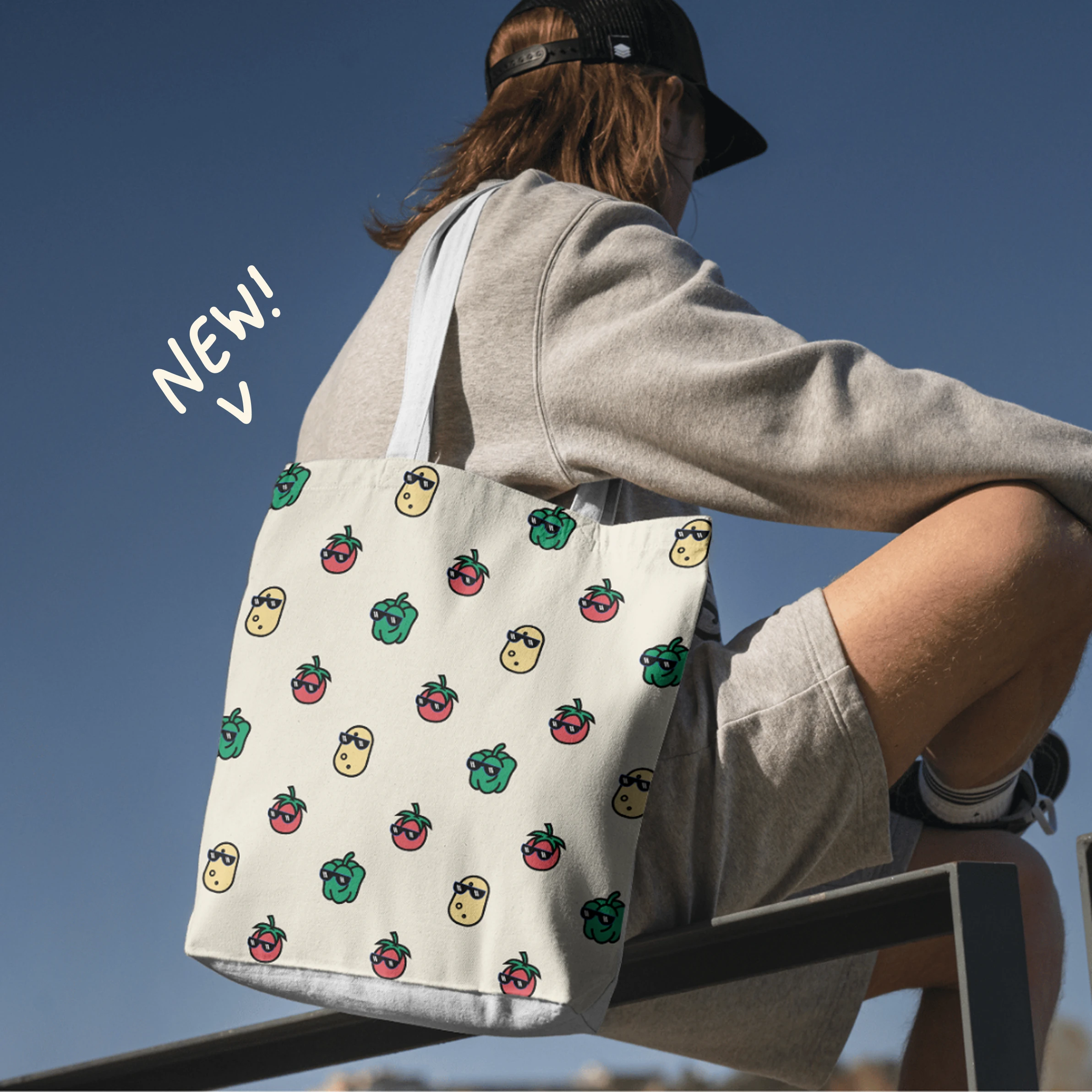
Brand Pattern
The brand pattern uses the mascot system as a playful and memorable visual element.
Each vegetable or fruit will have its own unique mascot, making the packaging feel personal, fun, and instantly recognizable. These mascots aren’t just illustrations—they bring personality to the produce and help tell the story of each item.
There are two main pattern styles:
Single Mascot Pattern
Used for individual fruit or vegetable packaging. Clean, focused, and tied to one product.
Multiple Mascots Pattern
Used for mixed or combo packs. It brings all the characters together—colorful, lively, and perfect for variety boxes or bundle sets.
This approach makes the brand feel more engaging and flexible, while keeping it consistent and full of personality across every pack.
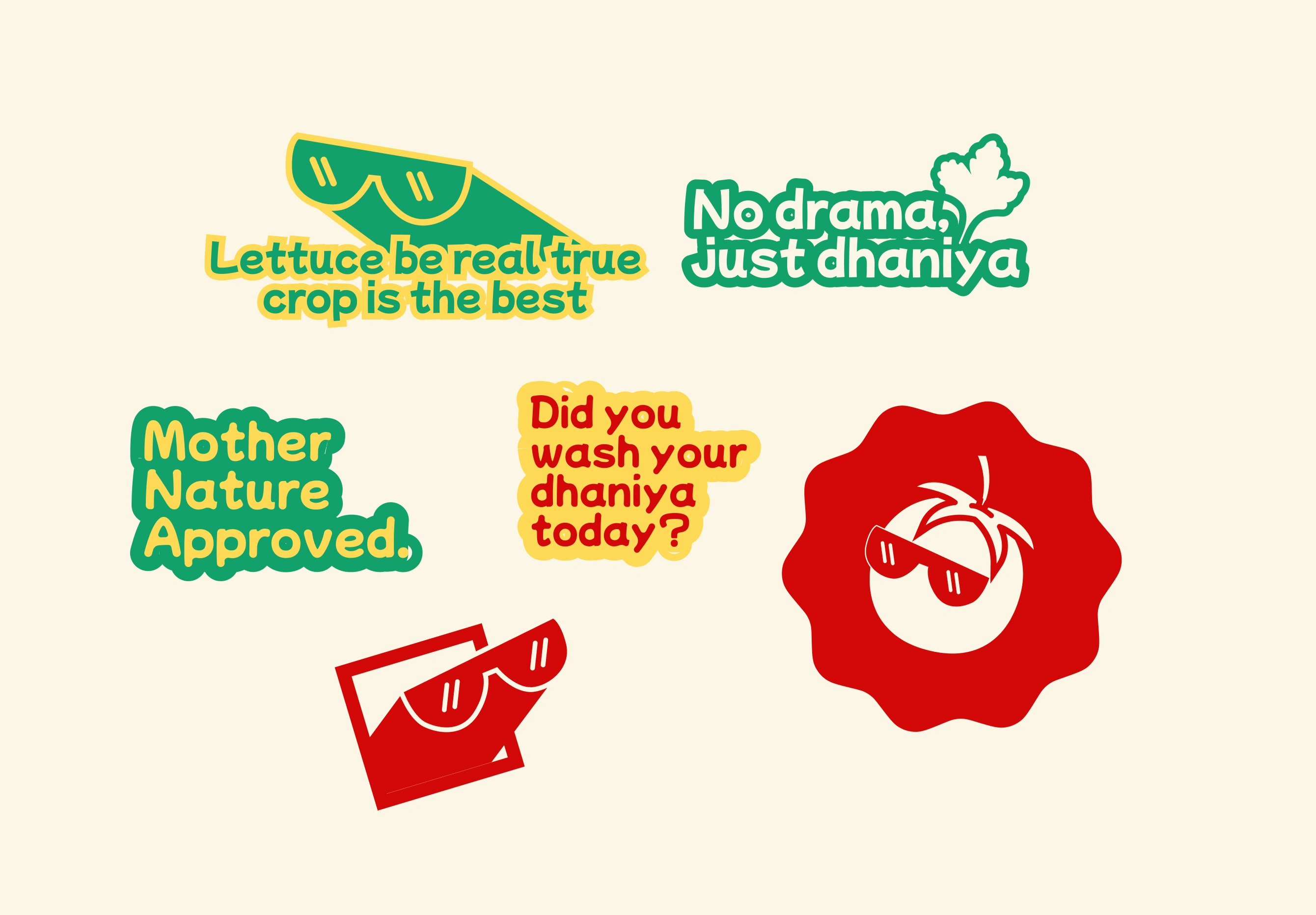
Sticker Set
To add some fun and flair, a custom sticker set was created for True Crop—perfect for packaging inserts, social media, or community engagement.
The set includes a mix of quirky veggie puns, mascot illustrations, and playful reminders that bring the brand’s personality to life
These stickers make the brand feel even more approachable and fun, while helping customers connect with the values of freshness, honesty, and everyday humor.
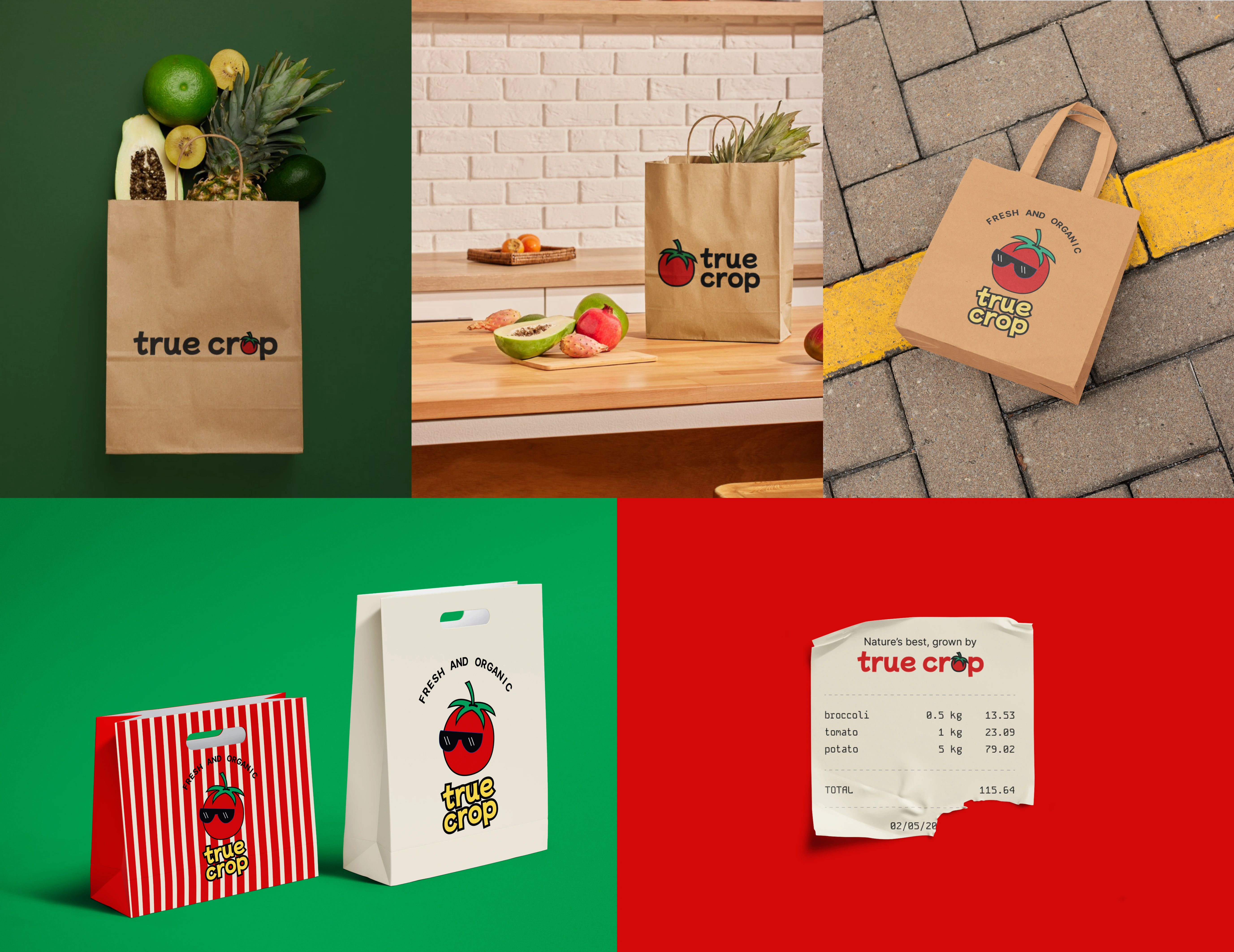
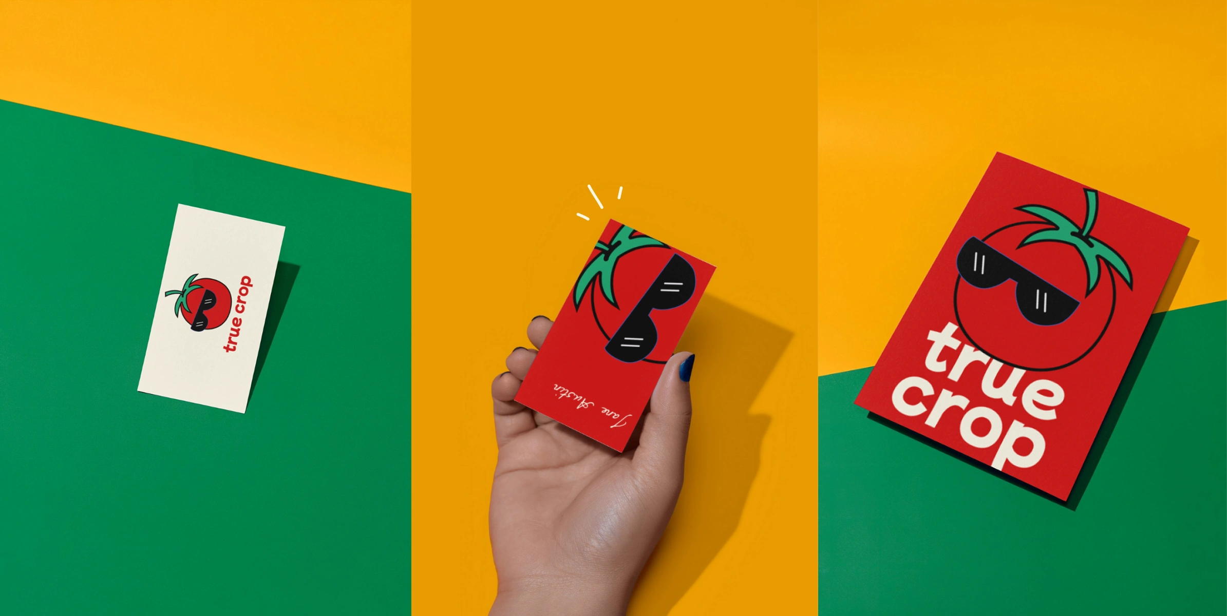
Mockups
Finally, the True Crop brand was brought to life through mockups—because great branding should look just as fresh in action. These visuals give a quick peek into how the brand shows up on shelves, in stores, and online: bold, colorful, and full of personality.

Final Thought
True Crop is about going back to the roots of real food—grown right, harvested with care, and delivered without compromise.
The brand identity captures that spirit with a friendly mascot, bold typography, and a fresh color palette. It’s a celebration of real food for real people, built on truth, taste, and trust.
Mockup 1
Like this project
Posted Jun 14, 2025
Fresh, fun, and full of flavor—True Crop is a bold take on organic produce branding with a friendly mascot, vibrant colors, and a whole lot of heart.