Patch Up
Ashita Seth
Patch Up sells transdermal vitamin patches—a cleaner, simpler way to get essential nutrients. No pills, powders, or sugary gummies. Just a patch that sticks on your skin and gets to work.
Their mission?
Make wellness effortless.
They’re all about delivering clean nutrition—free from unnecessary additives like sugar, artificial flavors, or fillers. Think of it as health without the clutter.
The Brief
This was a passion project—a creative challenge I took on to explore how Patch Up’s identity could be reimagined. The goal was to design a brand system that speaks to modern, health-conscious consumers while keeping things fresh, friendly, and non-intimidating.
The Big Idea: A Smiley
What if wellness didn’t feel like a chore?
That was the starting point for this concept.
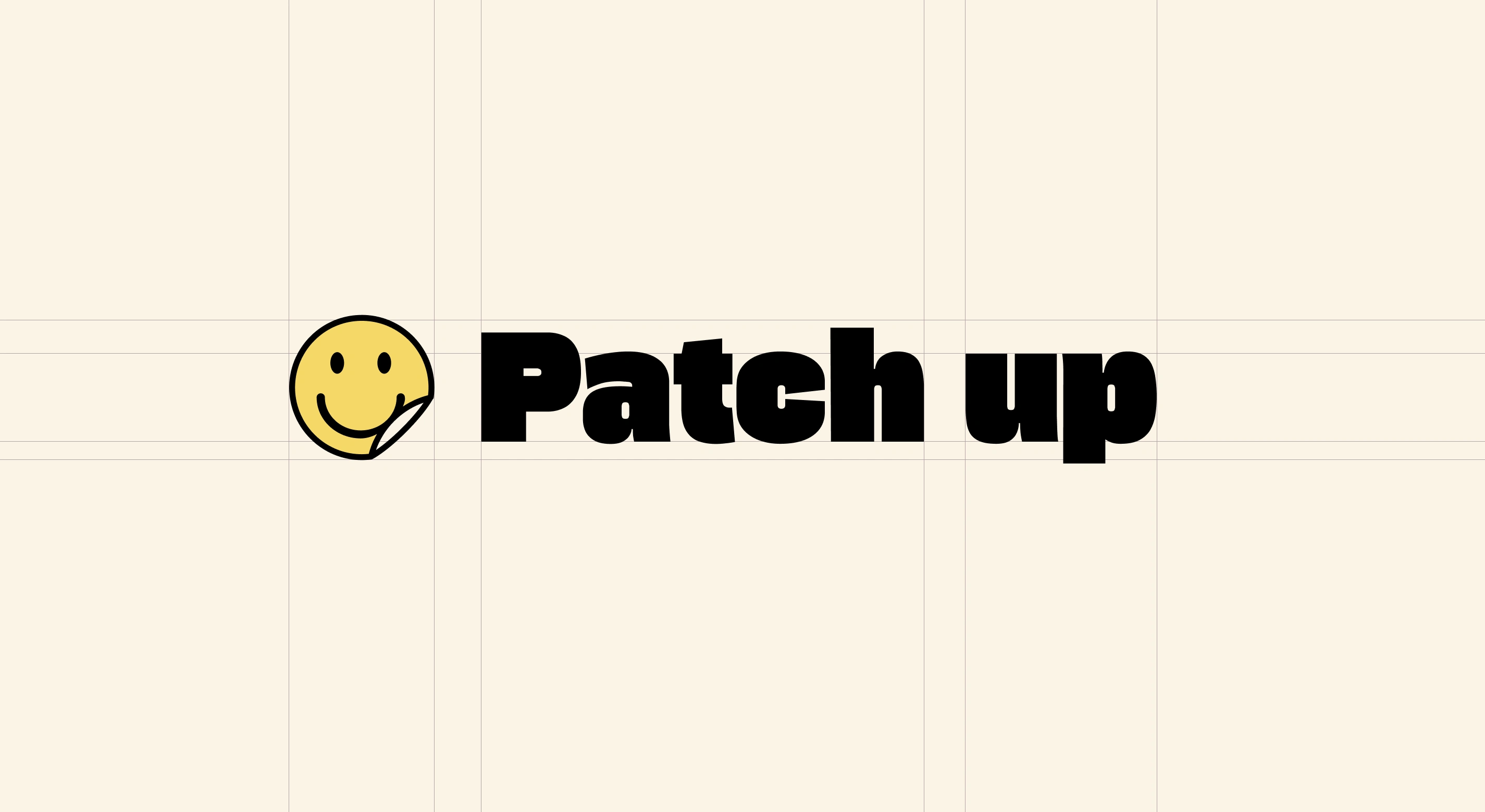
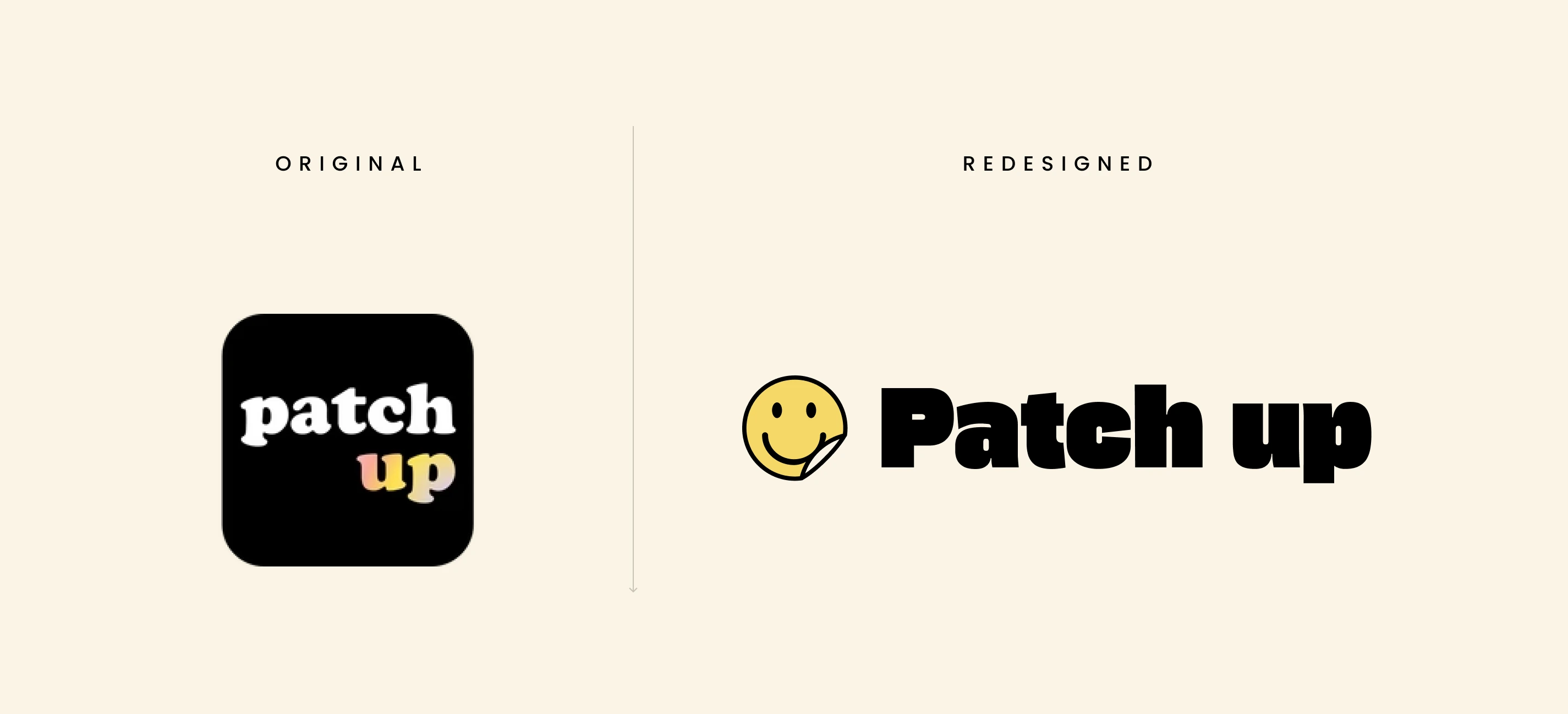
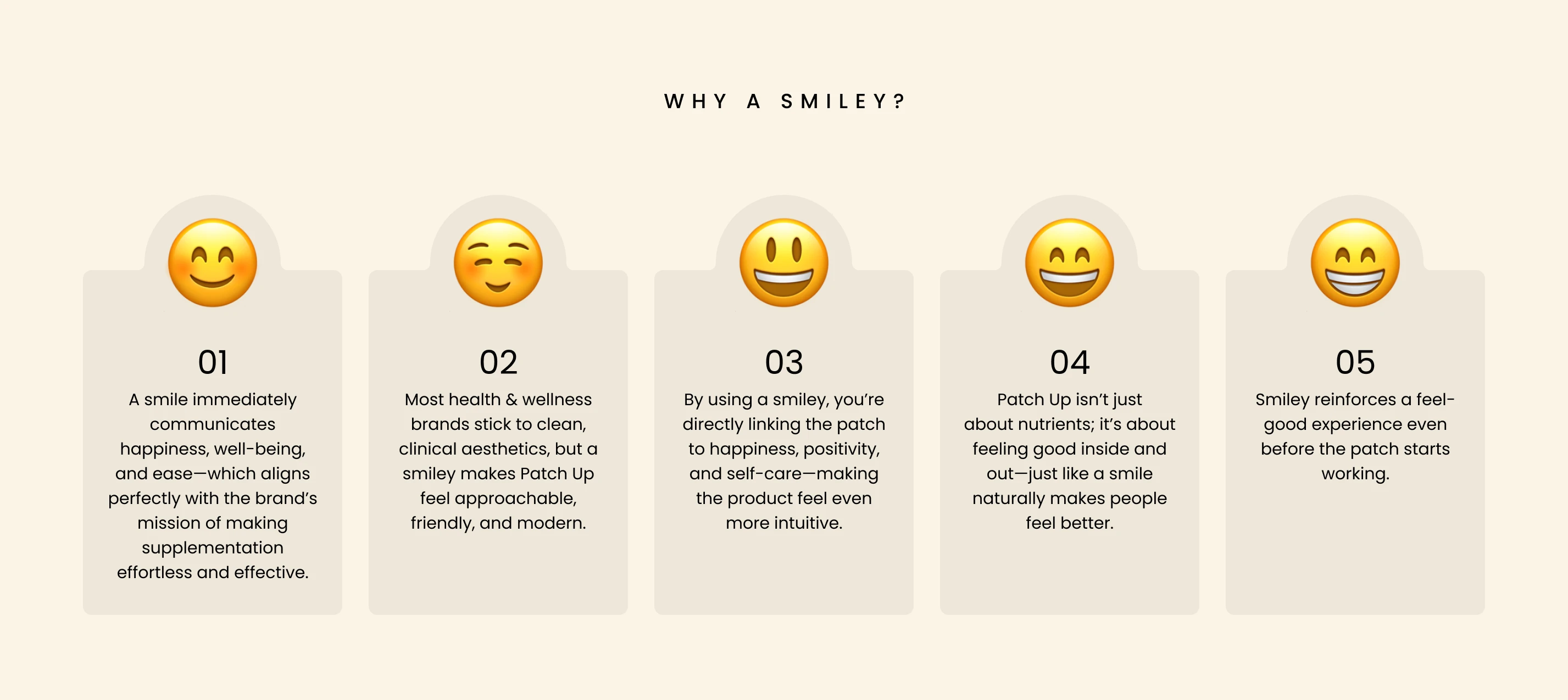
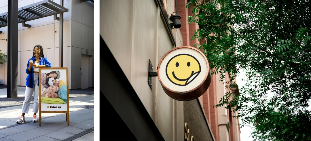
Most wellness brands feel clinical or overly “perfect.” I wanted Patch Up to feel light, optimistic, and real. So I created a smiley face logo that captures the brand’s essence: effortless health that makes you feel good.
That’s the idea behind Patch Up—health that makes you smile. Our smiley logo represents effortless wellness, positivity, and a smarter way to nourish your body. Just stick it, forget it, and let the good vibes (and nutrients) flow.
The smiley is simple, joyful, and universally recognizable—making Patch Up stand out in a sea of overdesigned wellness logos.
The smile curve is subtly lifted at the bottom, mimicking the motion of a patch being peeled off the skin. This visual detail gives the logo a dual meaning—both emotional and functional. It’s a reminder that wellness can feel light and happy, while still staying connected to what the product actually is: a simple patch that sticks on, works quietly, and lifts you up.
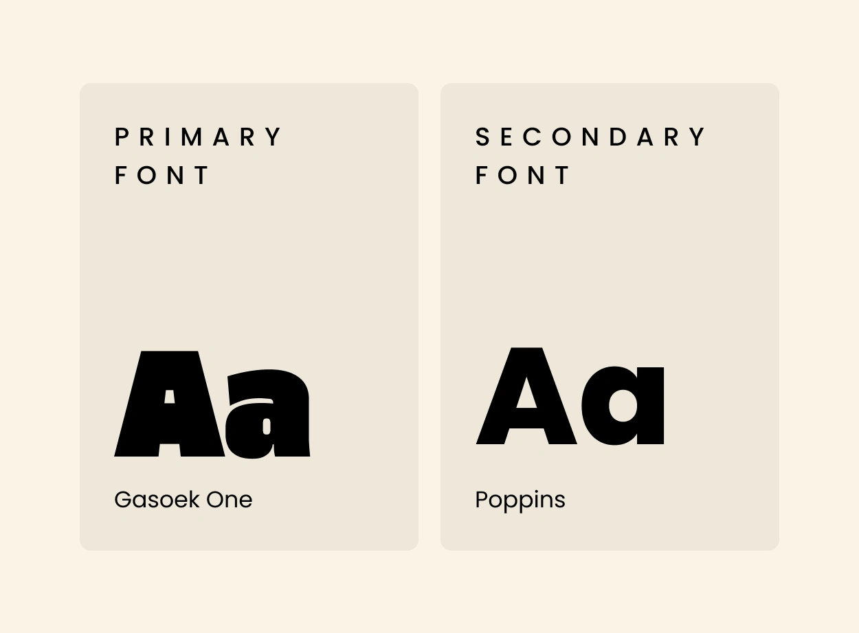
Typography Choice
We chose Gasoek One, a bold, playful typeface with a strong personality.
Why?
It feels confident but approachable
It pairs well with the quirky, joyful logo
It gives the brand a modern but not sterile edge
Typography isn’t just style here—it carries the tone of the brand: bright, clear, and positive.
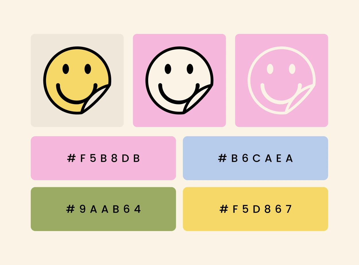
The Color Palette: Soft Pastels
To complement the fun tone, we went with a pastel color palette.
Here’s why:
Pastels feel light and clean—perfect for a product that’s all about additive-free wellness
They’re friendly and visually calming
They give the brand a modern, Instagram-friendly look without feeling too “clinical”
Pastels also allow the product icons and patches to stand out without overwhelming the viewer.
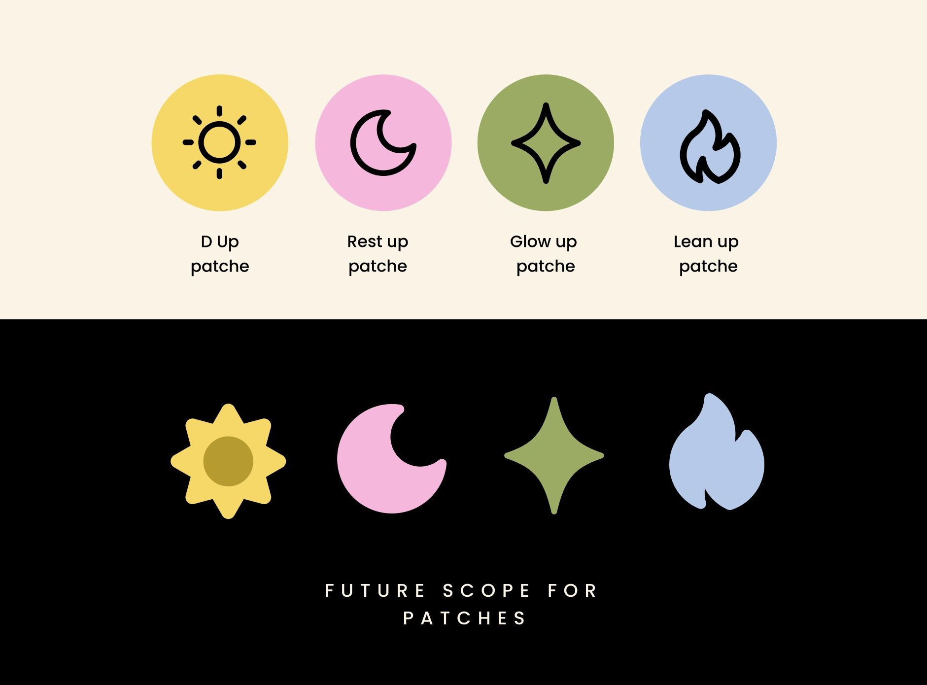
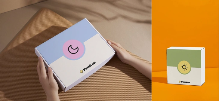
Patch Design
The patches themselves are minimal and icon-driven. Each variant has a unique symbol, making them instantly recognizable. In the future, the patches could come in different shapes to add variety, fun, and even fashion appeal. Health, but make it cool.
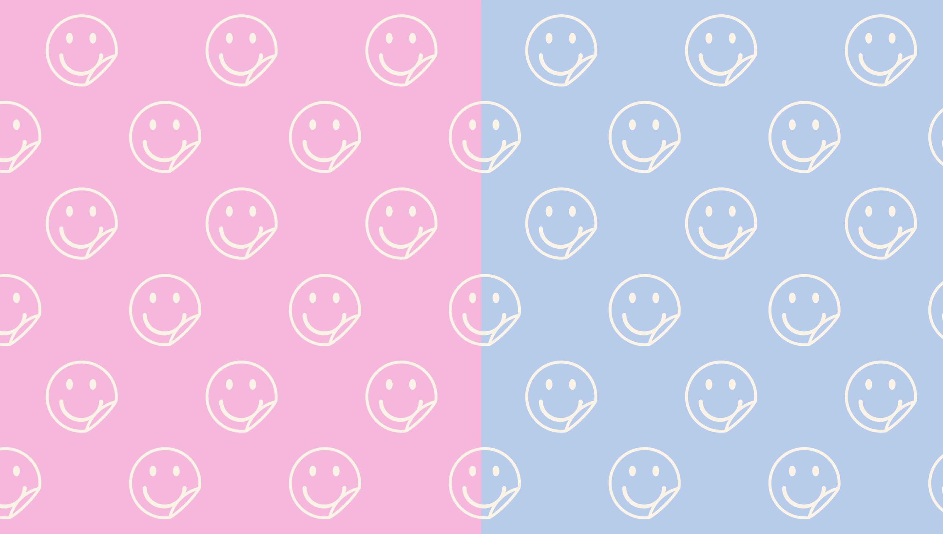
Brand Pattern
The brand pattern is made using the smiley face logo—it’s simple, scalable, and memorable. Whether it’s on packaging, stickers, or social media templates, this repeating pattern becomes a visual signature for Patch Up.
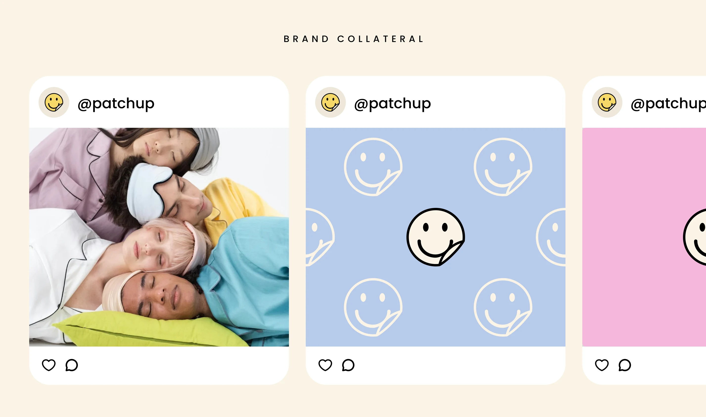
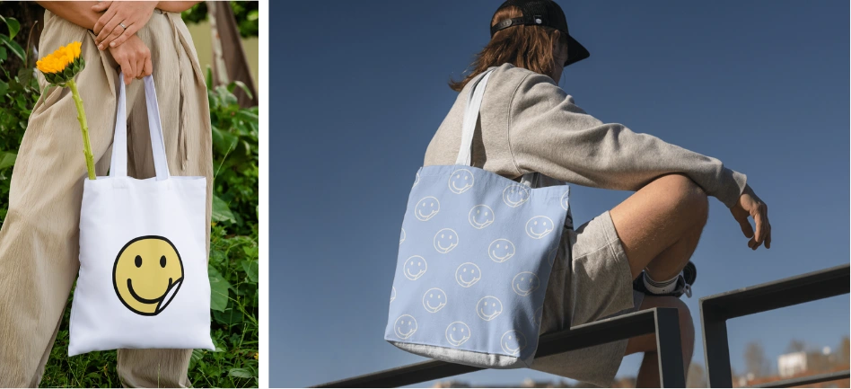
Social Media & Mockups
Finally, I brought the brand to life through mockups and social visuals—because a good brand should look great in context. These assets show how Patch Up could show up on feeds, websites, or packaging shelves with consistency and personality.
Final Thoughts
Patch Up’s refreshed identity is all about making wellness approachable, modern, and just a little bit fun. With a smiley at its core, a pastel palette, and clear typography, the brand now reflects the simplicity and positivity it delivers.
Like this project
Posted Jun 7, 2025
Designed a fresh brand identity for Patch Up with a smiley logo and pastel palette.