Arplo Branding
Arplo's mission is to connect everyone to healthcare, bridging the gap in care with AI and proprietary technology for 24/7 access to licensed professionals. Arplo is an emerging digital health company focused on building a HIPAA-compliant remote therapeutic monitoring (RTM) solution for stroke and chronic musculoskeletal conditions.
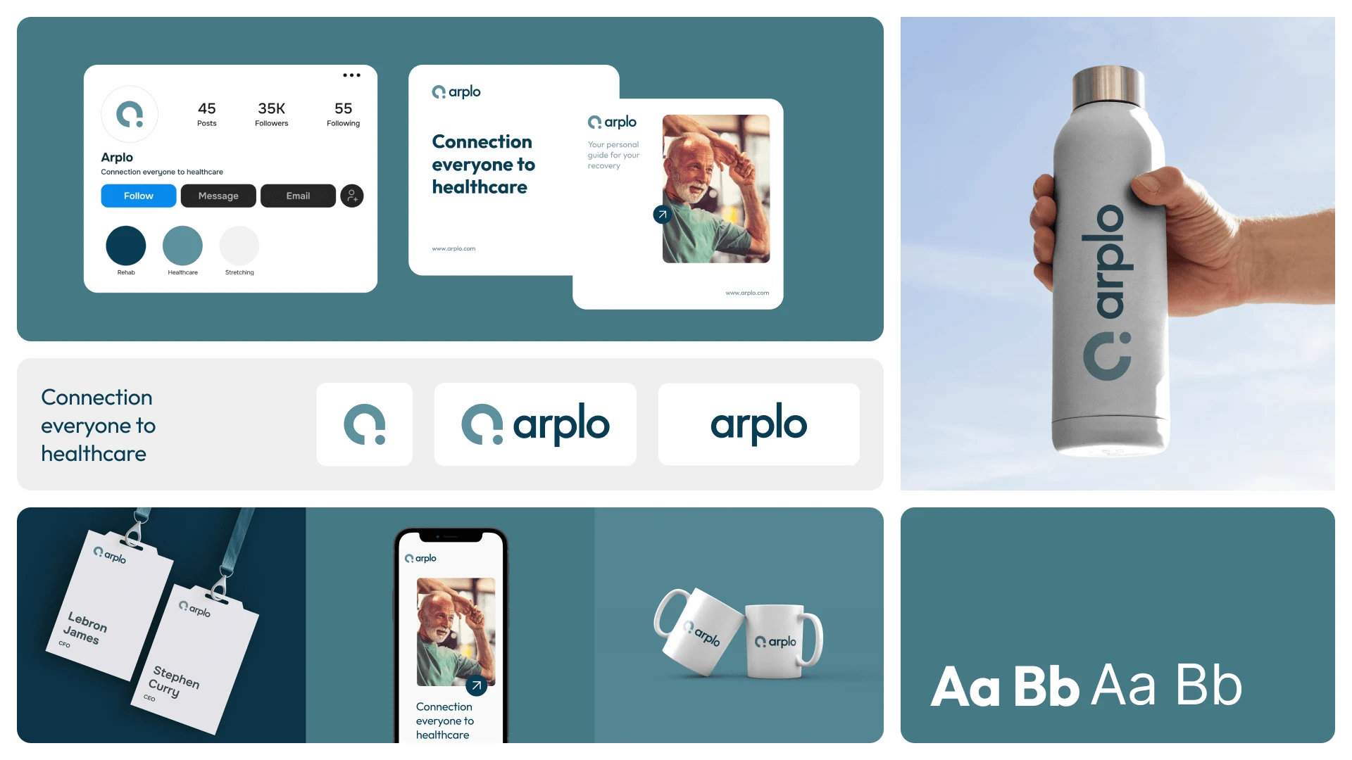
I created a brand for Arplo with the concept of unlocking connection and vitality. Our logo, featuring a lowercase 'a' with a distinct separation in the lower right, seamlessly converges into a captivating circle. This unique design harnesses the power of the 'A' shape, evoking dynamic energy and symbolizing synergy and growth.
Moodboard
Summary
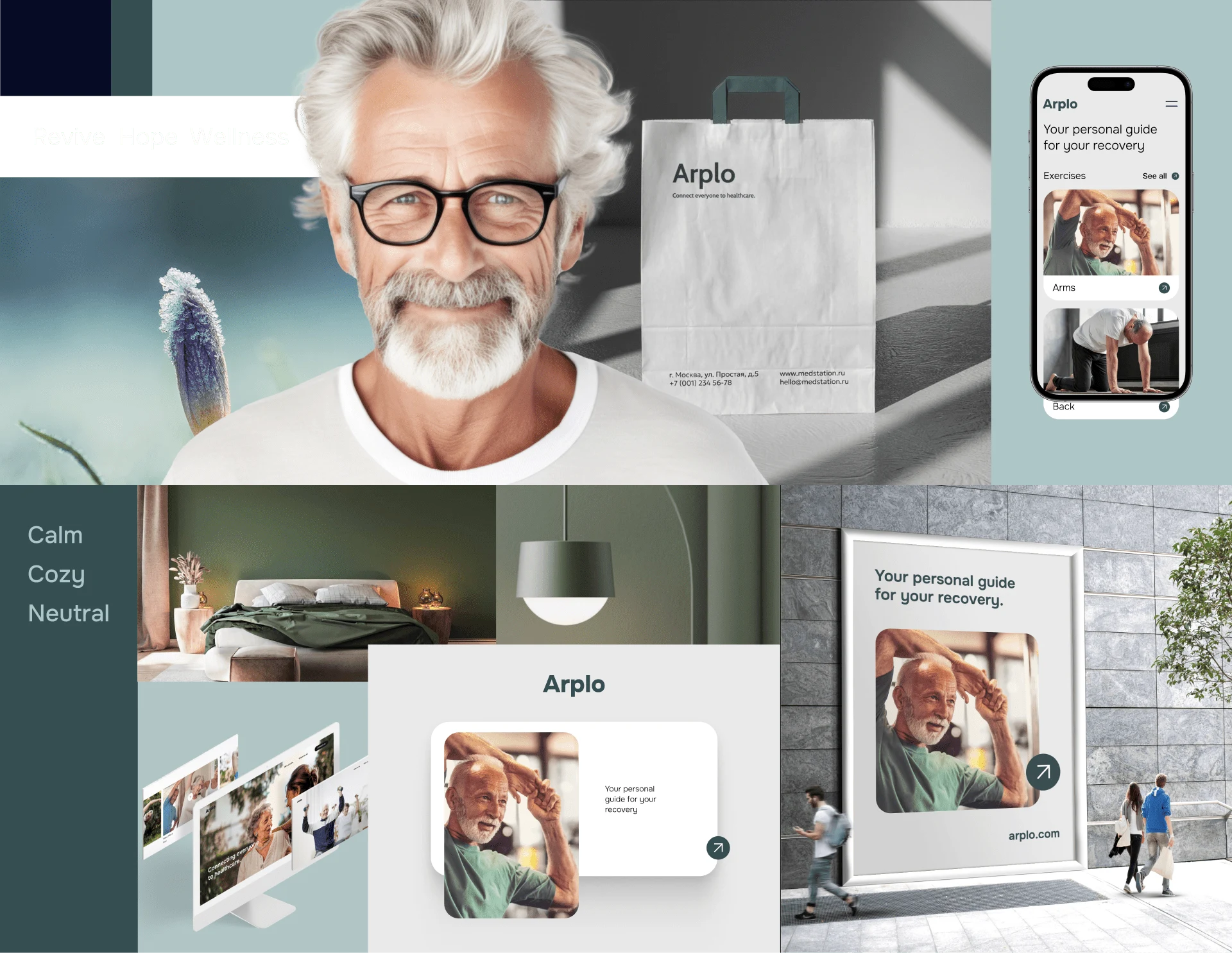
This visual moodboard embodies the essence of renewal, hope, and wellness, tailored specifically for a health company dedicated to guiding patients through their recovery journey. Each element carefully curated reflects the company's commitment to nurturing a positive and uplifting environment for healing and growth.
Foundations
Renewal: Blooming flowers, lush greenery, and serene landscapes symbolize transformation and progress.
Hope: Vibrant colors, sunrise imagery, supportive illustrations, and inspiring quotes evoke optimism and encouragement.
Wellness: Nutritious meals, yoga poses, meditation scenes, and spa treatments promote holistic well-being. Community support visuals highlight the importance of social connection in wellness.
This moodboard visually communicates the company's commitment to nurturing a positive, uplifting environment for healing and growth during the recovery process.
Typography
Primary Font - Outfit
Experience the boundless versatility of The Outfit Family's extensive array of styles, making our font the ultimate choice for a myriad of materials and scenarios. Beyond its adaptability, this font was handpicked for crafting our logo due to its impeccable attributes – defined curves, perfect balance, and proportionality. The letter 'A' seamlessly aligns with the icon, resulting in a logo that epitomizes precision and style.
Secondary Font - Inter
Inter shines through it's excellent legibility, readability, and perfectly symmetrical characteristics in each letter. Sitting at an x-height of 69%, Inter has specifically been designed to have a tall x-height to aid in the readability of mixed-case and lower-case

Base Colors
Principles
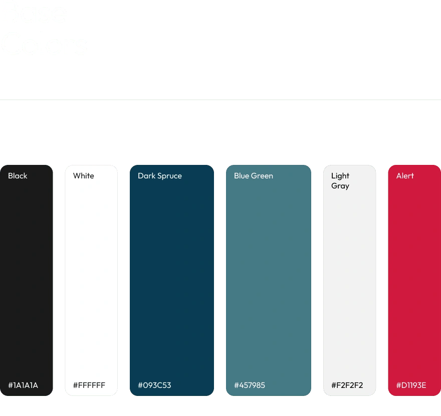
Embarking on a journey that seamlessly merges inspiration from our moodboard keywords—'revive,' 'hope,' and 'wellness'—with cutting-edge technology, we've woven a tapestry of colors synonymous with the tech and medical realms. Each shade, carefully calibrated for the perfect blend, introduces a touch of innovation to our palette. These colors, while subtly deviating from the original moodboard, retain the same inviting softness. It's not just a color scheme; it's a harmonious convergence of aspiration and technological prowess, defining our brand with a modern and reassuring allure.
Logo
Unlocking the essence of connection and vitality, our logo features a lowercase 'a' with a distinct separation in the lower right, seamlessly converging into a captivating circle. Crafted for Arplo, this unique design harnesses the power of the 'A' shape, forming a visual embrace and evoking the dynamic energy of a person stretching. It's more than a logo; it's a symbol of synergy and growth.

Like this project
Posted Sep 13, 2024
Arplo's brand-concept of unlocking connection and vitality. The lowercase 'a' in the logo, featuring separation, converges into a dynamic circle synergy/growth.
Likes
0
Views
11
