POLO SUR | Building a Brand Identity
Eva Puchades
The Challenge: Polo Sur, a new Chilean seafood exporter with a passion for delivering the highest quality products to the world, needed a brand identity that captured their essence and propelled them into the global market. They envisioned a logo that incorporated a distinctive fish element.
Charting the Course:
Collaborative Exploration: We partnered closely with Polo Sur to understand their vision, target audience (global seafood consumers), and desired brand image. We analyzed competitor landscape and industry trends to chart a unique course for Polo Sur, incorporating their desire for a fish-themed logo.
Conceptualizing the Brand Identity: Through brainstorming sessions, sketches, and mood boards, we explored diverse logo concepts that featured a fish face while reflecting Polo Sur's values – professionalism, reliability, and global reach.
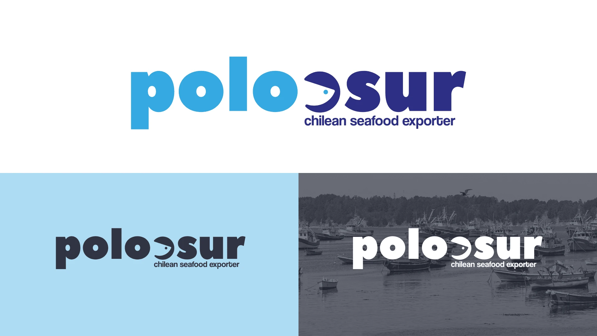
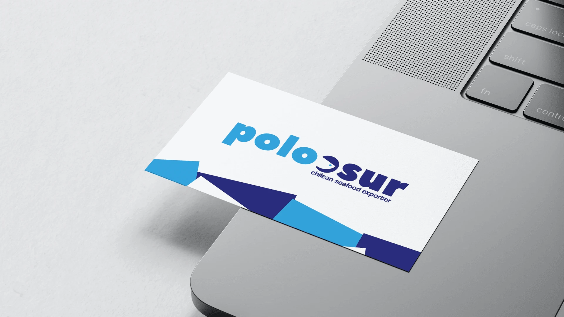
Forging the Brand Anchor: The chosen logo features a stylized fish face, symbolizing Polo Sur's connection to the ocean and their expertise in the seafood industry. The design balances playfulness with professionalism, using bold lines and a minimalist composition. The deep blue color exudes professionalism and trustworthiness.
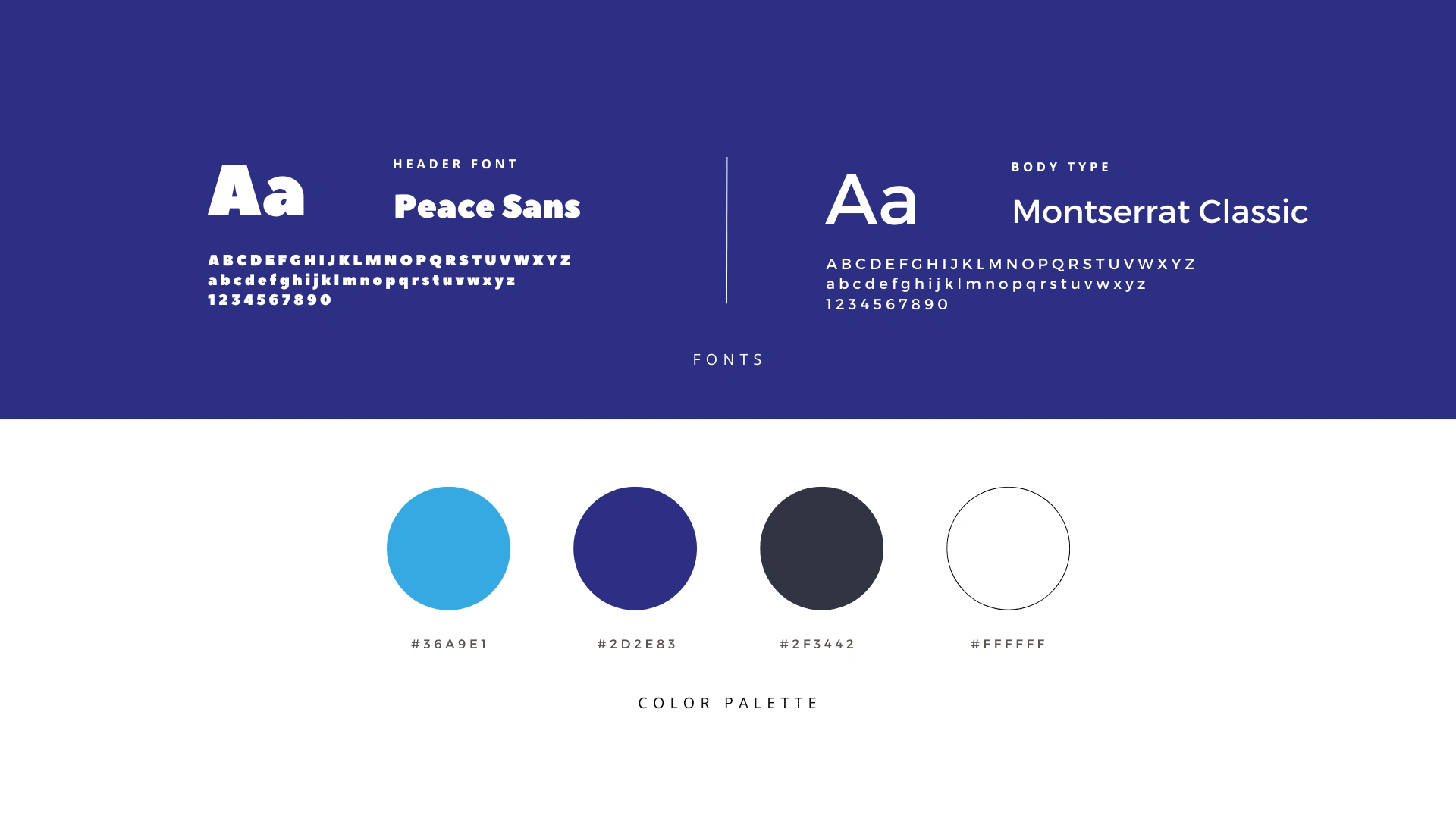
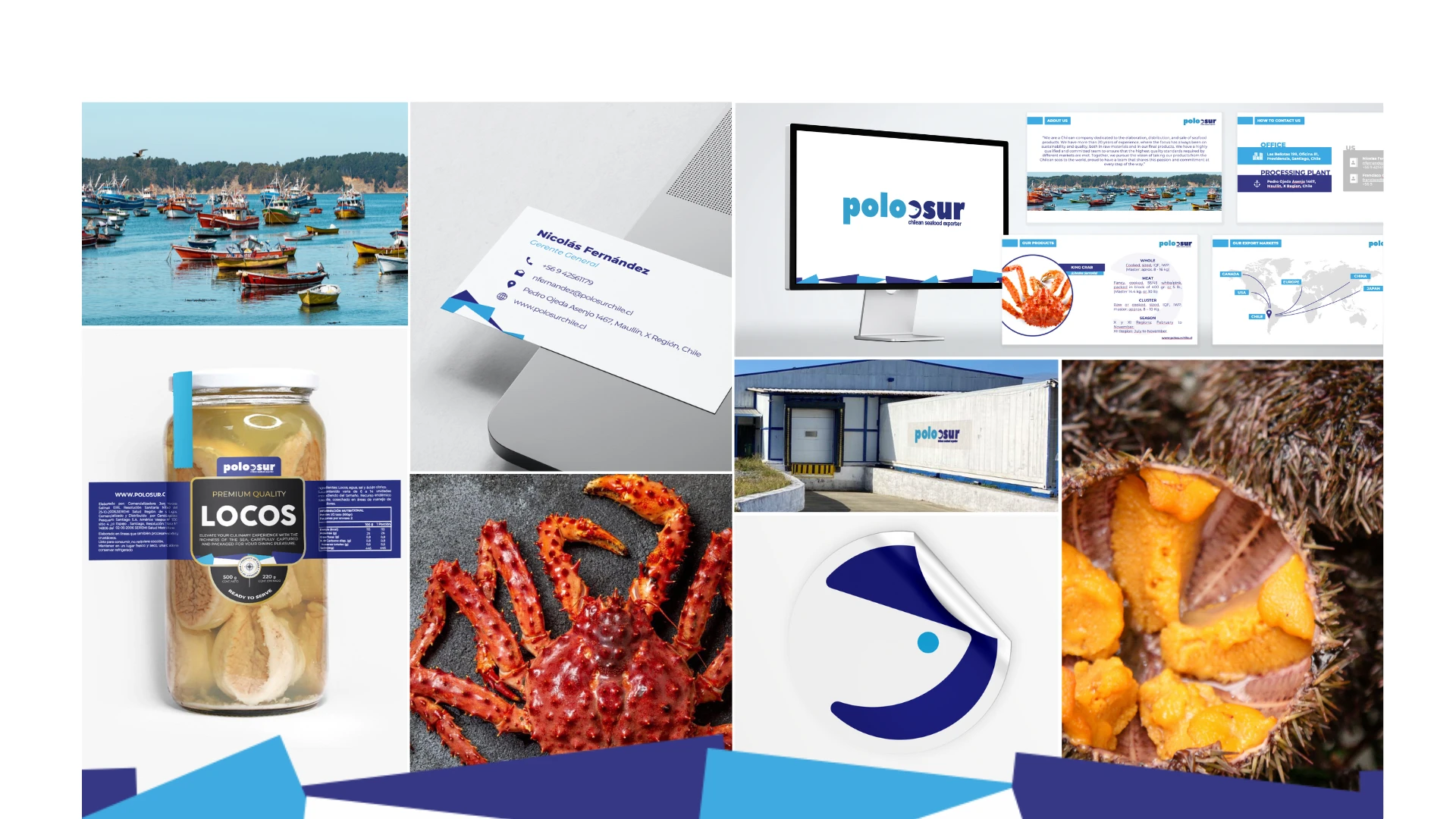
Building a Cohesive Brand Universe: We extended the logo design to create a comprehensive brand identity. This included color palettes, typography, and design elements applied consistently across business cards, letterhead, product packaging, and marketing materials.
Like this project
Posted Apr 24, 2024
Full branding for the Polo Sur brand, a seafood exporter based in Chile. Packaging and stationery design for seafood products.