Logo and Packaging Design for Aakuma's Rizz Chips

Ash


Aakuma- Rizz Chips
About the brand
Aakuma, meaning “demon” in Japanese, originally began as an anime-inspired clothing brand. Over time, the vision shifted toward food, with their first product being Rizz Chips, a healthy rice-based snack. Since the brand had no prior identity, this project required creating both a logo and packaging design system from scratch.
GOALS
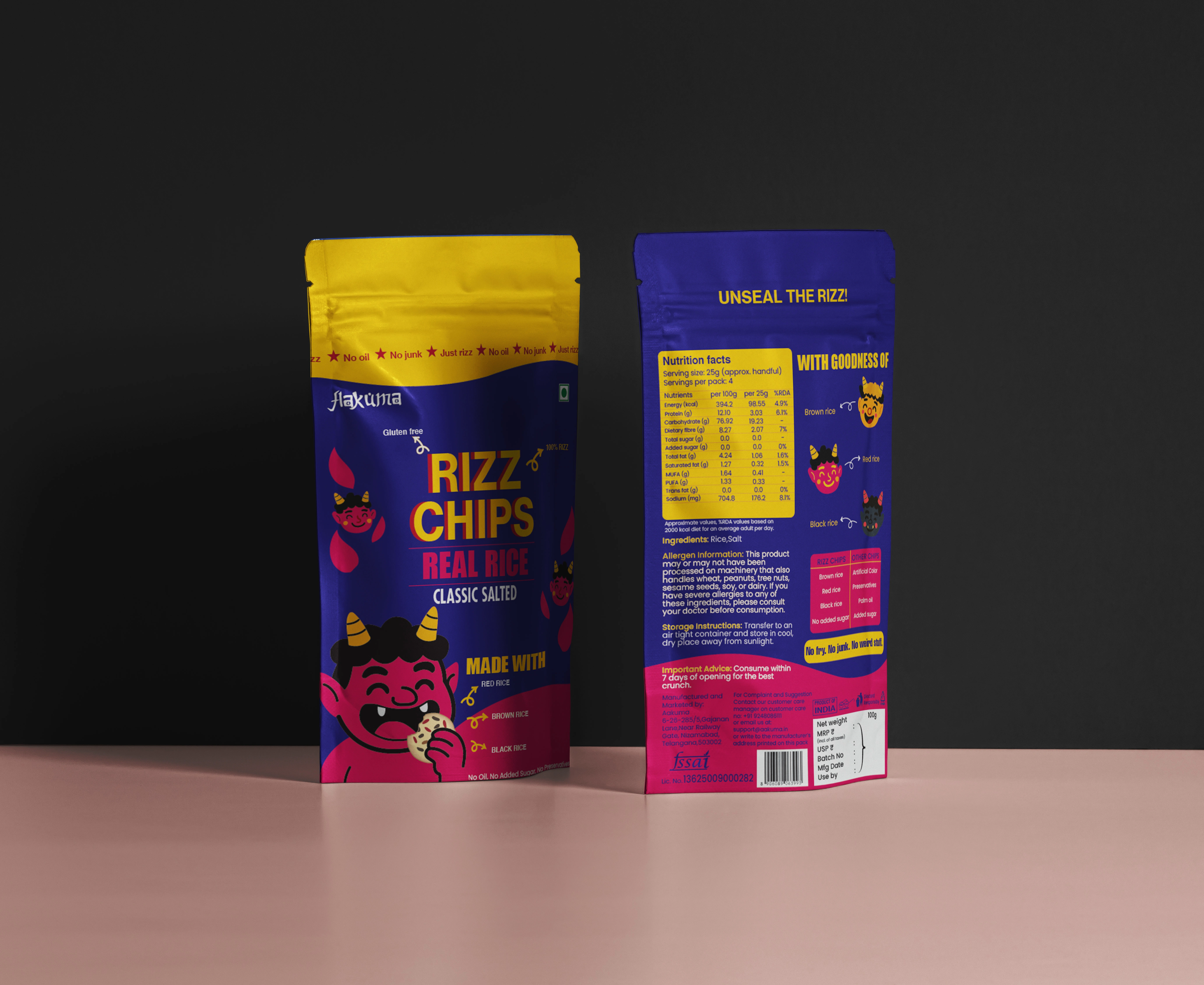
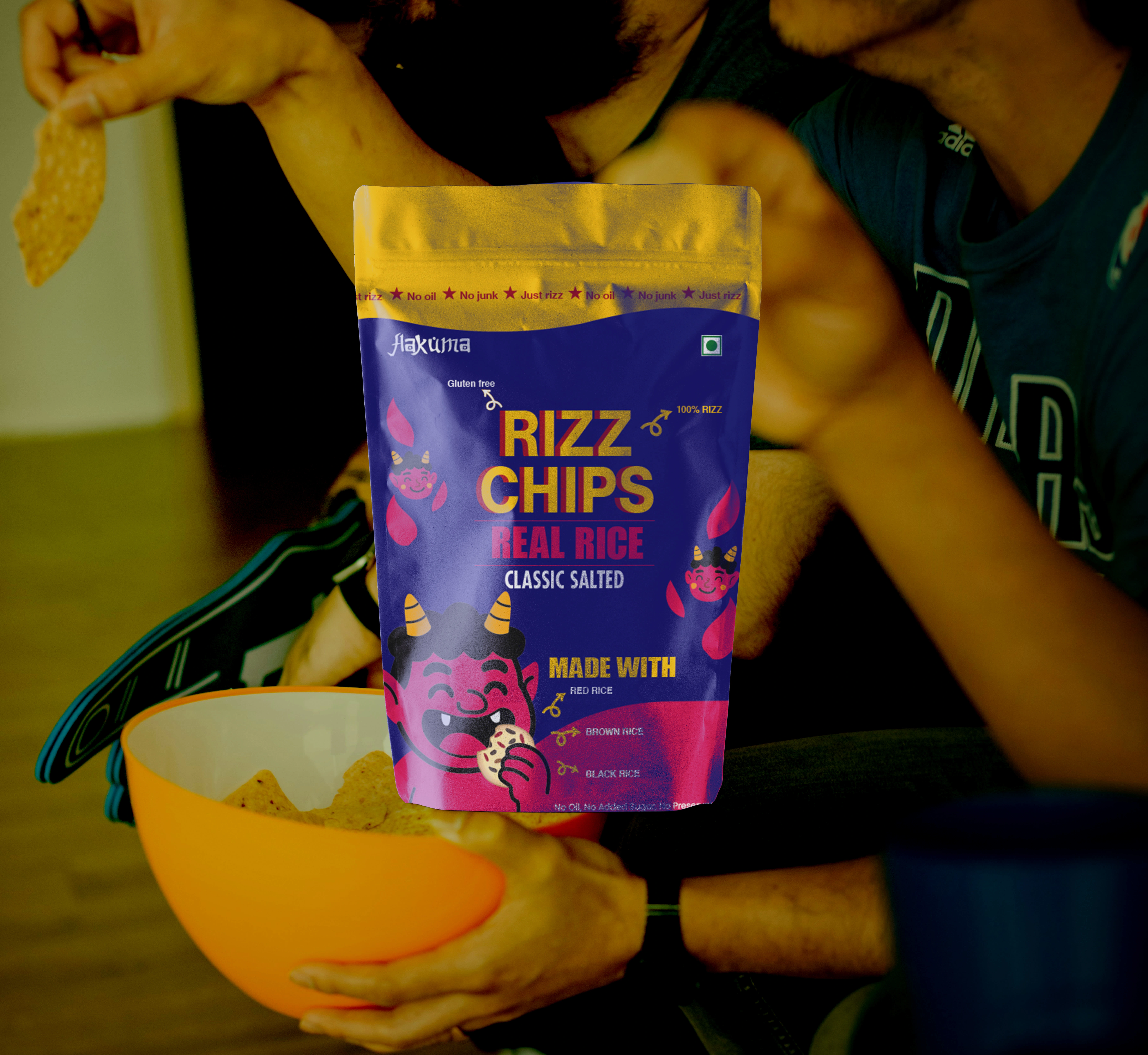
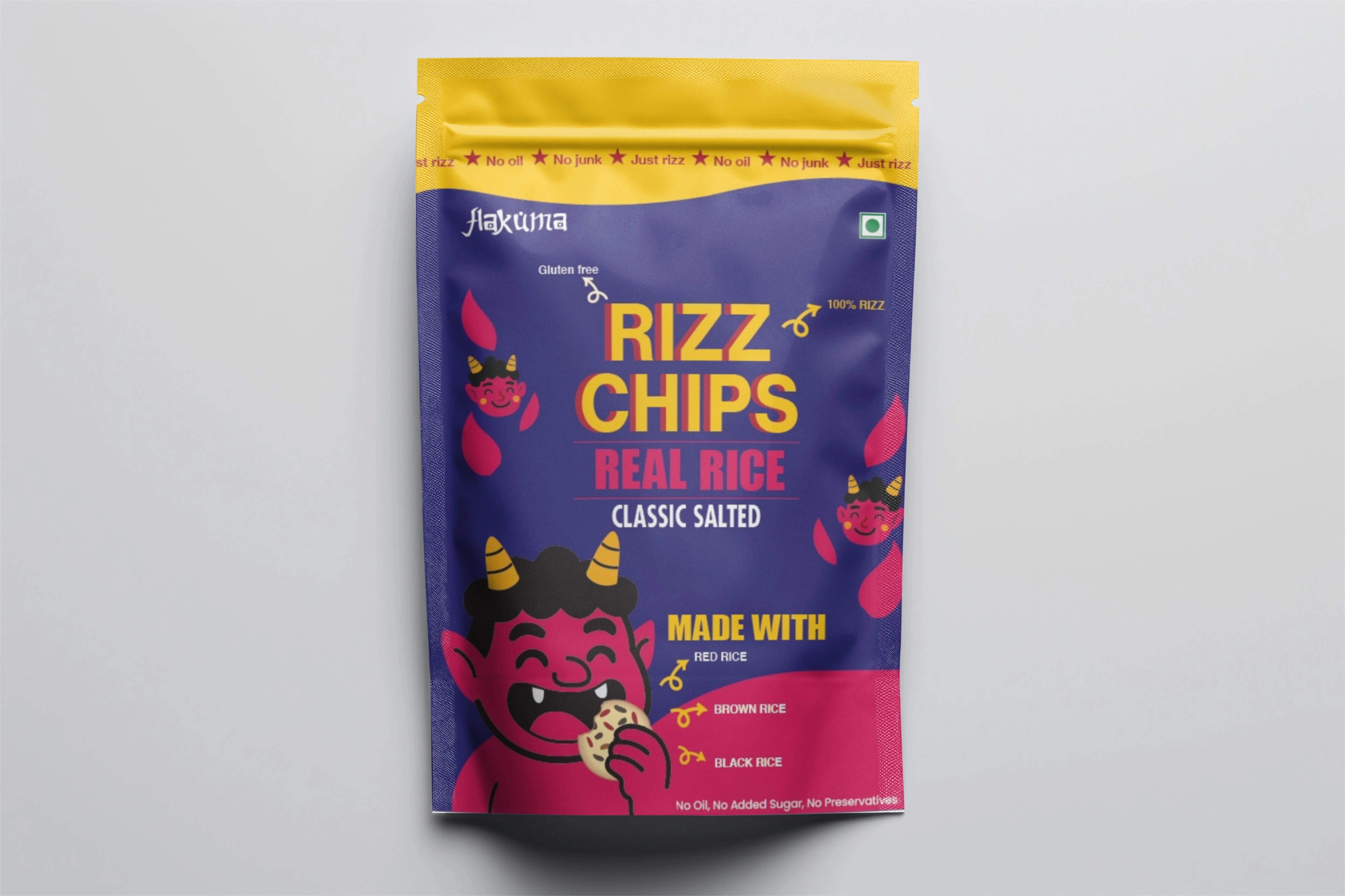
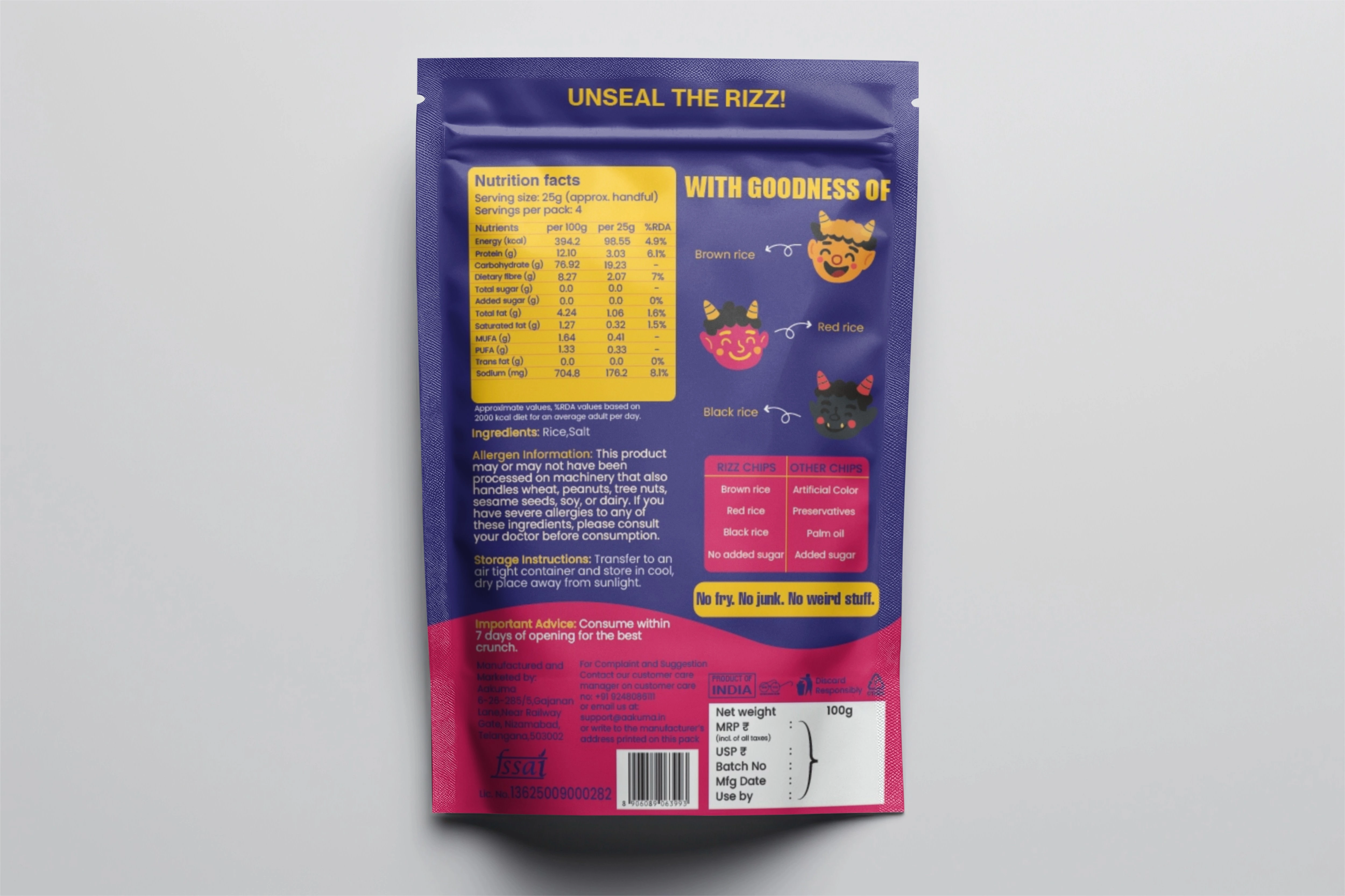
The client wanted packaging that was fun, bold, and engaging, while also communicating the product’s ingredients clearly. Alongside this, the project needed a logo that resonated with Japanese aesthetics yet felt modern and approachable.
PROCESS
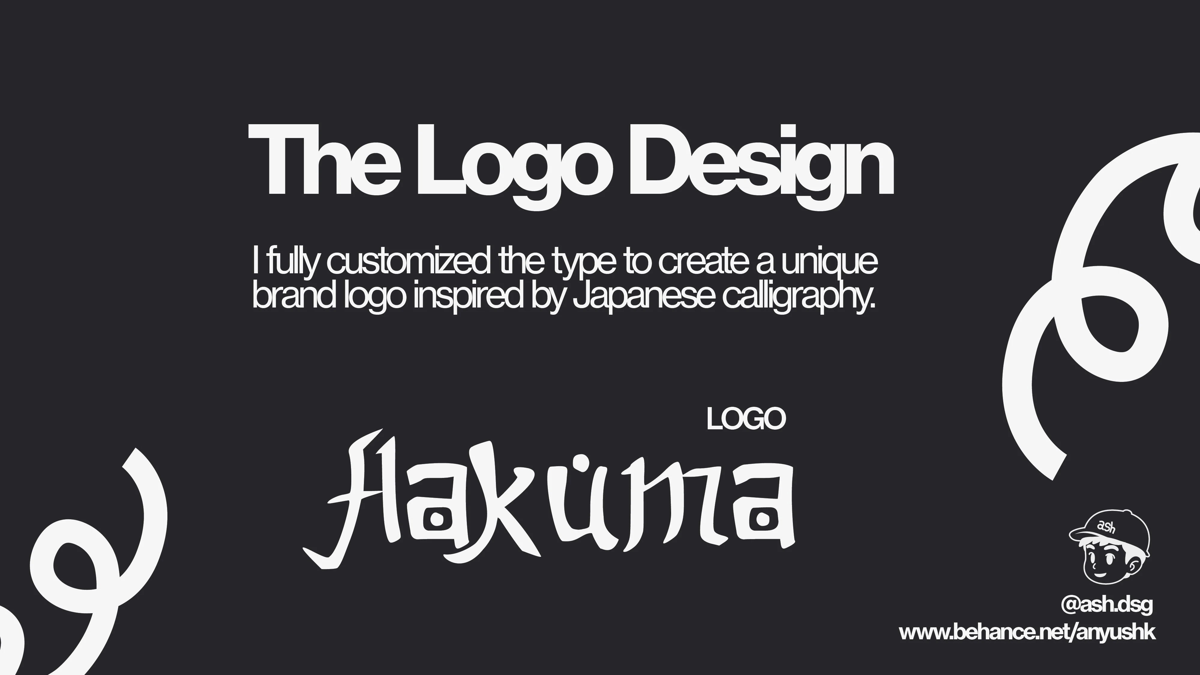
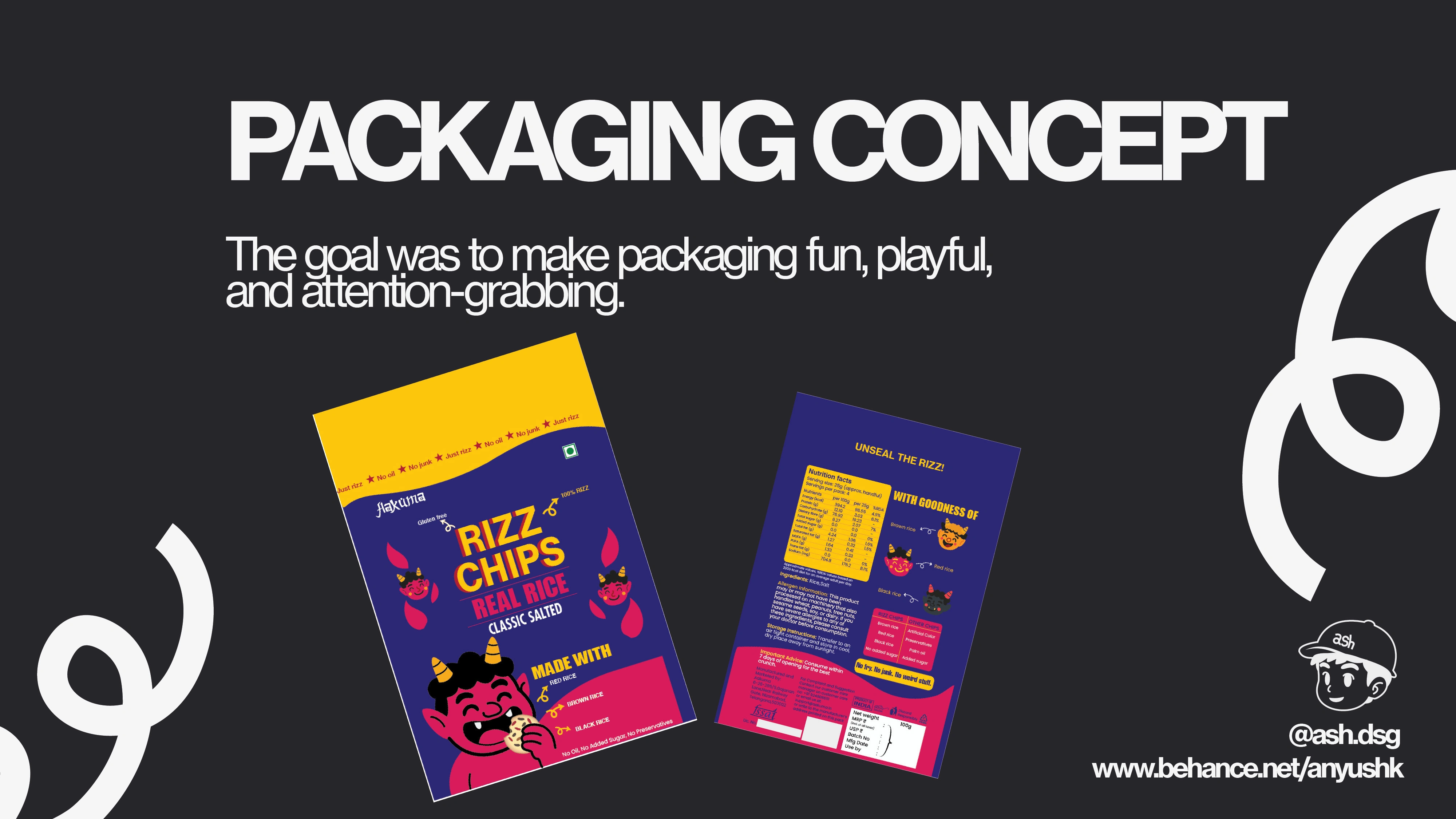
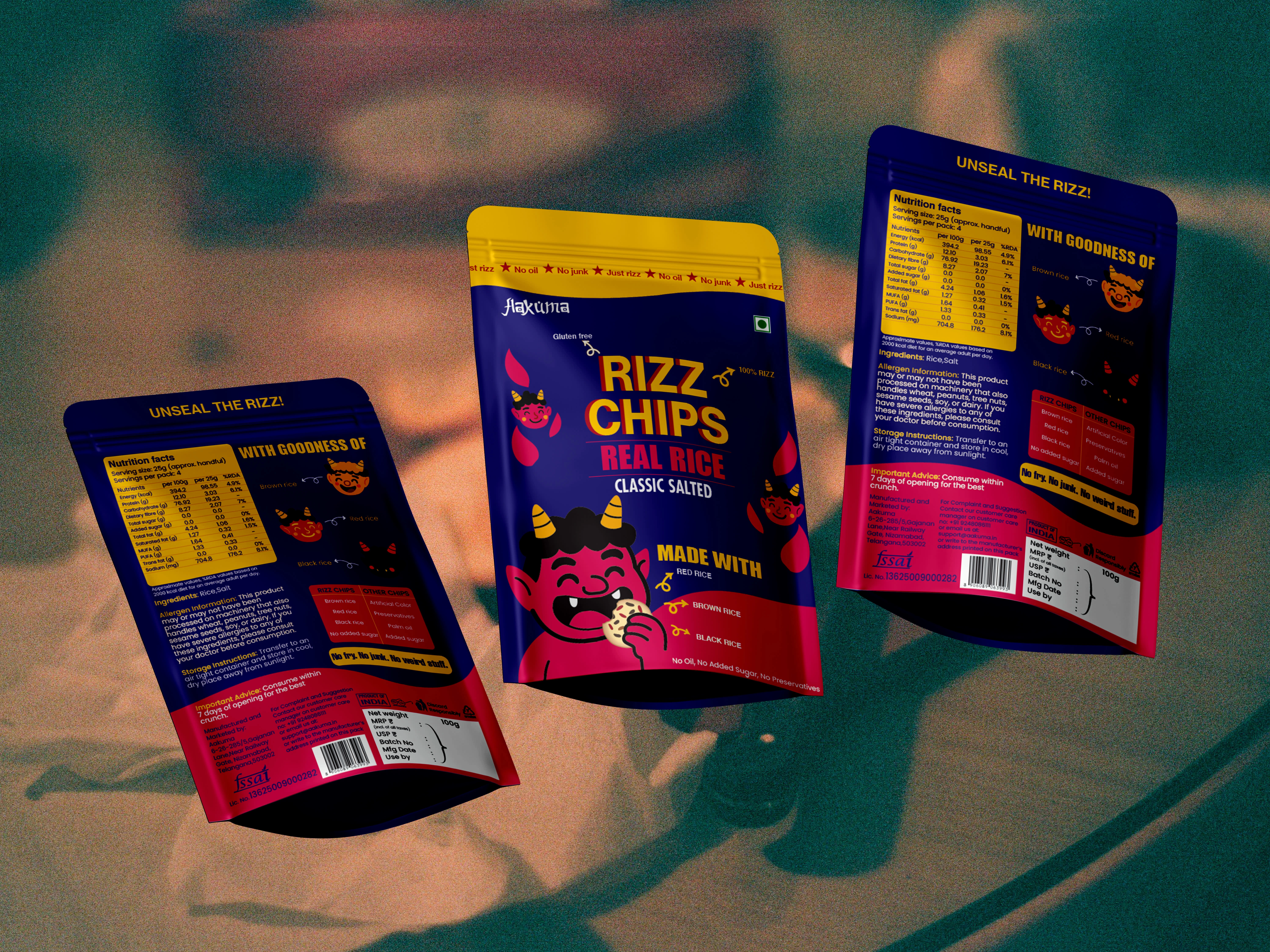
I began by exploring the brand’s Japanese connection and customized the Gaijin Shodo Regular typeface to design a unique logo. For the packaging, I illustrated playful demon characters to reflect the name Aakuma and bring storytelling into the product.
Like this project
Posted Oct 9, 2025
Created logo and packaging for Aakuma's Rizz Chips, a rice-based snack.