Literaturhaus München
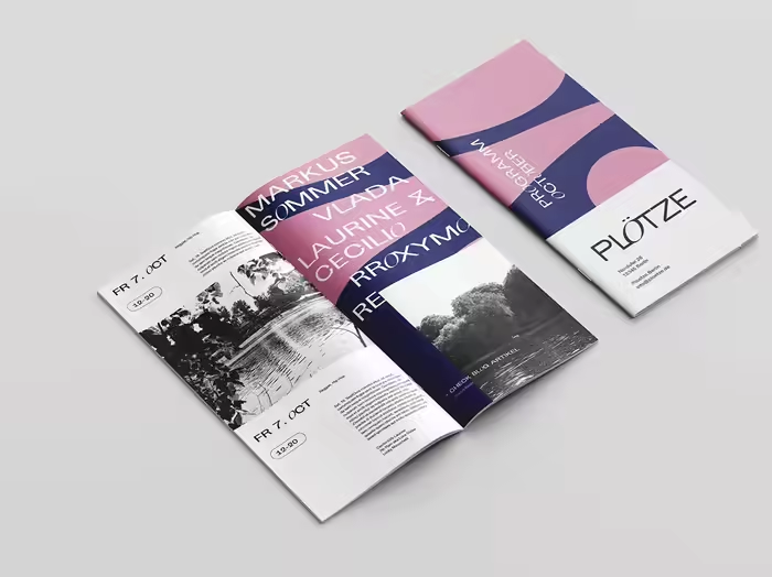
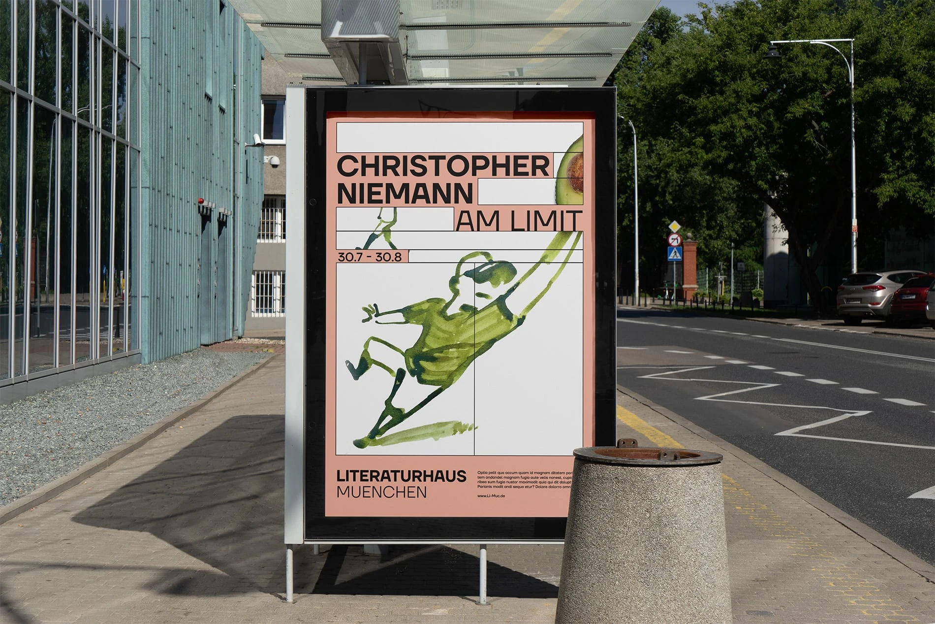
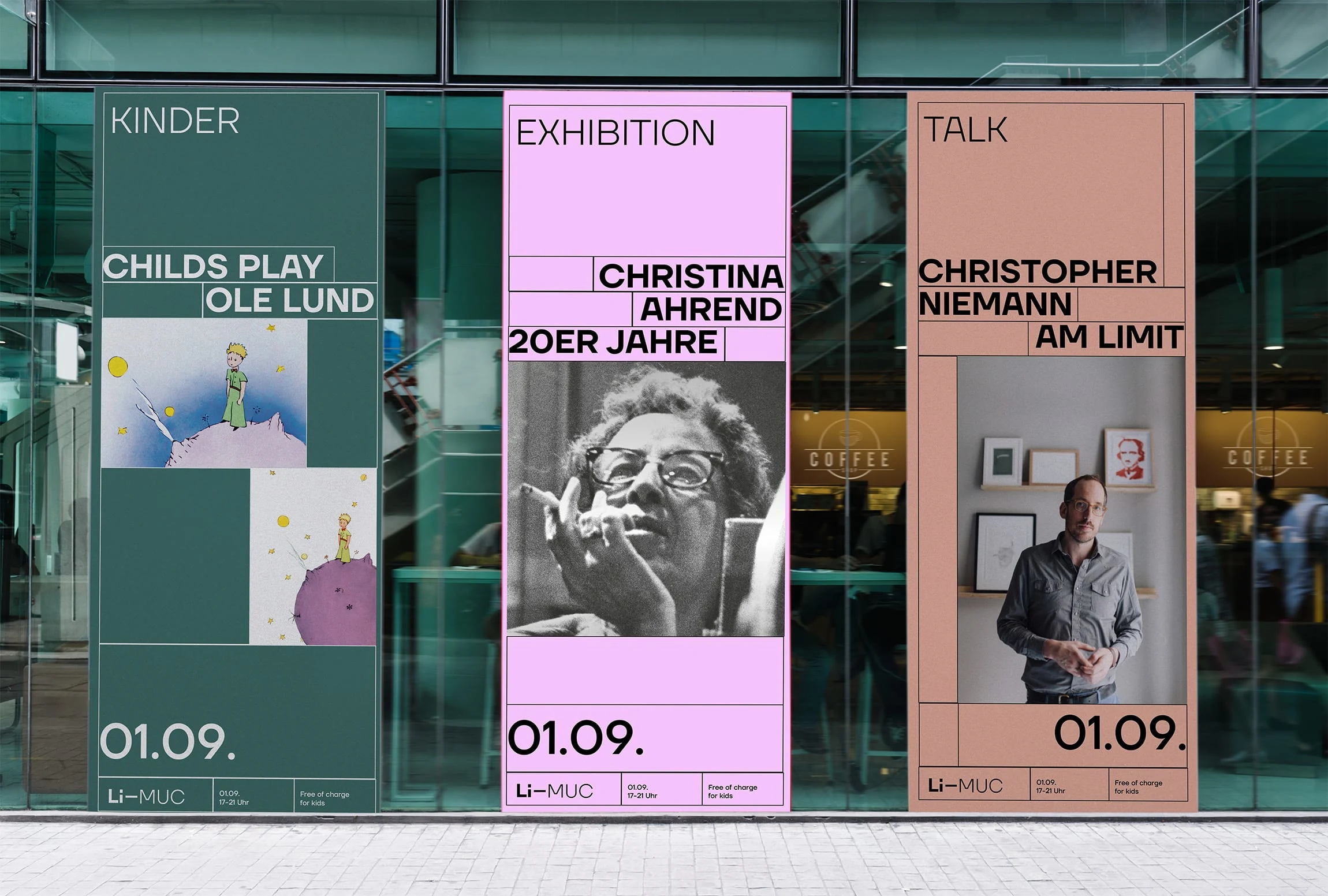
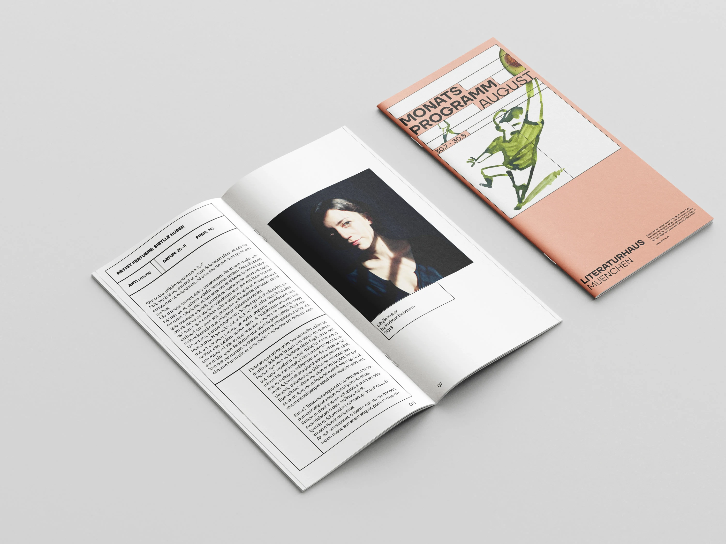
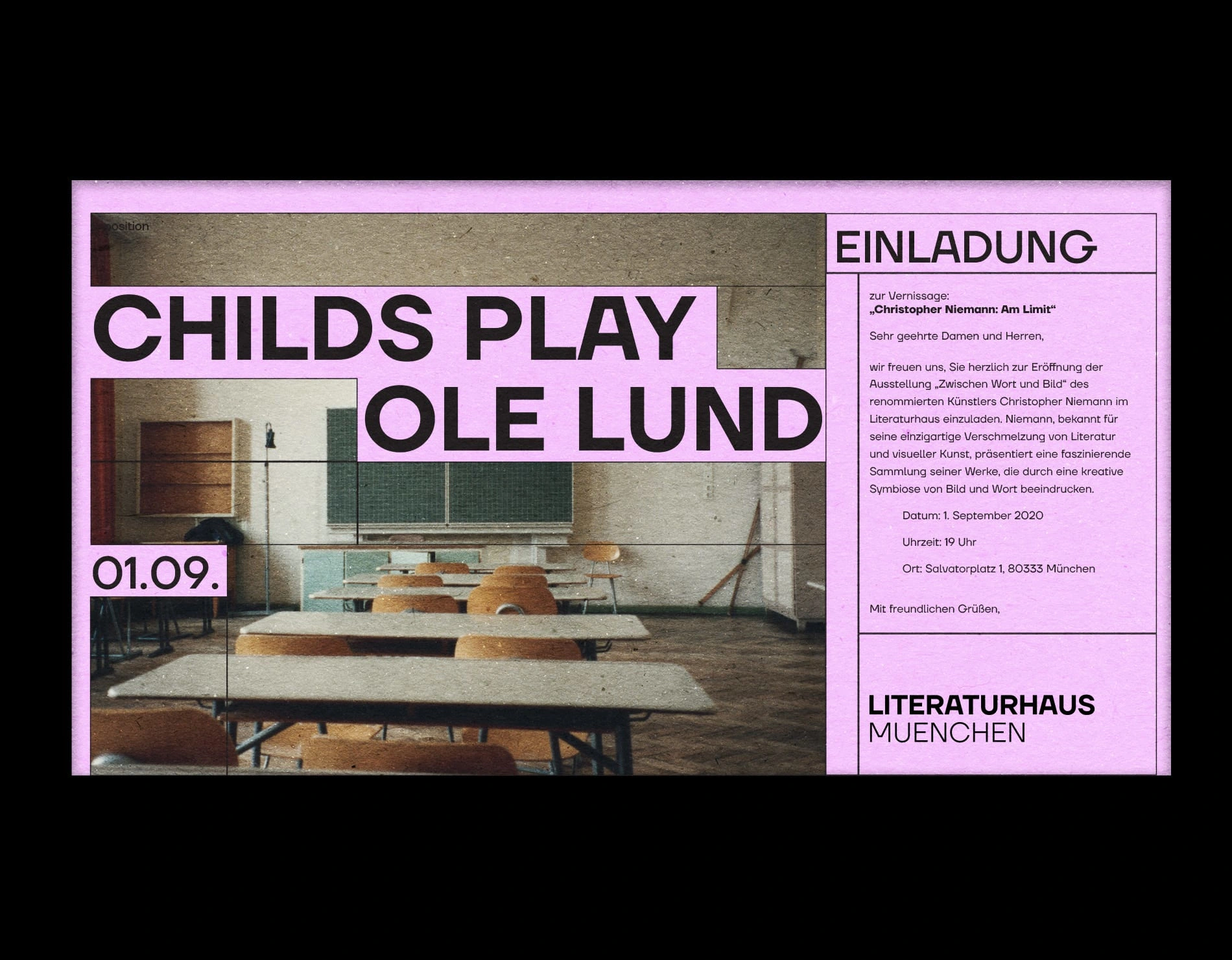
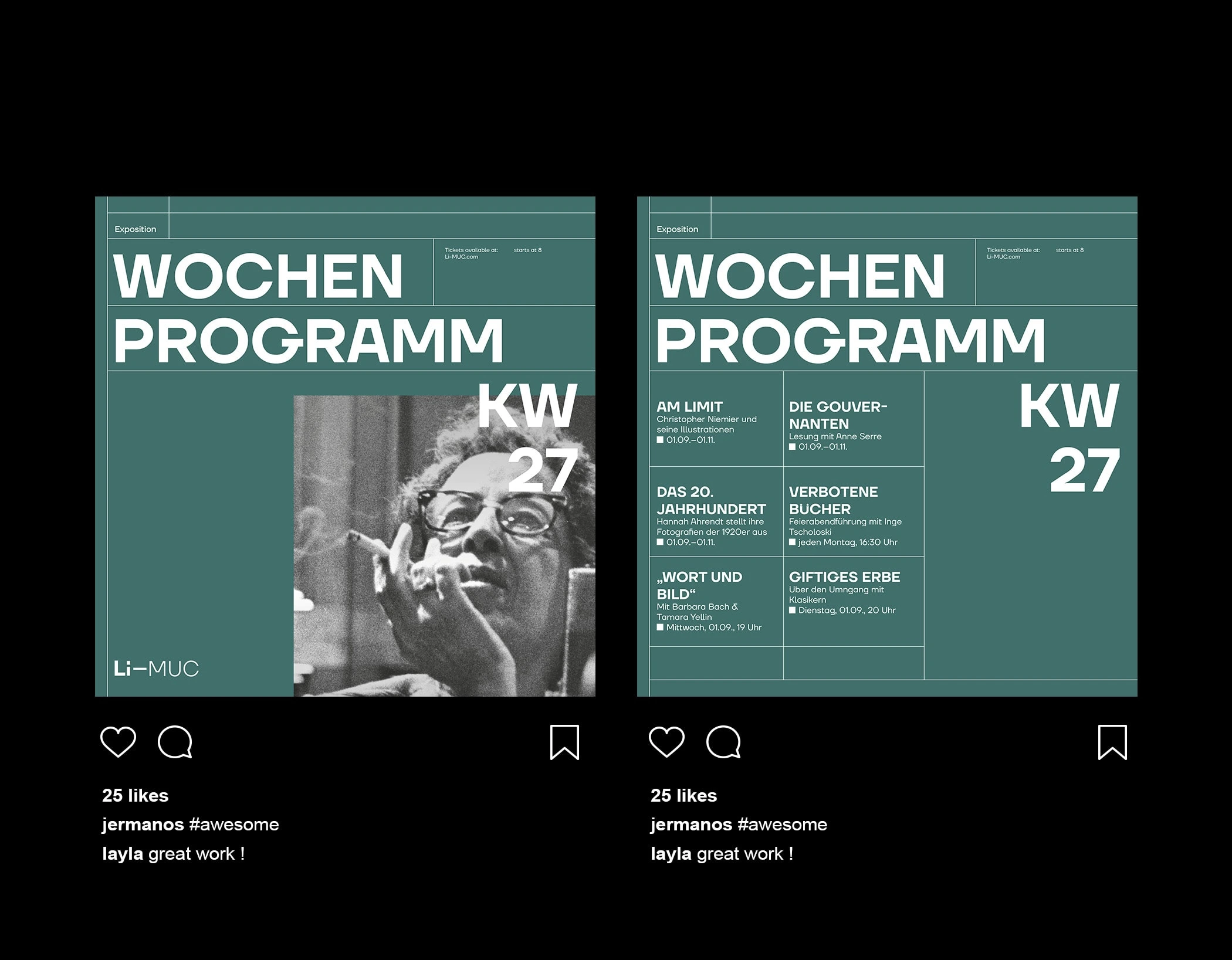
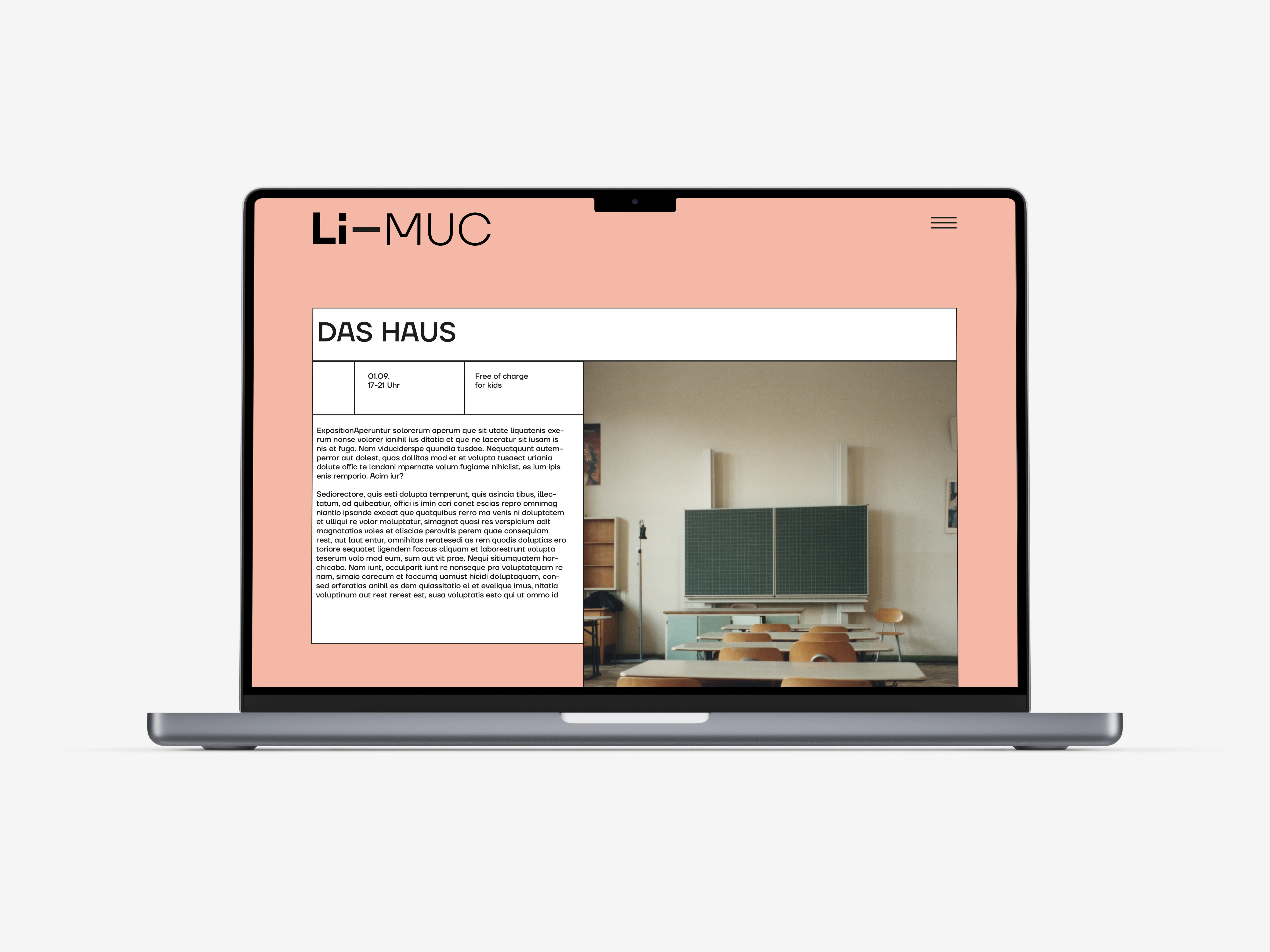
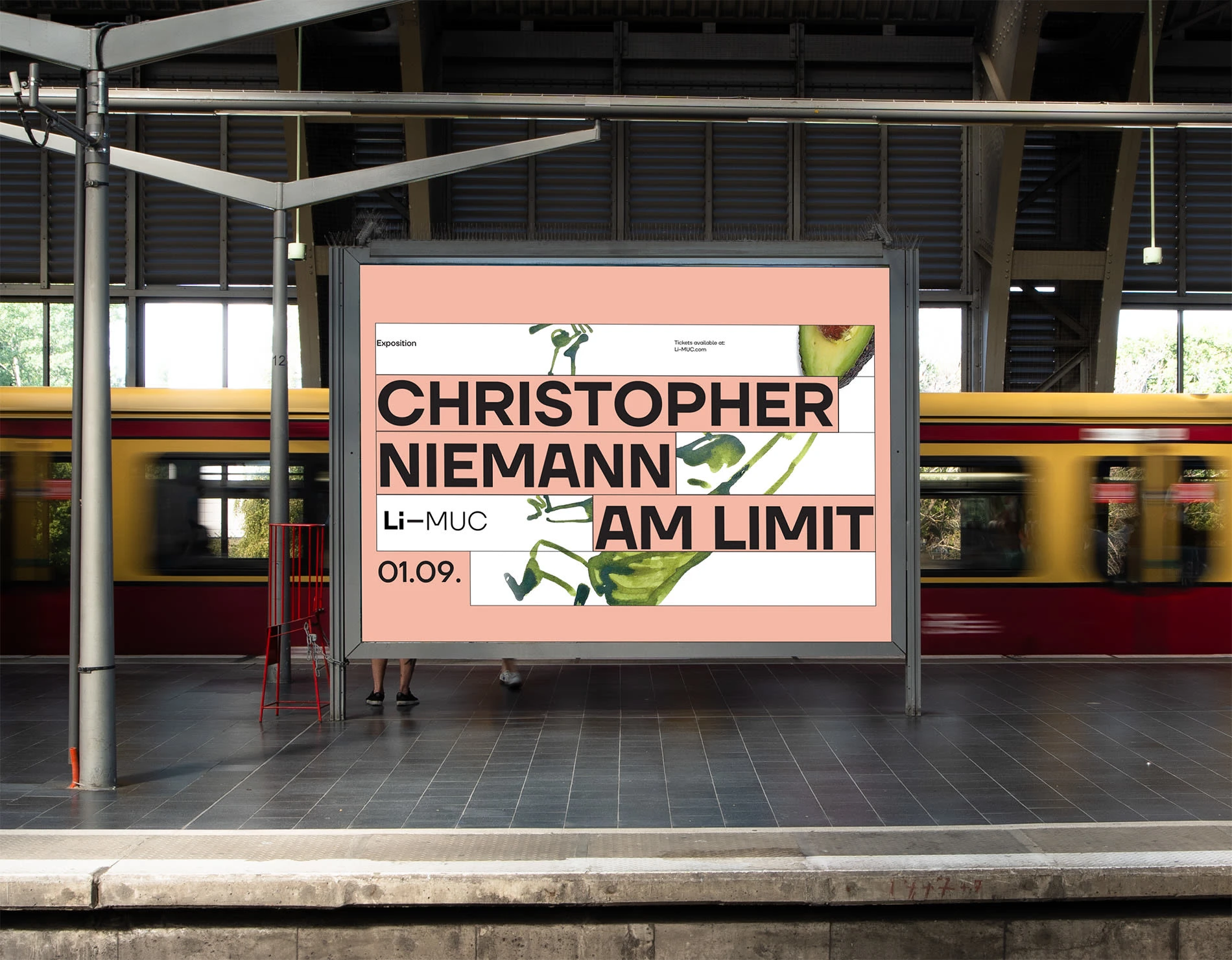
The Literaturhaus München is a cultural institution in downtown Munich that is dedicated to communicating literature and organizing literary events. Right after my oral bachelor exams I took part in a pitch for the rebranding of “Literaturhaus Muenchen”. The aim was to create a modern and timeless identity which targets both young and old.
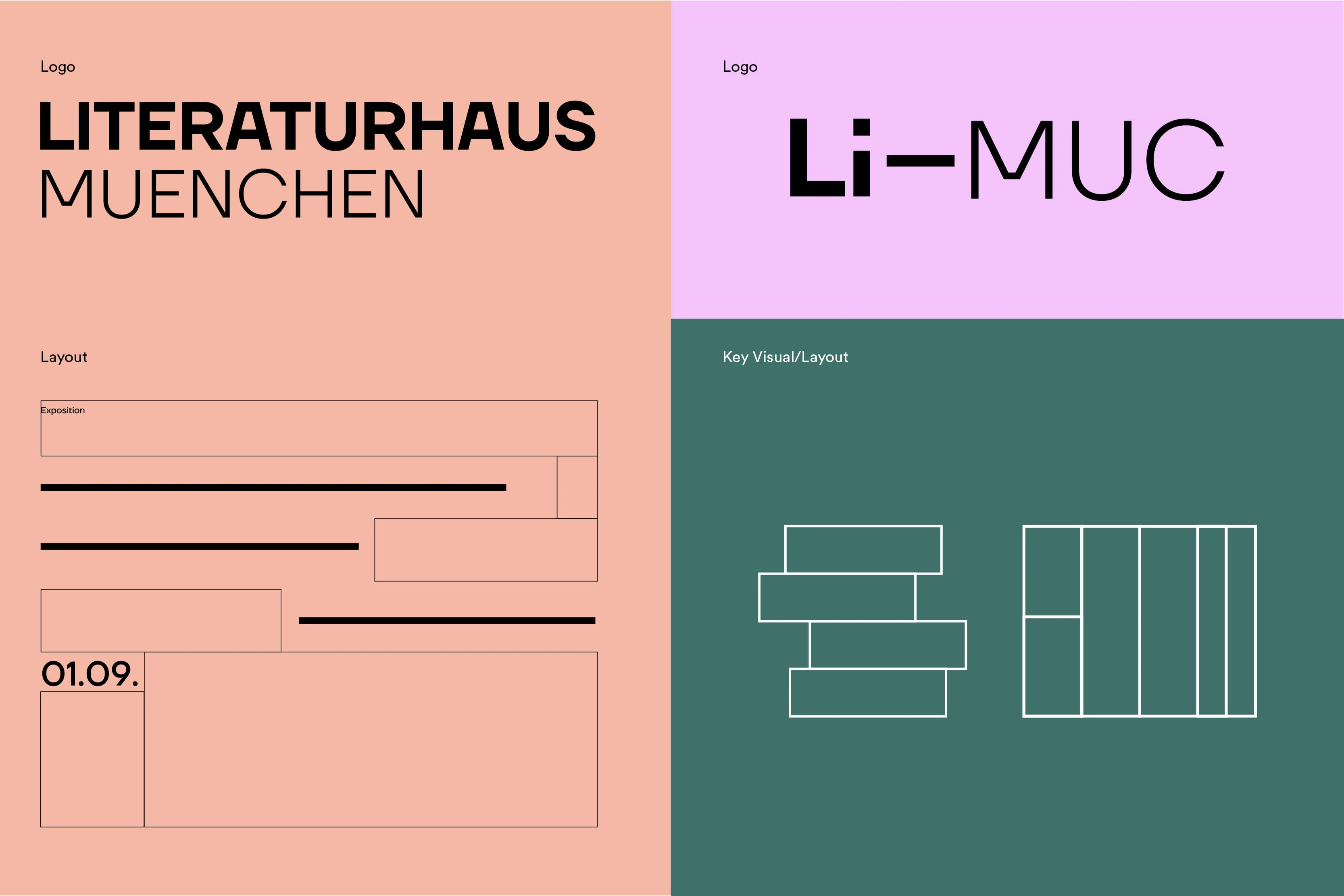
Since the facility is situated in a former building of the Russian orthodox community, I chose a typeface that refers to this fact. Furthermore the capital “A” is very similar to a flipped book. As a key element in the layout, I integrated lines and rectangles symbolising a stack of books and a bookshelf. This was then executed via OOH advertisement, website and a program booklet.
Like this project
Posted Jan 5, 2024
Redesign Pitch for a literature house.
Likes
0
Views
11
