Bundesdruckerei
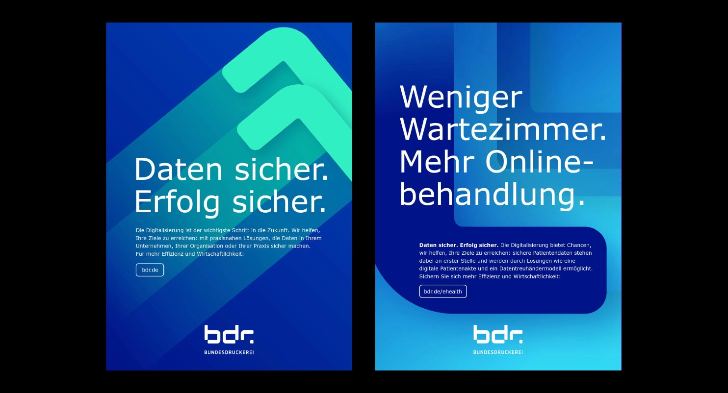
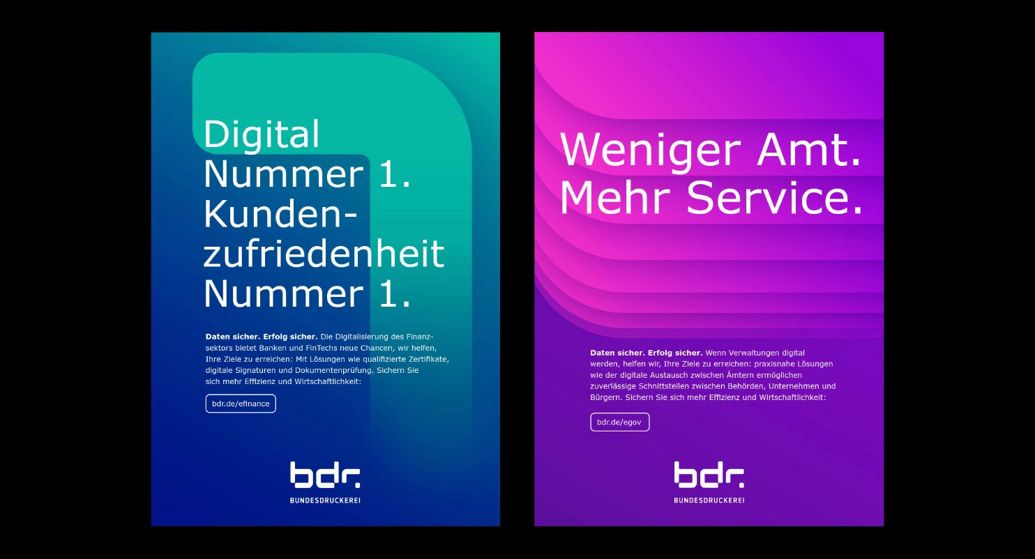
At Serviceplan Berlin we partook in a pitch from the Bundesdruckerei. The companies of the Bundesdruckerei Group use its services and technologies to protect digital identities, sensitive data and infrastructures. Our assignment was to create a new image campaign addressing these services
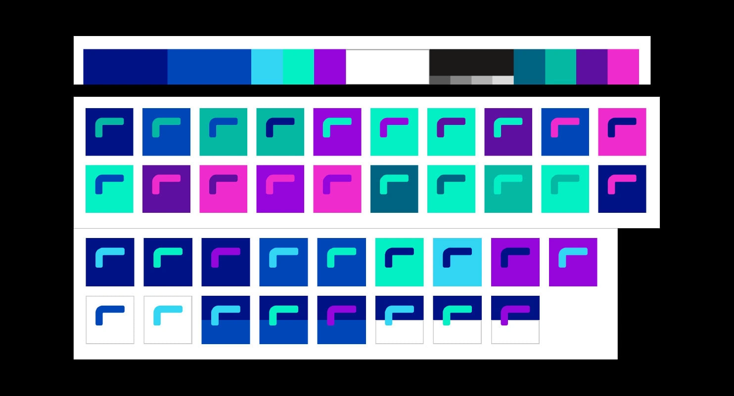
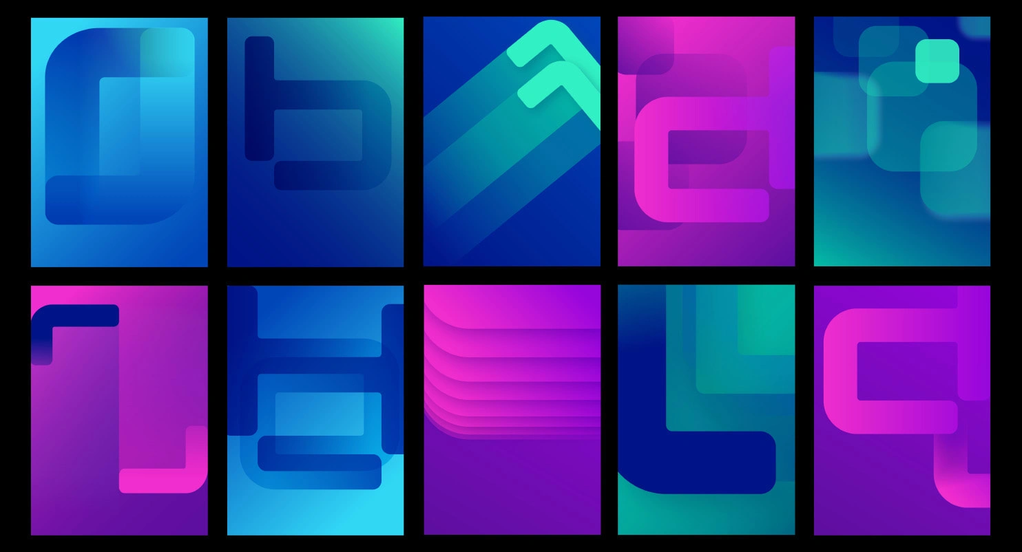
We developed a series of assets, picking up the „r“ in the logo and utilized a very straight forward, simple headline mechanic combined with a lively color system. Like this we could communicate the services as fast and easy as possible, as opposed to the old campaign where everything looked very complicated and took a lot of time to understand. Apart from creating the visual language of the campaign, I also animated digital banner ads.

Like this project
Posted Jan 5, 2024
Image Campaign Design for government agency.
