Funnely Platform UX/UI Design

Juan Garces

The challenge
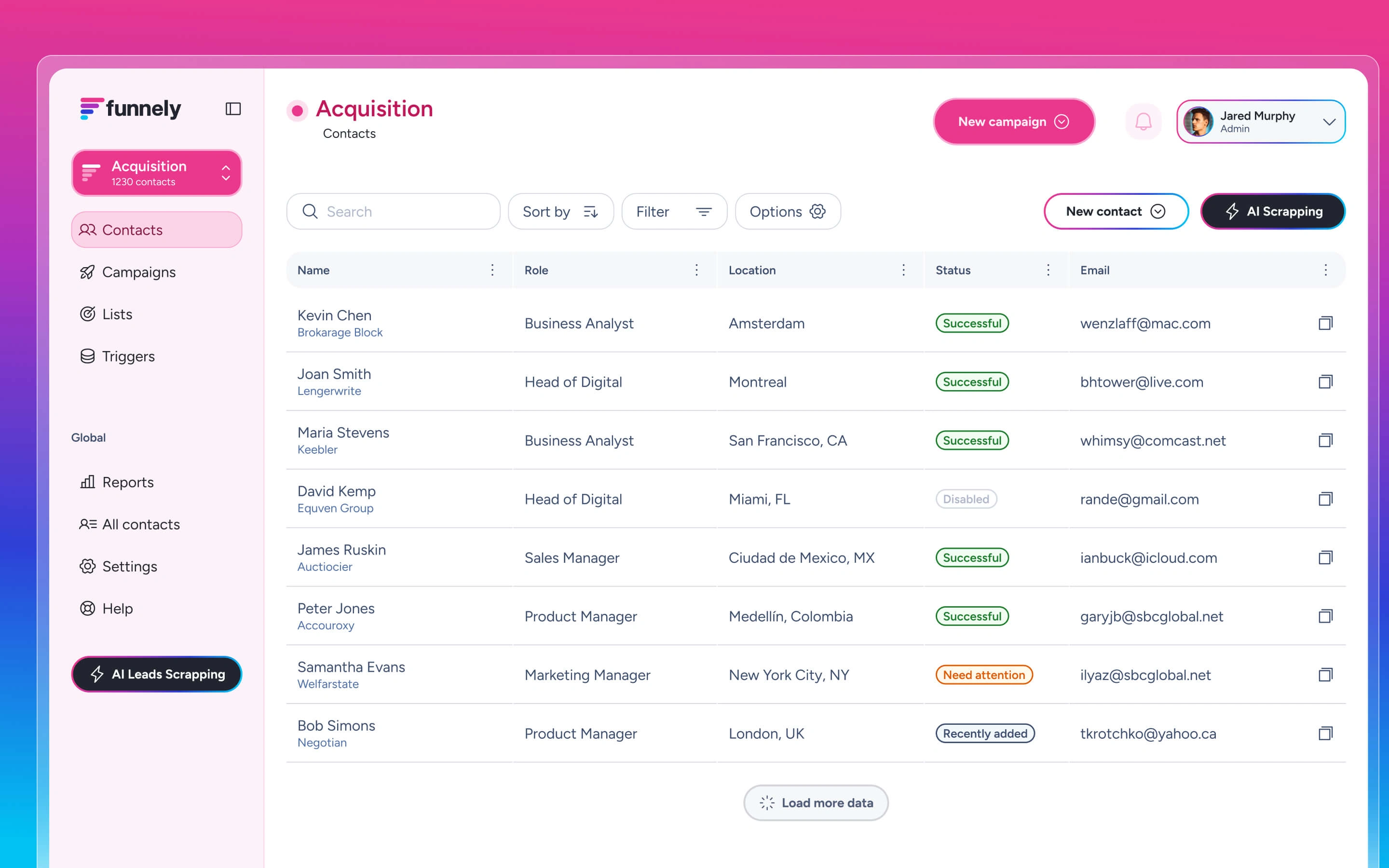
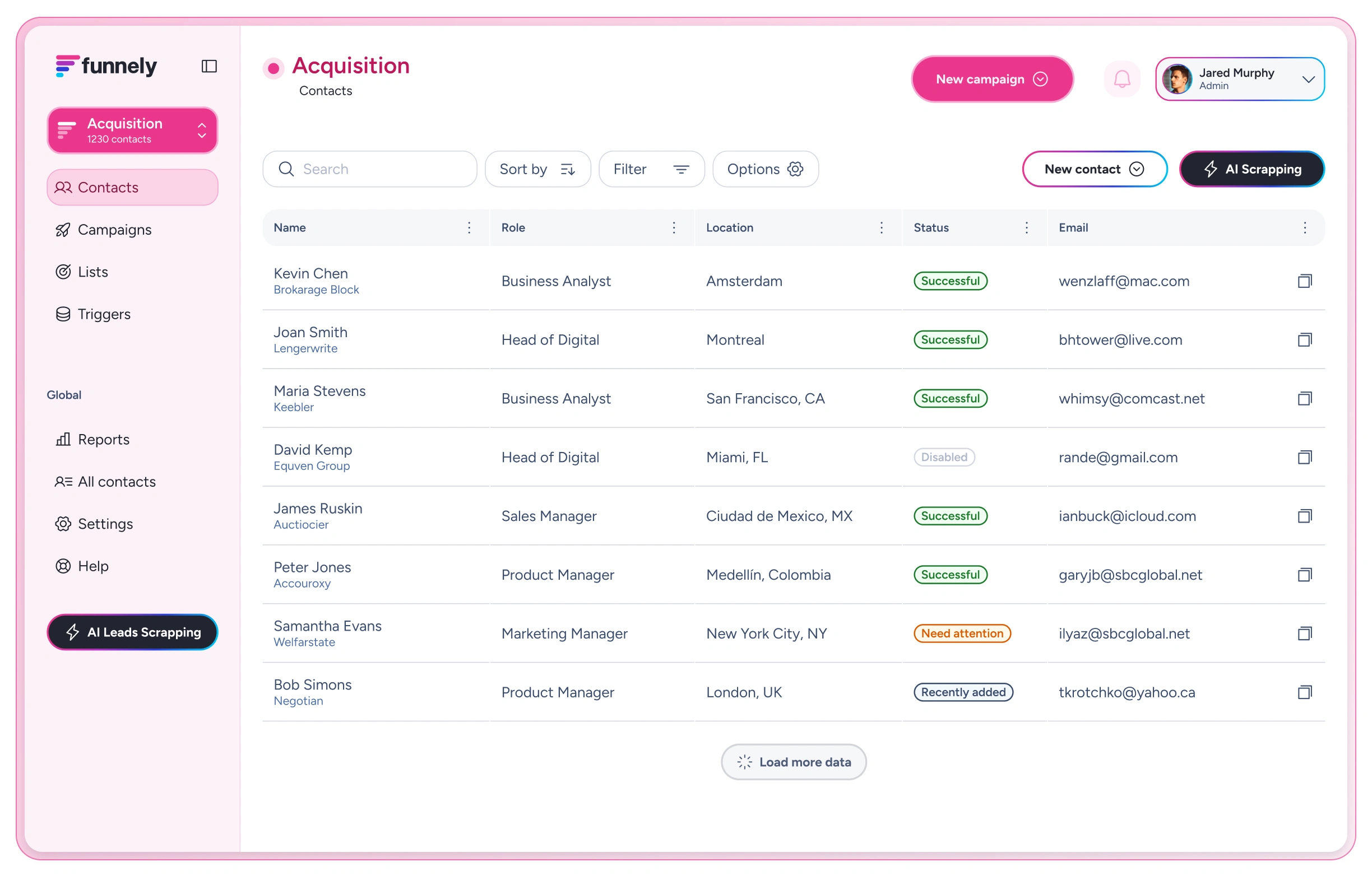
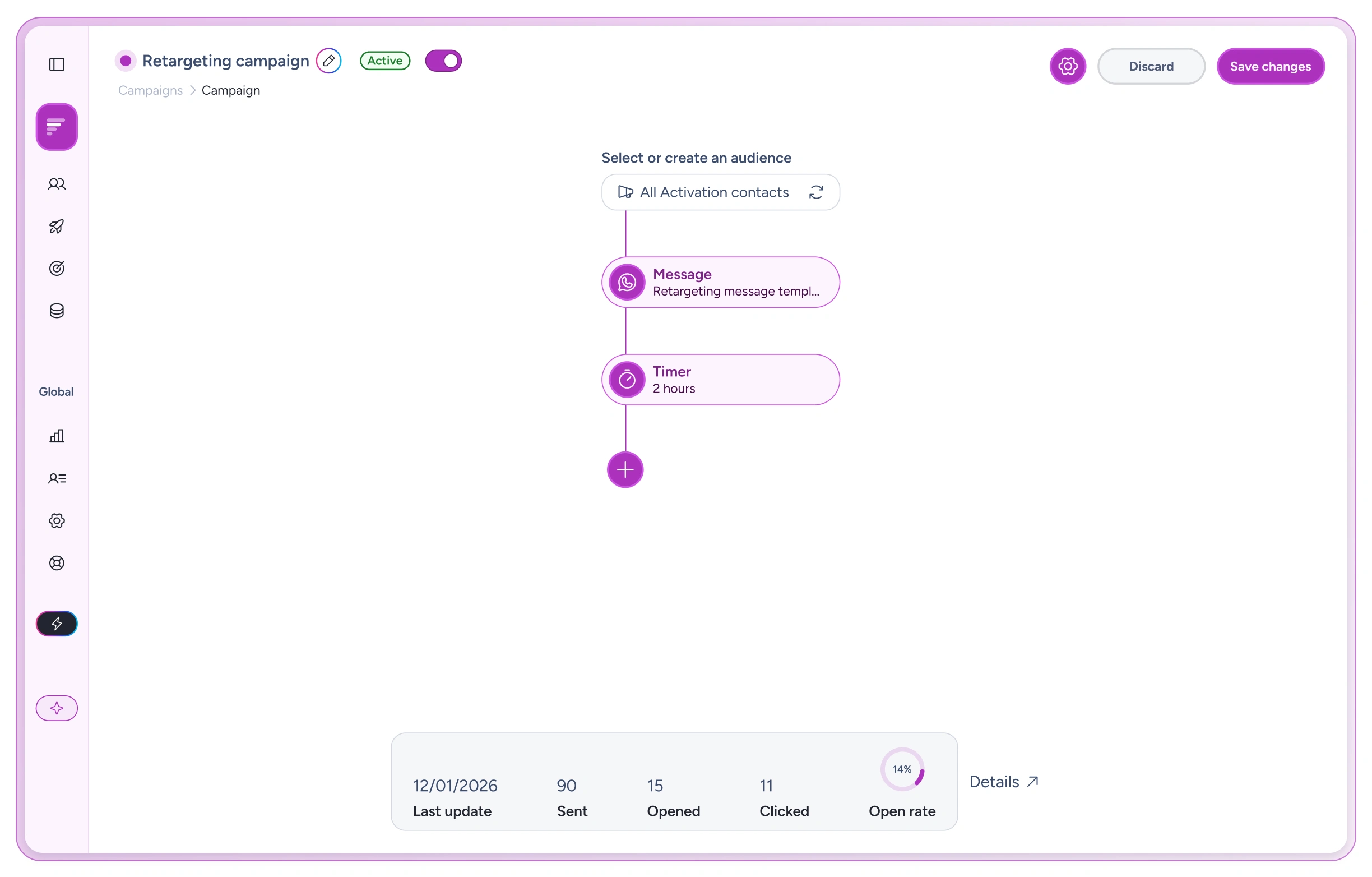
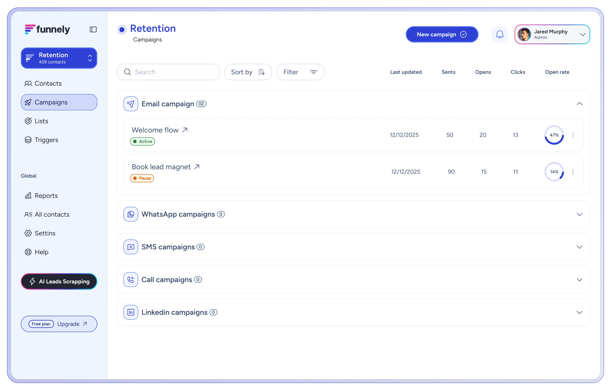
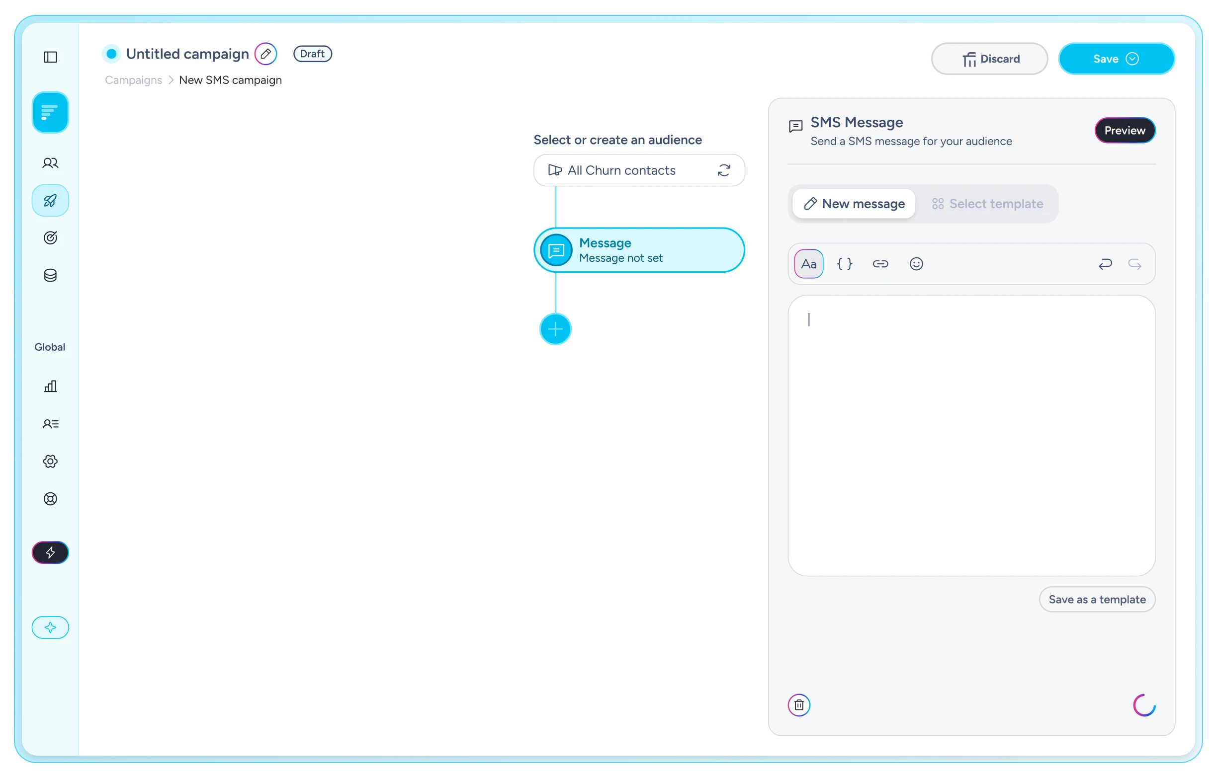
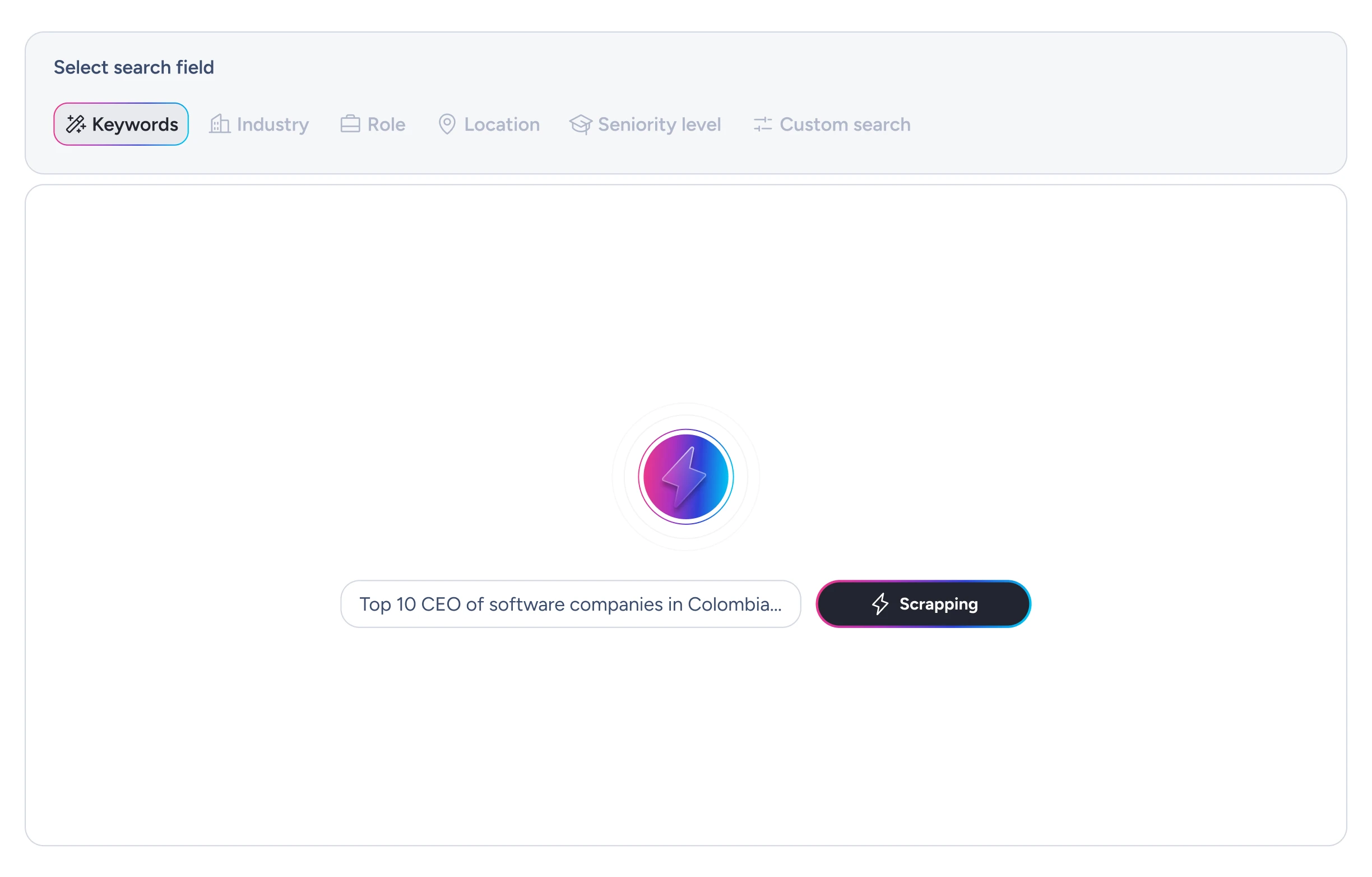
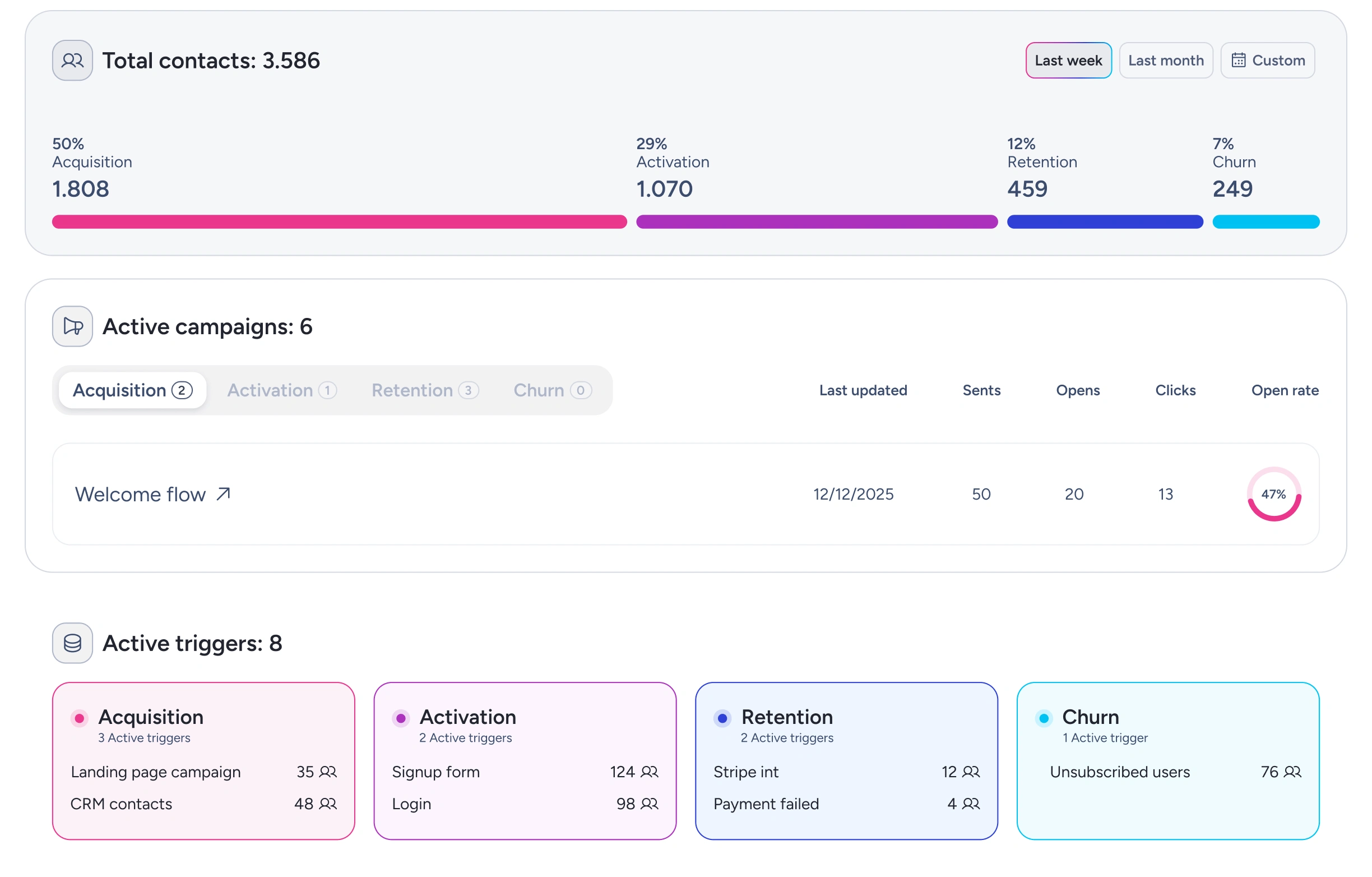
The challenge was to design, within a single platform, the entire customer lifecycle experience, broken down across every stage of the funnel: acquisition, activation, retention, and churn. Each funnel stage is represented by a distinct logo color, creating a cohesive, unified brand identity throughout the entire journey.
Design system
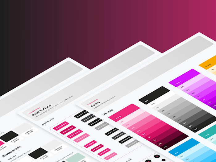
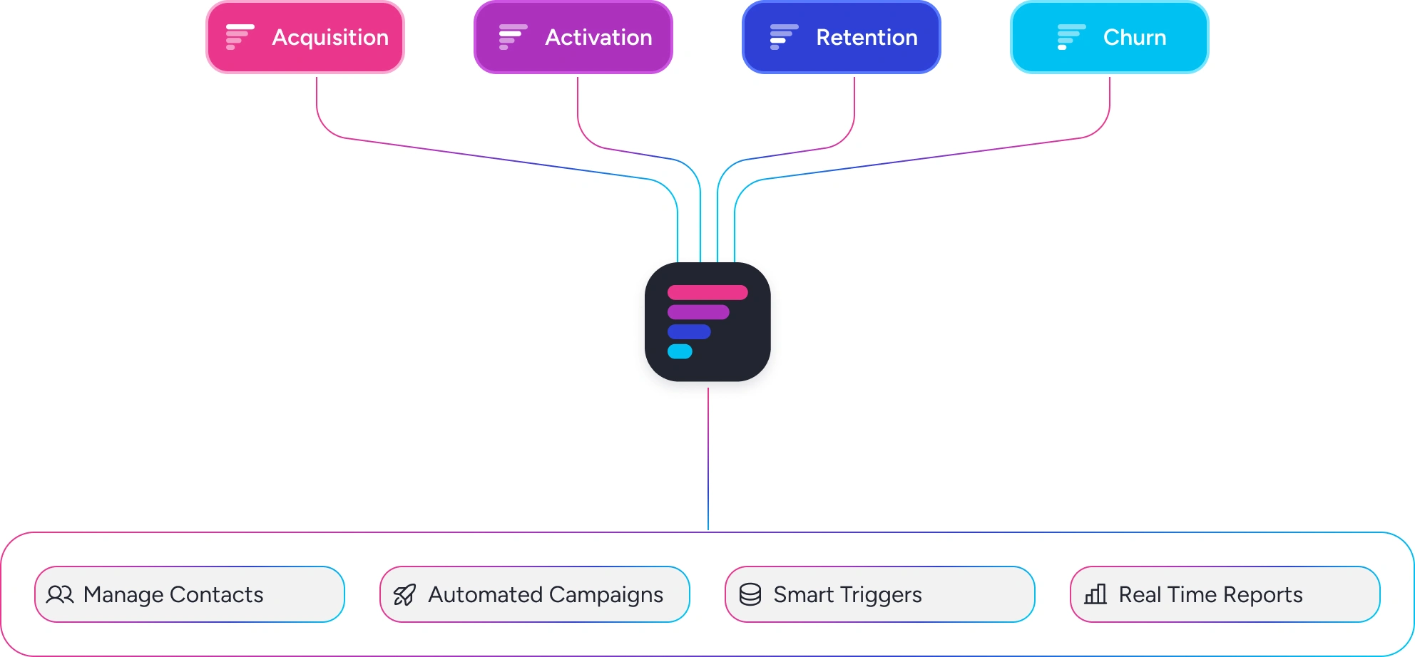
The design system included a total of 1,057 tokens and more than 50 components, each built with its own set of properties and variants. Most components were designed across every brand color, enabling a consistent interface for each stage of the funnel. Built on the Atomic Design methodology, the system played a key role in making UI creation faster, more consistent, and fully scalable as the product grew.


Platform design
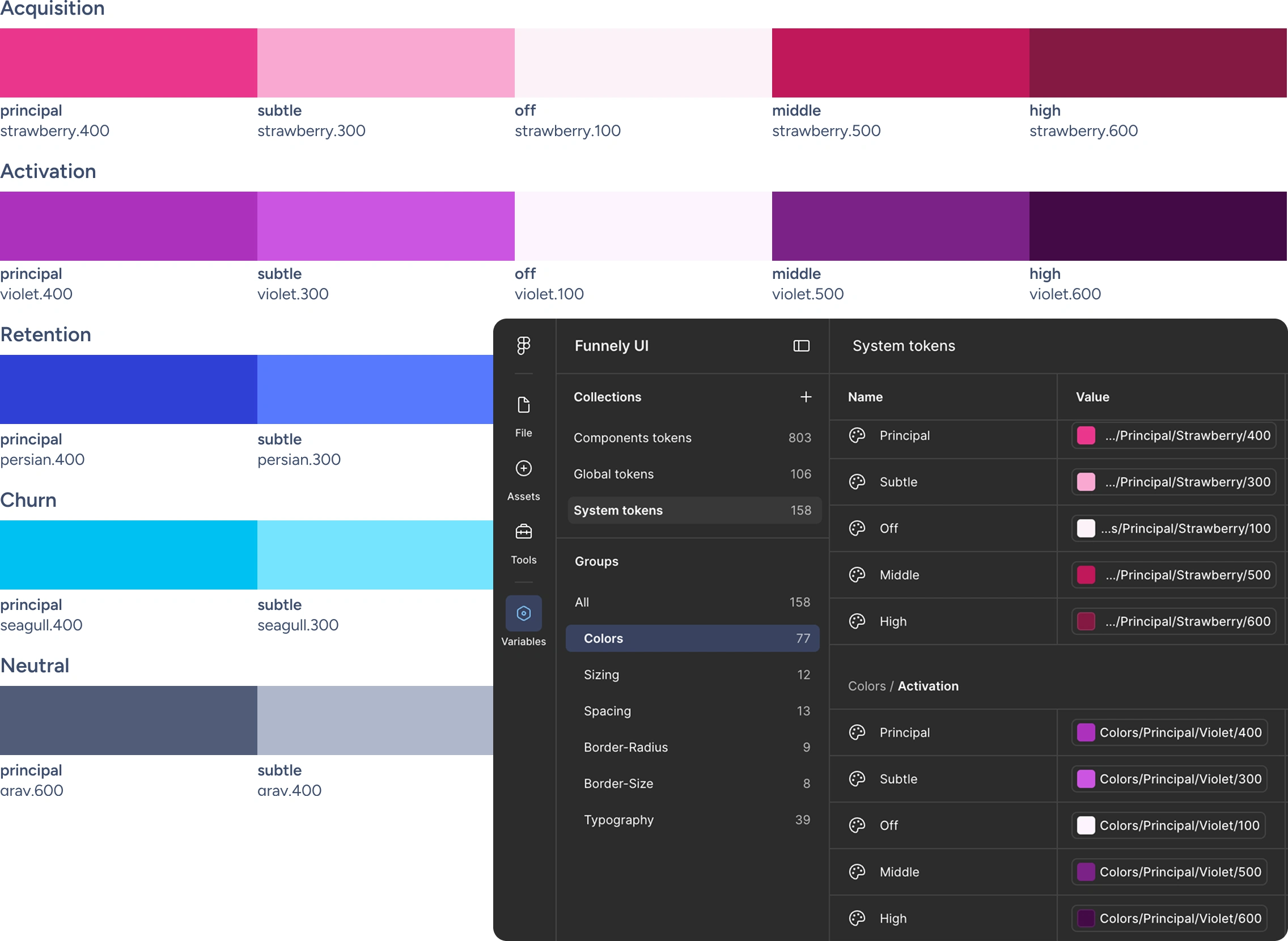
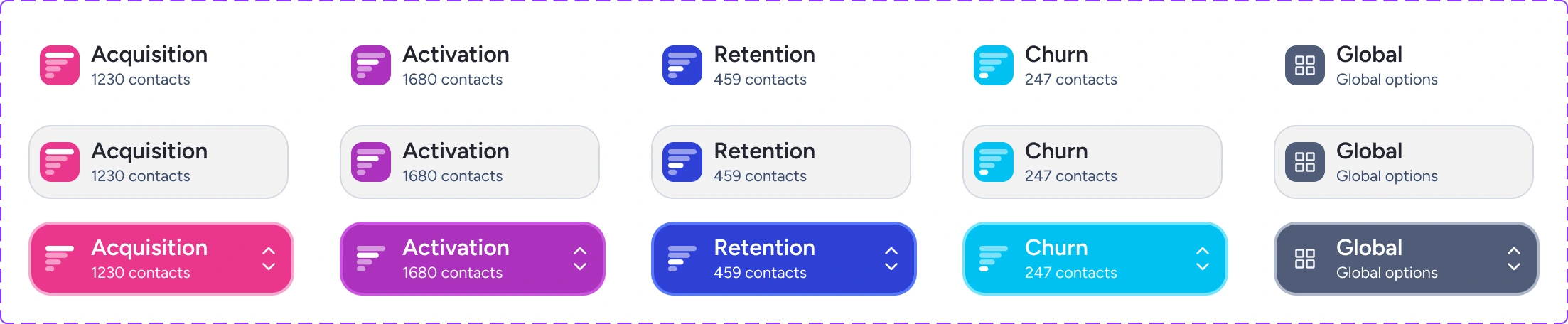
In total, the project included close to 100 screens spanning the acquisition, activation, retention, and churn sections. Each section was assigned its own color, drawn directly from the brand's identity system. This wasn't just a visual choice, it served a dual purpose: first, to give users an intuitive, at-a-glance understanding of exactly where they were in the platform and what actions they were taking; and second, to reinforce brand recognition at every touchpoint.
Like this project
Posted Jul 21, 2026
UX/UI design and design system for Funnely, a customer lifecycle platform that helps companies to find, convert, retain and reactivate customers.
Likes
0
Views
9