Cinder Bistro Logo & Packaging Design
Cinder Bistro is a Brand Identity creation project that I did for practice to hone my skills. The fictional brief for this client listed Cinder Bistro as a fun and energetic snack food brand that specializes in Vegan friendly snacks. They wanted to convey a sense of delight and appeal to people on a budget.
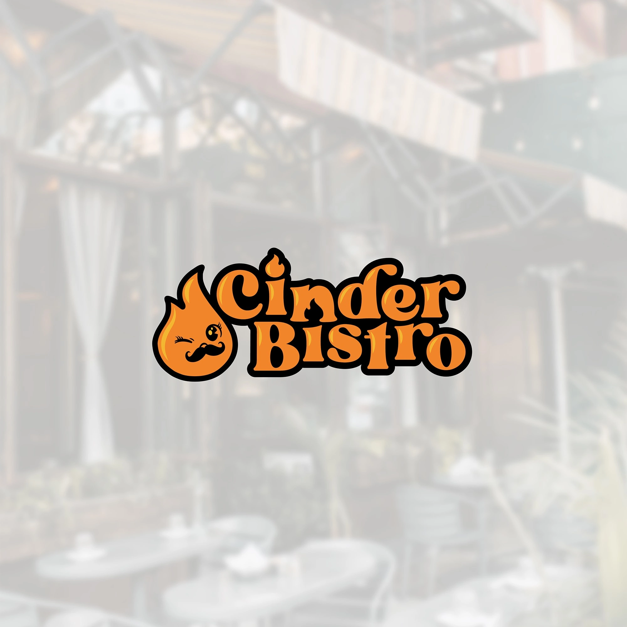
Primary logotype
For this project I did a lot of competitor analysis and found that a lot of snack food brands have a fun mascot. I focused my attention on creating something that would be instantly recognizable and playful and came up with a friendly flame with a mustache. From there I wanted to create a playful wordmark that would fit nicely with the mascot. I settled on the typeface blanch sage and customized the type by altering some of the glyphs, moving the letters around for a more playful layout and adding the flame accents atop the "i"s.
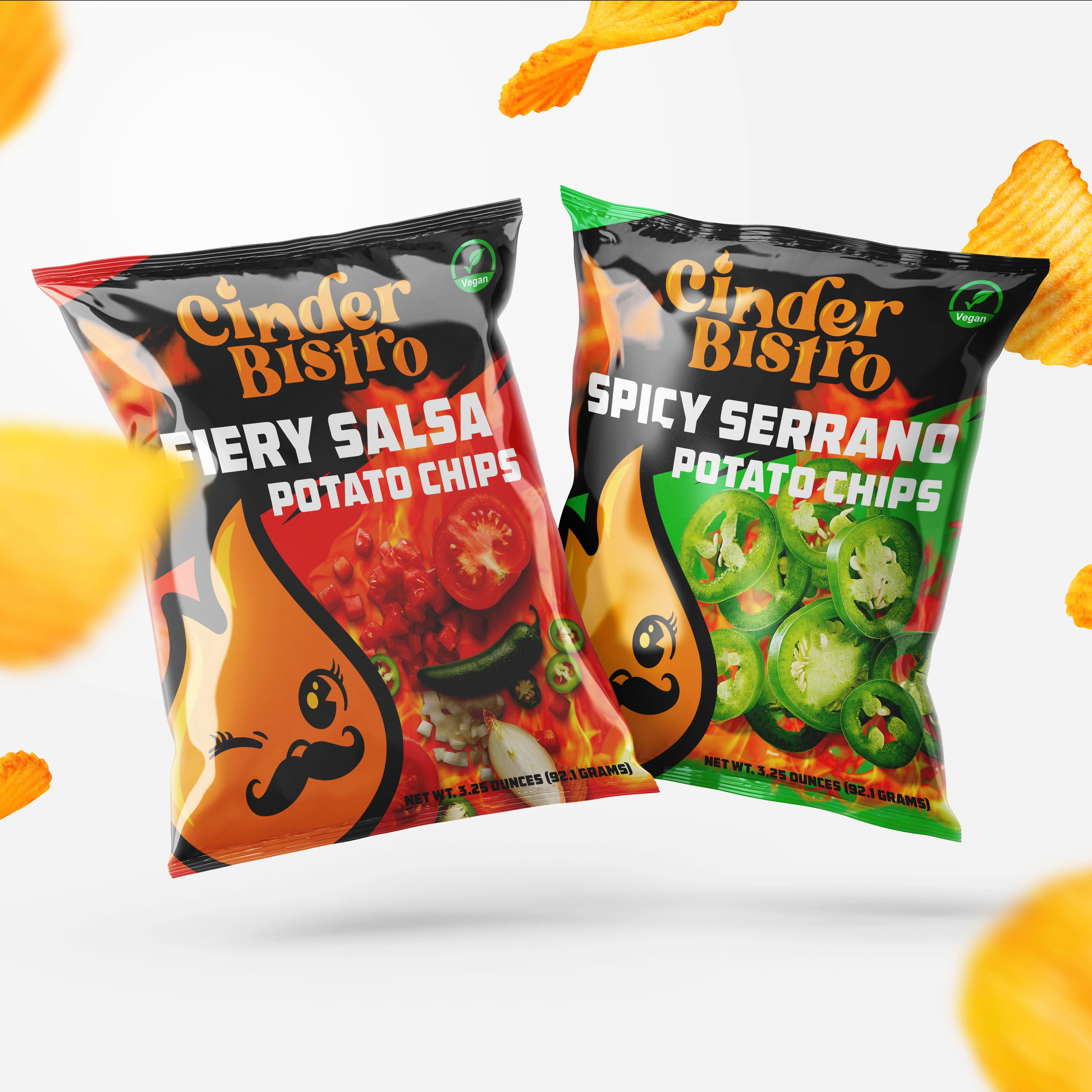
Chip Packaging Design for Cinder Bistro
Like this project
Posted Jun 12, 2023
Cinder Bistro is personal logo and packaging project for a company that makes vegan friendly spicy snack foods.

