Built with Framer
Continuing my exploration of the

Bright Ajiboye


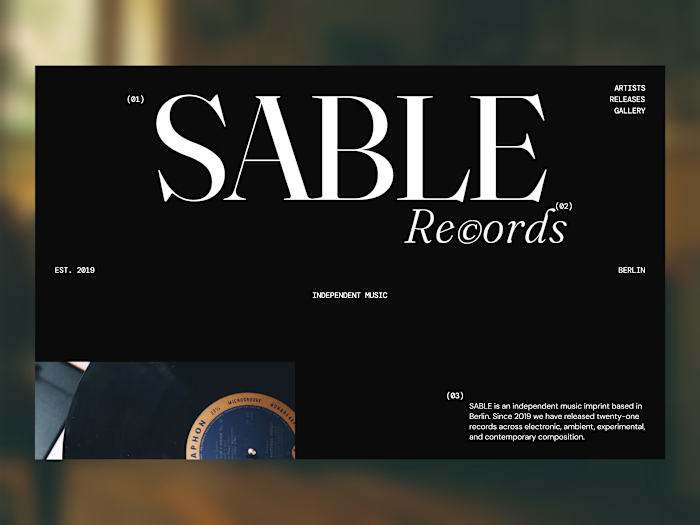
Continuing my exploration of the Sable Records website concept.
This is the Catalogue section, designed to showcase the label's latest releases through a more editorial and immersive approach.
Instead of relying on a standard card grid, I explored a composition built around oversized typography, strong imagery, asymmetry and intentional negative space.
The idea is to make each release feel like more than just an item in a catalogue.
A website can be functional without feeling generic—and for a music label with a strong identity, the browsing experience should be part of the world the label is creating.
Direction: Editorial / Experimental / Minimal
#Framer #WebDesign #CreativeDesign #EditorialDesign
Like this project
Posted Sep 7, 2026
Continuing my exploration of the Sable Records website concept. This is the Catalogue section, designed to showcase the label's latest releases through a mor...
Likes
0
Views
2