Built with Framer
SABLE RECORDS — Hero Section

Bright Ajiboye


SABLE RECORDS — Hero Section Exploration
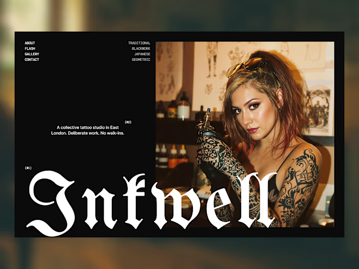
Exploring a bold, editorial direction for an independent music label.
The goal was simple: make the hero feel like a record sleeve translated into a digital experience.
Oversized typography.
Minimal navigation.
Strong contrast.
Generous whitespace.
A little bit of editorial attitude.
Nothing unnecessary.
Just a strong first impression that immediately establishes the character of the brand.
Currently exploring the full experience → artists, releases, and gallery.
If you’re looking for a designer/developer to bring this kind of visual direction to life, let’s work.
Like this project
Posted Aug 13, 2026
SABLE RECORDS — Hero Section Exploration Exploring a bold, editorial direction for an independent music label. The goal was simple: make the hero feel like a...
Likes
0
Views
6