
Smarter Finance. One Connected Experience.
Paynexa is a financial platform concept that brings everyday finances, spending insights, payments, and financial planning into one connected experience.
Our creative direction focused on transforming this vision into a modern, recognizable visual identity—combining clarity, confidence, and thoughtful digital design to make finance feel more accessible.
The Identity.
For Paynexa, the identity centers around a distinctive geometric mark inspired by the letter P, expressing progress, connection, and forward movement.
Built with simplicity and versatility in mind, the mark creates a recognizable foundation that works across both physical and digital environments.
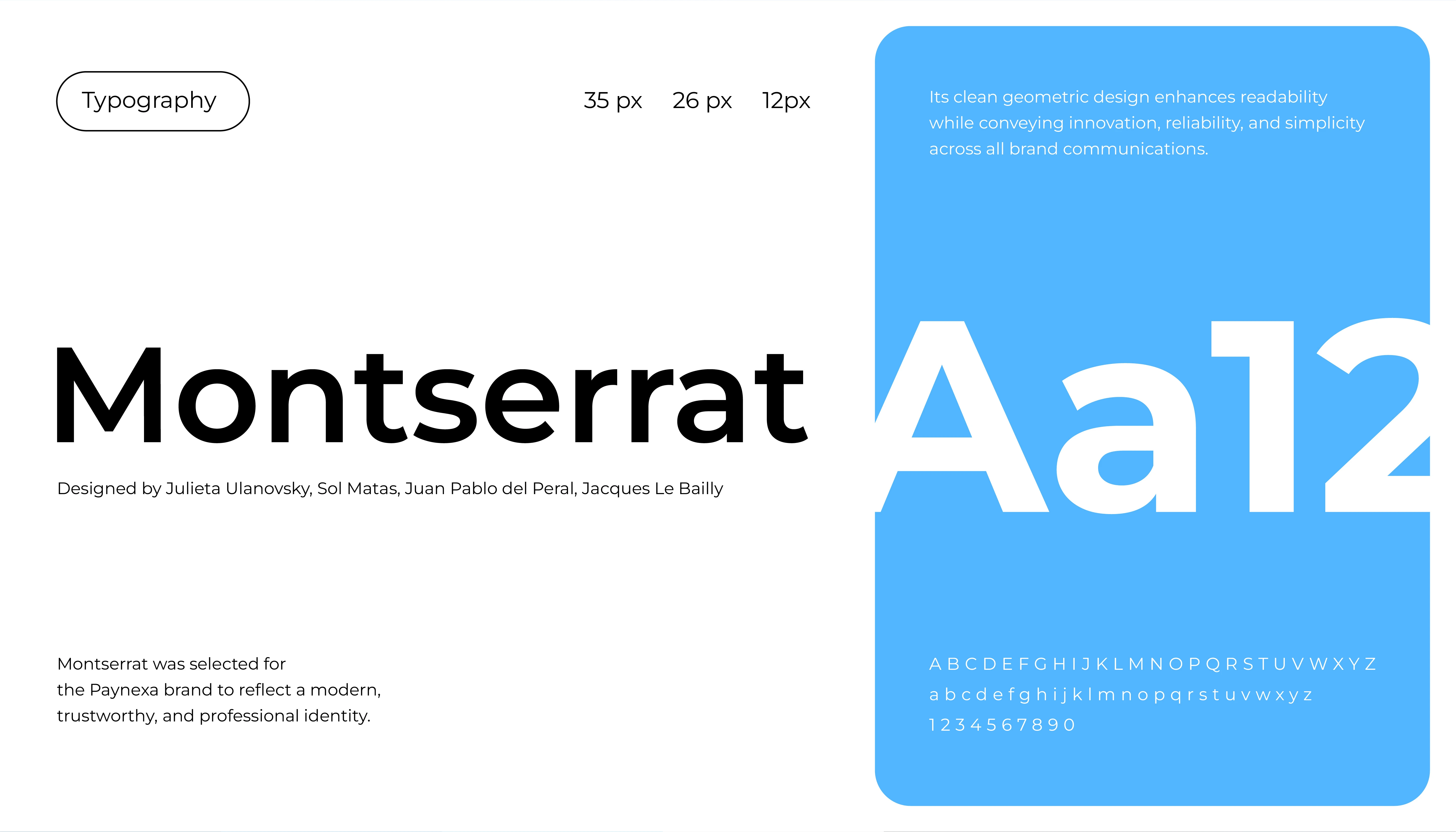
Confidence in Every Character.
We chose Montserrat for its clean geometric forms, contemporary personality, and strong readability. From bold statements to smaller interface details, its versatility creates a consistent visual rhythm across every touchpoint.
A Palette Built on Trust.
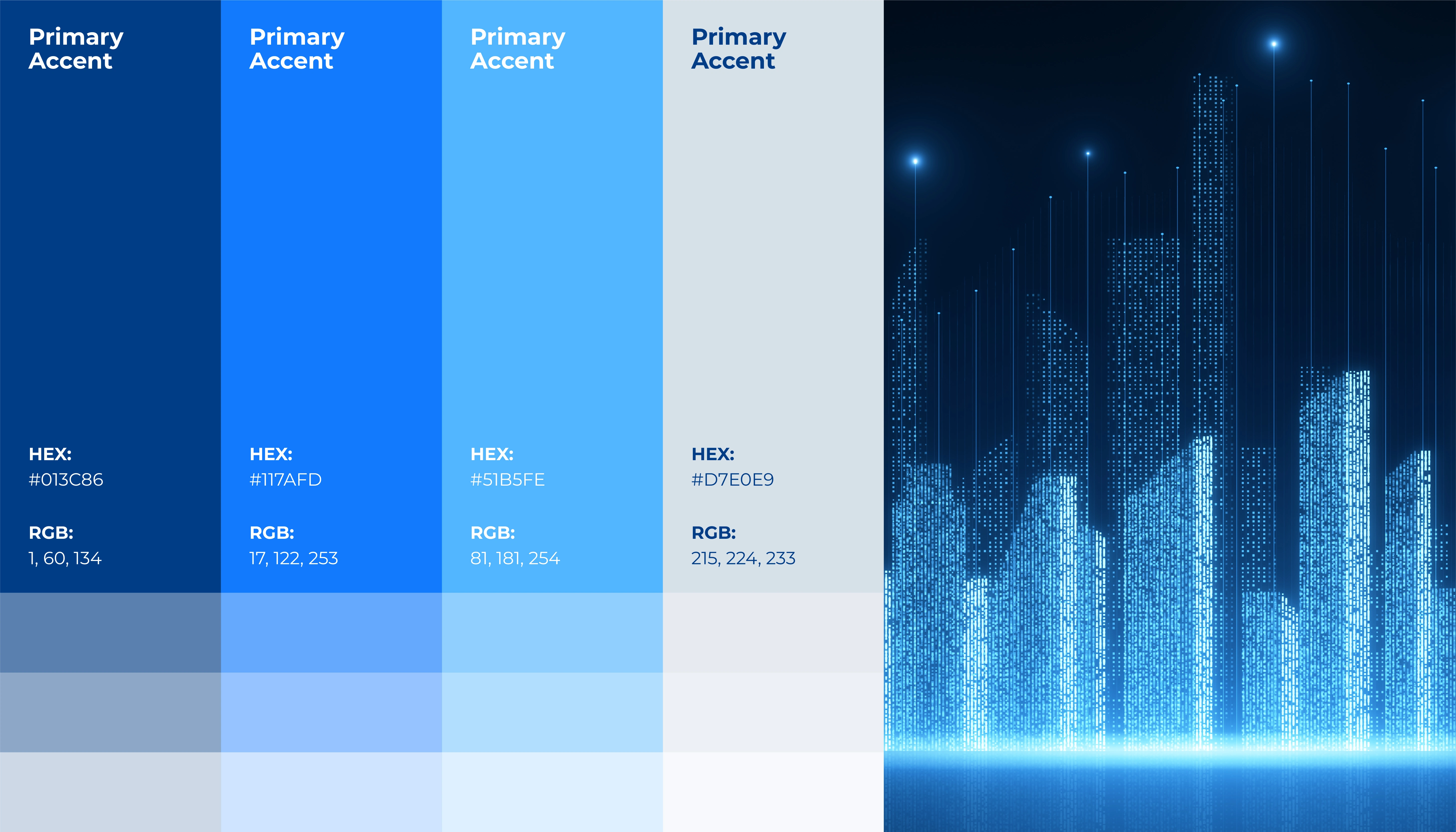
Color shapes how people feel about a brand, especially when it comes to finance.
For Paynexa, we explored a spectrum of blues that balances stability with innovation. Deep navy establishes confidence, brighter accents introduce energy, and softer tones create openness and clarity. Together, they form a visual language that feels secure, modern, and distinctly digital.
An Identity Made to Move.
We explored how Paynexa's visual identity translates into digital applications, bringing its geometric mark, vibrant blue accents, and clean design language into a cohesive visual experience.
Designed to feel consistent, adaptable, and ready for the digital world.
Turning Complexity Into Clarity.
Financial services can be complex. The experience of discovering them shouldn't be.
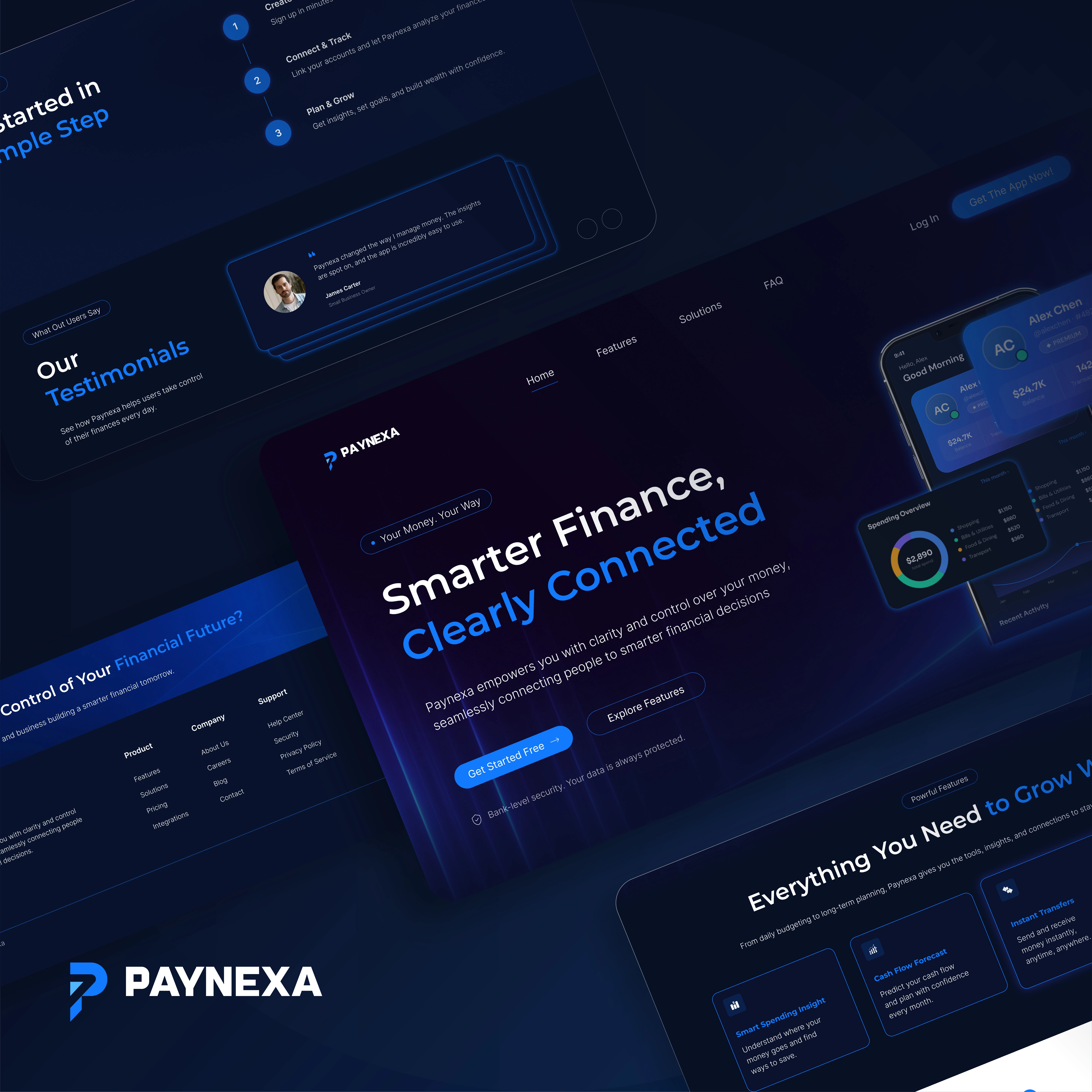
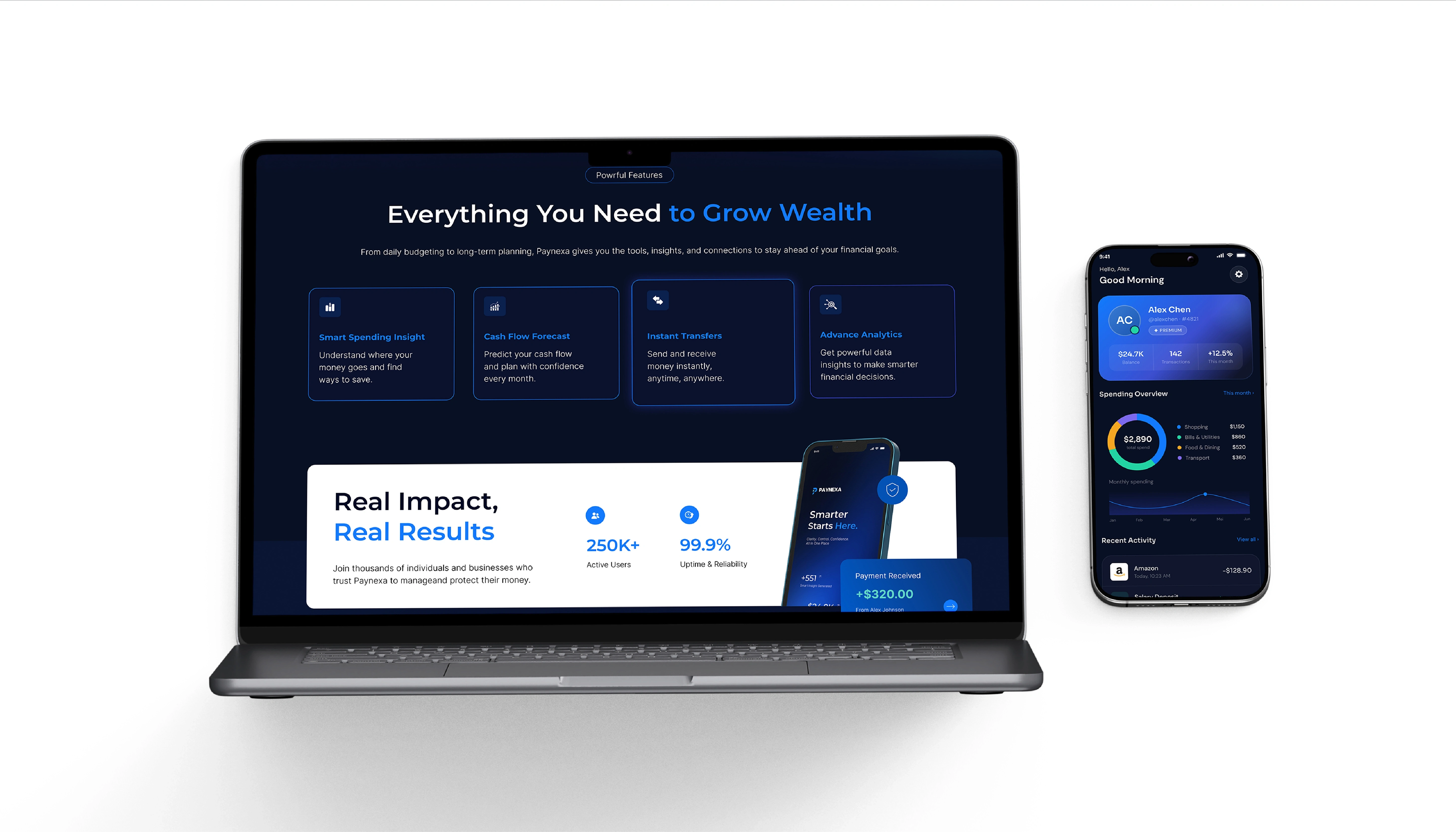
We approached Paynexa's website with a focus on intuitive navigation, clear messaging, and purposeful visual hierarchy.
Every Detail. A Better Experience.
A thoughtful interface isn't just about what users see. It's about how effortlessly they can understand what's in front of them.
Every element has a purpose. Every interaction starts with clarity.
One Seamless Digital Journey.
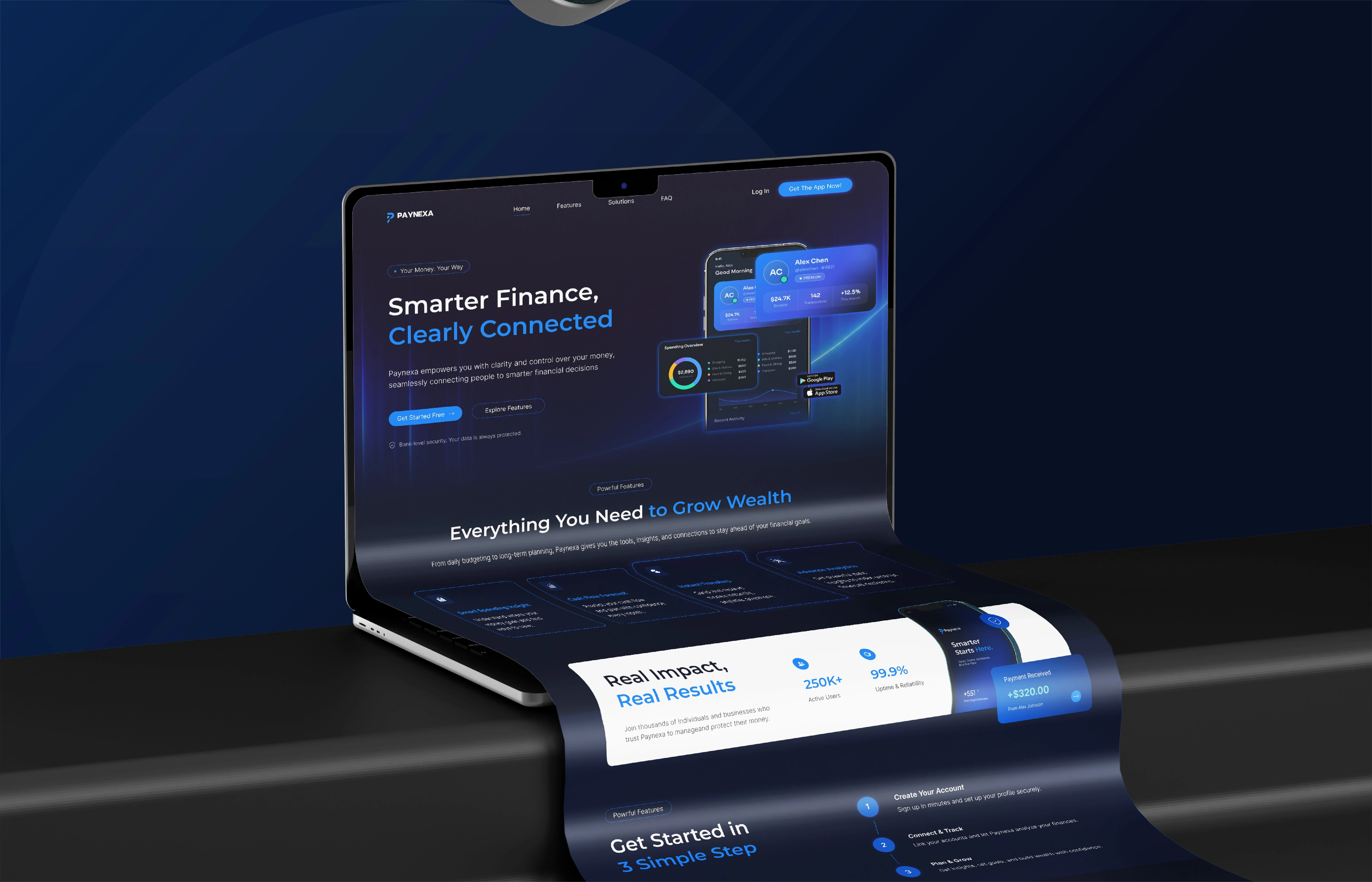
A great website connects every piece of information into one meaningful experience.
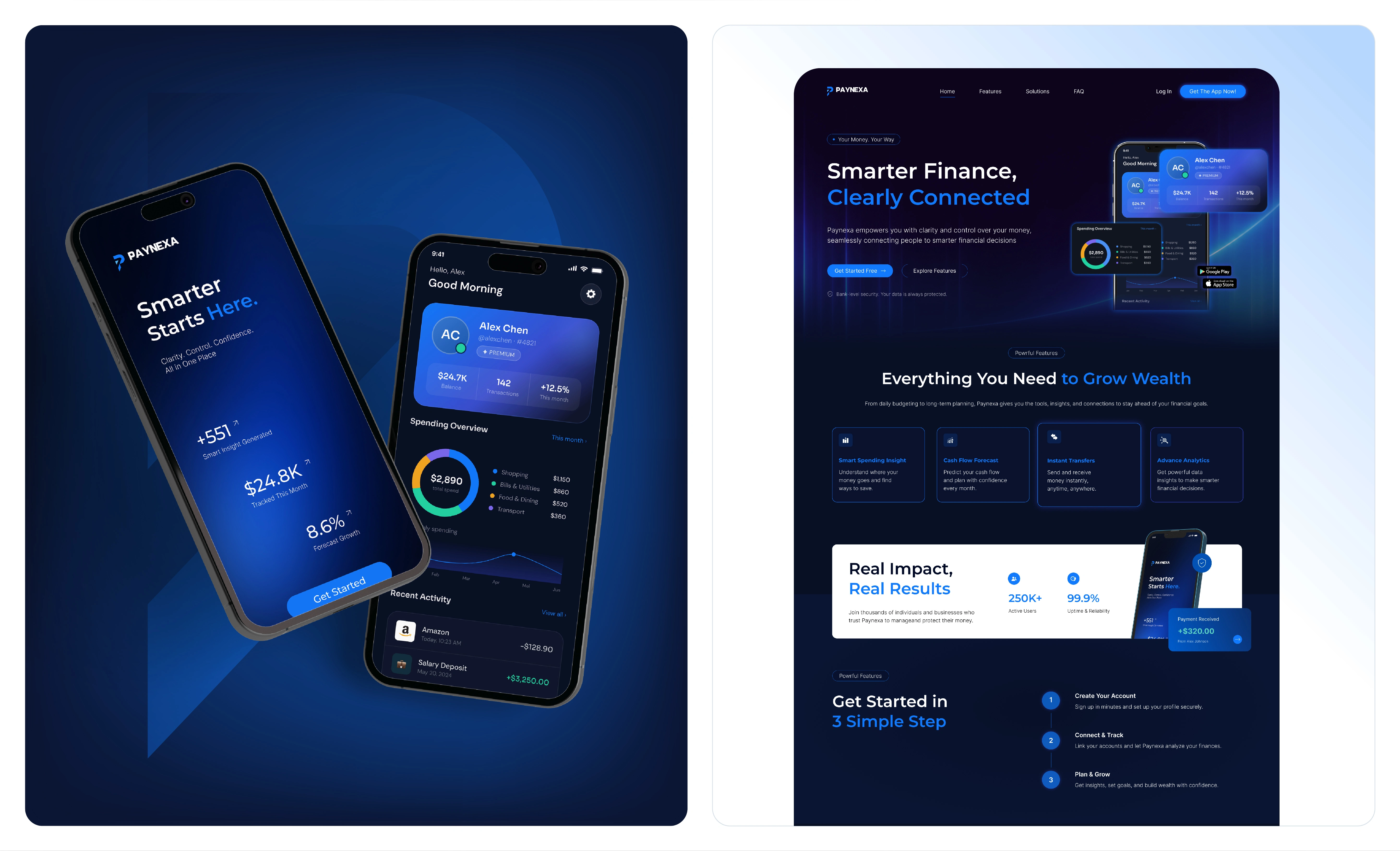
For Paynexa, we designed a cohesive page structure that moves naturally from introducing the platform to explaining its features, building understanding, and guiding the next step. Create a digital journey that feels intuitive from beginning to end.
Making Every Scroll Count.
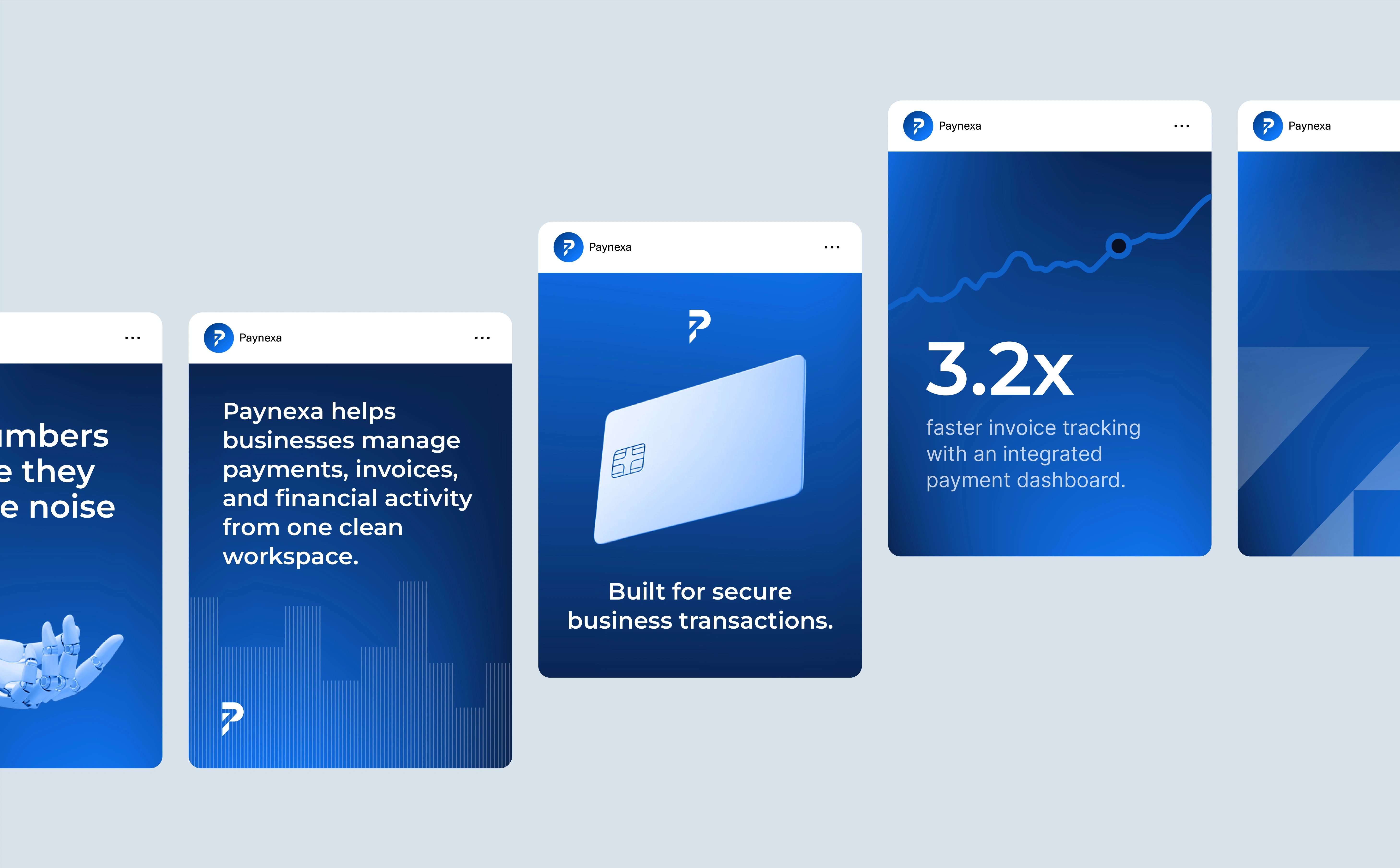
We explored a social media direction that transforms Paynexa's key messages into bold, digestible visuals.
Beyond Digital. Into Everyday Life.
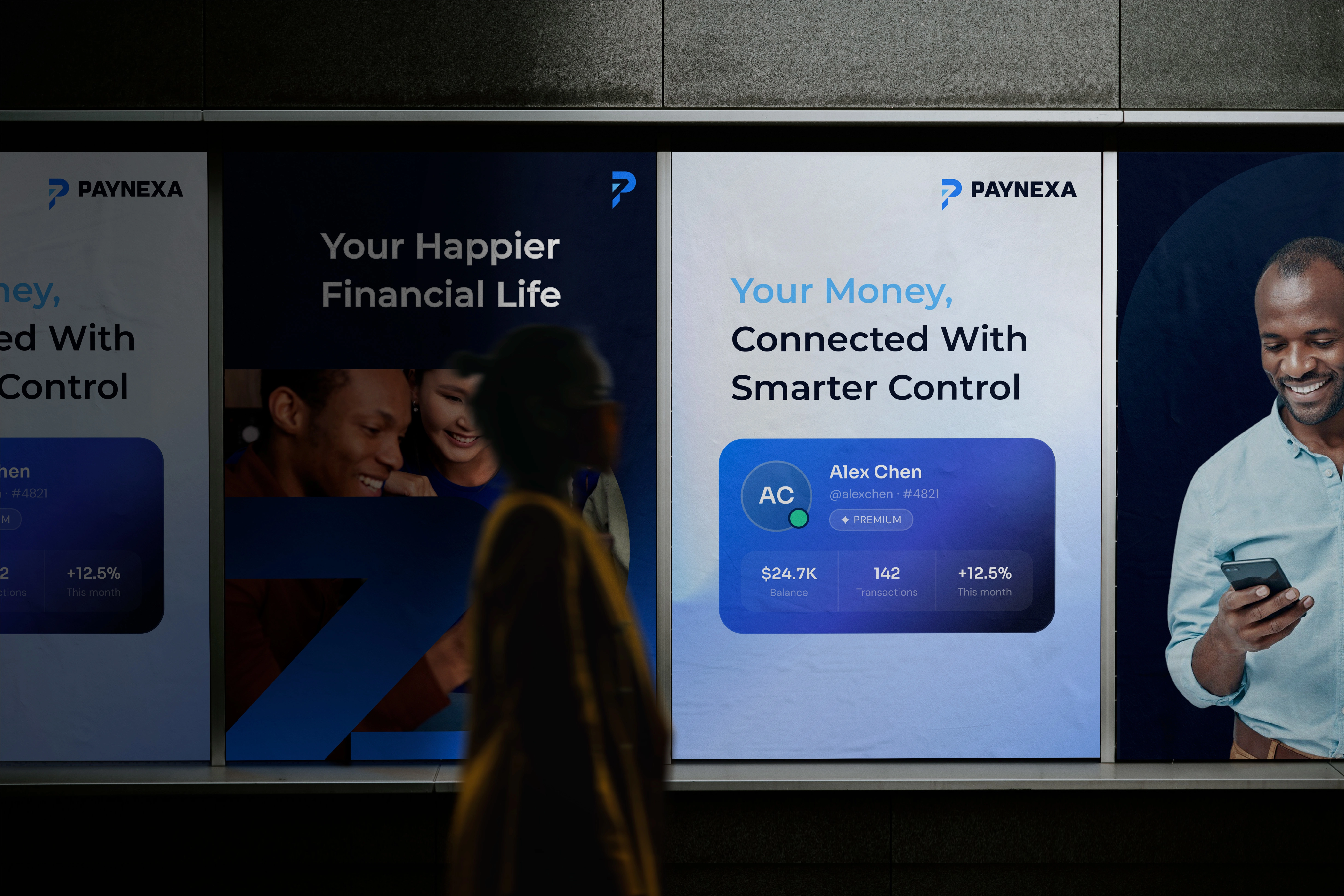
A recognizable brand shouldn't be limited to screens and interfaces.
We explored how Paynexa's identity could extend into larger advertising formats, combining confident messaging, human-centered imagery, and bold visual compositions.
Have an idea worth bringing to life? Let's create something remarkable together.
0 likes · 1 view · Nov 12, 2026
Paynexa is an all in one financial platform that empowers users to take a control of their money. Track spending, manage daily finances, set saving goals, and g


