Vespara | Brand Presentation
Bodhana Sundaresan
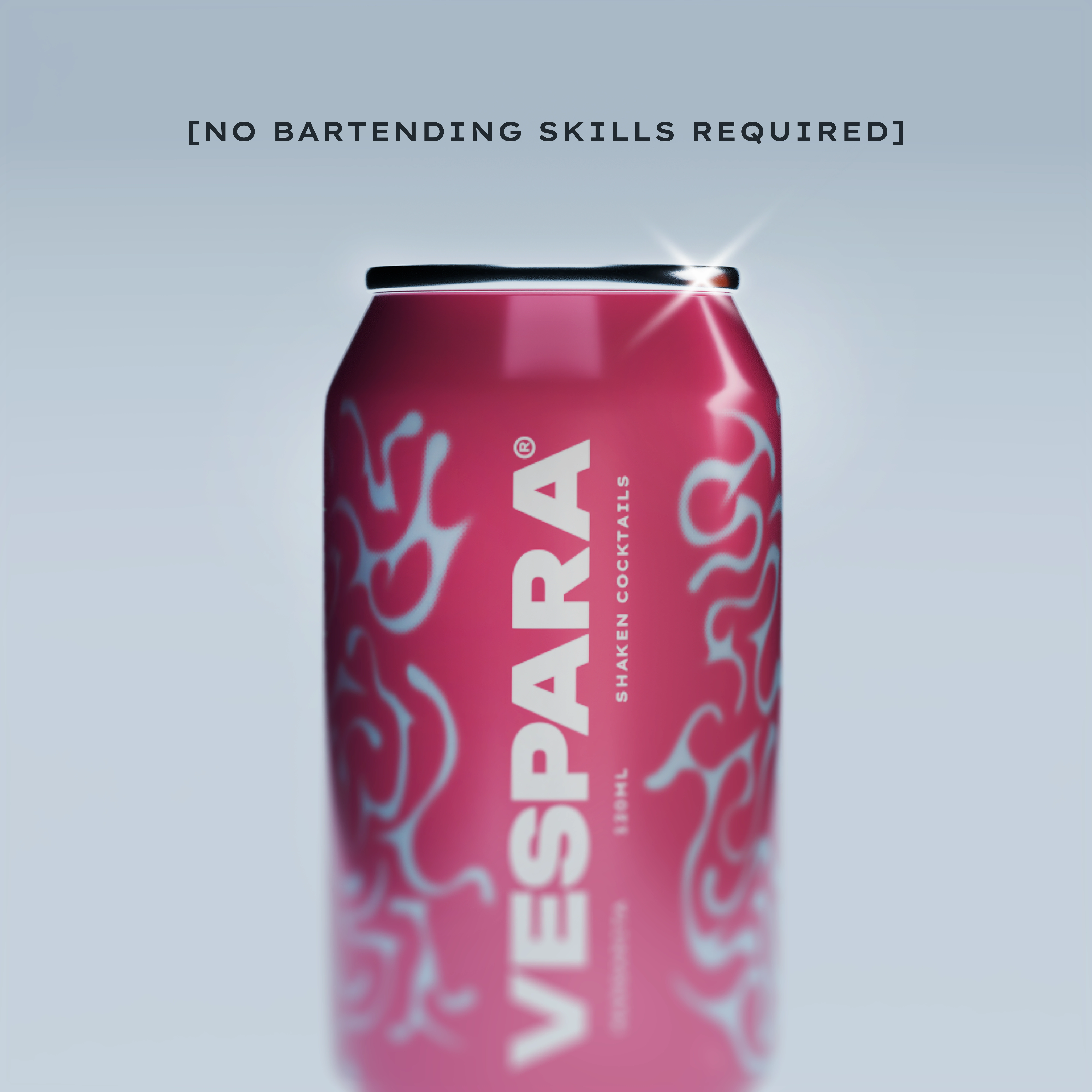
Shake, Pour, Sip
Introducing Vespara, a premium canned cocktail brand delivering bar-quality drinks with just a shake and pour. Perfectly crafted for any occasion, Vespara is designed for those who want convenience without compromising on taste.
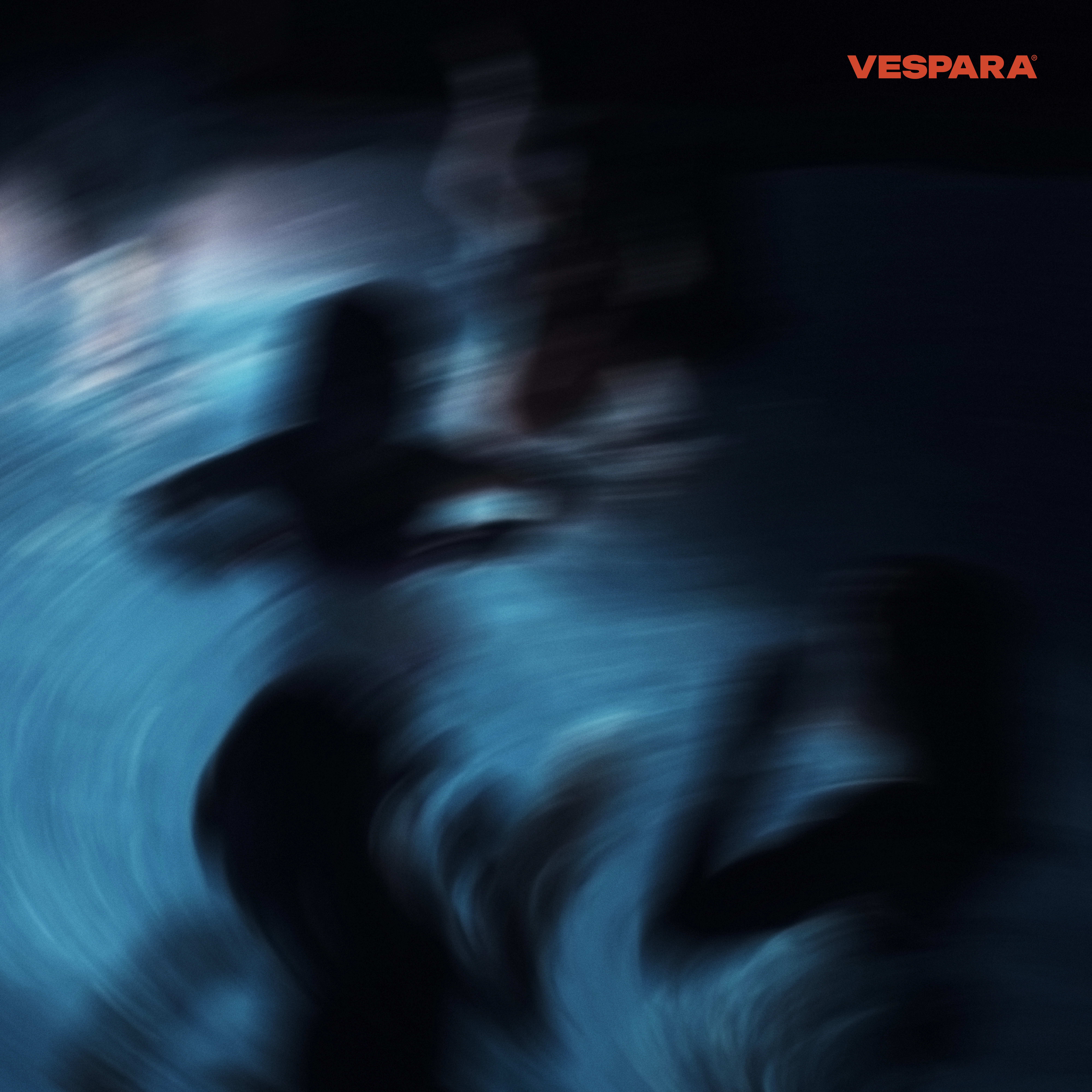
Animated poster for Vespara inspired by the movement of liquid
ABOUT VESPARA
Vespara is all about simplicity and eccentricity. Whether you're hosting a party or relaxing solo, Vespara makes it effortless to enjoy expertly mixed cocktails at home. Shake the can, pour into a glass, and experience premium flavors.
LOGO STRATEGY
The Vespara logo is a balance between modern elegance and bold simplicity. The wordmark embodies a sleek, minimalistic aesthetic, reflecting the brand's modernity and boldness. The fluid design, part of the brand's assets, accompanies identity symbolizing the swirl of ingredients as you shake the can
Colour Palette of Vespara
WHY THIS PALETTE?
The Vespara color palette is crafted to be playful and energetic, while still visually appealing and balanced. The deep black (#0E0E0F) and muted blue (#374551) add a sleek foundation, making the brighter colors stand out with more impact. Light grayish blue (#A3B5C8) and warm beige (#D3C5A3) provide a fresh, approachable feel that softens the bold tones. Vibrant red (#D1462F) and hot pink (#D13772) bring excitement and a lively personality, reflecting the brand’s fun, spirited vibe. Finally, dusty rose (#D39595) adds a touch of sophistication, making the overall palette dynamic and eye-catching while still enabling the creatives have a number of options to create colour pairings for the brand.
Product animations made keeping in mind the identity and guidelines
Product images made for promotional needs
IMAGERY & VISUAL STYLE
The visuals focus on bold, clean, and dynamic compositions that emphasize the movement of shaking, pouring, and sipping, key actions that define the Vespara experience. The use of bright, saturated colors in the imagery brings out a sense of fun and vibrancy, appealing to a young, social audience who values convenience without compromising on quality.
Illustrations, if included, are kept minimalistic but lively, often showcasing abstract shapes or swirling patterns that mimic the movement of liquid, reinforcing the brand’s energy. Photography highlights moments of enjoyment, such as friends sharing drinks or the product in a lively setting, emphasizing Vespara’s role in creating memorable, easygoing experiences. Combined, these elements create a visual style that is fresh, engaging, and effortlessly cool, making Vespara a go-to for consumers looking to elevate their casual moments with a touch of fun and flavor.
Design: DIOV Studios
More on Instagram: @diov.studios
Like this project
Posted Oct 10, 2024
Brand design and visuals for VESPARA, a premium canned cocktail brand delivering bar-quality drinks with just a shake and pour.