My Toca App
John Rodrigues
My Toca App - Soccer Training App
About the Product
My Toca app is one stop app designed to provide players with insights from their training. Players get to see their progress w.r.t session completion, celebrate the pathway progress overall player development, past session insights, and revisit their best moments at a TOCA Center.
About the Company
TOCA is a Global soccer-focused experience brand, that recently secured $25 million to accelerate expansion.
My Role
I led product design for a 6-month startup project—owning discovery, UX, and UI design. Worked with leadership and devs to deliver end-to-end experiences and introduced UX practices through workshops and collaboration.
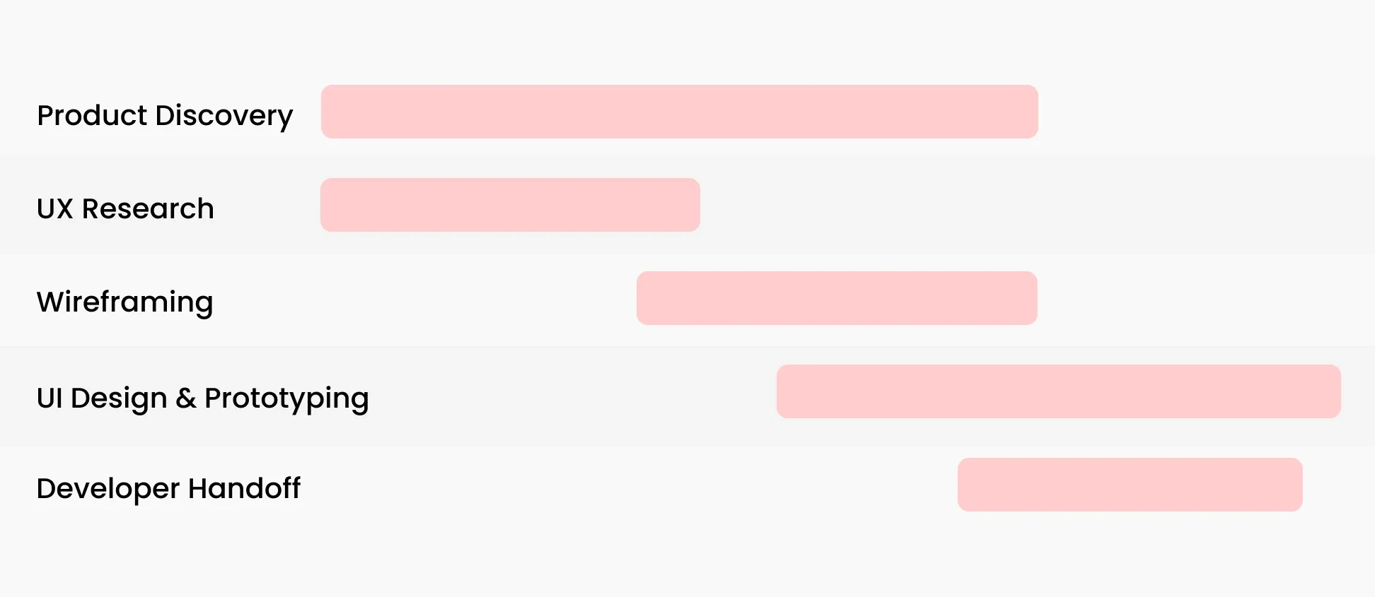
Project and Sprint Planning
The executives had done their research and concluded they wanted to create an app to improve the customer and trainer experience.So we started with creating a sprint plan shown below to execute the vision.
Product Discovery
To understand the product from the business perspective, we hosted 2 hours long brainstorming sessions.
We asked questions such as.
What are the business goals?
What’s the competitive advantage of this product?
Who is the primary and secondary user?
Who are the stakeholders who would use this app?
💡 key Findings
Business Goals: Retain and create an engaging experience for the customers
Competitive advantage: Gamified and personalized training.
Users: Parents and Kids ( trainee )
Other stakeholders: Trainer
Scope
We identified the app has two directions, one is customer-facing and the second is trainer-facing. For the scope of this project, we focused on the customer-facing direction.
Hypothesis
Gamified mobile app to track progress and provide users the insights on their training will help players succeed in training and retain more customers for TOCA Football.
User Research
Contextual Enquiry
I made a visit to the nearest training center to observe the player experience, I also spoke to the program manager and captured valuable insights.
Due to the limited time and budget, we captured the user's insights from past customer research. We captured one quote from the parent Interview, which helped us to validate the need.
“I wish I have a training map for my child” - Insights from the parent.
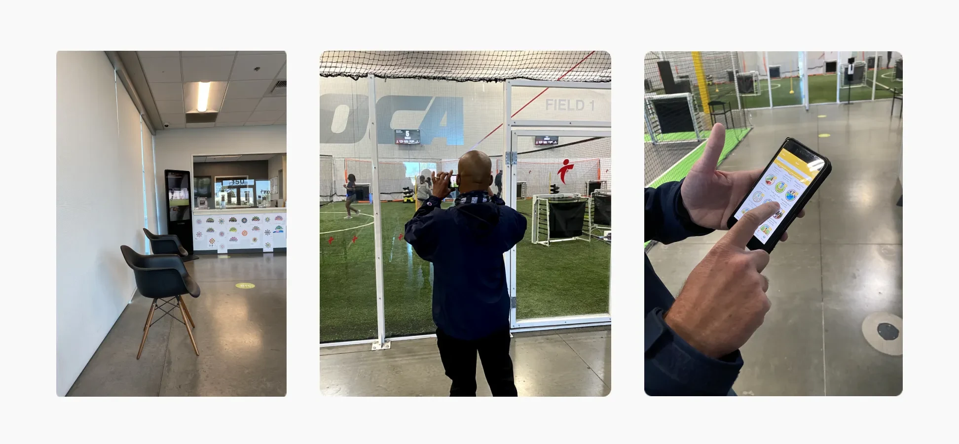
The training center already had ongoing training, which we had to understand to translate those operations into a digital experience. We spoke to various program managers and mapped out the program architecture.
We also identified the primary and secondary users.
Primary User: Player | Trainee.
Second user: Parent
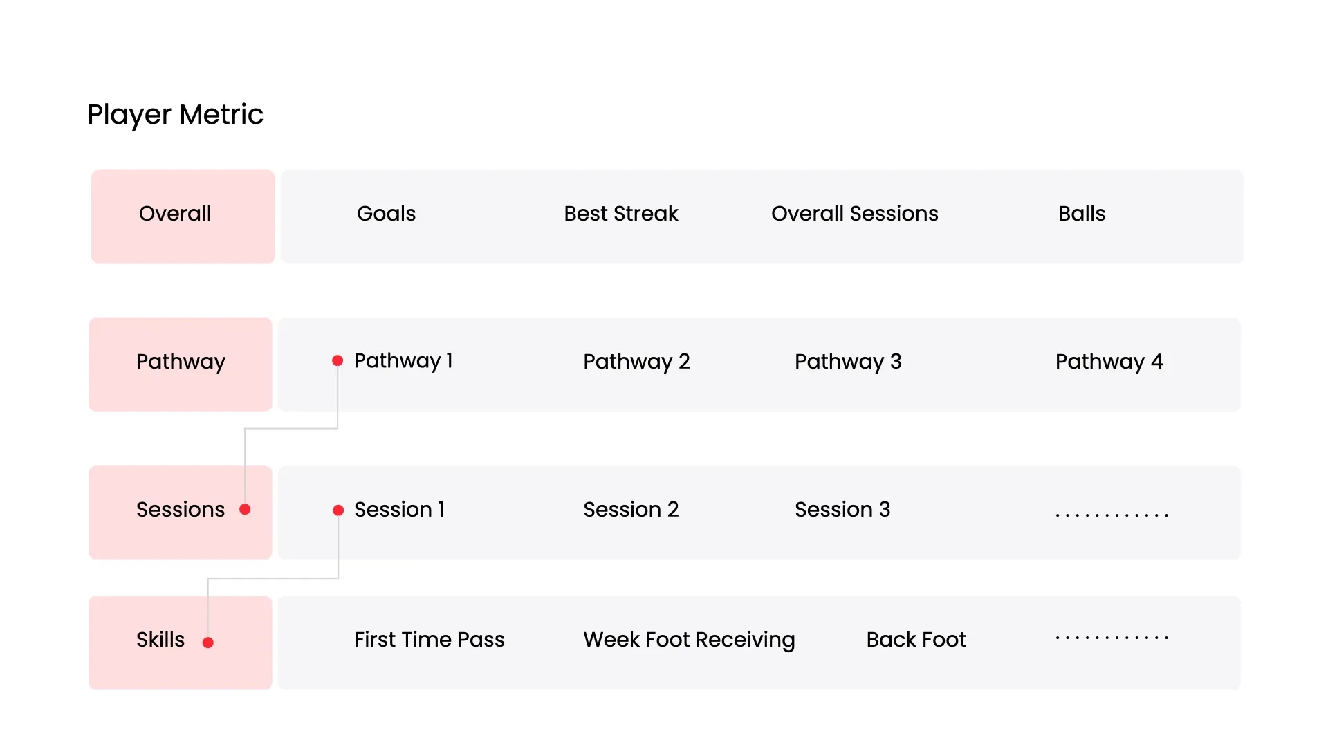
Training Program Discovery
The training programs had a pathway, sessions, and skill sessions. The following image shows how they are related.
Based on this discovery we created wireframes and user flows to capture stakeholder feedback.
Aligning The Stakeholder Directions
Since this product had multiple stakeholders, creating wireframes helped us capture feedback at the early stage and helped us to create alignment between multiple product partners.
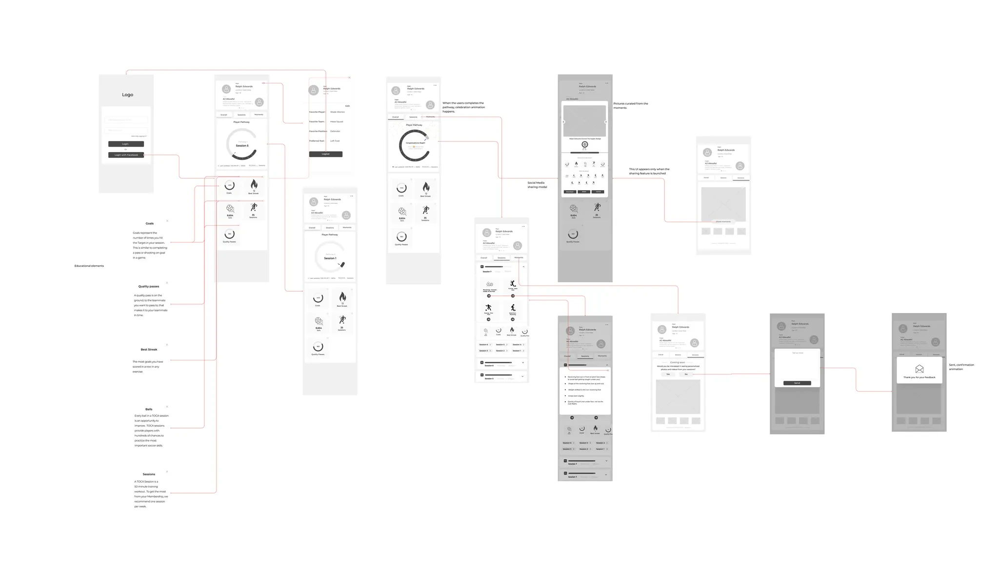
After going through 4+ product iterations we designed the following prototypes.
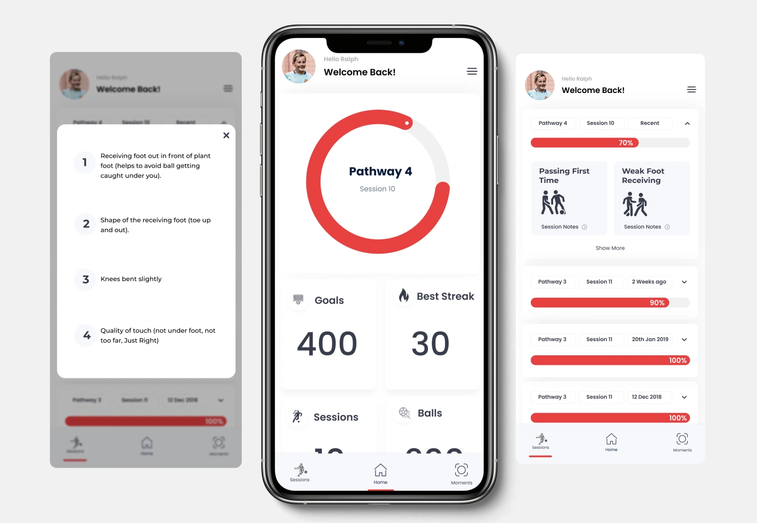
Product Prototype
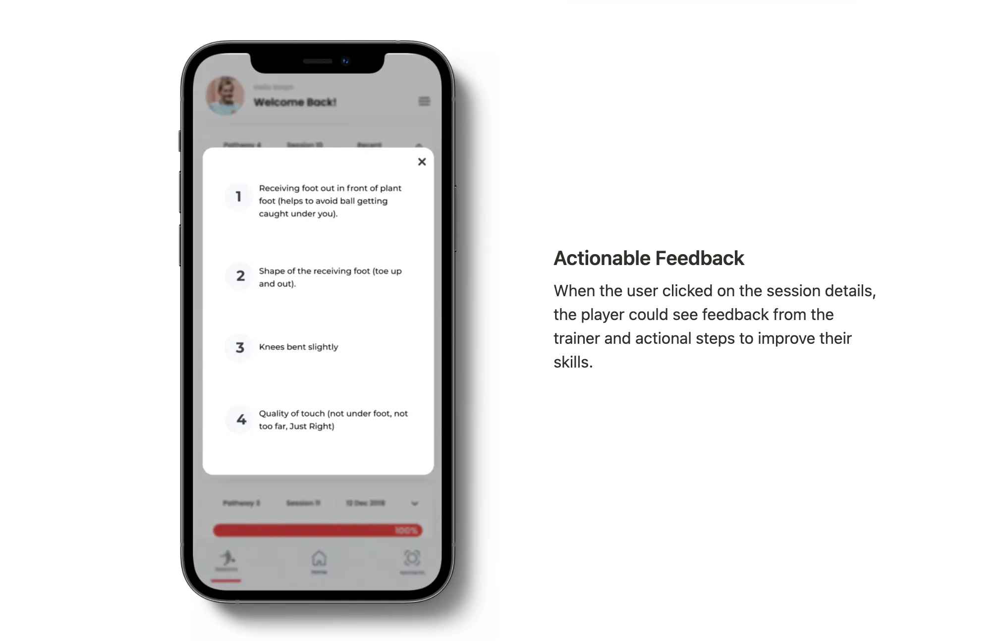
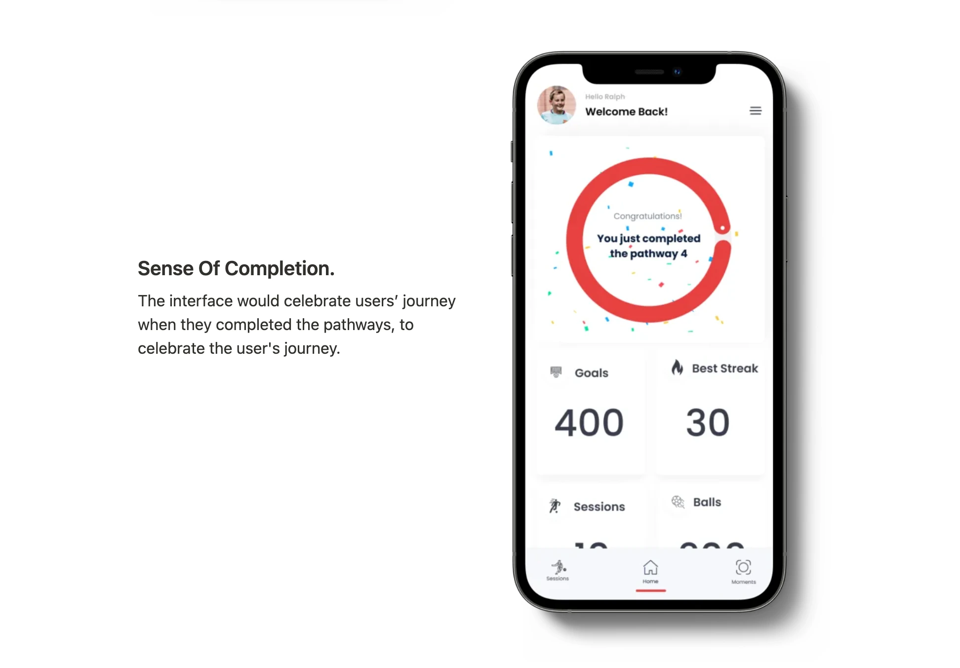
The product prototype showed users the pathway and sessions they are on. It also showed users the key training metrics like Goals, best streak, balls, and session details.
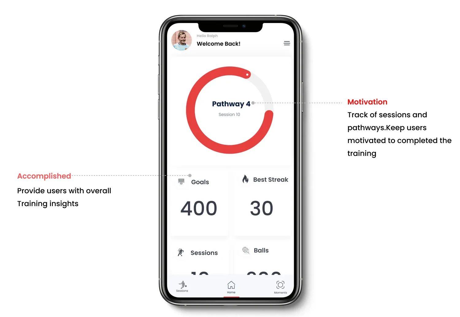
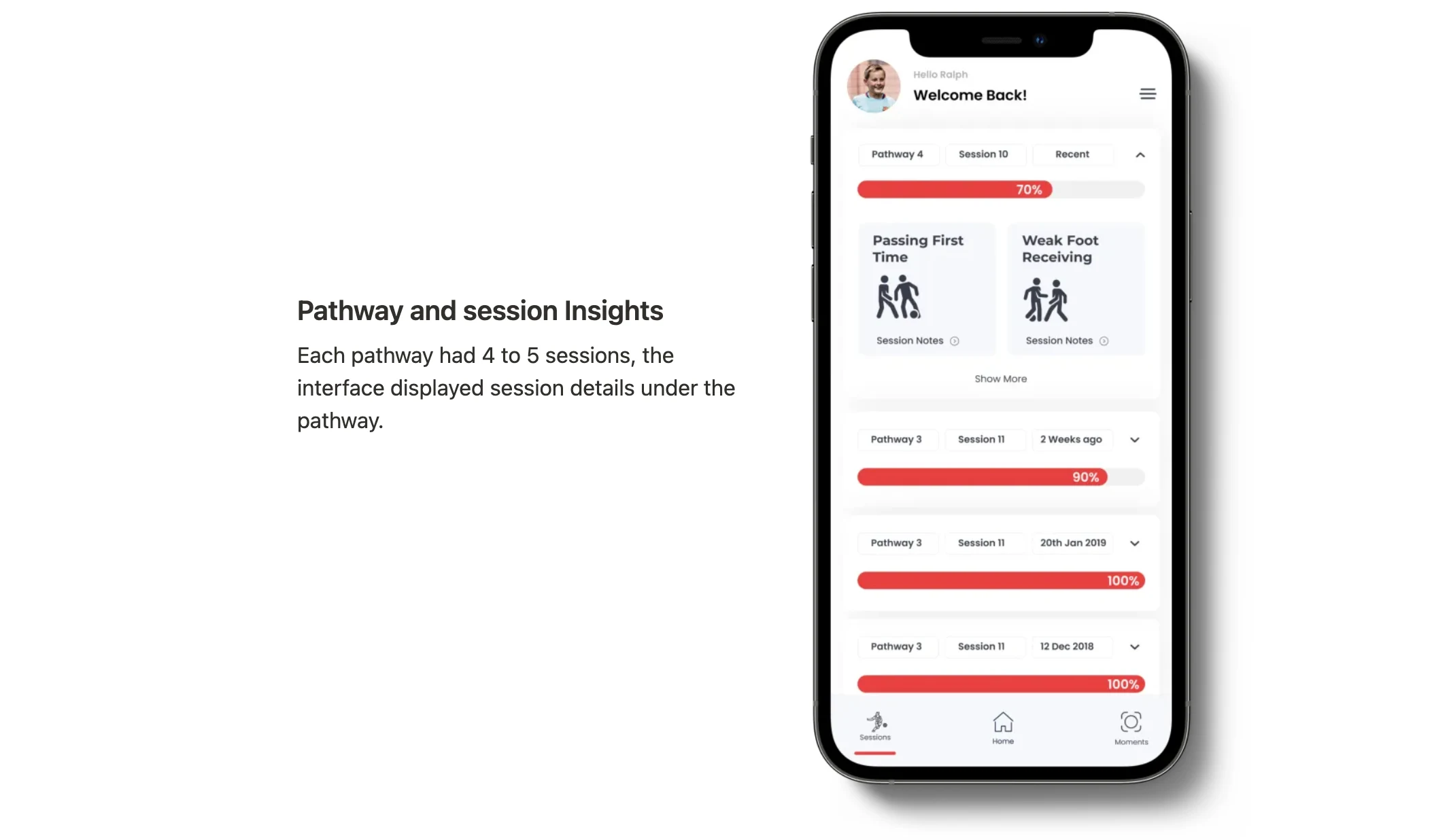
Pathway and session Insights
Each pathway had 4 to 5 sessions, the interface displayed session details under the pathway.
Product Features
Outcome
We designed an Interactive prototype to capture user feedback and communicate the product vision between the cross-disciplinary teams.
Thank You
Have a project in mind? Let’s connect.
Like this project
Posted May 15, 2025
The Toca app helps players track training progress, review past sessions, celebrate milestones, and revisit top moments—all in one place.
Likes
0
Views
8
Timeline
Aug 1, 2020 - Jan 1, 2021
Clients
TOCA