OrderMonkey Backoffice Revamp
Executive Summary
Imagine running your restaurant through an online ordering platform with a back-office that feels like navigating a maze blindfolded. That was the initial pain point for OrderMonkey merchants, leading to frustration, inefficiency, and ultimately, a dent in trust. This case study delves into the complete revamp of OrderMonkey’s backo-0ffice, focusing on user experience (UX) and visual appeal to foster trust and ensure smooth sailing for its merchants. Through a combination of open card sorting, design system development, and iterative usability testing, we transformed the back-office into a user-friendly haven, driving a 30% increase in user satisfaction.

The Challenge
Before the revamp, the OrderMonkey back-office resembled a cluttered kitchen after a rush hour. Navigation was difficult, functionalities were scattered, and the visual design lacked cohesion. This resulted in:
Lost Productivity: Merchants spent precious time searching for functionalities, hindering their operational efficiency.
Frustration and Confusion: The unclear interface led to user errors and a sense of disorientation, impacting their overall experience.
Weakened Trust: The lack of intuitiveness eroded trust in OrderMonkey’s ability to provide a seamless platform.
The Solution
OrderMonkey adopted a user-centered design approach, focusing on understanding user needs and iteratively improving the back office experience.
1. Unraveling the User Maze: Open Card Sorting
We started by conducting an open card sorting exercise with 12 merchants from diverse backgrounds. Each participant was presented with individual cards representing key functionalities and asked to group them based on their mental models. This provided valuable insights into:
User expectations: How merchants naturally categorize and think about backoffice tasks.
Information architecture: Identifying the most logical and intuitive structure for the navigation system.
Visualization: Imagine a card labeled “Today’s Orders” being consistently placed near another labeled “Order Tracking” by multiple participants. This indicated a strong user association, guiding us to group these functionalities under an “Orders & Management” cluster.
2. Building Trust Through Design:
With user needs mapped out, we focused on crafting a design that instilled trust and confidence:
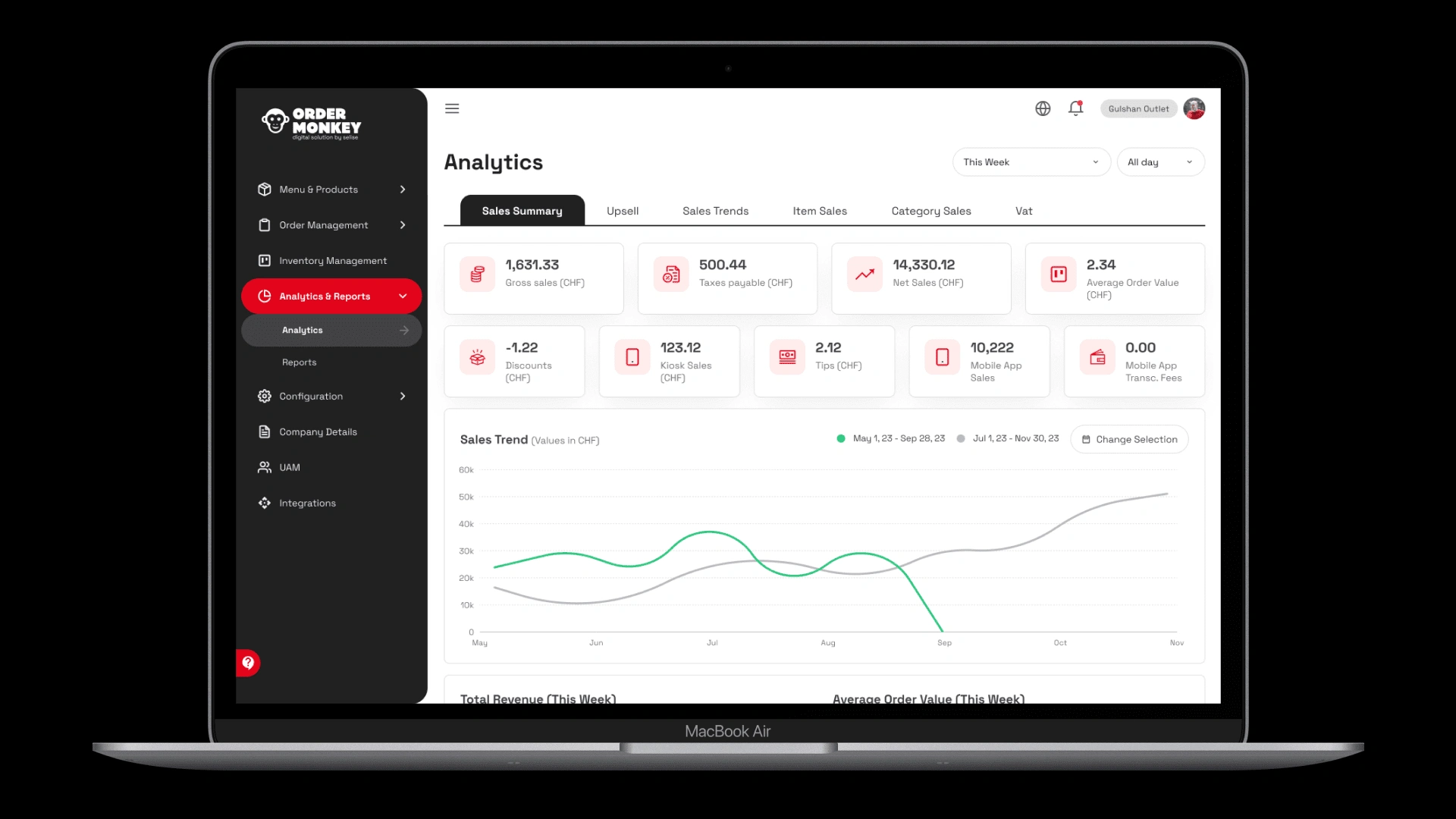
Modern UI Design System: We established a design system aligned with brand guidelines and contemporary design trends. This ensured visual consistency, professionalism, and a touch of modernity.
Intuitive Navigation: Based on the card sorting findings, we restructured the navigation menu with clear labels, logical groupings, and easy discoverability of features.
Visual Hierarchy: Information was prioritized and presented hierarchically, guiding users’ attention to the most important actions.
Visualization: Picture a navigation bar with prominent sections like “Orders & Management,” “Menu & Products,” and “Analytics & Reports.” Each section groups related functionalities, making it easy for users to find what they need.
3. Iterative Refinement: Usability Heuristics
We weren’t just building a pretty interface; we were ensuring it functioned flawlessly. Usability heuristics, a set of best practices for user-friendly design, were employed to identify and address potential usability issues:
Consistency: Consistent button styles, layout patterns, and terminology prevented confusion and learning curves.
Visibility of System Status: Users were kept informed about actions and loading states through clear feedback mechanisms.
Error Prevention: Error messages were clear, actionable, and guided users towards solutions.
Visualization: Imagine a user trying to edit an order but accidentally clicking the “Delete” button instead. Heuristics would suggest placing these buttons farther apart with clear labels and confirmation prompts to prevent such accidental actions.
4. Validating Success: Stakeholder Reviews and Usability Testing
We didn’t just assume our design hit the mark. We actively sought feedback:
Stakeholder Reviews: Merchants, product managers, and executives provided valuable insights and suggestions, ensuring the design aligned with business goals and user needs.
Usability Testing: Representative users interacted with the new backoffice, providing real-world feedback on intuitiveness, efficiency, and overall satisfaction.
The Results
The revamp was a resounding success:
30% Increase in User Satisfaction: Merchants reported feeling more confident and efficient using the new backoffice.
Enhanced Trust: The intuitive and user-friendly interface fostered trust in the platform’s reliability and professionalism.
Increased Feature Adoption: The clear navigation and discoverability of features encouraged merchants to explore and utilize the platform’s full potential.
Future Steps
The journey doesn’t end here. We’re committed to continuous improvement, and the plan is to:
Continuously monitor and refine: User feedback will remain our guiding light, informing further enhancements to the backoffice.
Embrace new features, seamlessly: As OrderMonkey evolves, we’ll ensure new functionalities integrate seamlessly into the existing design, maintaining the intuitive user experience.
Lessons Learned
This project served as a powerful reminder of the importance of user-centered design in building trust and fostering a positive user experience. Key takeaways include:
Prioritizing user needs is paramount: Understanding how users think and interact with the platform is essential for creating a truly successful design.
Collaboration is key: Working closely with stakeholders and the product team ensures the design aligns with business goals and user needs.
Iterative testing is invaluable: Continuously testing and refining the design based on user feedback is crucial for achieving optimal usability.
A Glimpse Into The Transformation
To truly appreciate the impact, imagine the “before” and “after” scenarios:
Before
A merchant frantically searches for the “Today’s Orders” section, buried amidst a sea of unrelated functionalities.
Confusion reigns as they try to decipher unclear labels and icons.
Frustration mounts as they click through multiple pages to complete a simple task.
After
The merchant effortlessly accesses “Today’s Orders” from a well-organized navigation menu with a single click.
Clear labels and an intuitive interface.
Like this project
Posted Mar 18, 2024
Building Trust and Navigation with User-Centred Design


