54 Mirrors Dynamic Pilates Studio Website Design

Viktoriia Savinkova


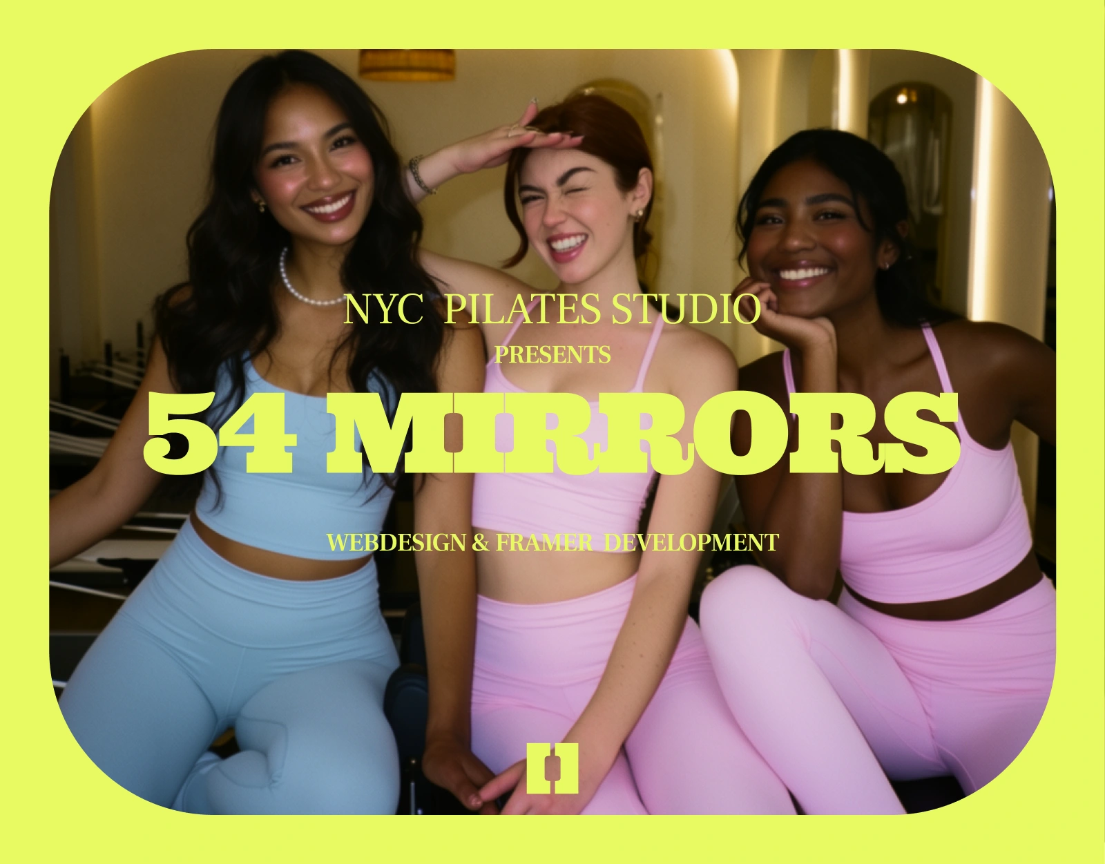
54 Mirrors: Eight reformers, low light, zero beige
01 · The studio
Look at any Pilates website. Go on. Beige. Thin serif. A woman stretching alone on a white floor. The word "wellness" three times before you've even scrolled. I got 54 Mirrors and I said no. Not this one. This one is a reformer studio on 8th Avenue with eight reformers, six instructors, fifty-minute classes and a room that sounds like a party, and the site had to hit you the same way the room does. Loud music, low light, eight people max. Your first class is $25, and that's it, that's the whole pitch. Come once. You'll be back, we both know it.
Moodboard
02 · How I built it
The brand came before a single frame. One line went on the wall and everything after it had to earn its place: girls want to have some fun. That's the studio. Not "restorative movement." Not "your wellness journey." Fun! Ultra for the headlines, heavy and a bit obnoxious, because a whisper font would've been a lie. DM Sans doing the quiet work underneath so the loud stuff stays loud.
Then the copy, which is where I spent the most time and where most studio sites give up. Three classes that actually sound like three different rooms: Foundations is your on-ramp, Reformer Flow is the one you take three times a week, Sculpt + Burn will absolutely wreck you and that's the point. Same energy in the bios. Six instructors, one shape, credential then personality: "Senior · calm voice, deep burn." You read that and you already know who you're booking, right?
Last decision, and it's the boring one that mattered most: classes and instructors run off the CMS, not off static frames. A studio adds a class on a Tuesday. It hires someone in March. If every change needs a designer, the site dies in four months. So I built the structure first and made the pretty part fit into it, instead of the other way around.
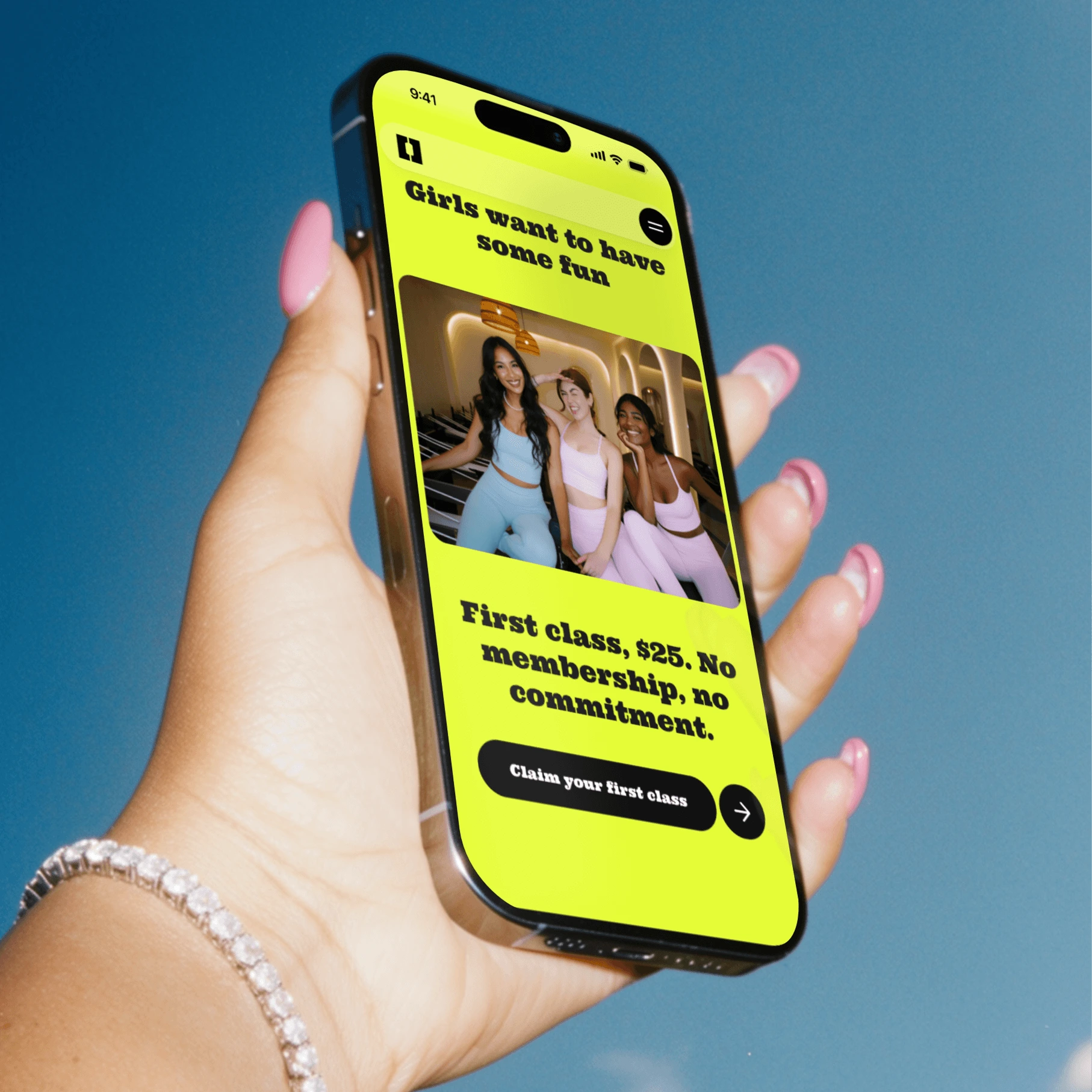
CTA on the Home Page
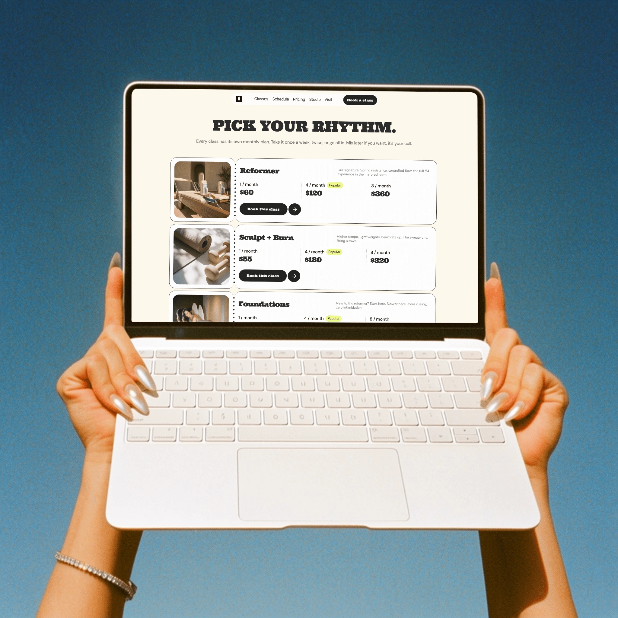
Pricing page
Home Page
Custom animation scroll
03 · What shipped
The full site, every page at desktop, tablet and phone. Classes and instructors live in the CMS so the studio can add a class without calling me. Pricing with booking wired in, legal pages, a custom 404 nobody will see and I still made it good, a documented style guide (18 colours, 9 text styles, all named like a human, no "Blue-2-final"), and a five-step handoff guide so the team can run the thing themselves.
And the pop-up classes got their own moment on the site, because a studio that throws a Pilates class on a rooftop and a tennis court deserves better than one line in the FAQ. That's the part I'm proudest of, honestly.
Tell me something though: when a studio or gym site actually makes you want to book, what did it? The photos, the price, or the way it talked to you? I keep going back and forth on this one 💬
Social Media Assets
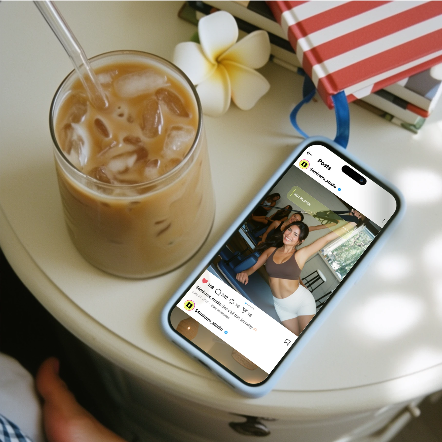
Like this project
Posted Sep 2, 2026
Designed a vibrant, dynamic website for 54 Mirrors reformer studio. Full build, CMS-driven, handoff guide included.