Ferenc Toth - Basic Brand Identity
Fanni Kazsoki
It is always a great honor to create visuals for other designers.
Ferenc Toth is a seasoned Web- and Graphic Designer with 20 years of experience. His design style and personal approach is similar; dynamic, fresh yet reliable.
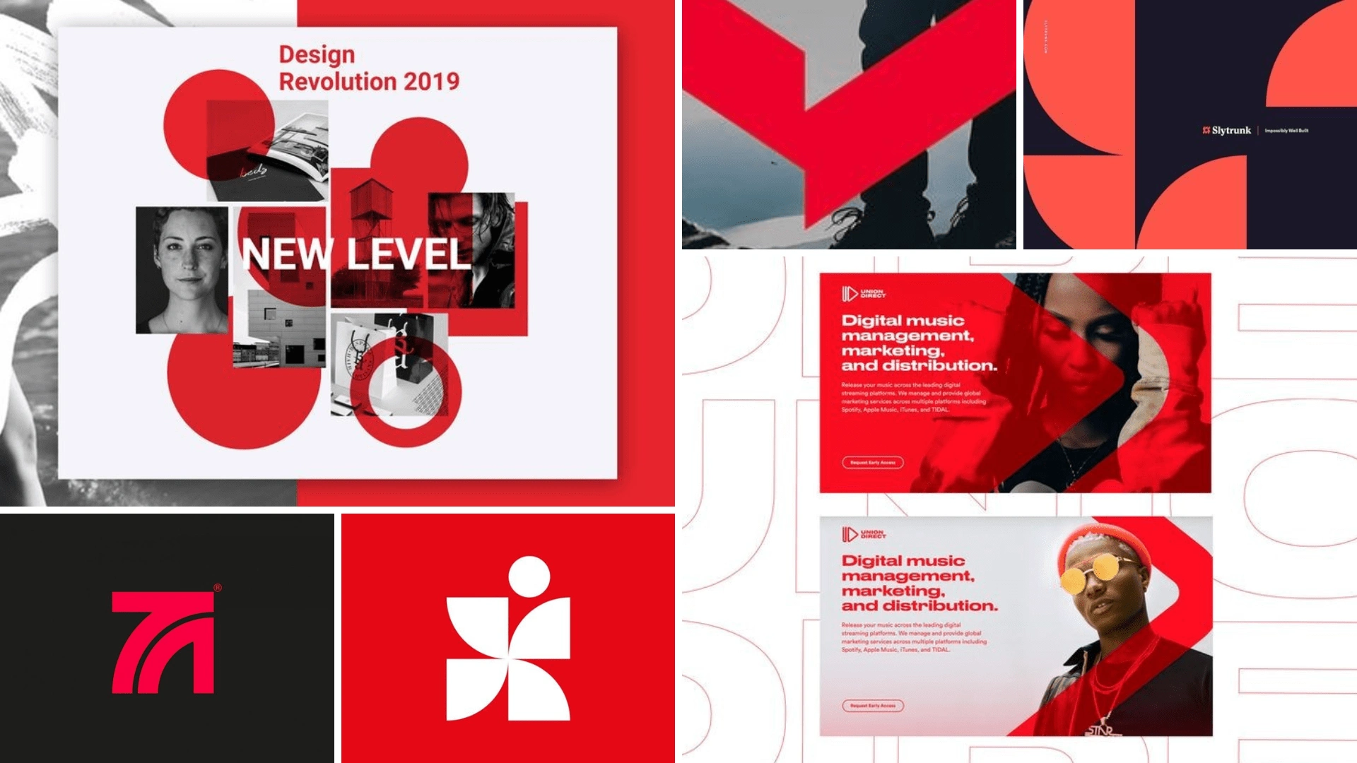
Moodboard
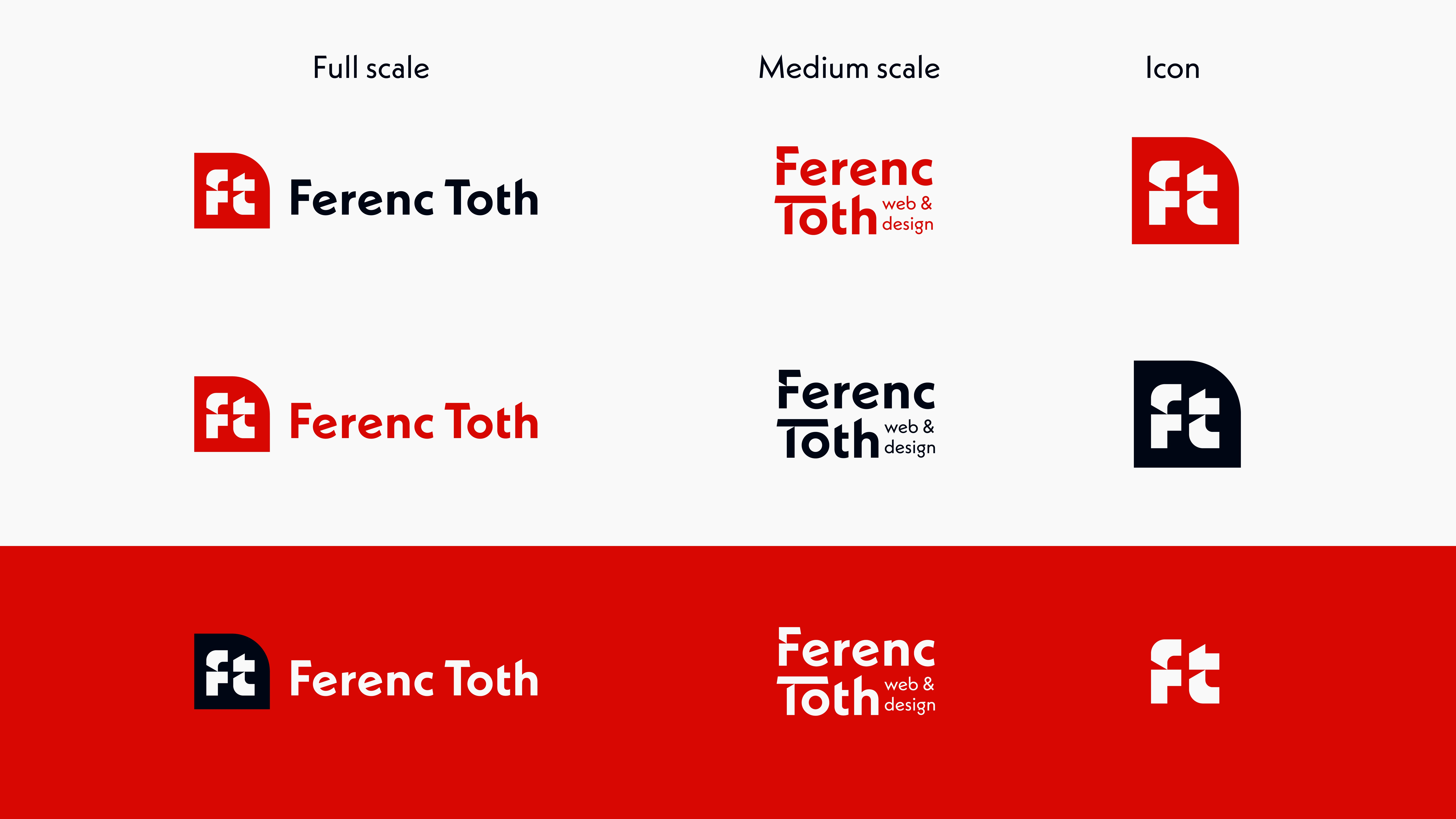
The logo started out with creating an icon using the monogram. The lowercase letters F and T were formed with the same elements: the cut arch and an L shape, cut out by the same angle of the arch in letter T.
This creates harmony and dynamism. Scaling included cutting out letters the same way, without displaying the icon.
Brand Identity visual
Instagram post
Instagram story
Brand Board
Like this project
Posted Nov 15, 2024
Dynamic yet reliable branding for web services.