Dubush Cookies and Jam: Brand Identity and Packaging
Dubush is a Mexican Kosher Food brand for whom I designed their brand identity and their packaging.
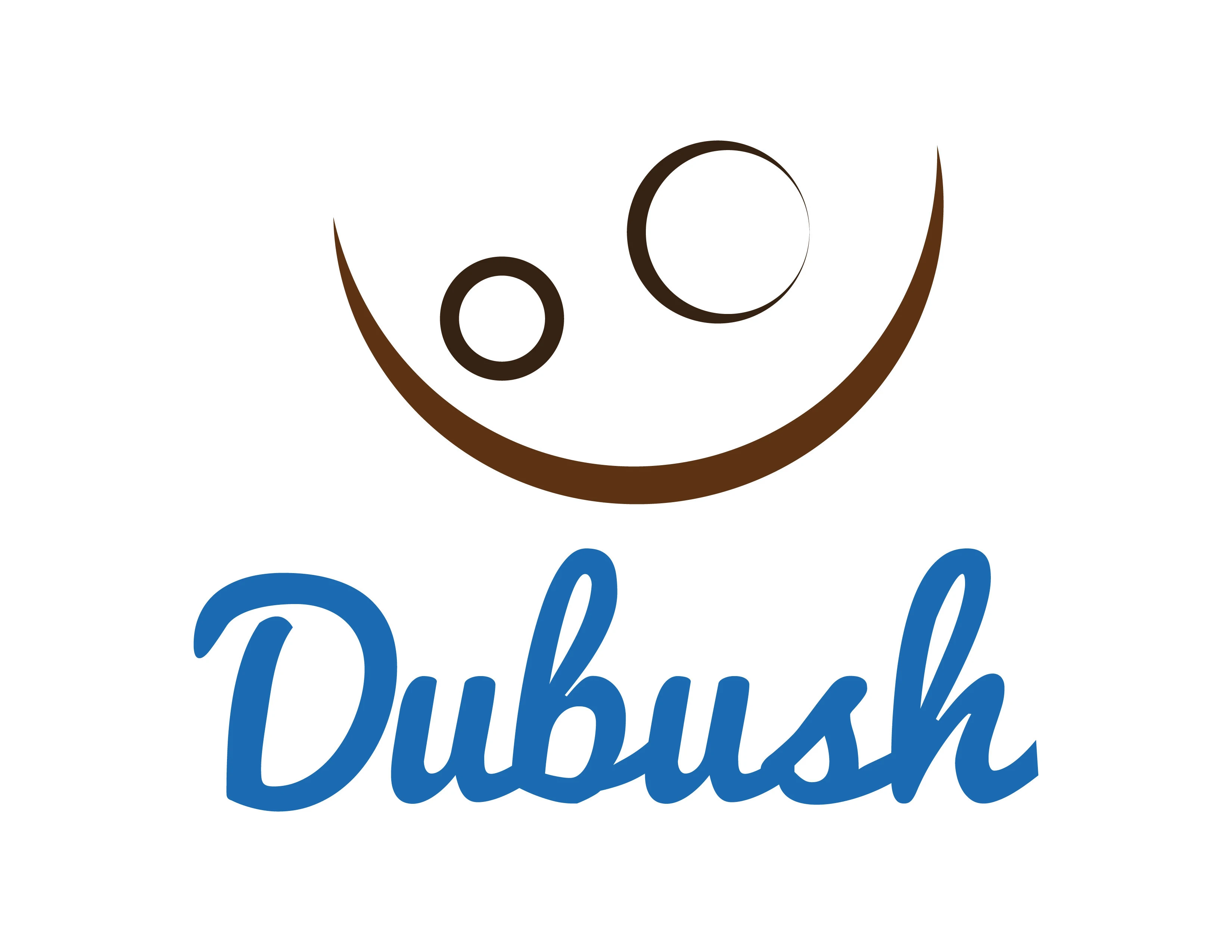
Logo in blue
The story.
Dubush is a Mexican Kosher food brand. They make cookies and jam, and they sell them in specialized supermarkets. It’s a family business, where a brother and sister joined forces and decided to start selling their delicious food. The brother, Abraham, he’s in charge of the cookies, and Mery is in charge of the jam. The cookies are meant for kids, as they even manufactured a version that has small bags for an afternoon snack for children. The jam is intended for a more grown-up audience, but we used the same logo to communicate the fact that it’s the same brand.

Logo grid
The goal.
Abraham and Mery needed an appealing logo and packaging design for their products. As previously mentioned, the cookies market is for children, so the imagery had to be colorful, impactful, and appealing. The jams had to have a more serious look even though we used the same logo.
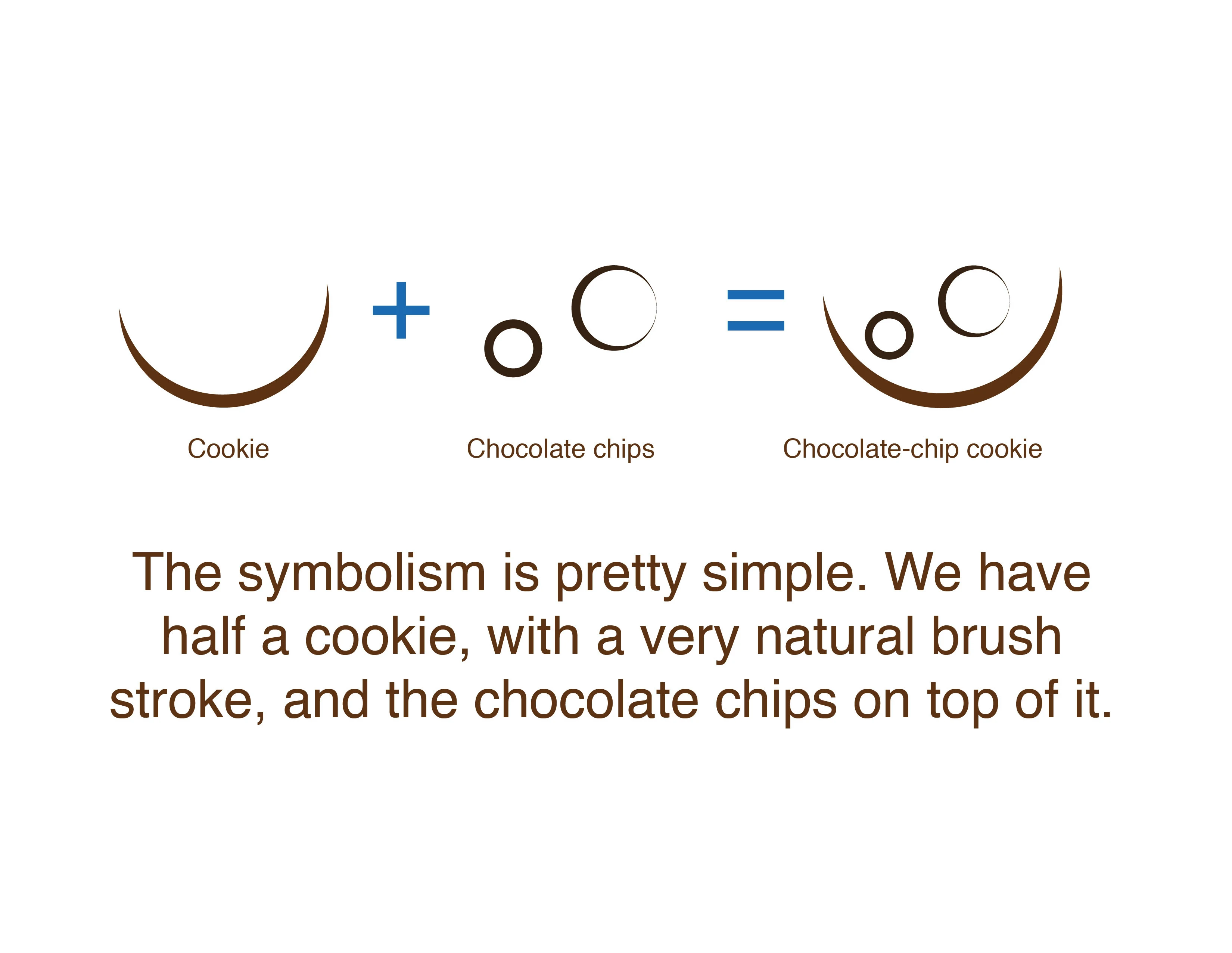
Logo structure
The solution.
In the end, I delivered and coordinated the printing of 6 cookie packages with 2 different presentations and 3 different versions (chocolate-chip, cookie assortment, and candy), as well as the snack version in bags. I also delivered 6 jam labels that were used on top of jars.
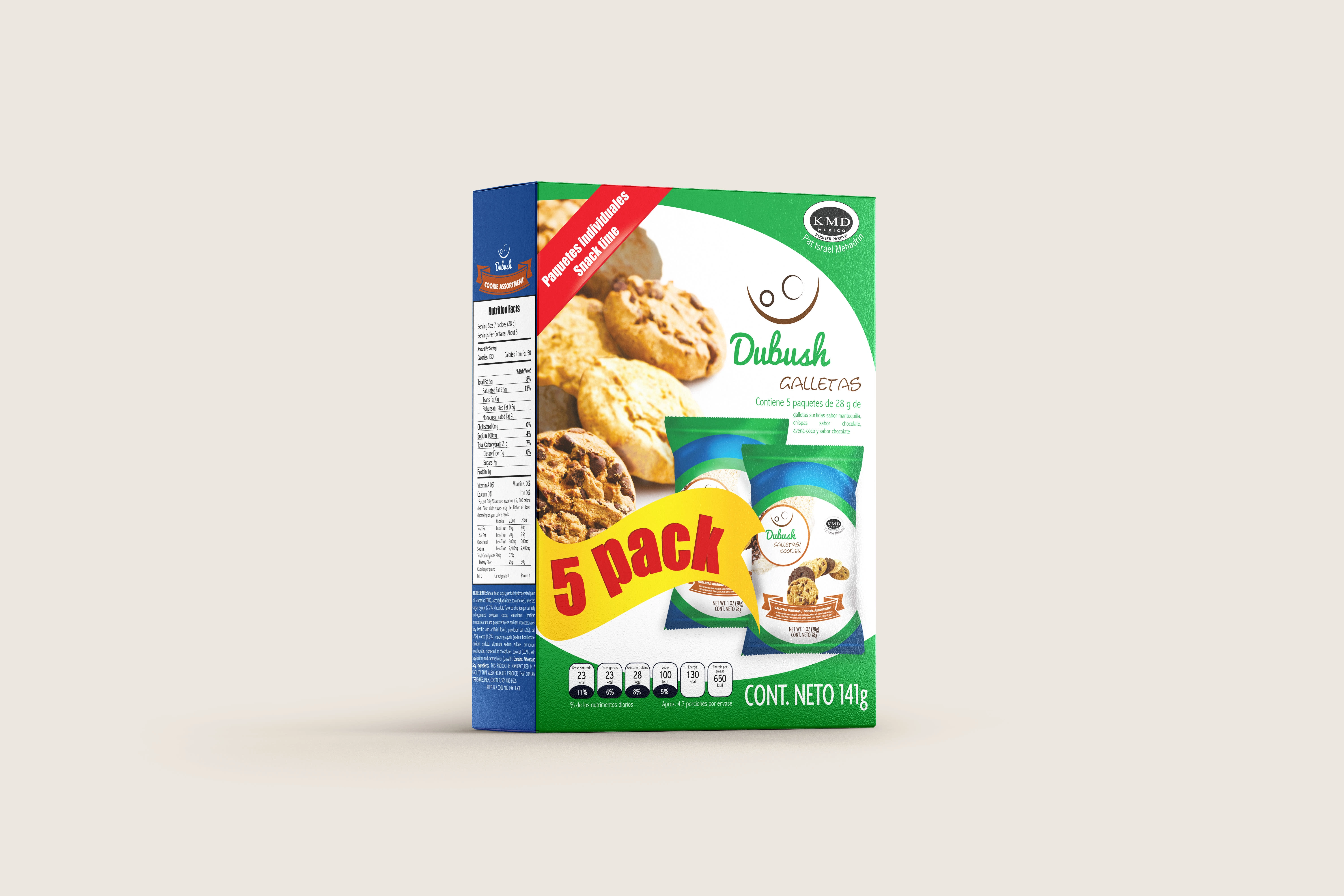
Packaging in green
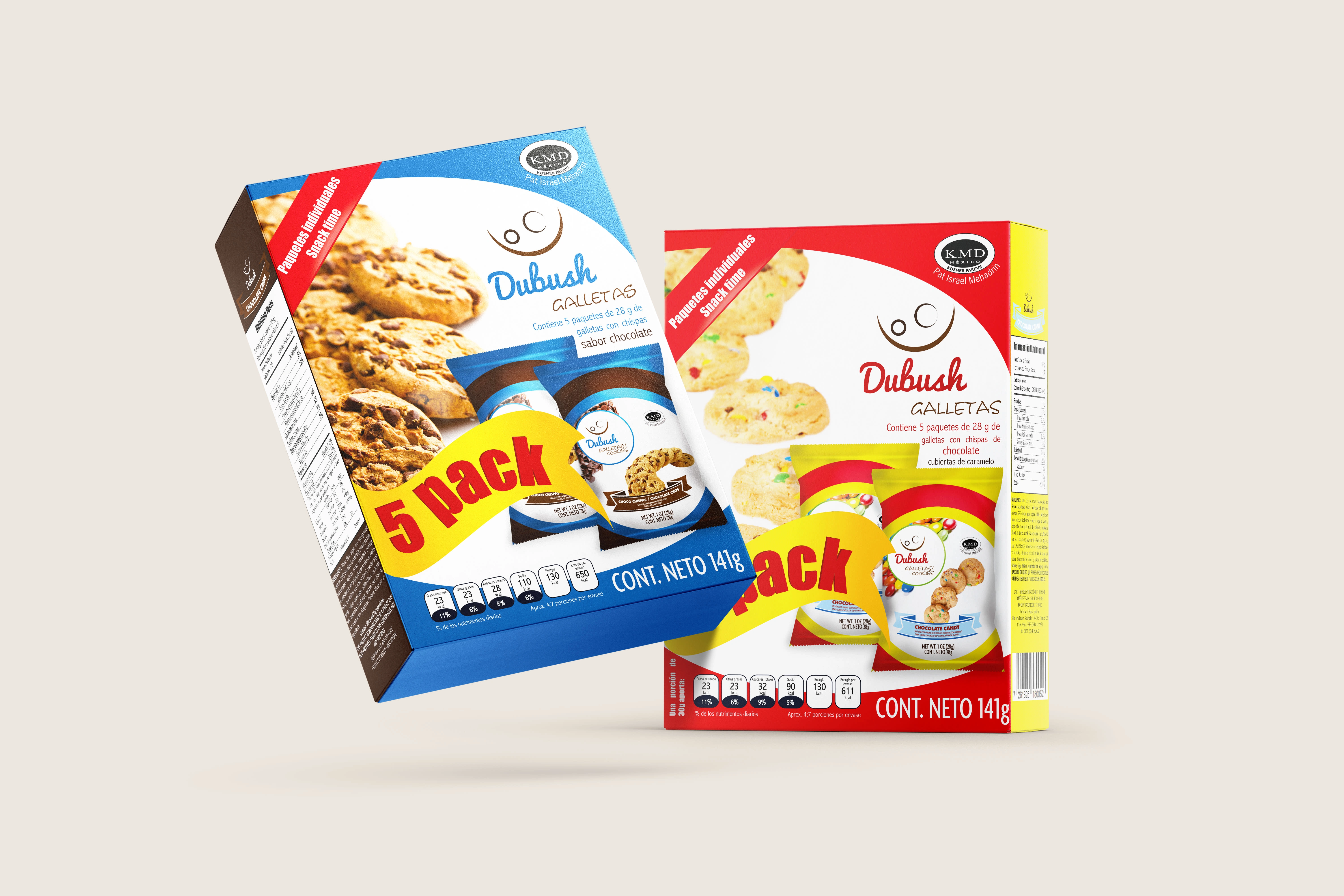
Blue and red packaging
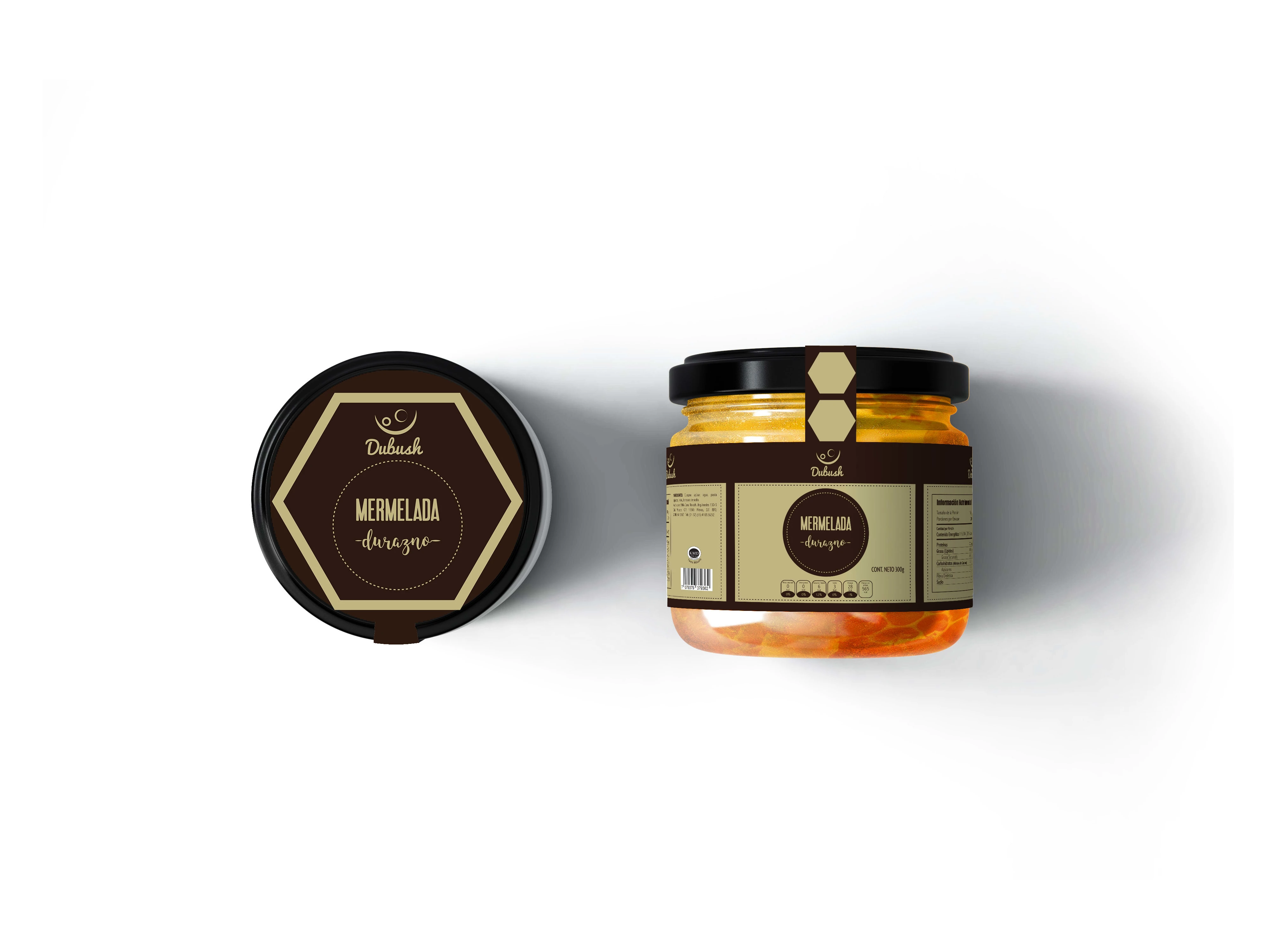
Jam
| Project Deliverables
Logo Design
6 cookie packages and 3 bag packages
6 jam labels
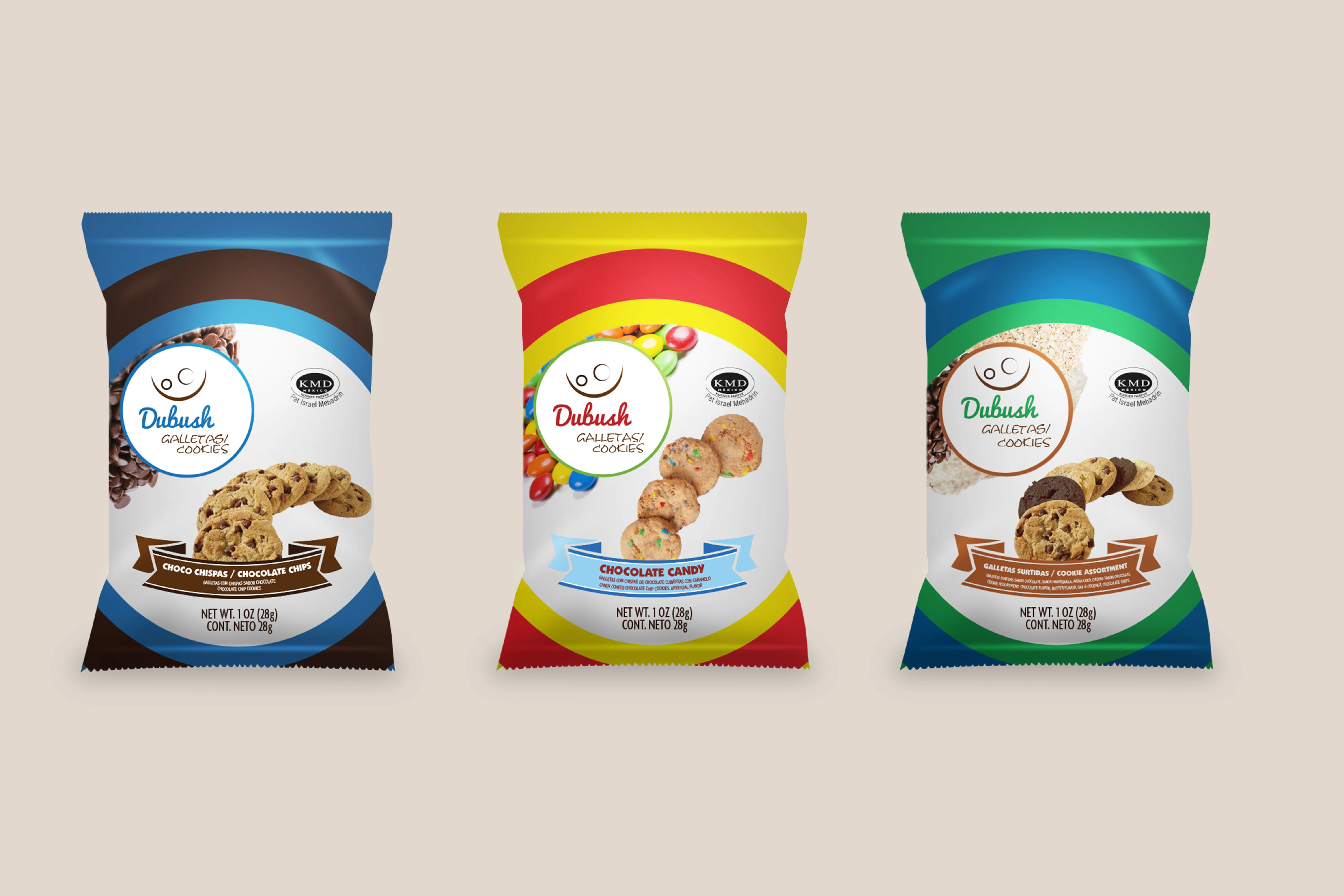
Snack bags
Like this project
Posted May 19, 2022
Dubush is a Mexican kosher food brand for whom I designed their brand identity and their packaging.

