Army Pink Freedom Rides Branding

Kathy Hallen


Army Pink Freedom Rides
Creative Director, Brand Designer, Graphic Designer
Tactics: Logo Design, Brand Identity System, Presentation decks, Website hero
Army Pink exists for one reason: to get a woman safely out of an abusive situation. Their pilot program, First 200 Rides, provides secure transportation for women escaping danger — launching in Los Angeles, with a national network as the long-term goal. A cause this urgent needed a brand that could carry real weight without ever feeling clinical or cold.
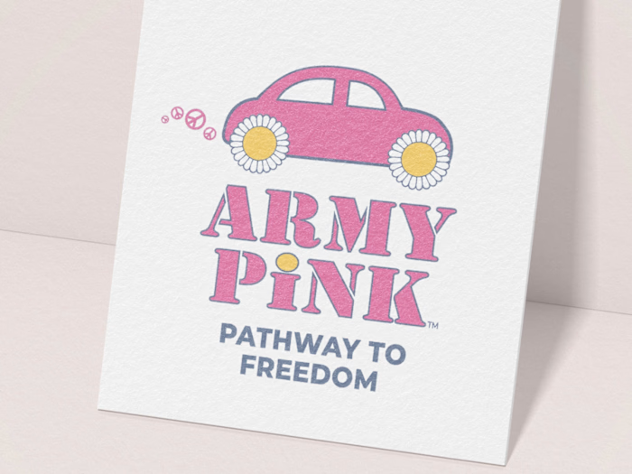
The brand was built from the ground up, starting with the logo — a mark that had to hold two things in tension: Army Pink’s playful, disarming personality, and the seriousness of what the organization actually does. Out of a wide range of concepts, the primary mark evolved from the brand’s existing Army Pink Tank icon into a stylized “Bug” — a symbol of mobility, safety, and escape, all in one shape. Actually, the other logo concepts resonated enough that they became their own icon system, giving all 7 audiences a mark that speaks to them specifically, while staying unmistakably one brand.
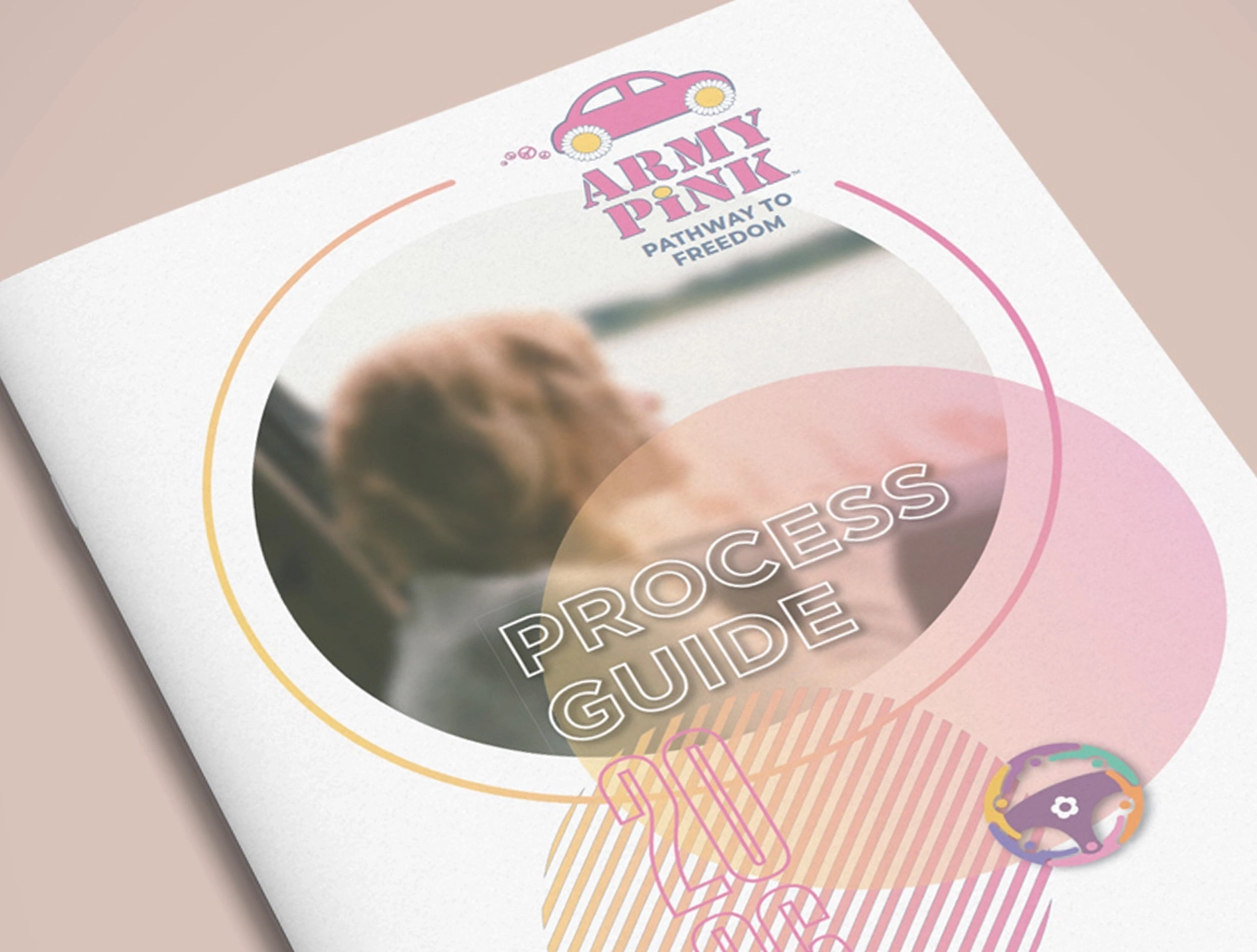
From there, the identity extended into the tools Army Pink needed to actually grow: presentation decks built for each audience segment, a process guide and infographic explaining how the rides work, and a complete brand kit in Canva so their team can produce on-brand materials without needing a designer for every piece. Custom brand patterns, gradients, and a set of playful “Groovicons” gave the system a distinct, memorable personality — rooted in the brand’s 70s-inspired spirit, but built to feel current.
Presently, I’m serving as their Creative Director and brand gatekeeper, overseeing new projects as the identity system does what it was built to do: scale. The results are already showing — over 100 volunteers, endorsements from some of Los Angeles’ largest domestic violence advocacy groups, and more than $10K in donor trade already committed. As Army Pink grows from a Los Angeles pilot toward a national network, the brand is ready to grow with it — giving every new city, volunteer, and donor a way to recognize the mission on sight, and trust it immediately.
This is the kind of work I look for most: full-scope brand building, from first sketch to national vision, for a cause that matters.
Like this project
Posted Aug 26, 2026
Developed brand identity for Army Pink, enhancing visibility and support for their Freedom Rides initiative.