THEO 1841 BEAN TO BAR // Exclusivity & Craftsmanship
LORENA LECHUGA
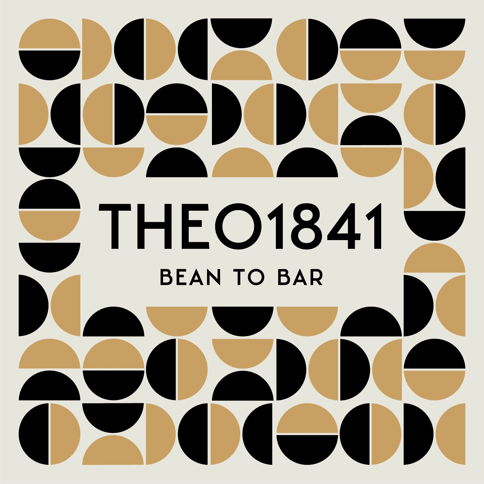
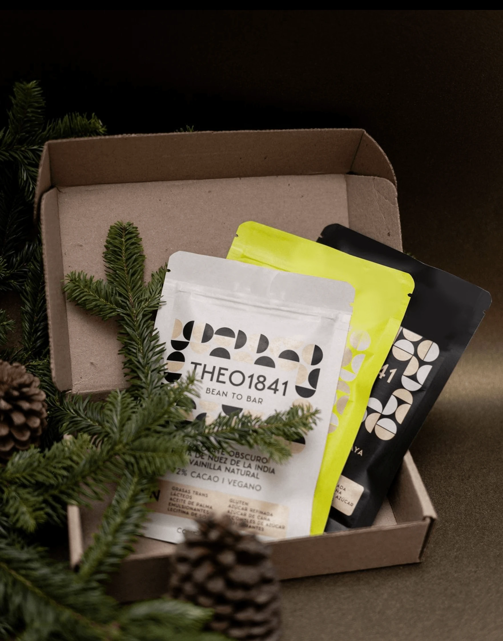
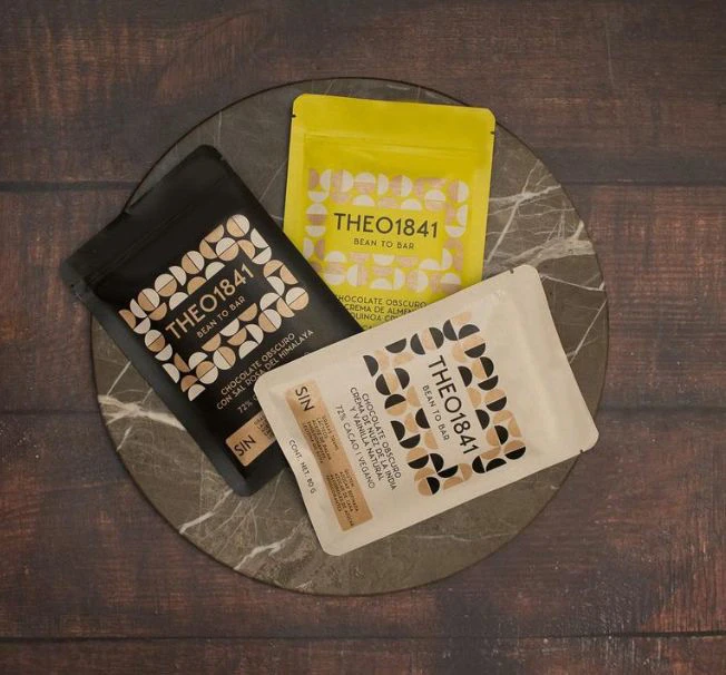
Theo 1841´s branding successfully communicates the exclusivity, craftsmanship, and quality of the best BEAN TO BAR CHOCOLATE. The packaging while maintaining a contemporary and approachable appeal ensures a cohesive and recognizable visual identity.
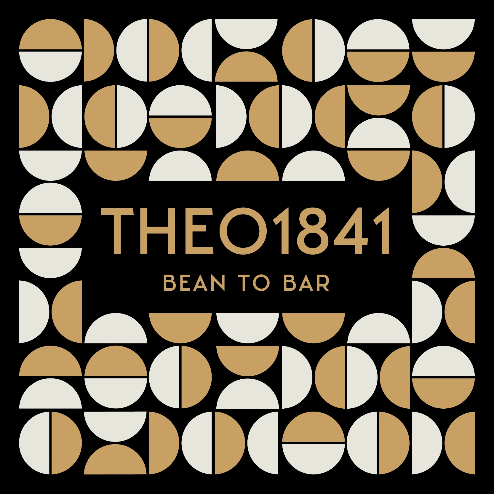
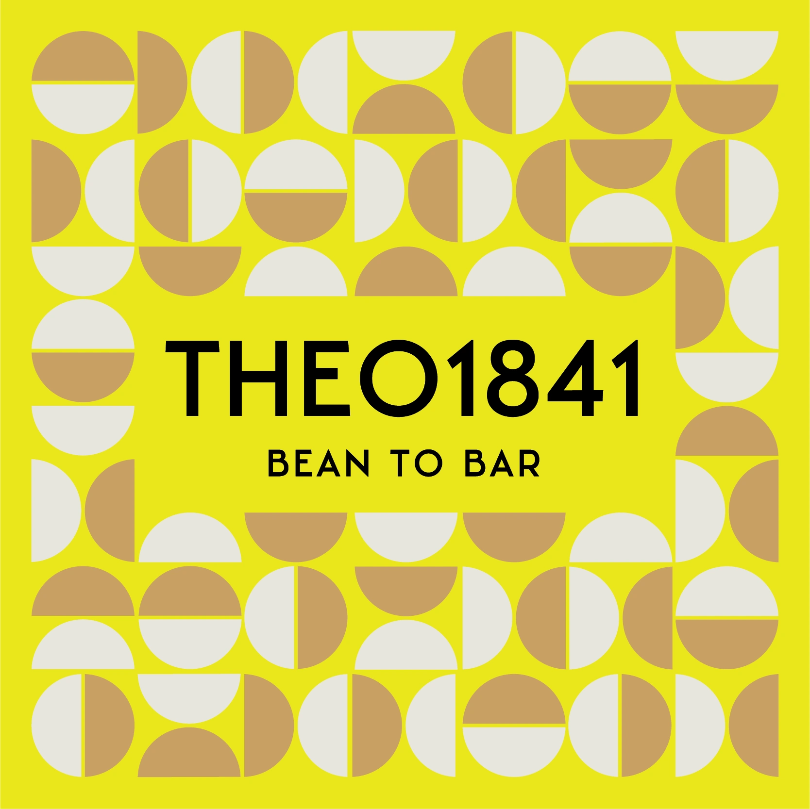
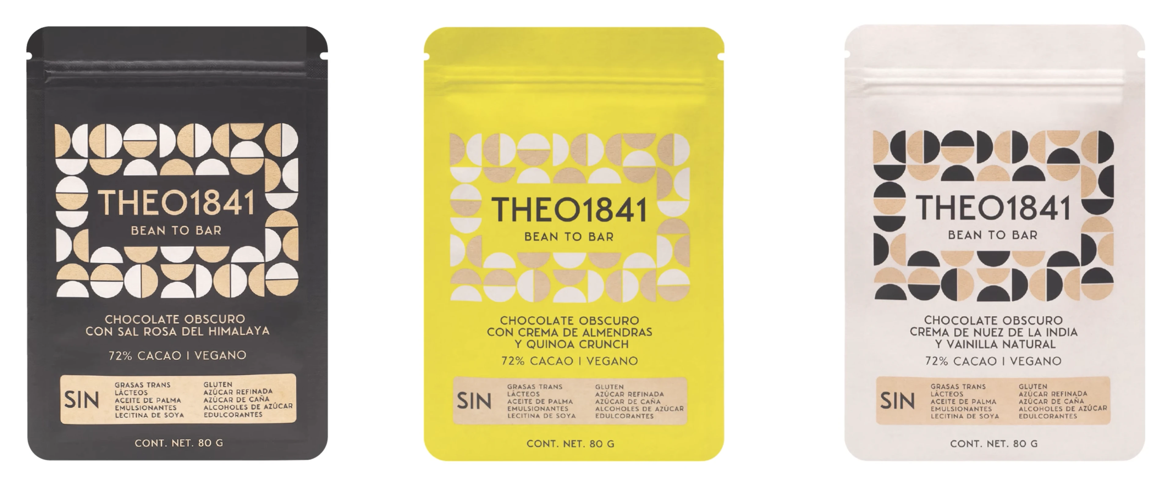
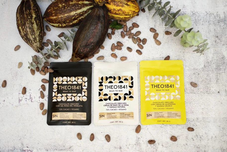
THEO1841 is a bean-to-bar chocolate brand rooted in craft and tradition. For this packaging system, we developed a visual identity inspired by mid-century geometry — bold, timeless, and sensorial.
The goal was to build a packaging experience that stood out on the shelf and told a story of artisanal quality. We explored a 1960s-inspired graphic language, creating a visual rhythm that reflected both the complexity of the product and its refined flavor profile.
Each flavor features a curated color palette and geometric motif, resulting in a cohesive, collectible series. The system invites exploration, while honoring the brand’s ethos: thoughtful design, elevated taste.
Let’s connect:
Instagram → @lechugaink_branding
Like this project
Posted Nov 28, 2024
The branding for "THEO1841 Bean to Bar" employs a modern and sophisticated design with geometric patterns and a minimalist aesthetic.