CREPERIE DE LA PAIX // Typographic Artistry
LORENA LECHUGA
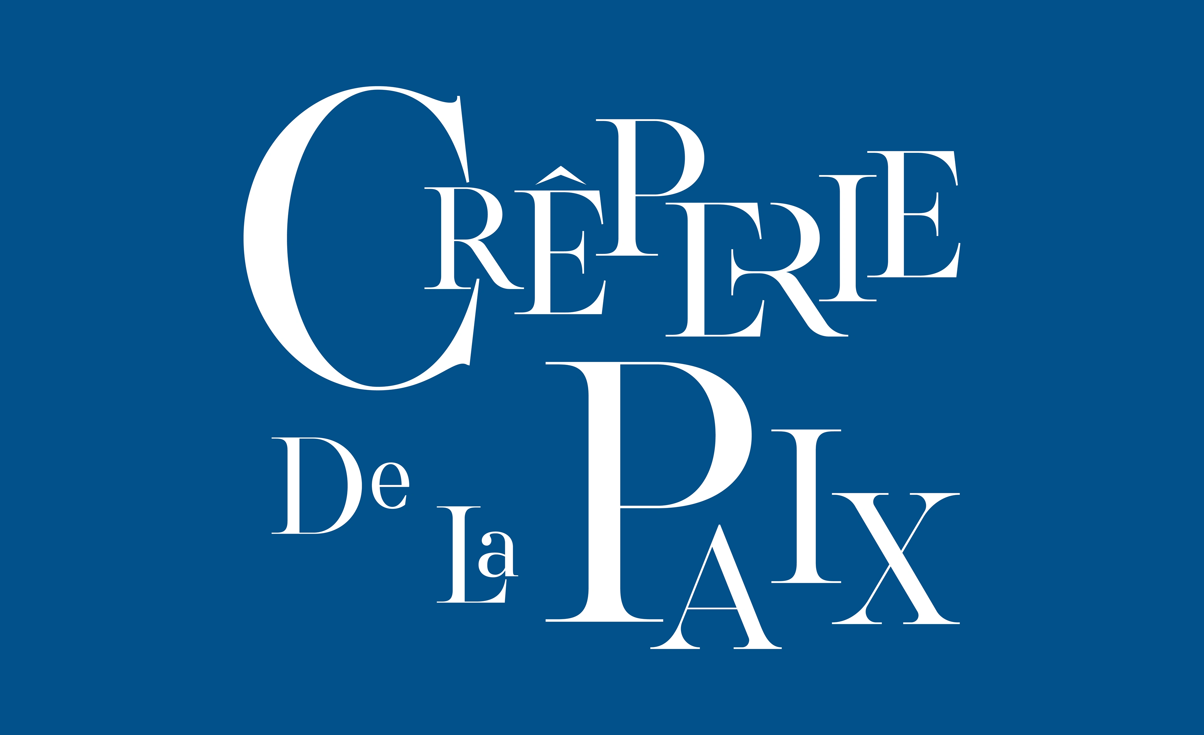

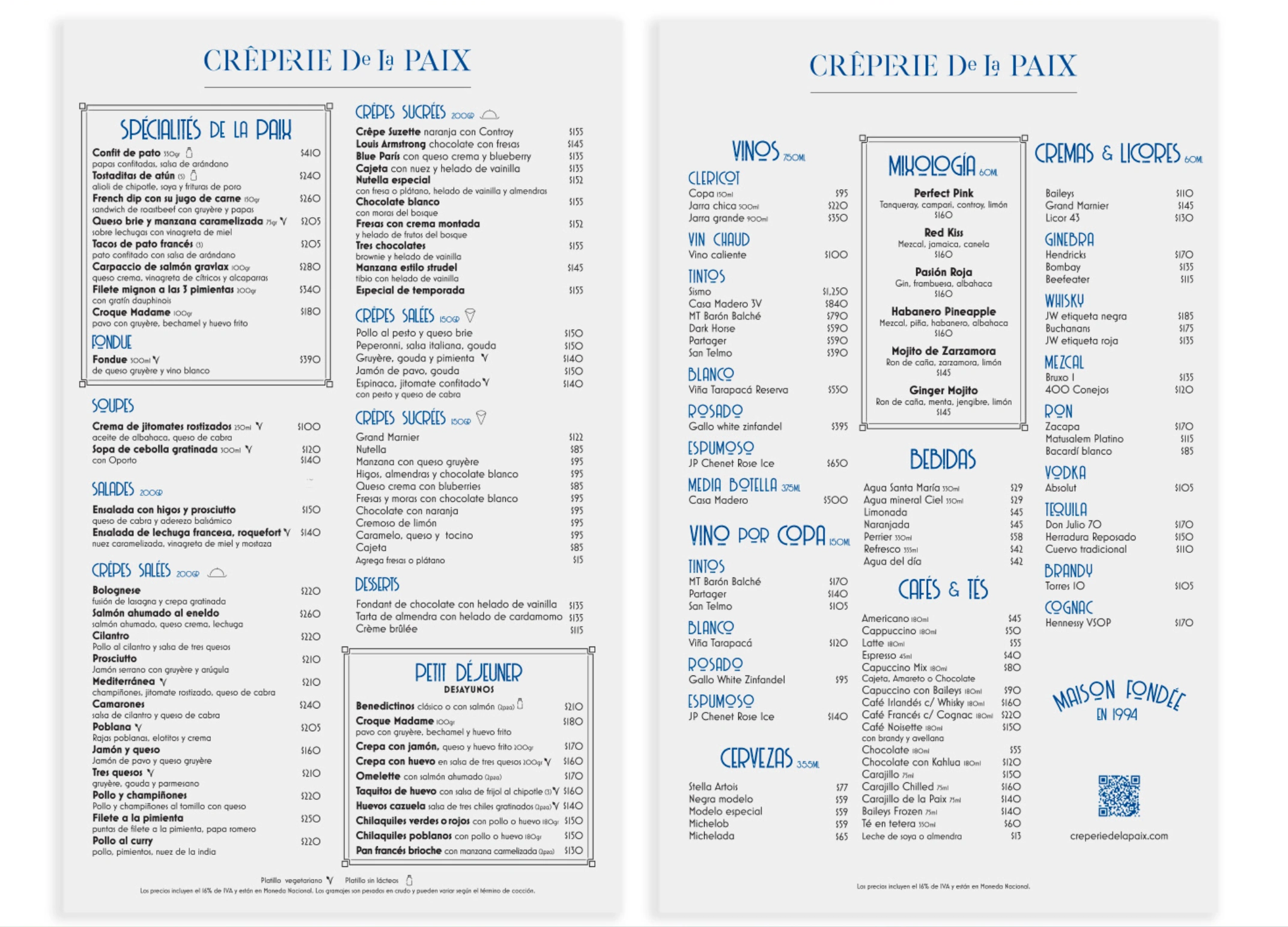
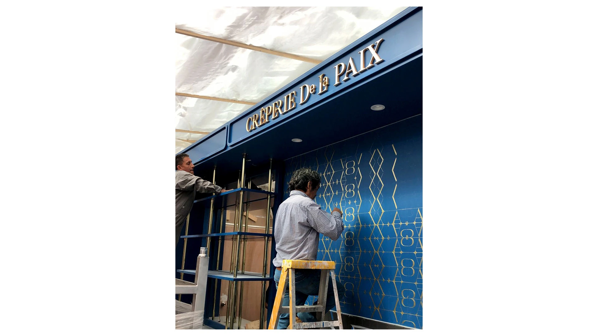
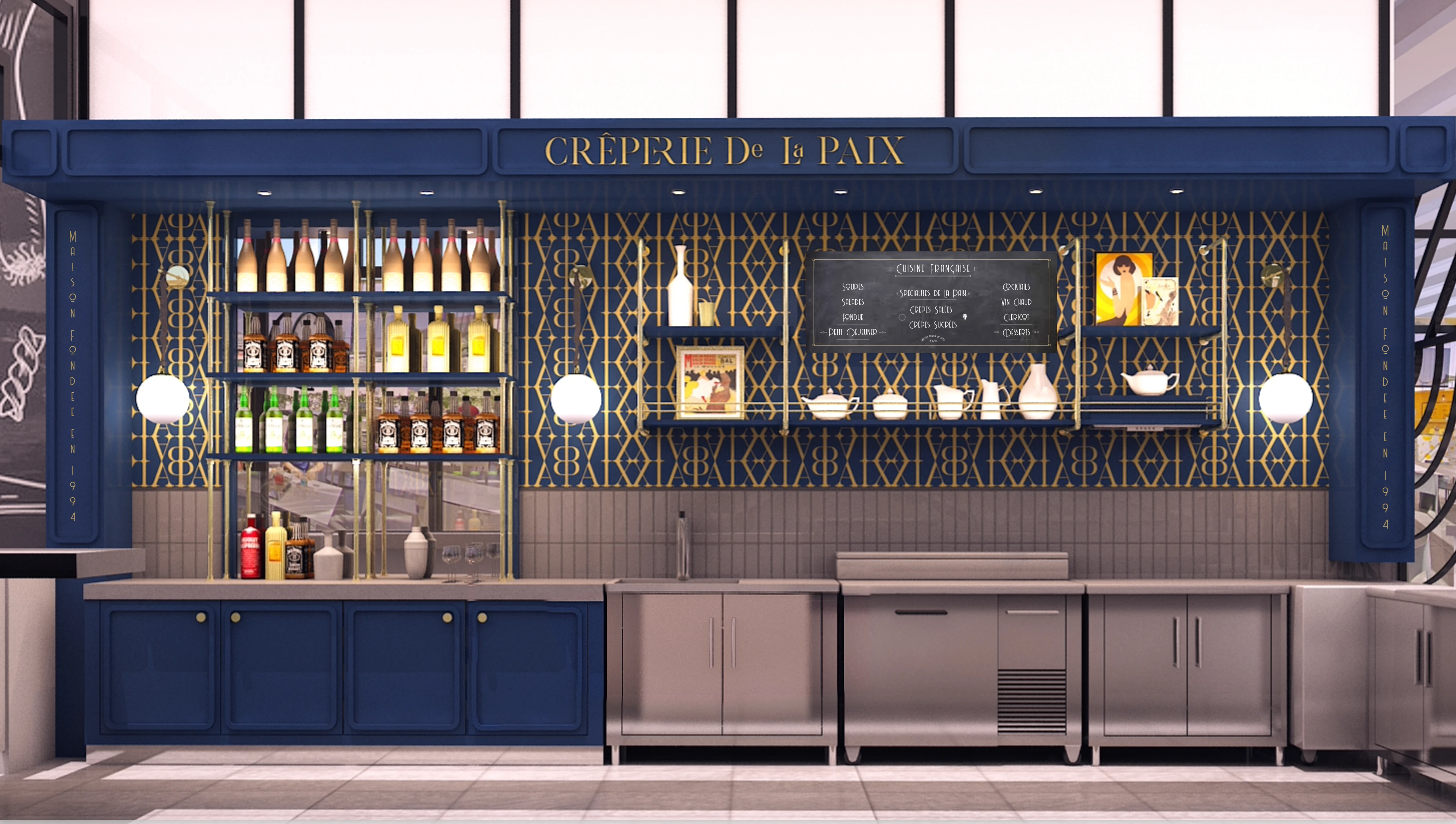
Crêperie de la Paix is a beloved neighborhood spot in Condesa, known for its authentic Parisian charm and sweet-savory classics. As they prepared to open a new location inside Palacio de Hierro’s gourmet zone, it was time to elevate the brand to match a more premium setting.
The challenge: rebrand the Crêperie to feel elegant and timeless — without losing its approachable essence. We aimed to bridge neighborhood familiarity with gourmet sophistication.
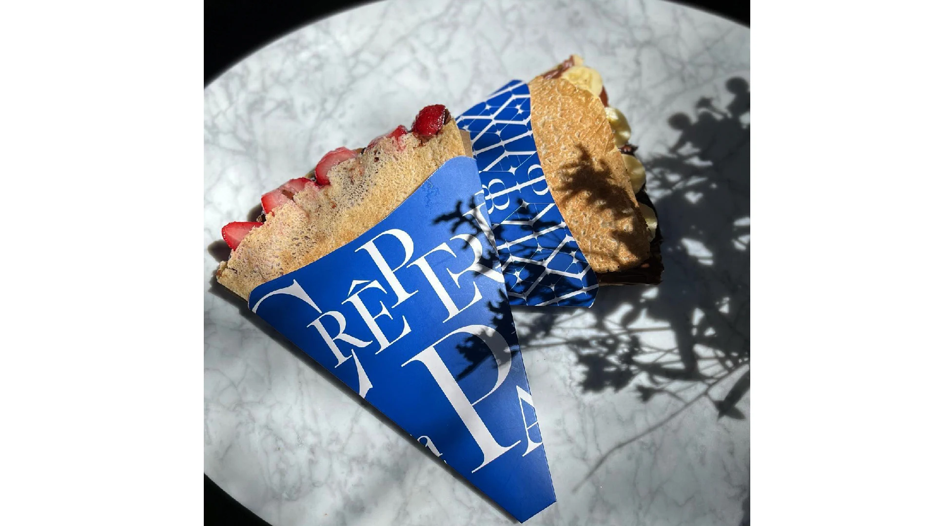
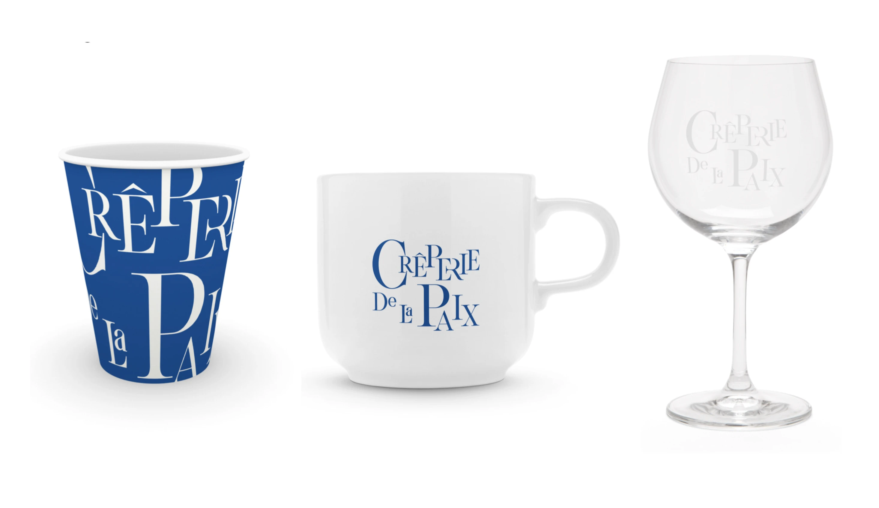
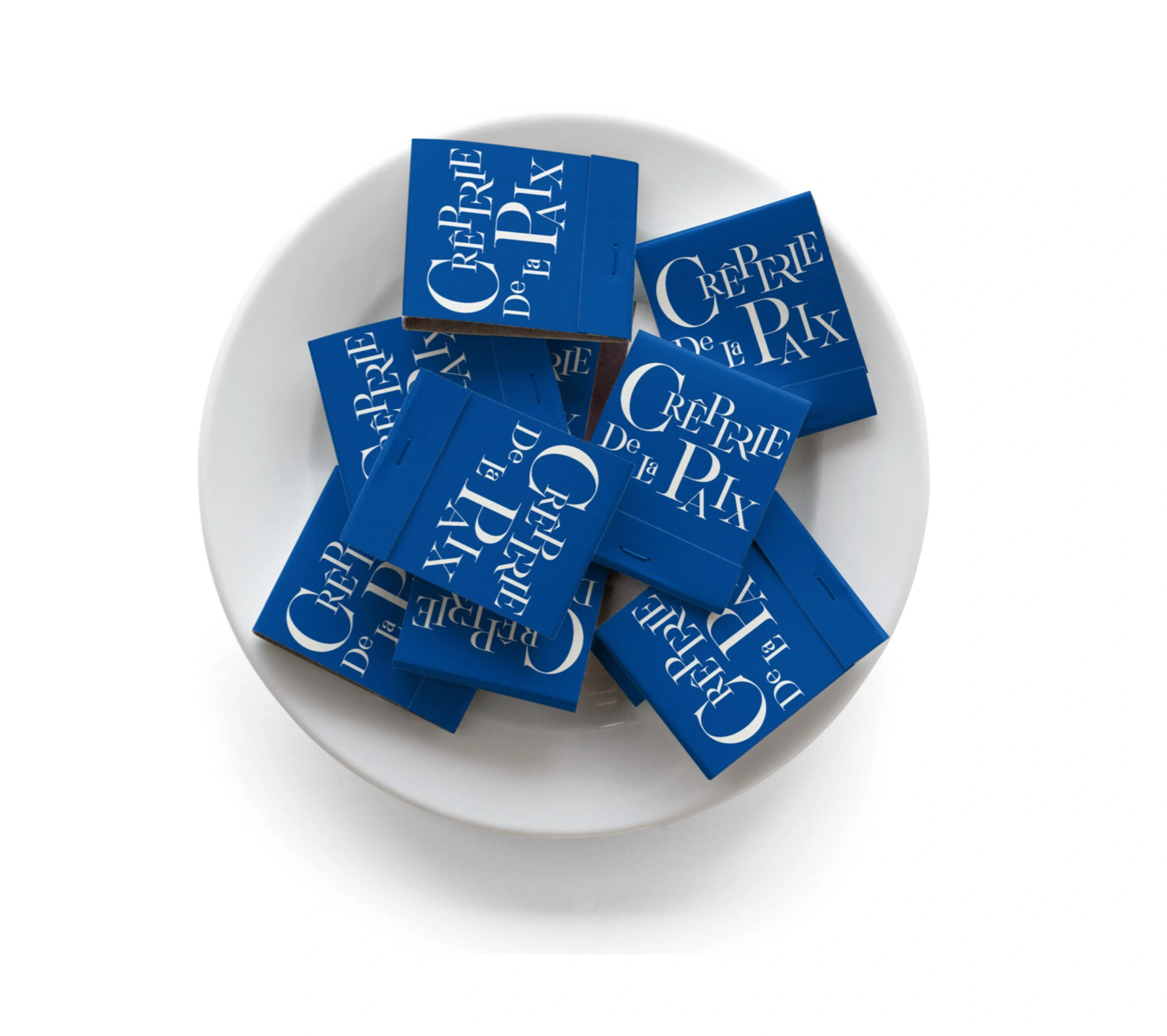
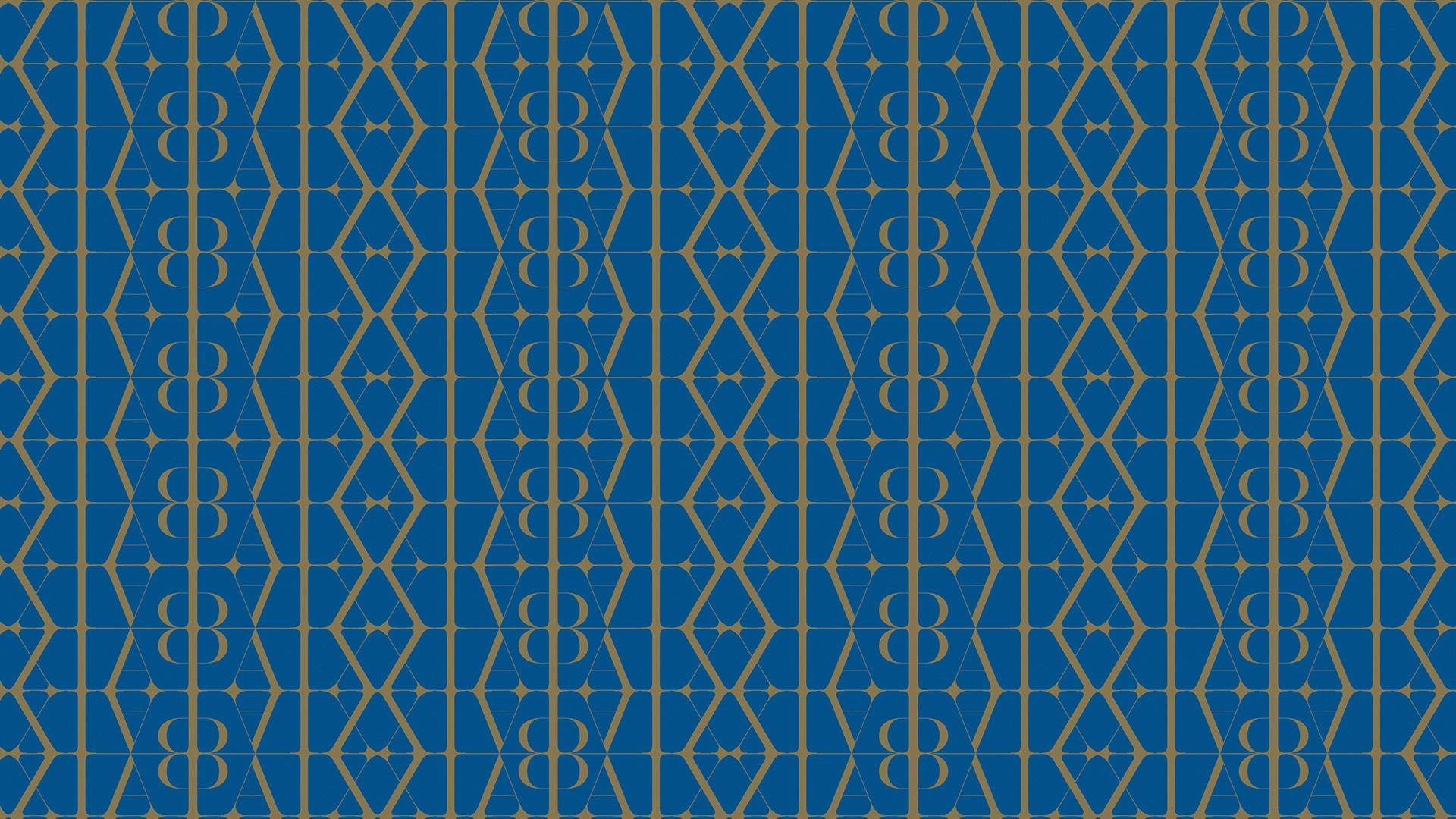
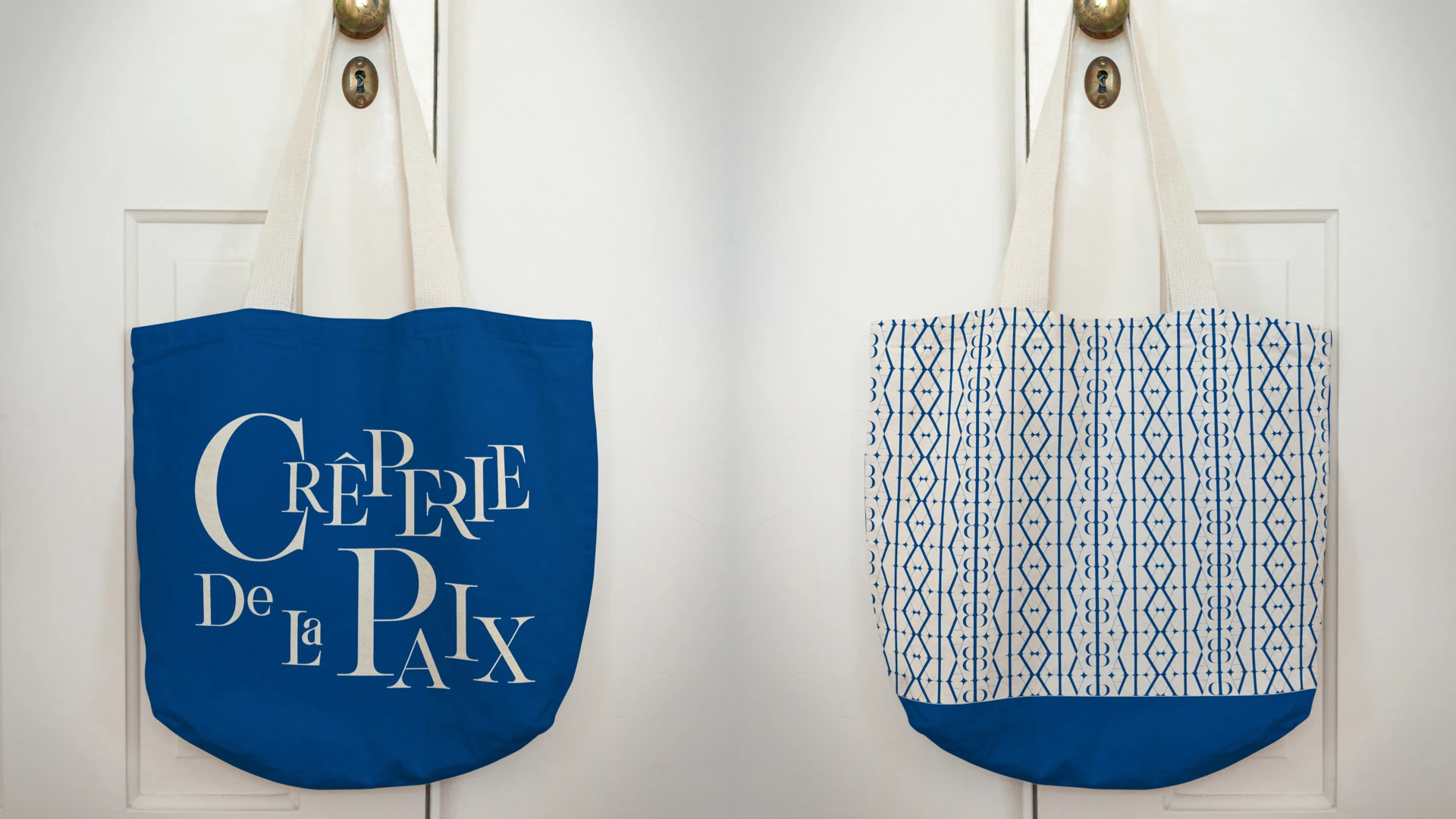
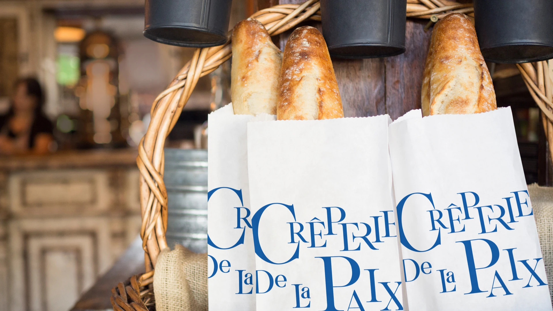
In collaboration with @mrzarquitectos, LechugaInk refreshed the identity with a deep, iconic blue inspired by traditional Parisian storefronts, and paired it with modern typographic details to maintain a youthful and current edge. The result is a brand that feels classic yet fresh — ready to stand out in one of Mexico’s most exclusive culinary destinations.
Let’s connect:
Instagram → @lechugaink_branding
Like this project
Posted Nov 28, 2024
"Crêperie de la Paix" blends classic French elegance with modern design, evoking nostalgia and authenticity while appealing to a sophisticated audience.